List
PUBLISHED
A list arranges multiple items in a single column.
|
List in developer's guides |
|
|---|---|
|
Native |
enlist |
|
Web |
List / Virtual List (+ Snap List view, Marquee) |
Usage
A list shows multiple items belonging to a single category. Users can select an item from a list to view more details or perform tasks.
Elements
- List items
- Text only
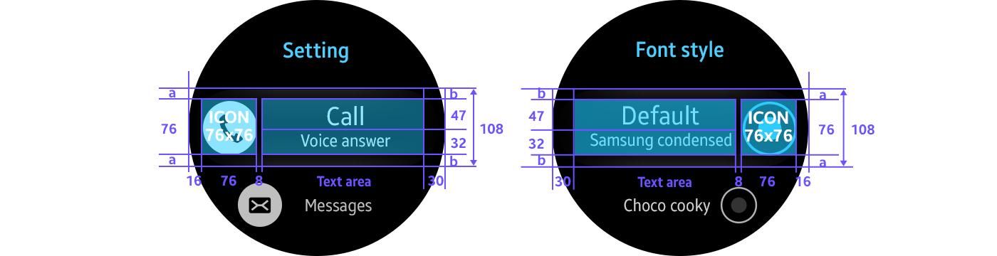
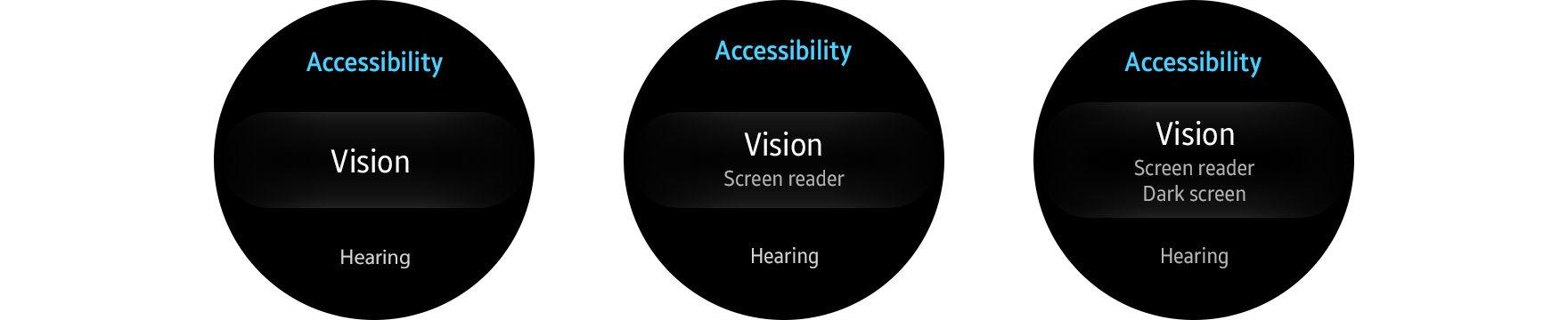
Text that’s longer than one screen slides in and fades out at the right-hand edge. Subtext strings can be added; they need to be center-aligned and limited to 2 lines.
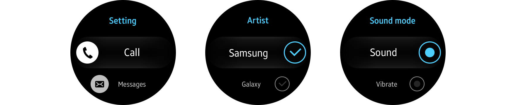
- Icon with text
List items can be supplemented with an icon.
- Icon only
Lists can consist solely of icons when providing list buttons.
- Additional controls
You can provide an on/off switch, checkbox, or radio button along with the main text.
- Text only
- Group index
Indexes help users quickly find the item they want by dividing a long list into groups. Groups can be browsed more easily and can be indexed in alphabetical order, by category, date, or time.
|
Group index in developer's guides |
|
|---|---|
|
Native |
Genlist > Groupindex |
|
Web |
- |
A group index should fit on a single line and come before the first item of each group. Because they function as a visual divider, they can’t be selected. Fast scroll indexes can also be used to facilitate quick browsing.

Group indexes divide list items into groups.
Behavior
- Focus
An item comes into focus when it’s brought to the center of the screen. Other items above and below the focus are demagnified.
- Rotary action
The bezel can be used to browse a list. Turning the bezel by one detent scrolls the list by one item.

Users can browse lists with the rotary action.
- Select mode
Users can select multiple items by touching and holding one list item.

Types
You can design list pages using one of the following formats. The default height for a list item is fixed to 130 px, but you can customize it if your list items have subtext.
|
Basic list view |
List view with subtext |
List view with multiple subtexts |
|
List view with an icon |
List view with check boxes |
List view with radio buttons |
Design specs
- Basic list view

- List view with subtext


- List view with multiple subtexts


- List view with an icon