"Air”
PUBLISHED
“Air” is one of the inspirations behind the Tizen design. The concept was introduced to achieve the key principles of openness, flow, curiosity, and focus. “Air” is a conceptual element that inspires an open, flexible, and rich visual experience. Designs should be created to satisfy users with visually reinforced presentations.
The Origins of the “Air” Concept
“Air” interacts with “Ground,” “Atmosphere,” and “Wind,” to create different results.
“Ground” symbolizes the structure and layout of the Tizen design. “Atmosphere” is the subtle variations of the “Air” principles, such as colors, themes, and overall design variations. “Wind” is created by the flow and movement of “Air.” For Tizen, it symbolizes visually pleasing motion graphics designs.
Natural Elements in the Design Language
“GROUND”: Bold and Distinctive Layout Design
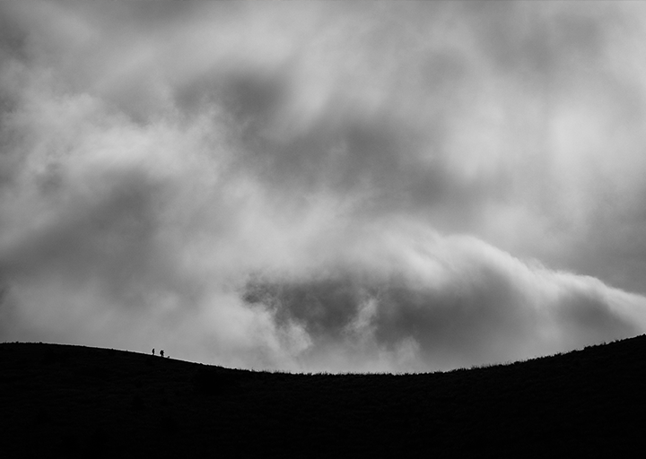
Ridges are formed where air touches the ground
In our design language, “Ground” is the first element “Air” touches. Solid structural designs powered by Tizen provide distinctive divisions on which all the other design elements are placed. Across all applicable platforms, such structural distinctiveness leads to glanceable and quickly recognizable designs.
The “Air” concept embraces the beauty of less and pursues minimalism in the layout. It aims to provide only the essential content based on actual needs. Therefore, the “Air” concept may not reveal its full potential at first look.
“ATMOSPHERE”: Natural Tones, Colors, and Moods
“Atmosphere” represents natural tones, colors, and moods present in the design. Inspired by the colorful gradients found in nature, such as deep blue skies with a slight hint of white cloud, sunrises, sunsets, and the Northern Lights, “Atmosphere” emphasizes the use of color gradients to achieve a natural, aesthetic design. A well-implemented “Atmosphere” can vastly enhance user experience.
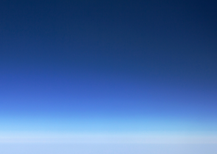
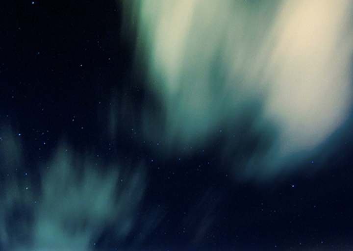
Color inspiration from nature
Using light, “Atmosphere” aims to achieve natural transition of colors as they are found in the sky. With carefully selected colors, “Atmosphere” creates natural, yet appealing color gradients.
We recommend contrasting color combinations in the background and foreground to ensure optimal readability. The use of subtle gradient prevents high-contrast screens from becoming boring by adding variations that keep the screen visually intriguing.
“WIND”: Animated Graphics from Nature
The “Wind” concept is based on animations providing users with feedback for each interaction, while conveying meaningful information to help orient users. For example, page-turning effects visually suggest the direction of navigation, and page-end effects inform users that they have reached the last page of the current content. Uniform, harmonious animations on the screen allow for a pleasant visual experience while maximizing the responsiveness of the design.

The wind is the flow of the content
Tizen screens have a multilayered structure. Each layer has its own directional flow, based on the uses and features, for consistent screen transition. Difference in direction helps users clearly identify which layer, level, or part of the design the interaction is taking place on.
Animation effects also include fade effects for transitions between layers and for opening and closing app screens.