Navigation
PUBLISHED
Navigation in Tizen follows the principle that a device screen must change according to changes in the application depth. The navigation design must be consistent so that the user can clearly understand which depth and screen of the application they are currently using.
Since navigation is the biggest factor affecting an application's overall usability, consider navigation-related issues as early as possible in your application development process.
Keys
Offer the Menu, Back, and Home keys as physical (hardware) keys.
Figure: Physical keys
Back Key and Cancel Button
When moving from a screen to another to perform a task, the user taps applicable elements on the current screen (for example, lists and pop-ups). When the user wants to return to the previous screen, he or she taps the Back key or Cancel button.
Back Key
The default position for the Back key is on the bottom right side of the device.
Video: Navigation using the Back key (click to play)
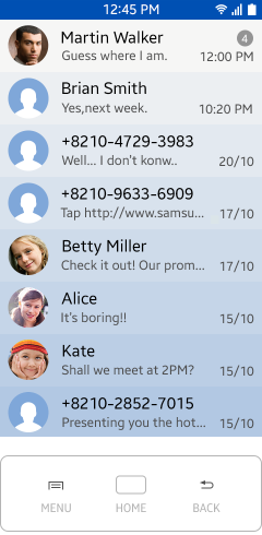
The following figure shows the navigation path from the file manager screen to an image folder. When the user taps a folder, the folder name appears in the title. The user can tap the Back key to return to the previous screen.
Video: Navigation between folders (click to play)
The Back key can be used not only to return to the previous screen, but also to hide the virtual keypad or notification pop-up.
Cancel Button
Use the cancel feature when the user needs to open a new screen for a particular task or wants to cancel a task after opening a screen to enter data. You can place another function button, such as Send or Done, to the right side of the Cancel button.
Home Key
Selecting the Home key at any point in your application returns the user to the Home screen. Pressing the Home key always sends the running application to the background and brings the Home screen to the foreground.
To return to your application, the user must tap the application icon on the Home screen or in the task switcher. The user accesses the task switcher by tapping and holding the Home key.
Video: Navigation to the Home screen (click to play)
Notification Panel
If the user opens an application from the Notification panel tapping the Back key, the user is returned to the screen that was previously active. If no application was active, the Home screen appears.
Video: Navigation with the Notification panel (click to play)
Navigation within an Application
Use tabs and drawers to enable navigation within an application.
Tab
Users can switch screens rapidly using the tab UI components. Tapping a tab changes the view rather than moving the user between screens. Therefore, tapping the Back key is not the correct navigation path to return to the previous tab.
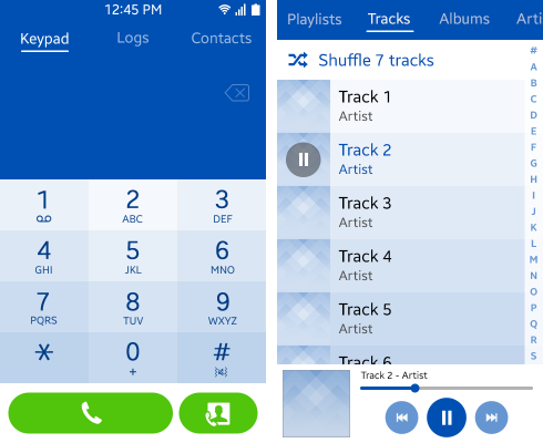
Use tabs when screens change rapidly, for example, when a different screen (such as the dialer or call log) is needed in a call application, or to sort the elements displayed on a music application screen (such as tracks, playlists, albums, or artists).
Figure: Tabs used in call and music applications
The position of the tabs at the top of the screen can make them hard to reach. To make it easier to switch between views, the user can swipe anywhere in a tab view to navigate to adjacent tabs.
Selecting the Back key should return the user to the previous depth, not the previous tab. For example, in the following figure, the user launches the application by tapping its icon in the Home screen, and then moves between tabs. Tapping the Back key should take the user back to the Home screen.
When using tabs, avoid using other components that also use horizontal scroll, such as an image carousel.
Video: Tab interaction (click to play)
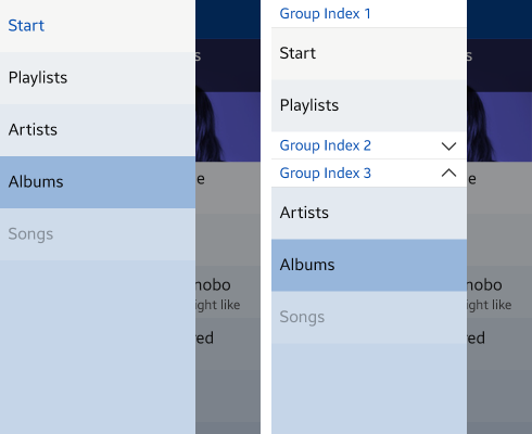
Drawer
The drawer is accessed by either tapping the drawer icon in the top left corner on the main screen, or by swiping from across the edge of the left bezel into the screen.
Each list item in the drawer can have a leading icon. If you use icons, ensure that all items in the drawer have one. The icon is only visible in the drawer, not in the title of the navigation path.
The drawer has a default layout and size but items in the drawer list are flexible. Items can use different sizes, placement, and colors to fit with the branding of the app, and they can be purely visual representations with no functionality, such as a logo.
To ensure a structured drawer list, use visual grouping, for example, adding background colors, for items that belong to logical groups. To further explain a drawer item, you can use sub-labels.
Figure: Drawers
Navigation between Applications
When an application brings another application to the foreground, the user should be able to return to the previous application by completing a task or tapping the Back key or Cancel button. For example, when the user activates the email application using the Share via email function in another application, tapping the Back key must take the user back to the original application.
Video: Navigation between applications (click to play)