Drop-down Menu
PUBLISHED
Drop-down menus allow the user to select 1 option from a list of multiple options within a drop-down popup. A drop-down menu consists of a drop-down button and a drop-down popup. When the user selects the button, the popup appears.
Drop-down menus can indicate the selected option in 2 ways:
- The selected option is marked within the drop-down popup.
- The selected option is shown as the label on the drop-down button.
A drop-down button or popup option can be in either of the following states:
- Normal
- Focused
- Selected
- Disabled
The following guidelines apply to drop-down menus:
- The drop-down menu must provide a default selected option.
- A check mark can appear on the selected option in the popup.
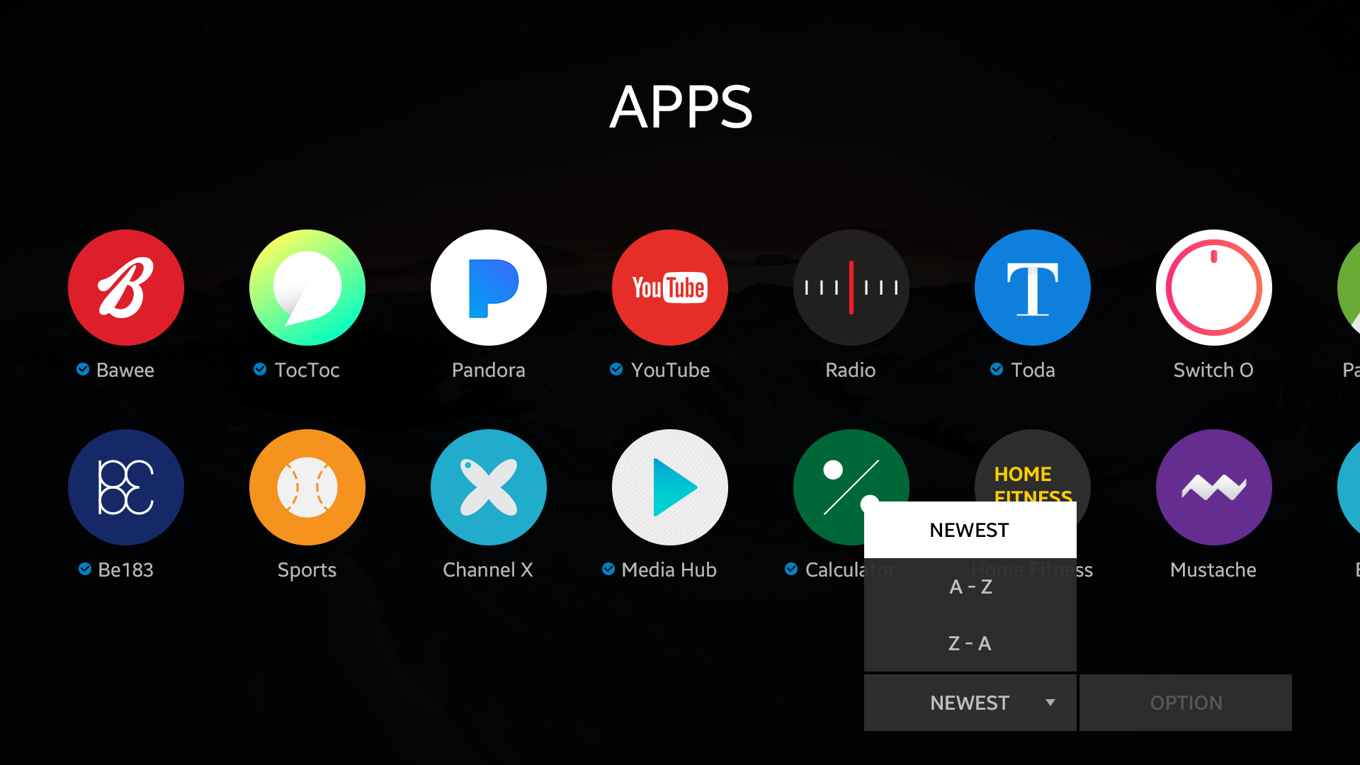
Drop-down menu with selected option as label.
Was this document helpful?
We value your feedback. Please let us know what you think.