Theme
PUBLISHED
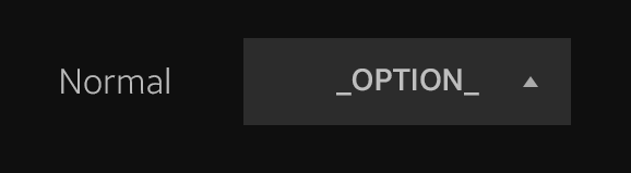
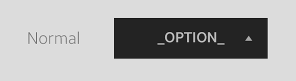
The UI components have 2 themes available: dark and light.
Each theme is used based on the background color. Since the background color is usually dark, the dark theme is mainly used. However, if the background is light, the light theme is applied.
|
Dark theme. |
Light theme. |
Was this document helpful?
We value your feedback. Please let us know what you think.