Help users find their way
PUBLISHED
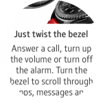
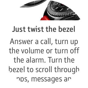
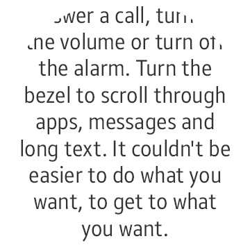
The Gear's small display can and should display a limited amount of content. It should use a clear information hierarchy so users can understand which information is critical and which is supplementary.
Examples
- News Briefing
News Briefing curates news from user-designated categories into a list. In a detailed news page, content is loaded smoothly within the same page, reducing the navigation depth for a seamless experience.


The image, title, and text are provided in order for simple navigation.
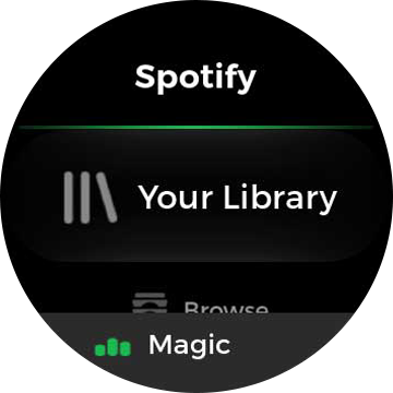
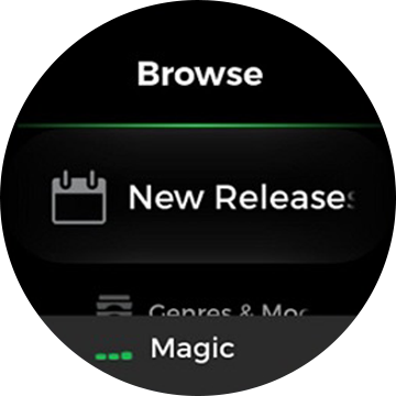
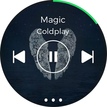
- Spotify
Spotify lists music in a simple structure, allowing users to navigate playlists intuitively. The bottom button on each screen takes the user immediately to the song that’s currently playing.
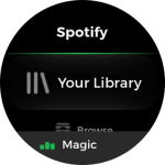
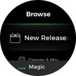

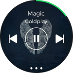
The fixed button at the bottom takes users to the currently playing song.


Things to check
- Can users explore your app easily?
- Is there any inconsistency in your navigation flow that deviates from the Gear guidelines?
- Does your app provide visual cues for what to do and where to tap?