Touch Feedback
PUBLISHED
You must give users feedback when they touch specific elements (especially buttons) on the screen. This supports communication between a user and the application.
To promote better touch interaction with visual cues, Tizen 2.3 offers several color changes and effects. The buttons have separate states (normal, press, and dim) for each button type, such as list buttons.
Figure: Tizen buttons
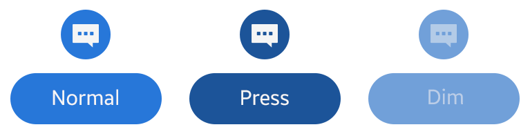
Table: Button states
|
STATUS |
Normal |
Press |
Dim |
|---|---|---|---|
|
BG image |
#2777d9 |
#1c5499 |
#71a0d9 |
|
Font and icon |
White |
White |
White (50% opacity) |
In the normal state, the button is shown within a blue BG image. When pressed, the button color turns into a darker shade.
In the dim state, based on the color value of the normal status, apply 50% opacity to the button text.
The following figure illustrates button states (icon buttons in the edit mode of the normal state and a text button in the pressed state).
Figure: Button examples
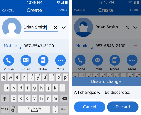
NOTE: You can customize the button dim color in the Web framework.