Grid View
PUBLISHED
A grid view is used to display graphical content. It consists of grid items and optional labels. The grid items can optionally have additional information.
A grid item can be in either of the following states:
- Normal
- Focused
- Selected
- Disabled
The following guidelines apply to grid items:
- The grid item displays only graphical items, such as icons and images.
- If the label length exceeds the text area, the excess characters are replaced with an ellipsis (…).
- If available, additional information is shown over the grid item.
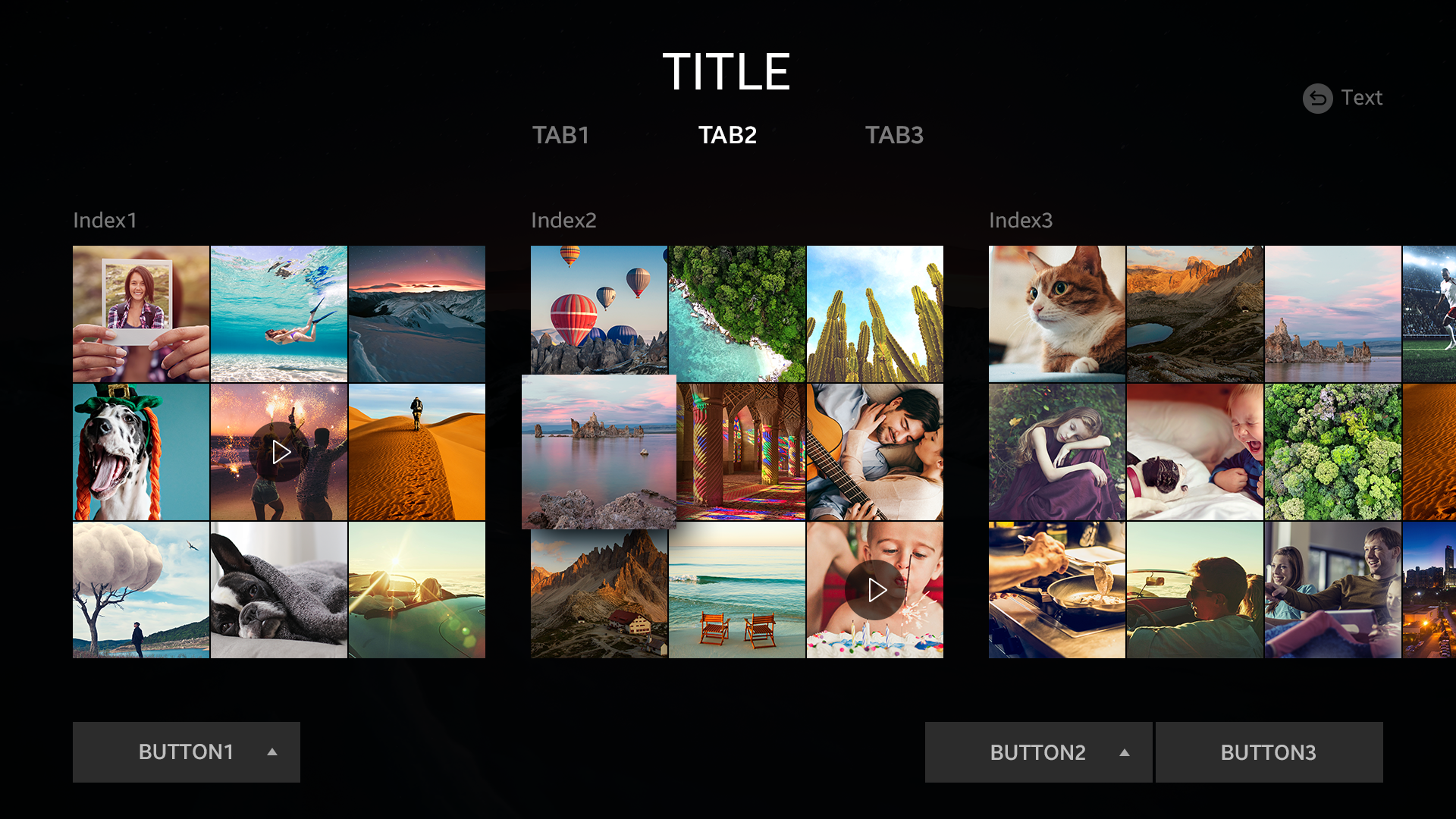
Grid view.