Buttons
PUBLISHED
Tapping a button performs an action. Buttons can appear on almost any screen, should be easy to tap, and are designed according to the purpose of an action.
Usage
- Use a bottom button when providing one important action on a screen
We recommend using a bottom button when you only provide one major function on a screen. If you don’t have enough space for a bottom button, use a text button instead.
- Use more options when providing multiple actions
If you need multiple buttons on one screen, move any less important actions to More options.
Behavior
- Tapping a button performs an action or opens a link
A button should look tappable so users know intuitively to tap it.
- Buttons should be disabled if they can’t be tapped
Disable a button if it’s not in a condition to perform an assigned action. For example, if no item was selected from a list, any Share or Delete buttons should be dimmed to indicate that they’re not active.
Types
- Bottom buttons
A bottom button provides one main action. It remains fixed and non-scrollable at the bottom of the screen. Text should be in all capital letters. Only use an icon when you can’t fit long text in the button field.
Bottom button in developer's guides
Native
Button
Web
Bottom Button

A bottom button is provided for one main action.
- Text buttons
Text buttons are used to show major functions when a bottom button isn’t available due to insufficient space or a decline in graphic quality. They’re also useful when you have more than one major function on the same screen. (We recommend against providing more than 2 functions per screen.)
Text buttons can appear anywhere in the body of a page. If the button triggers a screen transition when tapped, include a visual cue (>) next to the text unless the text is too long.

Present a text button with a visual cue (>) next to the text if the button causes a screen transition.
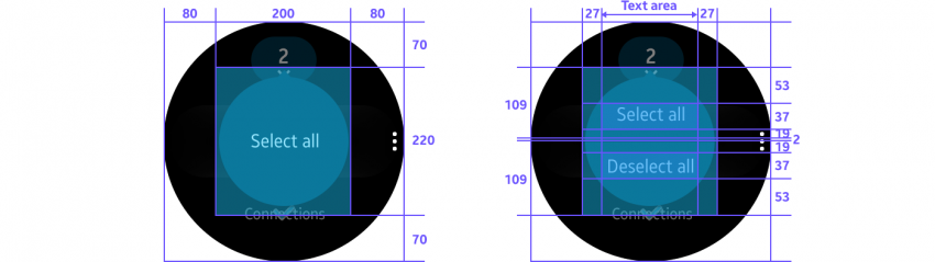
- Select mode buttons
These buttons appear when users select items from a list. Disable these buttons if there’s a limit in the number of items users can select, or no item was selected.
Selection mode action button in developer's guides
Native
(Circle) UI Components
(+ SDK : Ctxpopup)
Web
-

Users select/deselect all items in the select mode with the select mode action buttons.
- List buttons
List buttons present action options for an item in a list through an icon. Display an icon with text when there’s only one list button for one list item, but remove the text when there are 2-3 buttons for a list item.

A list button consists of either only icons or of an icon and text, depending on how many buttons there are.


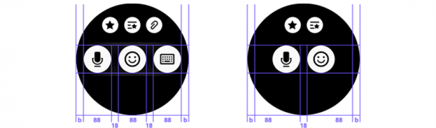
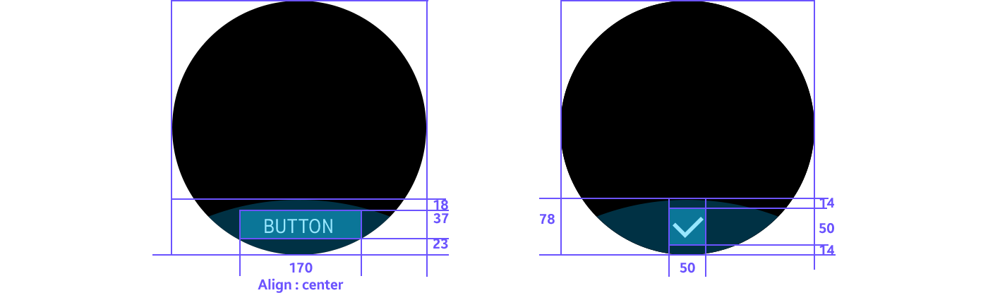
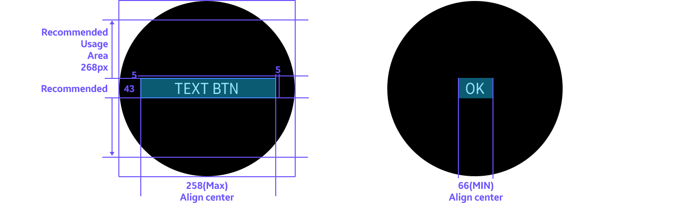
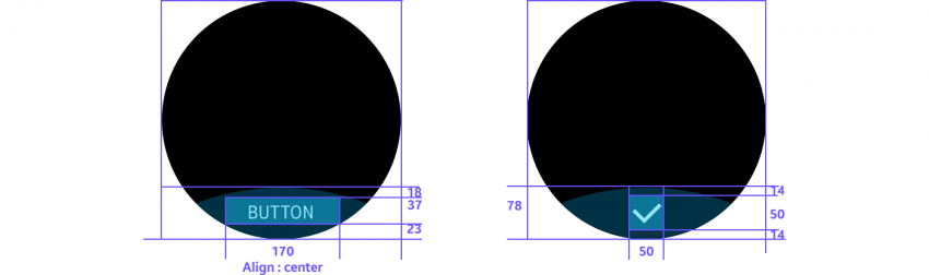
Design specs
Text Icon
- Bottom button
- Text button

- Select mode action button
- List button