Touch Feedback
PUBLISHED
You must give users feedback when they touch specific elements (especially buttons) on the screen. This supports communication between a user and the application.
To promote better touch interaction with visual cues, Tizen offers several color changes and effects. The buttons have separate states (normal, pressed, and dim) for each button type, such as list buttons.
| Status | Normal | Pressed | Dim |
|---|---|---|---|
| BG image | Dark gray | Blue | Dark gray
(Normal status + 60% opacity) |
| Font and icon | White
Black shadow Direction: 90 Distance: 2px |
White
Black shadow Direction: -90 Distance: 2px |
White
(Normal status + 60% opacity) |
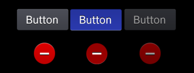
In the normal state, the button remains a dark-gray BG image, while in the pressed state, it has a blue engraving effect, and the direction of the font and icon shadow turns -90 degrees.
In the dim state, based on the color value of the normal status, you should apply 60% opacity to the button.
You can view a set of button examples below (from left to right: a Text button in the footer in the pressed state, and a Delete icon button in the edit mode of the normal state).