Display
PUBLISHED
Screen resolutions vary from device to device. When designing layouts for your applications, make sure you consider the range of possible resolutions, as well as both landscape and portrait screen orientations.
Resolution
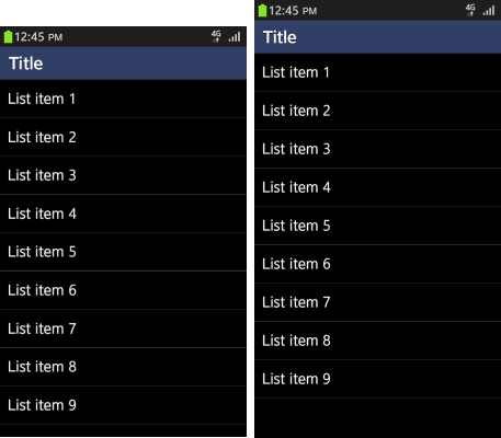
Tizen offers UI components for WVGA (480 x 800) and HD (720 x 1280) resolutions, so you can choose the components most suitable for your target device.
The WVGA and HD resolutions have the same basic layout, so when they are displayed in the screen of the same width, the size of the text and height of the list look identical. However, due to the difference in the ratio, the HD resolution can display more content.
Text size and other components have a ratio of 2:3 and must be adjusted in a smaller screen to provide enough touch space.

Screen Orientation
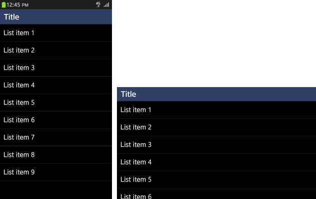
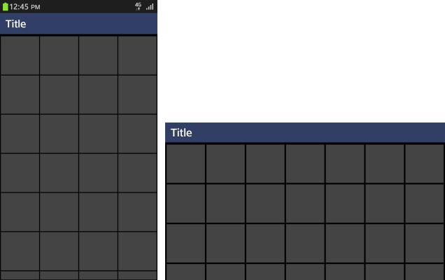
Tizen supports both landscape and portrait modes.
To ensure there is enough space for components, such as titles, you can vary the header and footer height depending on the mode.
In the main body content, component sizes, such as text and list height, do not change in the list view between different modes. However, sizes do change in the grid view where the layout depends on the ratio of the display area.


