Application Structure
PUBLISHED
The Tizen platform features a range of UI components. The purpose and functionality of your application determine the components (and layout) you select. In this section, we will use Tizen's available UI components to demonstrate the most basic form of an application structure.
For applications with a structure, we recommend displaying a list of items and showing details when an item is selected. Generally, applications can have more than two layers and can be divided into a normal mode and an edit mode based on the screen status, as shown in the following table.
| Normal mode | Edit mode | |
|---|---|---|
| Top level | Main view | Edit mode of main view |
| Lower level | Detail view | Edit mode of detail view |
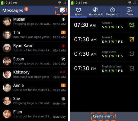
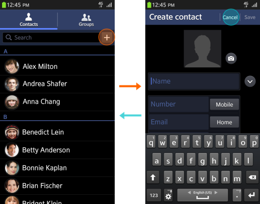
Main View
Use the following guidelines when designing the Main view:
Start with an overview
As the first screen of your application, the Main view plays a vital role in helping users find essential functions and understand its general structure. (If the application structure has different categories, use tabs in the header.)
Enable content creation in the current view
In the Main view, the user needs to be able to use and create content items easily. To support this behavior, you should display multiple items in a list or grid format. Offer the Compose or Create buttons ahead of any other items. Consider having an icon button in the header, or a text button in the footer.
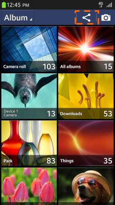
Enable easy content management
In addition to using or creating content items, users will often need to manage content items. The basic functions are as follows:
- Search: Find a desired item. Offer the search field or an additional button at the top of the item list.
- Share: Share items at any time. Offer an additional Share button on the screen.
- Delete: Delete items.
- Edit: Execute functions that apply to multiple items (e.g., Delete, Copy, or Move) using a single Edit button.
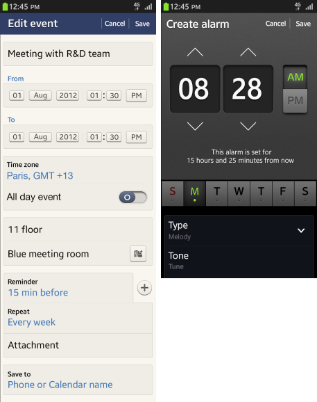
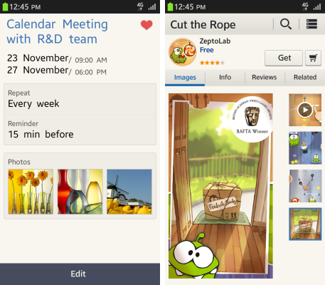
Detail View
Use the following guidelines to design the Detail view:
Focus on content
Display content elements, such as images or text, so that users recognize the content right away.
Execute functions easily
The Detail view displays various functions that users can execute in the current screen. You should normally place these function buttons in the header or footer, but you can also place them in the body of your application screen.
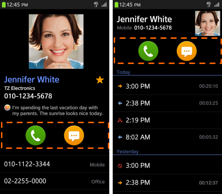
Enable easy navigation between screens
In the Detail view, the hardware Back key on the device always takes the user back to the previous screen. Place the Cancel button on the screen to quit the current task. Usually, the Cancel button is provided with a confirmation function, such as Save, Done, or Send.
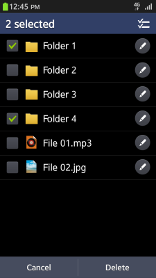
Edit Mode in the Main View
Use the following guidelines to design the edit mode in the Main view:
Allow users to manage multiple items
In edit mode in the Main view, the user can manage multiple items by selecting them with the checkbox component. However, if the user wants to cancel a task, they should do so by selecting a Cancel button instead of a Back key. When a user completes or cancels a task, the mode should automatically revert from edit to normal.
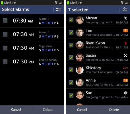
Support the ability to execute multiple functions
In edit mode, you can let users select functions, such as Delete, Rename, Copy, or Move, and execute them on a single screen. When the user completes the task, the mode automatically changes from edit to normal.
Edit Mode in the Detail View
Use the following guidelines to design the edit mode in the Detail view:
Allow users to create and edit content
In edit mode, users can create or delete content displayed in the Detail view. Ideally, your application should display an input method editor (for editing the text) and buttons (for completing or cancelling the task).
Provide setting modification options
Use the edit mode to let users set or update settings values via standard UI components (e.g., radio buttons, check boxes, and sliders).