Header
PUBLISHED
The header, which appears at the top of the application screen, is a word or phrase describing that screen's content or purpose. Depending on their format and function, headers fall into one of the three categories:
Basic Header
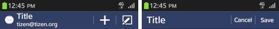
The basic header appears as a bar with a string inside. When necessary, you can display a basic header with other UI elements, such as icons or buttons. If you decide to do this in your application, make sure the header's text string appears on the left and any buttons appear on the right.
Place buttons in a basic header when:
- The application requires functions in addition to the main function button in the footer, or the Menu pop-up.
- The keypad is in use. Since the keypad covers the footer, users will be able to access any required functions is if they appear in the header.
Keep the following guidelines in mind when including buttons in a basic header:
- Place up to two buttons in the header and use icon-shaped buttons.
- If there are more than two buttons, you should place the most important and frequently used button to the left of the less important ones.
- Position the cancel button to the far left of the screen.
You can place any function as a button in the header. However, 'search' and 'refresh' are the functions that appear most often.
Tab
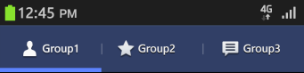
Tabs help categorize content, and you should placed them at the top of the screen. Users can see as many as four tabs on a screen, but they can always flick their screens sideways to see more. Keep the following guidelines in mind when using tabs in the header:
- Use tabs to show the overall categories on the first screen.
- Show internal categories as a combination of icons and text. Use such combinations as needed.
- Don't use buttons for other functions in the header if you are also displaying a tab at the top of the screen. In this case, find another location for your buttons – besides the footer or tab!
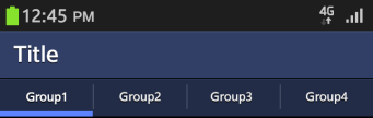
Tab with a Title
If your require an additional title for all tab items, you can combine a row of tabs with a title above it. The tab with a title functions in the same way as the basic tab, meaning you cannot use buttons in the tab.