Feedback
PUBLISHED
The Gear offers visual, auditory, and haptic feedback. Whichever the type of feedback being used, it should clearly communicate the result of a user’s input. You can combine more than one type of feedback when you need to emphasize user input.
|
Interaction |
Example |
|
|---|---|---|
|
Haptic response |
|
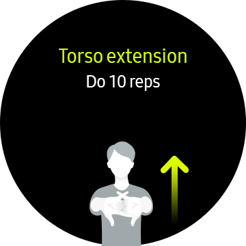
Respond to user input |
|
Visual response |
|
|
|
Sound response |
|
|


Haptic responses
Haptic responses deliver feedback to users using vibration so that they don’t have to look at the screen. You can vary the duration and number of vibrations to communicate different meanings.
- Designing vibration
You can design haptic patterns by using a mix of silence and vibrations of varying durations. Because users might have difficulty differentiating between complicated patterns, try to keep them as simple as possible.
-
Sample vibration Patterns
Examples
Meaning
Single short
(e.g. 100 ms)

Provides simple information
Single long
(e.g. 500 ms)

Signals a clear status
(e.g. completion of a task)
2-3 times fast

Provides a warning or an alert
2-3 times middle speed

Provides a general notification
2-3 times slow
(e.g. 60 times / min=60 BPM)

Provides an alert about an incoming/ongoing event
-
Duration of vibrations
Users often find extended vibrations annoying. In addition, long vibrations drain battery power.
- Appropriate feedback
Haptic vibration can be created with different intensities. Since the Gear is worn on the wrist, several factors can affect range of vibration that’s detectable, including whether users are moving, whether they are wearing the Gear, or how much they are focusing on the device. Haptic feedback should only be provided selectively to avoid tiring out users with unnecessarily frequent feedback.
- Feedback on text input
Since users generally type to perform a task, they need quick feedback on whether they are typing correctly. Consider ways to minimize latency to ensure instantaneous feedback on typing. Haptic feedback should be as brief as possible, within the range that users can notice the vibration. (e.g. below 30 ms)
Visual responses
Visual responses inform users of a current state. Provide visual feedback to inform users that they have reached the end of a scrollable page or that a button or icon has been pressed. Refer to Visual design for more details.
- Overscroll
Overscrolling effects indicate that the user has reached the end of a scrollable list or page. It appears as a straight line, at the edge of both a linear and circular page.
- Button press
Button press effects indicate that a button or icon has been pressed by adjusting the color opacity or size of the button.
- Adjusting the color opacity
You can adjust the color opacity of a button by 40% to indicate that the button has been pressed.
Normal Pressed

Opacity 100% Opacity 40%
The opacity of the entire container is adjusted to 40% when users press a colored icon.
Normal Pressed

Opacity 100% Opacity 40%
The color opacity of the whole container drops to 40% when users press a text button.
- Adjusting the size
You can adjust the size of a button to indicate that the button has been pressed.
Normal Pressed

Scale 100% Scale 110%
When users press a 2D icon without a container, a circle appears around the button and is scaled up to 110% of its original size
Normal Pressed

Scale 100% Scale 110%
When users touch the screen itself, the screen is scaled down to 90% and then returns to 100%.


Auditory responses
Auditory responses deliver feedback for the user’s touches or gestures. Using different stream types, durations, and melodies creates sounds that help users perform the correct next steps.
- Stream type
Consider which stream type is suitable for each auditory response. It could be a ringtone, a notification (message), or a snippet of media.
- Properties: notes, tones, melodies
Consider the meaning of each property when you’re designing your auditory feedback. For instance, touch interaction performs many different actions, so the related sounds typically have a neutral and simple tone. You can use a higher note when values go up, and a lower note one values go down. Likewise, you can use an ascending melody when turning on a function and a descending one when turning it off. Create standards that remain consistent throughout your app.
The table below shows some examples of the Gear's auditory responses for each type of interaction.
|
Touch/mode change |
|
|
|
Nokey (reach limit) |
|
|
|
Up/down |
|
|
|
On/off, Enable/disable |
|
|
|
Confirm/start/success |
|
|
|
Error/alert |
|
|
- Format
We recommend using the open source .ogg format. The file compression ratio should be at least 128 kbps (mono/stereo).
- Duration
Create a sound file of at least 100 msec. If the sound lasts for less than 100 msec, the system might not be able to play it.
- Pitch and Volume
Design your sounds considering the range of volume levels. Did you make sure that your sound is not too low or high to avoid straying from the peak range? Is the volume of your sound appropriate at the Gear’s default volume level? Does your sound play at all volume levels from 1 to 15?
Refer to the table below for the default volume of each stream type.
Ringtone
Notification
Media
System
11
11
7
9
- Sound and vibration
Sync sounds and vibrations when you combine them. It might confuse users if sounds and vibrations occur separately for the same feedback.