Design
JQuery to Tizen UX Conversion Tutorial: Dashboard Tutorial - Part 2
PUBLISHED
Overview
This article is part 2 of a two-part series that demonstrates the Dashboard pattern. The Dashboard sample application is based on the Tizen WebUI framework template generated by Tizen Web IDE.
The application demonstrates the design of dashboard form for Tizen applications using the Tizen widgets.
Note: This article explains about how to design a dashboard application and does not contain functionality of calculations and updation of real-time data, etc.
- Read more about JQuery to Tizen UX Conversion Tutorial: Dashboard Tutorial - Part 2
Pop-up
PUBLISHED
Pop-ups can give users vital information when they're completing a task. You can use the following types of pop-ups:
Center Pop-up
As you would expect, the center pop-up appears in the center of your application screen. Keep the following guidelines in mind when designing a center pop-up:
Progress and Process
PUBLISHED
If a specific task is running continually over a certain period of time, you must offer users a visual cue about its progress or process. Progress means that the duration or volume of the entire task can be predicted. Process means that the duration or volume of the task cannot be predicted, so you can only make users aware that the task is being processed. You should fill the progress bar from left to right as the task is being completed.
Picker
PUBLISHED
In the Tizen platform, you can include pickers in your application design to help users set the date and/or time, and select colors.
Time Picker
You can use the following types of time pickers:
Slider
PUBLISHED
Give users sliders so they can adjust values in settings with multiple or consecutive steps. If you want to make a slider's function as clear as possible, you can place text or icons at each end. However, neither the text nor the icons should be interactive.
Text Field
PUBLISHED
You can allow users to enter text in an application via a text field. Tapping the text field activates the keypad and reveals a cursor. There are 2 types of text fields:
- Fixed single-line
- Multi-line
In a fixed single-line text field, if the amount of text a user is entering exceeds the text field range, the entered text scrolls to the left and disappears so that the user can continue writing. In a multi-line text field, the amount of text the user enters will dictate the number of lines.
Controls
PUBLISHED
You can use a variety of UI controls in your application:
Scroll
PUBLISHED
The body area supports the following types of scrolling and related functionality:
Body
PUBLISHED
The body is the area visible between the header and footer. Your application's body can contain various content types, such as different kinds of lists or menus.
List
This is the most basic type of body content. You can use lists to display either single-line or multi-line items in an orderly manner. Each list item can have various elements, such as text, an icon, a thumbnail image, or a button.
Footer
PUBLISHED
As its name suggests, the footer appears at the bottom of your application screen. You can place function buttons in the footer if the function is essential, or if a prompt feedback is required.
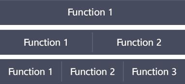
Keep the following guidelines in mind when designing your footer: