Pop-up
PUBLISHED
Pop-ups can give users vital information when they're completing a task. You can use the following types of pop-ups:
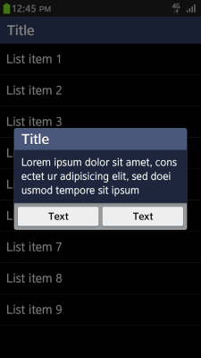
Center Pop-up
As you would expect, the center pop-up appears in the center of your application screen. Keep the following guidelines in mind when designing a center pop-up:
- Display it when your application requires immediate user attention.
- Use it to provide information and prompt users to make selections for the next task.
- Make various combinations of text, image, icon, and edit field available so that the user receives the correct message and can take appropriate action.
- Provide relevant buttons in case the user needs to confirm or cancel something. Interacting with one of these buttons will close the pop-up. However, a pop-up with no buttons will disappear from the user's screen after a pre-defined amount of time.
Center pop-up
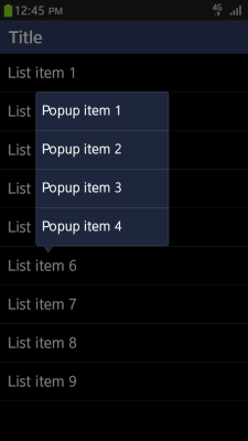
Contextual Pop-up
Keep the following guidelines in mind when designing a contextual pop-up:
- Use a contextual pop-up to show the functions of a particular button or list.
- In a contextual pop-up, offer items that the user can select in the form of a list.
- Design the pop-up so that it disappears when the user taps the screen area outside it.
Contextual pop-up
Additionally, you can display a ticker notification at the top of the screen when an event occurs. In your application, you must clarify where the event occurred by showing the relevant application icon in the ticker.
Category:
UX Guide