Mobile UI Components
The EFL Elementary is a set of fast, finger-friendly, scalable, and themeable UI component libraries. The number of supported UI components is around 80, including both containers and non-containers. Originally, the Elementary was developed as part of the Window Manager development on Desktop devices. For the mobile profile, Tizen reused the proper UI components and created new ones, and then enhanced and adjusted all of them for Tizen native applications.
This feature is supported in mobile applications only.
The UI components are mobile-friendly: for example, the Naviframe component supports view-managing for multiple views, the Entry component supports many modes (such as Password, Single/Multi-line, Edit/No-Edit), the Index component supports fast access to another group of UI items, and the Toolbar component shows a menu when an item is selected.
The mobile UI components were designed to allow the user to interact with touch screen-equipped mobile devices. Therefore, when developing mobile applications, you can easily use them through the mobile-related infrastructure in company with view managing and when reacting to touch events and the user finger size.
| Category | Component name | Description |
|---|---|---|
| Navigation elements | Toolbar | The toolbar component is a scrollable list of items. It can also show a menu when an item is selected. Only one item can be selected at a time. |
| Index | The index component provides an index for fast access to another group of UI items. | |
| Segmentcontrol | The segmentcontrol component is a horizontal control made of multiple segment items, each segment item functioning similarly as a discrete 2-state button. | |
| Presentation views | Win | The win component is the root window component that will be often used in an application. It allows you to create some content in it, and it is handled by the window manager. |
| Background | The background component can be used to set a solid background decoration to a window or a container object. It works like an image, but has some background specific properties, such as setting it to tiled, centered, scaled, or stretched. | |
| Genlist | The genlist component displays a scrollable list of items. It can hold a lot of items while still being fast and memory-efficient (only the visible items are allocated memory). | |
| Gengrid | The gengrid component displays objects on a grid layout and renders only the visible objects. | |
| Panel | The panel component is an animated object that can contain child objects. It can be expanded or contracted by clicking on the button on its edge. | |
| List | The list component is a very simple list for managing a small number of items. If you need to manage a lot of items, use the genlist component instead. | |
| Label | The label component displays text with simple HTML-like markup. | |
| Image | The image component can load and display an image from a file or from memory. | |
| Icon | The icon component inherits from the image component. It is used to display images in an icon context. | |
| Progressbar | The progressbar component can be used to display the progress status of a given job. | |
| Photocam | The photocam component is designed to display high-resolution photos taken with a digital camera. It allows you to zoom photos, load photos fast, and fit photos. It is optimized for JPEG images and has a low memory footprint. | |
| User input | Button | The button component is a simple push button. It is composed of a label icon and an icon object, and has an auto-repeat feature. |
| Check | The check component toggles the value of a Boolean between true and false. | |
| Radio | The radio component can display 1 or more options, but the user can only select one of them. The UI component is composed of an indicator (selected/unselected), an optional icon, and an optional label. Even though it is usually grouped with 2 or more other radio components, it can also be used alone. | |
| Entry | The entry component is a box to which the user can enter text. | |
| Slider | The slider component is a draggable bar that is used to select a value from a range of values. | |
| Datetime | The datetime component can display and input date and time values. | |
| Colorselector | The colorselector component provides a color selection solution to the user. It has different modes available, each of them showing a different configuration of the color selection. | |
| Spinner | The spinner component enables the user to increase or decrease a numeric value by using arrow buttons. | |
| Flipselector | The flipselector component shows a set of text items one at a time. The user can flip up or down the selector to change the text on it. | |
| Calendar | The calendar component displays and manipulates month views. | |
| Assist views | Popup | The popup component shows a pop-up area that can contain a title area, a content area, and an action area. |
| Ctxpopup | The ctxpopup component is a contextual popup that can show a list of items. | |
| Notify | The notify component displays a container in a specific region of the parent object. It can receive some content, and it can be automatically hidden after a certain amount of time. | |
| Tooltip | The tooltip component is a smart object used to show tips or information about a parent object when the mouse hovers over the parent object. | |
| Hoversel | The hoversel component is a button that pops up a list of items. | |
| Transition | Transit | The transit component can apply several transition effects to an Evas object, such as translations and rotations. |
| Flip | The flip component can hold two Evas objects and let the user flip between these objects using a variety of predefined animations. | |
| Hardware acceleration | GLView | The GLView component can render OpenGL in an Elementary object, hiding EvasGL complexity. |
| Miscellaneous | Map | The map component can display a geographic map. The default map data is provided by the OpenStreetMap project (http://www.openstreetmap.org/). |
| Plug | The plug component allows you to show an Evas object created by another process. It can be used anywhere like any other Elementary UI component. |
Mobile UI Component Styles
EFL can separate the GUI and logic of each UI component, resulting in each component having a different style of look. To change the styles of UI components, use the elm_object_style_get() and elm_object_style_set() functions to get and apply the style for a specific UI component.
The following tables list the styles for each winset, including the names of the styles, and the name of the part where to set text or some other Evas_Object in the UI component. For more detailed information, see Themes.
| Style | Sample | Text part | Swallow part |
|---|---|---|---|
| elm/button/base/default |  |
elm.text | elm.swallow.content |
| elm/button/base/circle |  |
elm.text | elm.swallow.content |
| elm/button/base/editfield_clear |  |
elm.swallow.content | |
| elm/button/base/bottom |  |
elm.text | elm.swallow.content |
| elm/button/base/icon_reorder | |||
| elm/button/base/icon_expand_add | |||
| elm/button/base/icon_expand_delete | |||
| elm/button/base/naviframe/title_left |  |
elm.text | |
| elm/button/base/naviframe/title_right |  |
elm.text | |
| elm/button/base/naviframe/back_btn |  |
||
| elm/button/base/dropdown |  |
elm.text | |
| elm/button/base/contacts (Tizen 2.3 only style) | elm.text | ||
| elm/button/base/naviframe/title_done (Tizen 2.3 only style) |  |
||
| elm/button/base/naviframe/title_cancel (Tizen 2.3 only style) |  |
||
| elm/button/base/naviframe/drawers (Tizen 2.3 only style) | |||
| elm/button/base/option (Tizen-2.3 only style) |
| Style | Sample |
|---|---|
| elm/check/base/default | 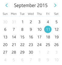 |
| Style | Sample |
|---|---|
| elm/check/base/default |  |
| elm/check/base/favorite |  |
| elm/check/base/on&off |  |
| Style | Sample | Notes |
|---|---|---|
| elm/colorselector/item/color/colorplane |  |
Use the following command: elm_colorselector_mode_set(colorselector, ELM_COLORSELECTOR_PALETTE); |
| Style | Sample |
|---|---|
| elm/progressbar/horizontal/default |  |
| elm/progressbar/horizontal/pending |  |
|
elm/progressbar/horizontal/process_large
elm/progressbar/horizontal/process_medium elm/progressbar/horizontal/process_small |
 |
| Style | Sample |
|---|---|
| elm/radio/base/default |  |
| Style | Sample |
|---|---|
| elm/multibuttonentry/base/default |  |
| Style | Sample | Text part | Swallow part | Notes |
|---|---|---|---|---|
| default |  |
default
subtitle |
default
title_left_btn title_right_btn |
|
| tabbar |  |
default
subtitle |
default
title_left_btn title_right_btn tabbar |
The tabbar_with_title style toolbar can be set into the tabbar part. |
| tabbar/notitle |  |
default
tabbar |
Toolbar can be set into the tabbar part. | |
| tabbar/icon |
default
subtitle |
default
title_left_btn title_right_btn tabbar |
The tabbar_with_title style toolbar with icons can be set into the tabbar part. | |
| tabbar/icon/notitle |
default
tabbar |
Toolbar with icons can be set into the tabbar part. |
| Style | Sample | Text part | Swallow part | Notes |
|---|---|---|---|---|
| elm/toolbar/base/default | 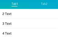 |
|||
| elm/toolbar/base/navigationbar | 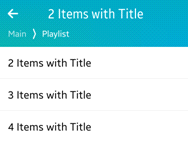 |
|||
| elm/toolbar/base/tabbar_with_title | 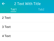 |
|||
|
elm/toolbar/item/tabbar
elm/toolbar/item/default |
elm.text | elm.swallow.icon | This style is for the toolbar's item. Use the elm_toolbar_item_append() function to set the text and the icon. | |
| elm/toolbar/item/navigationbar | elm.text | This style is for the toolbar's item. Use the elm_toolbar_item_append() function to set the text and the icon. |
| Style | Sample |
|---|---|
| elm/flipselector/base/default | 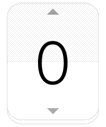 |
| Style | Sample |
|---|---|
| elm/genlist/base/solid/default | 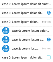 |
| Style | Sample | Text part | Swallow part |
|---|---|---|---|
| elm/genlist/item/type1/default |  |
elm.text
elm.text.end elm.text.sub elm.text.sub.end |
elm.swallow.bg
elm.swallow.icon elm.swallow.icon.0 elm.swallow.icon.1 elm.swallow.icon.2 elm.swallow.end |
| elm/genlist/item/type2/default |  |
elm.text
elm.text.end elm.text.sub elm.text.sub.end |
elm.swallow.bg
elm.swallow.icon elm.swallow.icon.0 elm.swallow.icon.1 elm.swallow.end |
| elm/genlist/item/multiline/default |  |
elm.text
elm.text.multiline |
elm.swallow.bg
elm.swallow.icon elm.swallow.icon.0 elm.swallow.icon.1 elm.swallow.icon.2 elm.swallow.end |
| elm/genlist/item/full/default |  |
elm.swallow.bg
elm.swallow.content |
|
| elm/genlist/item/group_index/default |  |
elm.text
elm.text.end |
elm.swallow.bg
elm.swallow.end |
| elm/genlist/item/group_index/expandable/default |  |
elm.text | |
| elm/genlist/item/default/default |  |
elm.text |
elm.swallow.icon
elm.swallow.end |
| elm/genlist/item/double_label/default |  |
elm.text
elm.text.sub |
elm.swallow.icon
elm.swallow.end |
| elm/genlist/item/one_icon/default | elm.text | elm.swallow.icon | |
| elm/genlist/item/end_icon/default |  |
elm.text | elm.swallow.end |
| Style | Sample | Text part | Swallow part |
|---|---|---|---|
|
elm/gengrid/item/default/default
elm/gengrid/item/type1/default |
 |
elm.text |
elm.swallow.icon
elm.swallow.end |
| elm/gengrid/item/type2/default |  |
elm.text |
elm.swallow.icon
elm.swallow.end |
| elm/gengrid/item/default/popup |  |
elm.text |
elm.swallow.icon
elm.swallow.end |
| Style | Sample |
|---|---|
| elm/index/base/vertical/default |  |
| elm/index/base/vertical/pagecontrol |  |
| Style | Sample |
|---|---|
| elm/ctxpopup/layout/default | 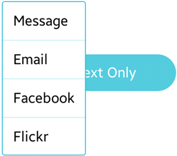 |
| elm/ctxpopup/layout/more/default | 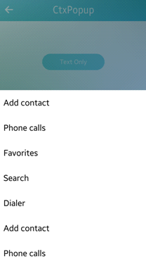 |
| elm/ctxpopup/layout/dropdown/list (Tizen 2.3 only style) | 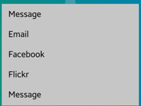 |
| elm/ctxpopup/layout/dropdown/label (Tizen 2.3 only style) |  |
| Style | Sample |
|---|---|
| apps | |
| arrow_down | |
| arrow_left | |
| arrow_right | |
| arrow_up | |
| chat | |
| clock | |
| close | |
| delete | |
| edit | |
| file | |
| folder | |
| home | |
| no_photo | |
| refresh | |
| media_player/forward | |
| media_player/info | |
| media_player/next | |
| media_player/pause | |
| media_player/play | |
| media_player/prev | |
| media_player/rewind | |
| media_player/stop | |
| menu/apps | |
| menu/arrow_down | |
| menu/arrow_left | |
| menu/arrow_right | |
| menu/arrow_up | |
| menu/chat | |
| menu/clock | |
| menu/close | |
| menu/delete | |
| menu/edit | |
| menu/file | |
| menu/folder | |
| menu/home | |
| menu/refresh | |
| photo/no_photo | |
| toolbar/apps | |
| toolbar/arrow_down | |
| toolbar/arrow_left | |
| toolbar/arrow_right | |
| toolbar/arrow_up | |
| toolbar/chat | |
| toolbar/clock | |
| toolbar/close | |
| toolbar/delete | |
| toolbar/edit | |
| toolbar/file | |
| toolbar/folder | |
| toolbar/home | |
| toolbar/more_menu | |
| toolbar/refresh |
| Style | Sample | Text part | Notes |
|---|---|---|---|
| elm/entry/base/default |  |
elm.guide: for the guide text.
elm.text: for the main text. |
The guide text is automatically erased when the main text is entered. |
| Style | Sample |
|---|---|
|
elm/datetime/base/default
elm/datetime/base/date_layout |
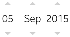 |
| elm/datetime/base/time_layout | 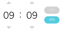 |
| elm/datetime/base/time_layout_24hr | 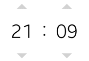 |
| Style | Sample |
|---|---|
| elm/slider/horizontal/default |  |
| elm/slider/horizontal/center_point |  |
| elm/slider/horizontal/warning |  |
| elm/slider/vertical/default |  |
| elm/slider/vertical/center_point |  |
| elm/slider/vertical/warning |  |
| Style | Sample |
|---|---|
| elm/popup/base/default | 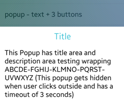 |
| elm/popup/base/toast |  |
| elm/popup/base/theme_bg | 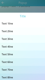 |
| Style | Sample |
|---|---|
| elm/scroller/base/default |  |
| elm/scroller/base/handler |  |
| Style | Sample |
|---|---|
| elm/spinner/base/horizontal |  |
| elm/spinner/base/vertical |  |
| Note |
|---|
| Except as noted, this content is licensed under LGPLv2.1+. |

