Toolbar
This feature is supported in mobile applications only.
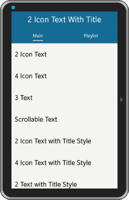
The toolbar component is a scrollable list of items and shows a menu when an item is selected. Only one item can be selected at a time.
For more information, see the Toolbar API.
Figure: Toolbar component

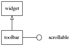
Figure: Toolbar hierarchy

Adding a Toolbar Component
To create a toolbar, use the elm_toolbar_add() function:
Evas_Object *toolbar, *parent;

toolbar = elm_toolbar_add(parent);
Using the Toolbar Styles
The toolbar has the following styles:
- default
- tabbar
- tabbar_with_title
- navigationbar
The following example sets the style to navigationbar.
elm_object_style_set(toolbar, "navigationbar");
Configuring the Toolbar
The toolbar displays its items in one of the following options.
- ELM_TOOLBAR_SHRINK_NONE: The toolbar sets a minimum size to its items so that all of them fit without scrolling.
- ELM_TOOLBAR_SHRINK_HIDE: The toolbar does not scroll or show the items that do not fit in.
- ELM_TOOLBAR_SHRINK_SCROLL: The toolbar scrolls to show the items that do not fit in.
- ELM_TOOLBAR_SHRINK_MENU: The toolbar creates a button to popup hidden items.
In the following example, the toolbar is set to ELM_TOOLBAR_SHRINK_NONE.
elm_toolbar_shrink_mode_set(toolbar, ELM_TOOLBAR_SHRINK_NONE);
By default, the toolbar displays items homogeneously. Items with long labels occupy a lot of space. To avoid that, you can disable the homogeneous mode.
elm_toolbar_homogeneous_set(toolbar, EINA_FALSE);
Adding Items to the Toolbar
The following example shows how to add 2 items and choose the associated icon, label, and function to call when the item is clicked.
{
   Elm_Object_Item *home_it, *help_it;

   home_it = elm_toolbar_item_append(toolbar, "home", "Home",
                                    _home_item_pressed_cb, NULL);
   help_it = elm_toolbar_item_append(toolbar, "help", "Help",
                                    _help_item_pressed_cb, NULL);
}

static void
_home_item_pressed_cb(void *data, Evas_Object *obj, void *event_info)
{
   dlog_print(DLOG_INFO, LOG_TAG, "Home item clicked \n");
}

static void
_help_item_pressed_cb(void *data, Evas_Object *obj, void *event_info)
{
   dlog_print(DLOG_INFO, LOG_TAG, "Help item clicked \n");
}
An item can be disabled. The following example shows how to disable the help item. The disabled item does not receive input and, if the theme supports it, is themed differently (usually greyed out) from its normal state.
elm_object_item_disabled_set(help_it, EINA_TRUE);
Adding Items with States
Items have 2 or more states. Each state has its own icon, label, and function to call when an item is clicked. The following example shows how to create 2 states to the help item with the same icon but 2 different labels.
elm_toolbar_item_state_add(help_it, "help", "Help state 1",
                           _help_item_pressed_cb, NULL);
elm_toolbar_item_state_add(help_it, "help", "Help state 2",
                           _help_item_pressed_cb, NULL);
It is possible to cycle through the states of the help item by using the following code.
elm_toolbar_item_state_set(help_it, elm_toolbar_item_state_next(help_it));
Using the Toolbar Callbacks
The toolbar component emits the following signals:
- clicked: The toolbar item is double-clicked and selected. event_info is an object of the type Elm_Toolbar_Item.
- clicked,double: The toolbar item is double-clicked. event_info is an object of the type Elm_Toolbar_Item.
- longpressed: The toolbar is pressed for a certain amount of time. event_info is an object of the type Elm_Toolbar_Item.
- language,changed: The program language changes.
- item,focused: The item is highlighted. event_info is an object of the type Elm_Toolbar_Item.
- item,unfocused: The highlight is removed from the item. event_info is an object of the type Elm_Toolbar_Item.
- scroll: The toolbar scrolls. event_info is NULL.
- scroll,anim,start: The toolbar scrolling animation starts. event_info is NULL.
- scroll,anim,stop: The toolbar scrolling animation stops. event_info is NULL.
- scroll,drag,start: The user starts dragging the toolbar. event_info is NULL.
- scroll,drag,stop: The user stops dragging the toolbar. event_info is NULL.
The following example shows how to register a callback on the clicked signal.
{
   evas_object_smart_callback_add(toolbar, "clicked", clicked_cb, data);
}

// Callback function for the "clicked" signal
// This callback is called when a toolbar item is clicked
void
clicked_cb(void *data, Evas_Object *obj, void *event_info)
{
   Elm_Toolbar_Item * item = event_info;

   dlog_print(DLOG_INFO, LOG_TAG, "Item clicked\n");
}
| Note |
|---|
| Except as noted, this content is licensed under LGPLv2.1+. |

