Slider
This feature is supported in mobile applications only.
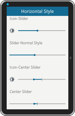
The slider component is a draggable bar that is used to select a value within a certain range.
For more information, see the Slider API.
Figure: Slider component

Figure: Slider hierarchy

Adding a Slider Component
To create a slider object:
Evas_Object *slider, *parent;

slider = elm_slider_add(parent);
Using the Slider Styles
The slider has the following styles:
- default
- center_point
To set the style to center_point:
elm_object_style_set(slider, "center_point");
With this style, the slider 0 point is in the middle of the UI component.
Configuring the Slider
To configure the slider:
-
Set the orientation with the elm_slider_horizontal_set() function, and invert it the same way as the progressbar component. In the following example, the slider is set to vertical and inverted.
elm_slider_horizontal_set(slider, EINA_FALSE);
elm_slider_inverted_set(slider, EINA_TRUE);
-
Set icons (icon and end partnames), a label, a unit label, and an indicator label to the slider:
Evas_Object *icon1, *icon2;

// Set the icons
elm_object_part_content_set(slider, "icon", icon1);
elm_object_part_content_set(slider, "end", icon2);

// Set the label
elm_object_part_text_set(slider, "default", "slider label");

// Set the unit format
elm_slider_unit_format_set(slider, "%1.2f meters");
-
Set the minimum and maximum values to the slider with the elm_slider_min_max_set() function. The current value is set with the elm_slider_value_set() function. The following example sets the minimum value to 0, the maximum value to 100, and the current value to 50.
elm_slider_min_max_set(slider, 0.0, 100.0);
elm_slider_value_set(slider, 50.0);
-
Retrieve the current value of the slider:
double value = elm_slider_value_get(slider);
-
Set the slider span with the elm_slider_span_size_set() function. The span of the slider represents its length horizontally or vertically. It is scaled by the object or applications scaling factor.
-
Disable the slider indicator size.
By default, the slider indicator becomes bigger when the user drags it. This can be disabled if you want the slider indicator to keep its default size. The following example sets the state of the indicator enlargement and then inverts the behavior.
// Get the current state of the indicator
Eina_Bool enlarge = elm_slider_indicator_show_get(slider);

// Invert the behavior
elm_slider_indicator_show_set(slider, !enlarge);
Using the Slider Callbacks
The slider component emits the following signals:
- changed: The user changes the slider value.
- slider,drag,start: Dragging the slider indicator around starts.
- slider,drag,stop: Dragging the slider indicator around stops.
- delay,changed: A short time after the user changes the value. This is called only when the user stops dragging for a very short period or when releases the finger or mouse, so that it avoids possibly expensive reactions to the value change.
For all these signals, event_info is NULL.
The following example shows how to register a callback on the changed signal.
{
   evas_object_smart_callback_add(slider, "changed", changed_cb, data);
}

// Callback function for the "changed" signal
// This callback is called when the slider value changes
void
changed_cb(void *data, Evas_Object *obj, void *event_info)
{
   dlog_print(DLOG_INFO, LOG_TAG, "The slider has changed\n");
}
| Note |
|---|
| Except as noted, this content is licensed under LGPLv2.1+. |

