Ctxpopup
This feature is supported in mobile applications only.
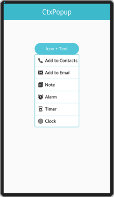
Context popup (ctxpopup) component is a contextual popup that can show a list of items inside it.
For more information, see the Ctxpopup API.
Figure: Ctxpopup component

Figure: Ctxpopup hierarchy

Adding a Ctxpopup Component
Create the ctxpopup with the elm_ctxpopup_add() function. When shown, the ctxpopup automatically chooses an area inside its parent object's view to optimally fit into it. Set the object view with the elm_ctxpopup_hover_parent_set() function.
Evas_Object *ctxpopup, *parent;

// Create a ctxpopup
ctxpopup = elm_ctxpopup_add(parent);
Modifying the Ctxpopup Style
The following styles are available:
- default
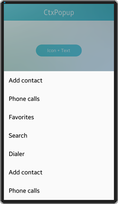
- more/default
- dropdown/list (only for Tizen 2.3)
- dropdown/label (only for Tizen 2.3)
In Tizen 2.4, dropdown styles are no longer supported. Use a hoversel component for those instead.
Figure: Ctxpopup default (left) and more/default (right) style


To set the more/default style:
elm_object_style_set(ctxpopup, "more/default");
Configuring the Ctxpopup
To configure the ctxpopup:
-
Set the ctxpopup orientation with the elm_ctxpopup_horizontal_set() function. In the following example, it is set to horizontal.
elm_ctxpopup_horizontal_set(ctxpopup, EINA_TRUE);
- Disable auto hiding.
Ctxpopup can be hidden automatically when its parent is resized. The auto hide functionality is enabled by default. You can disable auto hiding by calling the elm_ctxpopup_auto_hide_disabled_set() function with EINA_TRUE.
elm_ctxpopup_auto_hide_disabled_set(ctxpopup, EINA_TRUE);
-
Set the priority of the direction where the ctxpopup appears from:
elm_ctxpopup_direction_priority_set(ctxpopup, ELM_CTXPOPUP_DIRECTION_UP, ELM_CTXPOPUP_DIRECTION_LEFT,
                                    ELM_CTXPOPUP_DIRECTION_DOWN, ELM_CTXPOPUP_DIRECTION_RIGHT);
-
Hide the ctxpopup with an animation by calling the elm_ctxpopup_dismiss() function:
elm_ctxpopup_dismiss(ctxpopup);
Managing the Ctxpopup Items
To manage the ctxpopup items:
-
The ctxpopup can contain a small number of items. Each of them can have a label, an icon, or both. The following example shows how to append an item with test label, icon, and the clicked callback (_ctxpopup_item_cb).
Elm_Object_Item *it;
Evas_Object *icon;

it = elm_ctxpopup_item_append(ctxpopup, "test", icon, _ctxpopup_item_cb, NULL);
-
Change the item label and icon if the label and icon parameters are not NULL when the item is appended. The following example shows how to change the item label to New label:
elm_object_item_part_text_set(it, "default", "New label");
-
Set its icon to the standard home icon:
Evas_Object *home_icon = elm_icon_add(ctxpopup);
elm_icon_standard_set(home_icon, "home");

elm_object_item_part_content_set(it, "icon", home_icon);
-
The clicked callback is called when the item is clicked:
static void
_ctxpopup_item_cb(void *data, Evas_Object *obj, void *event_info)
{
   dlog_print(DLOG_INFO, LOG_TAG, "ctxpopup item selected\n");
}
Using the Ctxpopup Callbacks
The ctxpopup emits the dismissed signal when it is dismissed. You can register a callback to this signal. The event_info parameter is NULL.
{
   evas_object_smart_callback_add(ctxpopup, "dismissed", dismissed_cb, data);
}

// Callback function for the "dismissed" signal
// This callback is called when the ctxpopup is dismissed
void
dismissed_cb(void *data, Evas_Object *obj, void *event_info)
{
   dlog_print(DLOG_INFO, LOG_TAG, "Ctxpopup dismissed\n");
}
| Note |
|---|
| Except as noted, this content is licensed under LGPLv2.1+. |

