Settings
PUBLISHED
In Settings, users can view and customize various functions that an application offers to avoid repeatition and to ensure consistency when executing a function. By offering the right setting at the right time, you can enrich the user experience of your application.
Designing Settings
The user can view application preferences:
- Using a function within the application
- From the Settings application
Keep the following guidelines in mind when designing user-definable settings:
- Include the setting in the application in situations when the user might want to change the function frequently.
- Ask for preferences or include the setting in the application if it is likely that most (but not all) users will set the same value.
If you expect most users to set the same value or that they won't change the settings very often, then it doesn't matter if you use a fixed setting or one that prompts users for their preferences.
Of course, if none of the above guidelines apply, then you can simply create the preferences and manage them in the General settings.
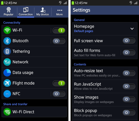
Locating Application Preferences in the General Settings
Preferences for the application appear at the very bottom of the Settings > More tab, including settings for any other downloaded applications. You should arrange the applications in alphabetical order regardless of their origin.
Design the preferences as shown in the figure below. In keeping with the INTERNET preference screen, classify your application settings by function and group them with different names.
Preference UI Control Types
The UI control types for designing application preferences are as follows:
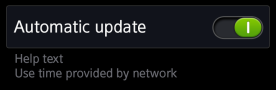
Secondary text
Status: Show the present state within the list.
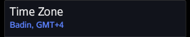
Help text: Show the help text in the lower column of the list.
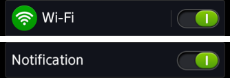
On/off switch
This control helps the user switch a specific function on or off. The control can be used to offer the on/off switch on the first depth without showing additional depths unless the switch is on.
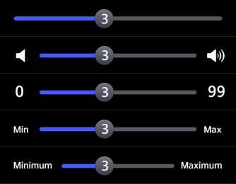
Slider
These controls are useful when adjusting values in settings in multiple steps or consecutive steps. Applicable texts or icons can appear on both ends of a slider.
Slider interaction
