Icons
PUBLISHED
Tizen applications can use a variety of icons.
Main Icons
This type of icon represents the application. It is recommend to have a circular shape for the icons of the Tizen platform, but it is not mandatory. It is normally used on the Home screen. However, if you do use it in other applications, make sure that the main icon is noticeable on any background.
The main icon should have the following properties:
- File format: PNG file with a transparent background
- Size for a mobile device: 117 x 117 pixels (based on the HD resolution)
- Size for the Tizen Store: 512 x 512 pixels
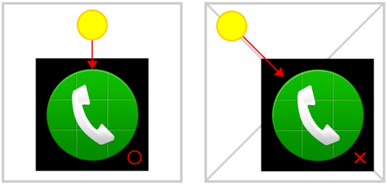
- Effect: Give the main icon a sense of dimension by angling the light at 90 degrees from the top of the icon. For consistency, you should apply the same light angle to any icon you create. The following figure shows the correct light angle (90 degrees) on the left and an incorrect light angle (120 degrees) on the right.
Although each icon in the Menu screen has a round frame on the edge of the circle, the frame is a UI element that only appears in the Menu screen. Do not use this type of frame when creating a main icon for your application.
Note: Always surround each icon with two pixels of transparent free space.
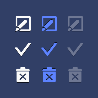
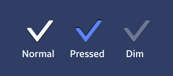
2D icons
These icons, which feature round edges and white-toned colors, can appear in one of three different states: normal, pressed, and dim. Also, depending on where you put them in your application, they should appear in either the plate or engraving format.
You can design icons for your application based on your brand identity or character. However, to maintain visual consistency, you should always give priority to the Tizen 2D style. Carefully consider the color and size of the area where you position the icon and make sure it's visible in each of the three states (normal, pressed, and dim) .
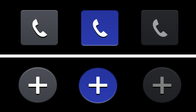
If you put a single icon in the header, footer or tab, it takes the engraved format by default. However, you can add more impact by applying subtle effects.
When you design a 2D icon, make sure you represent its status (normal, pressed, or dim) with the right color, as shown in the following figure:
| Status | Color | Effect |
|---|---|---|
| Normal | #fafafa | Black shadow
Direction: 90 Distance: 2px |
| Pressed | #5d83ff | Black shadow
Direction: -90 Distance: 2px |
| Dim | #fafafa | Black shadow
Direction:90 Distance: 2px (Normal status + 60% opacity) |
List icons
These icons can have square or circular shapes with the graphic appearing in the centre. The overall color tone and rules are similar to icons in other areas.
Note that when a list icon's status changes, its shape can be affected, too. For example, when the icon status is 'normal' or 'dim', the same color and effect values are applied to icons in other areas.
However, when the status is 'pressed', the shape color changes, while the icon color assumes the same color value as the background.
| Status | Color | Inner shadow |
|---|---|---|
| Normal | #fafafa | Black shadow
Direction: -90 Distance: 2px |
| Pressed | #212d8d | Black shadow
Direction: -90 Distance: 2px |
| Dim | #fafafa | Black shadow
Direction:-90 Distance: 2px (Normal status + 60% opacity) |