Managing UI Component Attributes in layout.xml
PUBLISHED
Dependencies
- Tizen Studio 1.0 and Higher
Content
- Element Hierarchy of the layout.xml File
- Attributes for Multiple Screens
- Palette of the Native UI Builder
- Component Attributes – Common
- Component Attributes – UI Container
- Component Attributes – UI Component
- Component Attributes – Custom UI Component
Related Info
This document describes the meta schema of the layout.xml file, which can be used in the native UI Builder. You can edit the layout.xml file through the Source editor of the UI Builder.
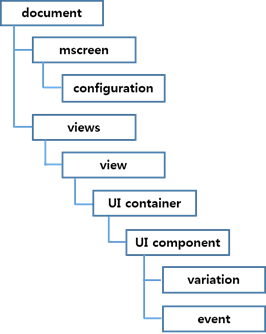
Element Hierarchy of the layout.xml File
The layout.xml file has a hierarchical organization, which consists of XML elements. The tree structure in the following figure shows the relationship between the elements of the layout.xml file.
Figure: Elements in the layout.xml file
The following example illustrates the content and structure of the layout.xml file. The usage format is <attribute_name=value>.
<?xml version="1.0" encoding="UTF-8" standalone="no"?>
<document>
    <mscreen>
        <configuration device="HD" id="config1" name="common" orientation="portrait" type="common"/>
        <configuration orientation="landscape" name="sd" id="configuration1" type="specific" device="HD"/>
    </mscreen>
    <views startup="view1">
        <view id="view1" indicator="true" page_location_x="0" page_location_y="0" screen_orientation="full_sensor" type="view">
            <grid align_h="fill" vsize_w="1000" align_v="fill" visible="true" weight_v="1"
                  id="grid1" weight_h="1" vsize_h="1000">
                <button align_v="fill" visible="true" weight_v="1" pack_h="49" weight_h="1" align_h="fill"
                        pack_w="210" disable="false" pack_x="406" pack_y="219" style="default" id="button1" text="Button">
                    <event connection_wrapper="connection_view1_button1_onclicked"
                           function_name="view1_button1_onclicked" signal="clicked" target="view2"/>
                    <variation config_ref="configuration1" visible="true" pack_w="210" pack_x="515"
                               pack_h="49" pack_y="753"/>
                </button>
            </grid>
        </view>
        <view indicator="true" screen_orientation="full_sensor" id="view2" type="view"></view>
    </views>
</document>
Attributes for Multiple Screens
The multiple screen feature is intended for creating an application that works in various screen sizes and densities. For more information, see Supporting Multiple Screens.
Configuration
The <configuration> element represents a specific screen configuration, as shown in the following example:
<mscreen>
   <configuration device="HD" id="config1" name="common" orientation="portrait" type="common"/>
</mscreen>
The <configuration> element is placed as a child of the <mscreen> element. The following attributes are used for all configurations.
Table: Common configuration attributes
| Attribute | Value |
|---|---|
id |
Identification for the configuration |
name |
Name of the display |
type |
Whether the configuration is specific or common |
device |
Supported device:
|
orientation |
portrait or landscape |
Variation
The <variation> element represents a set of the variation properties. The following is an example:
<button align_v="fill" visible="true" weight_v="1" pack_h="49" weight_h="1"
        align_h="fill" pack_w="210" disable="false" pack_x="406"
        pack_y="219" style="default" id="button1" text="Button">
    <variation config_ref="configuration1" visible="true" pack_w="210" pack_x="515" pack_h="49" pack_y="753"/>
</button>
The <variation> element is placed as a child of the <UI component> element. The <variation> element has visible and pack attributes. The value of the pack attribute depends on the parent container of the UI component. The following attributes are used for all variations.
Table: Variation attributes
| Attribute | Value |
|---|---|
config_ref |
Screen configuration ID |
visible |
true or false |
pack_x, pack_y, pack_w, pack_h |
Absolute coordinates when the parent container is a grid.
0 ~ |
pack_col, pack_row, row_span, col_span |
Position when the parent container is a table.
|
pack |
Position when the parent container is a pane.
|
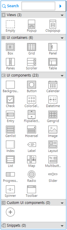
Palette of the Native UI Builder
By using various UI containers and components in the Palette of the native UI Builder, you can create your application UI layout. Each component can be set in various styles. For a detailed list of component styles, see the related guides (mobile and wearable).
Figure: Native UI Builder Palette
Component Attributes - Common
The following attributes are used for all UI components.
Table: Common component attributes
| Attribute | Value | Function |
|---|---|---|
align_h |
left, right, center, 0 ~ 1.0 |
evas_object_size_hint_align_set() |
align_v |
top, bottom, center, 0 ~ 1.0 |
evas_object_size_hint_align_set() |
weight_h or eight_v |
0 ~ 1.0 |
evas_object_size_hint_weight_set() |
Some UI component attributes depend on the type of the UI container. For example, if the <button> element is a child of a <grid> element, the <button> element must have pack_x, pack_y, pack_w, and pack_h attributes.
Table: Specific component attributes
| UI container | Attribute | Function |
|---|---|---|
| Grid | pack_x, pack_y, pack_w, pack_h |
elm_grid_pack() |
| Table | pack_col, pack_row, row_span, col_span |
elm_table_pack() |
| Panes | pack |
elm_object_part_content_set() |
Event
An <event> element represents a set of the event attributes. The following is an example:
<button align_v="fill" visible="true" weight_v="1" pack_h="49" weight_h="1"
        align_h="fill" pack_w="210" disable="false" pack_x="406"
        pack_y="219" style="default" id="button1" text="Button">
    <event connection_wrapper="connection_view1_button1_onclicked" function_name="view1_button1_onclicked"
           signal="clicked" target="view2"/>
</button>
The <event> element is placed as a child of the <UI component> element.
The following attributes are used for all <event> elements.
Table: Event attributes
| Attribute | Value |
|---|---|
function_name |
Name of the function |
signal |
Unique component signal. See the component documentation for details. |
source |
Source of accepted signal. Only used for the custom UI component. |
connection_wrapper |
Connection wrapper function's name |
target |
Target view ID to transform |
Component Attributes - UI Container
The <UI container> is an element that has the <UI component> elements as children. In the layout.xml file, containers, such as View, Box, Grid, Panel, Panes, Scroller, and Table, are supported.
View
A <view> element is a basic unit that represents a layout of the application UI. It contains a <UI container> component as a child.
The following attributes are used for <view> element.
Table: View attributes
| Attribute | Value |
|---|---|
id |
Automatically incrementing and editable. Duplicates are not allowed. |
indicator |
true or false |
screen_orientation |
no_sensor, only_portrait, only_landscape, or full_sensor |
type |
view or popup |
page_location_x |
#number |
page_location_y |
#number |
Box ( )
)
A box is a basic and simple EFL container.
<box homogeneous="false" align_h="fill" align_v="fill" visible="true" weight_v="1" padding_v="0"
     id="box2" padding_h="0" weight_h="1" direction="vertical">
</box>
The following attributes are used for the box container.
Table: Box attributes
| Attribute | Value | Function |
|---|---|---|
id |
Automatically incrementing and editable. Duplicates are not allowed. | elm_box_add() |
direction |
horizontal or vertical |
elm_box_horizontal_set() |
homogeneous |
true or false |
elm_box_homogeneous_set() |
padding_h or padding_v |
0 |
elm_box_padding_set() |
visible |
true or false |
evas_object_show() |
Grid ( )
)
In a grid container, objects are placed at specific positions along a fixed grid.
<grid align_h="fill" vsize_w="1000" align_v="fill" visible="true" weight_v="1"
      id="grid1" weight_h="1" vsize_h="1000">
    <button align_v="fill" visible="true" weight_v="1" pack_h="48" weight_h="1" align_h="fill"
            pack_w="210" disable="false" pack_x="365" pack_y="197" style="default" id="button1" text="Button">
    </button>
</grid>
The child element of the grid container has the pack_w, pack_h, pack_x, and pack_y attributes to indicate the positions in the grid. The following attributes are used for the grid container.
Table: Grid attributes
| Attribute | Value | Function |
|---|---|---|
id |
Automatically incrementing and editable. Duplicates are not allowed. | elm_grid_add() |
vsize_w |
0 ~ | elm_grid_size_set() |
vsize_h |
0 ~ | elm_grid_size_set() |
visible |
true or false |
evas_object_show() |
Panel ( ) in Mobile Applications
A panel container is an animated object that contains child objects. It can be expanded or collapsed by clicking the button on its edge.
<panel align_h="fill" align_v="fill" visible="true" orient="top" hidden="false" weight_v="1"
       id="panel1" weight_h="1">
</panel>
The following attributes are used for the panel container.
Table: Panel attributes
| Attribute | Value | Function |
|---|---|---|
id |
Automatically incrementing and editable. Duplicates are not allowed. | elm_panel_add() |
visible |
true or false |
evas_object_show() |
orient |
top, bottom, left, or right |
elm_panel_orient_set() |
hidden |
true or false |
elm_panel_hidden_set() |
Panes ( ) in Mobile Applications
A panes container adds a draggable bar between 2 sections of content. The sections are resized when the bar is dragged.
<panes align_h="fill" align_v="fill" visible="true" weight_v="1" fixed="false" id="panes1"
       weight_h="1" right_size="0.5" direction="vertical">
    <button align_h="fill" align_v="fill" visible="true" weight_v="1" disable="false" style="default"
            id="button1" text="Button" weight_h="1" pack="left">
    </button>
    <button align_h="fill" align_v="fill" visible="true" weight_v="1" disable="false" style="default"
            id="button2" text="Button" weight_h="1" pack="right">
    </button>
</panes>
The child element of the panes container has the pack attribute to indicate the positions in the panes. The following attributes are used for the panes container.
Table: Panes attributes
| Attribute | Value | Function |
|---|---|---|
id |
Automatically incrementing and editable. Duplicates are not allowed. | elm_panes_add() |
visible |
true or false |
evas_object_show() |
direction |
horizontal or vertical |
elm_panes_horizontal_set() |
fixed |
true or false |
elm_panes_fixed_set() |
right_size |
0 ~ 1 | elm_panes_content_right_size_set() |
Scroller ( )
)
A scroller container holds (and clips) a single object and allows you to scroll across it.
<scroller scrollbar_v="auto" align_v="fill" visible="true" weight_v="1" pack_h="123"
          content_min_h="false" weight_h="1" scrollbar_h="auto" align_h="fill" propagate_events="true"
          pack_w="276" pack_x="v433" pack_y="173" style="default" id="scroller1" content_min_w="false">
</scroller>
The following attributes are used for the scroller container.
Table: Scroller attributes
| Attribute | Value | Function |
|---|---|---|
id |
Automatically incrementing and editable. Duplicates are not allowed. | elm_scroller_add() |
style |
See the supported properties for each profile and version | elm_object_style_set() |
colors |
#000000 ~ #ffffff
See the supported properties for each profile and version. |
elm_object_color_class_color_set() |
content_min_w or content_min_h |
true or false |
elm_scroller_content_min_limit() |
propagate_events |
true or false |
elm_scroller_propagate_events_set() |
visible |
true or false |
evas_object_show() |
scrollbar_h or scrollbar_v |
auto, true, or false |
elm_scroller_policy_set() |
Table ( )
)
A table container is like the box but with 2 dimensions.
<table align_v="fill" visible="true" weight_v="1" pack_h="244" padding_h="0" weight_h="1" rows="2"
       homogeneous="false" align_h="fill" pack_w="417" pack_x="164" pack_y="166" padding_v="0" id="table1" cols="2">
    <button align_v="fill" visible="true" weight_v="1" weight_h="1" col_span="1" align_h="fill"
            pack_row="0" row_span="1" disable="false" style="default" pack_col="1" id="button2" text="Button">
    </button>
</table>
The child element of the table container has the pack_col, pack_row, row_span, and col_span attributes to indicate the position in the table. The following attributes are used for the table container.
Table: Table attributes
| Attribute | Value | Function |
|---|---|---|
id |
Automatically incrementing and editable. Duplicates are not allowed. | elm_table_add() |
homogeneous |
true or false |
elm_table_homogeneous_set() |
padding_h or padding_v |
0 ~ 50 | elm_table_padding_set() |
visible |
true or false |
evas_object_show() |
cols or rows |
1 ~ 10 | elm_table_pack() |
Component Attributes - UI Component
Background ( )
)
A background component (in mobile and wearable applications) is used to set a solid background decoration to a window or a container object. It works like an image, but has some background-specific properties, such as setting it to a tiled, centered, scaled, or stretched mode.
<bg align_v="fill" visible="true" color="" src="" weight_v="1" pack_h="162" weight_h="1" align_h="fill"
    pack_w="278" pack_x="338" pack_y="244" id="bg1" option="scale">
</bg>
The following attributes are used for the background component.
Table: Background attributes
| Attribute | Value | Function |
|---|---|---|
id |
Automatically incrementing and editable. Duplicates are not allowed. | elm_bg_add() |
option |
center, scale, stretch, or tile |
elm_bg_option_set() |
color |
#000000 ~ #ffffff |
elm_bg_color_set() |
src |
#string |
elm_bg_file_set() |
visible |
true or false |
evas_object_show() |
Button ( )
)
A button component (in mobile and wearable applications) is a simple push button. It is composed of a label icon and an icon object, and has an auto-repeat feature.
<button align_v="fill" visible="true" weight_v="1" pack_h="49" weight_h="1" align_h="fill" pack_w="210"
        disable="false" pack_x="290" pack_y="364" style="default" id="button1" text="Button">
</button>
The following attributes are used for the button component.
Table: Button attributes
| Attribute | Value | Function |
|---|---|---|
id |
Automatically incrementing and editable. Duplicates are not allowed. | elm_button_add() |
disable |
true or false |
elm_object_disabled_set() |
visible |
true or false |
evas_object_show() |
text |
#string |
elm_object_text_set() |
style |
See the supported properties for each profile and version | elm_object_style_set() |
colors |
#000000 ~ #ffffff
See the supported properties for each profile and version. |
elm_object_color_class_color_set() |
Calendar ( )
)
A calendar component displays and manipulates month views. (Since 2.4, this component is supported in mobile applications only.)
<calendar align_v="fill" visible="true" weight_v="1" pack_h="365" weight_h="1" max_year="-1"
          align_h="fill" select_mode="default" pack_w="668" disable="false" pack_x="207" pack_y="247"
          interval="0.85" id="calendar1" min_year="1902">
</calendar>
The following attributes are used for the calendar component.
Table: Calendar attributes
| Attribute | Value | Function |
|---|---|---|
id |
Automatically incrementing and editable. Duplicates are not allowed. | elm_calendar_add() |
disable |
true or false |
elm_object_disabled_set() |
visible |
true or false |
evas_object_show() |
min_year or max_year |
integer |
elm_calendar_min_max_year_set() |
select_mode |
default, always, none, or ondemand |
elm_calendar_select_mode_set() |
interval |
double |
elm_calendar_interval_set() |
Check ( )
)
A check component (in mobile and wearable applications) toggles the Boolean value between true and false.
<check align_v="fill" visible="true" weight_v="1" pack_h="48" weight_h="1" align_h="fill" pack_w="208"
       disable="false" pack_x="429" pack_y="356" style="default" id="check1" text="Check" state="false">
</check>
The following attributes are used for the check component.
Table: Check attributes
| Attribute | Value | Function |
|---|---|---|
id |
Automatically incrementing and editable. Duplicates are not allowed. | elm_check_add() |
state |
true or false |
elm_check_state_set() |
disable |
true or false |
elm_object_disabled_set() |
visible |
true or false |
evas_object_show() |
text |
#string
See the supported properties for each profile and version. |
elm_object_text_set() |
style |
See the supported properties for each profile and version | elm_object_style_set() |
Colorselector ( ) in Mobile Applications
A colorselector component provides a color selection solution to the user. It has different modes, each of them showing a different configuration of selectable colors.
<colorselector align_h="fill" align_v="fill" visible="true" weight_v="1" pack_w="667" pack_x="386"
               pack_h="131" pack_y="565" id="colorselector1" weight_h="1">
</colorselector>
The following attributes are used for the colorselector component.
Table: Colorselector attributes
| Attribute | Value | Function |
|---|---|---|
id |
Automatically incrementing and editable. Duplicates are not allowed. | elm_colorselector_add() |
visible |
true or false |
evas_object_show() |
Ctxpopup
A ctxpopup component (in mobile and wearable applications) is a contextual popup that shows a small list of items.
<view indicator="true" screen_orientation="full_sensor" id="view2" type="popup">
    <ctxpopup align_h="fill" align_v="fill" visible="true" weight_v="1" disable="false"
              id="ctxpopup1" weight_h="1" direction="vertical">
        <ctxpopupitem id="ctxpopupitem1" text="CtxPopupItem"></ctxpopupitem>
    <ctxpopupitem id="ctxpopupitem2" text="CtxPopupItem"></ctxpopupitem>
    </ctxpopup>
</view>
The <ctxpopup> element must be placed as a child of the <view> element, and the type attribute in the view must be popup. The following attributes are used for the ctxpopup component.
Table: Ctxpopup attributes
| Attribute | Value | Function |
|---|---|---|
id |
Automatically incrementing and editable. Duplicates are not allowed. | elm_ctxpopup_add() |
direction |
horizontal or vertical |
elm_ctxpopup_horizontal_set() |
style |
See the supported properties for each profile and version | elm_object_style_set() |
disable |
true or false |
elm_object_disabled_set() |
visible |
true or false |
evas_object_show() |
Ctxpopupitem
A ctxpopup item component can be placed as a child of the ctxpopup component. Each item can have a label, an icon, or both. The following attributes are used for the ctxpopup item component.
Table: Ctxpopup item attributes
| Attribute | Value | Function |
|---|---|---|
id |
Automatically incrementing and editable. Duplicates are not allowed. | elm_ctxpopup_item_append() |
text |
#string |
elm_ctxpopup_item_append() |
Datetime ( )
)
A datetime component (in mobile and wearable applications) can display and accept input for date and time values.
<datetime align_h="fill" align_v="fill" visible="true" weight_v="1" pack_w="528" disable="false" pack_x="232"
          pack_h="171" pack_y="433" style="default" id="datetime1" weight_h="1">
</datetime>
The following attributes are used for the datetime component.
Table: Datetime attributes
| Attribute | Value | Function |
|---|---|---|
id |
Automatically incrementing and editable. Duplicates are not allowed. | elm_datetime_add() |
disable |
true or false |
elm_object_disabled_set() |
visible |
true or false |
evas_object_show() |
style |
See the supported properties for each profile and version | elm_object_style_set() |
colors |
#000000 ~ #ffffff
See the supported properties for each profile and version. |
elm_object_color_class_color_set() |
Entry ( )
)
An entry component (in mobile and wearable applications) is a box to which the user can enter text.
<entry context_menu="true" align_v="fill" visible="true" src="" weight_v="1" editable="true" pack_h="82"
       scroll="false" weight_h="1" single_line="false" align_h="fill" password="false"
       file_text_format="plain_utf8" pack_w="208" disable="false" pack_x="289" pack_y="268"
       id="entry1" text="Entry">
</entry>
The following attributes are used for the entry component.
Table: Entry attributes
| Attribute | Value | Function |
|---|---|---|
id |
Automatically incrementing and editable. Duplicates are not allowed. | elm_entry_add() |
scroll |
true or false |
elm_entry_scrollable_set() |
single_line |
true or false |
elm_entry_single_line_set() |
password |
true or false |
elm_entry_password_set() |
editable |
true or false |
elm_entry_editable_set() |
context_menu |
true or false |
elm_entry_context_menu_disabled_set() |
file_text_format |
plain_utf8 or markup_utf8 |
elm_entry_file_text_format_set() |
disable |
true or false |
elm_object_disabled_set() |
visible |
true or false |
evas_object_show() |
text |
#string |
elm_object_text_set() |
src |
#string |
elm_entry_file_set() |
Flipselector ( )
)
A flipselector component shows a set of text items one at a time. The user can flip the selector up or down to change the text on it. It can contain a small number of items. (Since 2.4, this component is supported in mobile applications only.)
<flipselector align_h="fill" align_v="fill" visible="true" weight_v="1" pack_w="196" disable="false" pack_x="210"
              pack_h="146" pack_y="312" id="flipselector1" weight_h="1">
    <flipselectoritem id="flipselectoritem1" text="item"></flipselectoritem>
</flipselector>
The following attributes are used for the flipselector component.
Table: Flipselector attributes
| Attribute | Value | Function |
|---|---|---|
id |
Automatically incrementing and editable. Duplicates are not allowed. | elm_flipselector_add() |
disable |
true or false |
elm_object_disabled_set() |
visible |
true or false |
evas_object_show() |
Flipselectoritem
A flipselector item component can be placed as a child of the flipselector container. Each item can have a label. (Since 2.4, this component is supported in mobile applications only.)
Table: Flipselector item attributes
| Attribute | Value | Function |
|---|---|---|
id |
Automatically incrementing and editable. Duplicates are not allowed. | elm_flipselector_item_append() |
text |
#string |
elm_flipselector_item_append() |
Gengrid ( ) in Mobile Applications
A gengrid component displays objects on a grid layout and renders only the visible objects. The gengrid can contain a small number of items.
<gengrid scrollbar_v="auto" align_v="fill" visible="true" weight_v="1" pack_h="324" item_size_w="200"
         weight_h="1" scrollbar_h="auto" align_h="fill" select_mode="default" multi_select="false"
         item_size_h="200" pack_w="554" disable="false" pack_x="206" pack_y="316" style="default"
         id="gengrid1" direction="vertical">
    <gengriditem src="" style="default" disabled="false" id="gengriditem1"
                 text="item" selected="false"></gengriditem>
    <gengriditem src="" style="default" disabled="false" id="gengriditem2"
                 text="item" selected="false"></gengriditem>
</gengrid>
The following attributes are used for the gengrid component.
Table: Gengrid attributes
| Attribute | Value | Function |
|---|---|---|
id |
Automatically incrementing and editable. Duplicates are not allowed. | elm_gengrid_add() |
visible |
true or false |
evas_object_show() |
disable |
true or false |
elm_object_disabled_set() |
style |
See the supported properties for each profile and version | elm_object_style_set() |
select_mode |
default, always, none, or display_only |
elm_gengrid_select_mode_set() |
direction |
horizontal or vertical |
elm_gengrid_horizontal_set() |
item_size_w or item_size_h |
integer |
elm_gengrid_item_size_set() |
multi_select |
true or false |
elm_gengrid_multi_select_set() |
scrollbar_h or scrollbar_v |
auto, true, or false |
elm_scroller_policy_set() |
Gengriditem in Mobile Applications
A gengrid item component can be placed as a child of the gengrid component. Each item can have a label and image, depending on the style. The following attributes are used for the gengrid item component.
Table: Gengrid item attributes
| Attribute | Value | Function |
|---|---|---|
id |
Automatically incrementing and editable. Duplicates are not allowed. | elm_gengrid_item_append() |
style |
See the supported properties for each profile and version | elm_gengrid_item_append() |
colors |
#000000 ~ #ffffff
See the supported properties for each profile and version. |
elm_object_item_color_class_color_set() |
text |
#string |
elm_gengrid_item_append() |
src |
#string |
elm_gengrid_item_append() |
selected |
true or false |
elm_gengrid_item_selected_set() |
disabled |
true or false |
elm_object_item_disabled_set() |
Genlist ( )
)
A genlist component (in mobile and wearable applications) displays a scrollable list of items.
<genlist scrollbar_v="auto" align_v="fill" visible="true" weight_v="1" pack_h="244" weight_h="1"
         homogeneous="false" scrollbar_h="auto" align_h="fill" select_mode="default" pack_w="668"
         disable="false" pack_x="134" pack_y="204" style="solid/default" id="genlist1">
    <genlistitem sub_text="Sub Text" end_image_path="" item_type="none" image_path="" style="default"
                 id="genlistitem1" text="List item" end_standard_icon="" selected="false"
                 standard_icon=""></genlistitem>
    <genlistitem sub_text="Sub Text" end_image_path="" item_type="none" image_path="" style="default"
                 id="genlistitem2" text="List item" end_standard_icon="" selected="false"
                 standard_icon=""></genlistitem>
</genlist>
The following attributes are used for the genlist component.
Table: Genlist attributes
| Attribute | Value | Function |
|---|---|---|
id |
Automatically incrementing and editable. Duplicates are not allowed. | elm_genlist_add() |
select_mode |
default, always, none, or display_only
See the supported properties for each profile and version. |
elm_genlist_select_mode_set() |
style |
See the supported properties for each profile and version | elm_object_style_set() |
disable |
true or false |
elm_object_disabled_set() |
visible |
true or false |
evas_object_show() |
homogeneous |
true or false
See the supported properties for each profile and version. |
elm_genlist_homogeneous_set() |
scrollbar_h or scrollbar_v |
auto, true, or false |
elm_scroller_policy_set() |
Genlistitem
A genlist item component can be placed as a child of the genlist component. Each item can have a label and image, depending on the style. The following attributes are used for the genlist item component.
Table: Genlist item attributes
| Attribute | Value | Function |
|---|---|---|
id |
Automatically incrementing and editable. Duplicates are not allowed. | elm_genlist_item_append() |
end_image_path |
#string |
elm_genlist_item_append() |
end_standard_icon |
See the supported properties for each profile and version | elm_genlist_item_append() |
image_path |
#string |
elm_genlist_item_append() |
style |
See the supported properties for each profile and version | elm_object_style_set() |
colors |
#000000 ~ #ffffff
See the supported properties for each profile and version. |
elm_object_item_color_class_color_set() |
text |
#string |
elm_genlist_item_append() |
selected |
true or false
See the supported properties for each profile and version. |
elm_genlist_item_selected_set() |
standard_icon |
See the supported properties for each profile and version | elm_genlist_item_append() |
sub_text |
#string |
elm_genlist_item_append() |
Hoversel ( ) in Mobile Applications
A hoversel component is a button that pops up a list of items.
<hoversel align_h="fill" align_v="fill" visible="true" disable="false" weight_v="1"
          pack_h="41" weight_h="1" pack_w="69" pack_x="308" pack_y="341"
          id="hoversel1" text="Hoversel">
    <hoverselitem id="hoverselitem1" text="Hoverselitem"></hoverselitem>
    <hoverselitem id="hoverselitem2" text="Hoverselitem"></hoverselitem>
</hoversel>
The following attributes are used for the hoversel component.
Table: Hoversel attributes
| Attribute | Value | Function |
|---|---|---|
id |
Automatically incrementing and editable. Duplicates are not allowed. | elm_hoversel_add() |
text |
#string |
elm_object_text_set() |
disable |
true or false |
elm_object_disabled_set() |
visible |
true or false |
evas_object_show() |
Hoverselitem in Mobile Applications
A hoversel item component can be placed as a child of the hoversel component. Each item can have a text. The following attributes are used for the hoversel item component.
Table: Hoversel item attributes
| Attribute | Value | Function |
|---|---|---|
id |
Automatically incrementing and editable. Duplicates are not allowed. | elm_hoversel_item_append() |
text |
#string |
elm_hoversel_item_append() |
Image ( )
)
An image component (in mobile and wearable applications) loads and displays an image from a file or memory.
<image resizable_up="true" resizable_down="true" align_v="fill" visible="true" src="" weight_v="1"
       pack_h="41" weight_h="1" align_h="fill" aspect_fixed="false" pack_w="69" pack_x="308" pack_y="341"
       no_scale="false" id="image1" fill_outside="false">
</image>
The following attributes are used for the image component.
Table: Image attributes
| Attribute | Value | Function |
|---|---|---|
id |
Automatically incrementing and editable. Duplicates are not allowed. | elm_image_add() |
src |
#string |
elm_image_file_set() |
aspect_fixed |
true or false |
elm_image_aspect_fixed_set() |
fill_outside |
true or false |
elm_image_fill_outside_set() |
resizable_up or resizable_down |
true or false |
elm_image_resizable_set() |
no_scale |
true or false |
elm_image_no_scale_set() |
visible |
true or false |
evas_object_show() |
Index ( )
)
An index component (in mobile and wearable applications) provides an index for quick access to another group of UI items. The index can contain a small number of items.
<index indicator="true" align_v="fill" visible="true" weight_v="1" pack_h="122" weight_h="1" align_h="fill"
       pack_w="276" disable="false" pack_x="368" pack_y="385" id="index1" autohide="false">
    <indexitem id="indexitem1" text="item"></indexitem>
    <indexitem id="indexitem2" text="item"></indexitem>
</index>
The following attributes are used for the index component.
Table: Index attributes
| Attribute | Value | Function |
|---|---|---|
id |
Automatically incrementing and editable. Duplicates are not allowed. | elm_index_add() |
autohide |
true or false |
elm_index_autohide_disabled_set() |
indicator |
true or false |
elm_index_indicator_disabled_set() |
visible |
true or false |
evas_object_show() |
Indexitem
An index item component can be placed as a child of the index component. Each item can have a label. The following attributes are used for the index item component.
Table: Index item attributes
| Attribute | Value | Function |
|---|---|---|
id |
Automatically incrementing and editable. Duplicates are not allowed. | elm_index_item_append() |
text |
#string |
elm_index_item_append() |
Label ( )
)
A label component (in mobile and wearable applications) displays text with a simple HTML-like markup.
<label align_v="fill" visible="true" weight_v="1" line_wrap="none" pack_h="24" weight_h="1"
       ellipsis="false" align_h="fill" wrap_width="0" pack_w="139" disable="false"
       pack_x="282" pack_y="415" id="label1" text="Label">
</label>
The following attributes are used for the label component.
Table: Label attributes
| Attribute | Value | Function |
|---|---|---|
id |
Automatically incrementing and editable. Duplicates are not allowed. | elm_label_add() |
ellipsis |
true or false |
elm_label_ellipsis_set() |
wrap_width |
0 ~ | elm_label_wrap_width_set() |
line_wrap |
none, char, word, or mixed |
elm_label_line_wrap_set() |
visible |
true or false |
evas_object_show() |
text |
#string |
elm_object_text_set() |
Layout ( )
)
A layout is a container component that takes a standard Edje design file and wraps it very thinly in a UI component.
<layout align_v="fill" visible="true" src="edc.edj" weight_v="1" pack_h="122" weight_h="1" align_h="fill"
        pack_w="210" disable="false" pack_x="329" pack_y="398" id="layout1" group="main">
</layout>
The following attributes are used for the layout component.
Table: Layout attributes
| Attribute | Value | Function |
|---|---|---|
id |
Automatically incrementing and editable. Duplicates are not allowed. | elm_layout_add() |
disable |
true or false |
elm_object_disabled_set() |
visible |
true or false |
evas_object_show() |
src or group |
#string |
elm_layout_file_set() |
List ( )
)
A list component (in mobile and wearable applications) is a very simple list for managing a small number of items. If you need to manage a lot of items, use the genlist component instead.
<list scrollbar_v="auto" align_v="fill" visible="true" weight_v="1" pack_h="244" weight_h="1" mode="scroll"
      scrollbar_h="auto" align_h="fill" select_mode="default" multi_select="false" pack_w="667"
      disable="false" pack_x="307" pack_y="272" id="list1">
    <listitem id="listitem1" text="List item" selected="false"></listitem>
    <listitem id="listitem2" text="List item" selected="false"></listitem>
</list>
The following attributes are used for the list component.
Table: List attributes
| Attribute | Value | Function |
|---|---|---|
id |
Automatically incrementing and editable. Duplicates are not allowed. | elm_list_add() |
direction |
horizontal or vertical |
elm_list_horizontal_set() |
select_mode |
default, always, none, or display_only |
elm_list_select_mode_set() |
multi_select |
true or false |
elm_list_multi_select_set() |
mode |
compress, scroll, limit, or expand |
elm_list_mode_set() |
disable |
true or false |
elm_object_disabled_set() |
visible |
true or false |
evas_object_show() |
scrollbar_h or scrollbar_v |
auto, true, or false |
elm_scroller_policy_set() |
Listitem
A list item component can be placed as a child of the list component. Each item can have a label. The following attributes are used for the list item component.
Table: List item attributes
| Attribute | Value | Function |
|---|---|---|
id |
Automatically incrementing and editable. Duplicates are not allowed. | elm_list_item_append() |
text |
#string |
elm_list_item_append() |
selected |
true or false |
elm_list_item_selected_set() |
Map ( )
)
A map component can display a geographic map. The default map data is provided by the OpenStreetMap project.
<map align_v="fill" visible="true" weight_v="1" pack_h="244" latitude="0" zoom_level="15" weight_h="1"
     align_h="fill" pack_w="417" pack_x="221" pack_y="318" id="map1" longitude="0">
</map>
The following attributes are used for the map component.
Table: Map attributes
| Attribute | Value | Function |
|---|---|---|
id |
Automatically incrementing and editable. Duplicates are not allowed. | elm_map_add() |
zoom_level |
integer (0~) |
elm_map_zoom_set() |
longitude |
double |
elm_map_region_show() |
latitude |
double |
elm_map_region_show() |
visible |
true or false |
evas_object_show() |
Multibuttonentry ( ) in Mobile Applications
A multibutton entry component allows the user to enter text so that the text is divided into chunks and managed as a set of buttons.
<multibuttonentry align_v="fill" visible="true" weight_v="0" editable="true" pack_h="40" weight_h="0"
                  align_h="fill" expanded="false" pack_w="210" disable="false" pack_x="329"
                  pack_y="360" id="multibuttonentry1">
    <multibuttonentryitem id="multibuttonentryitem1" text="item"/>
</multibuttonentry>
The following attributes are used for the multibutton entry component.
Table: Multibutton entry attributes
| Attribute | Value | Function |
|---|---|---|
id |
Automatically incrementing and editable. Duplicates are not allowed. | elm_multibuttonentry_add() |
editable |
true or false |
elm_multibuttonentry_editable_set() |
expanded |
true or false |
elm_multibuttonentry_expanded_set() |
disable |
true or false |
elm_object_disabled_set() |
visible |
true or false |
evas_object_show() |
Multibuttonentryitem in Mobile Applications
A multibutton entry item component can be placed as a child of the multibutton entry component. The following attributes are used for the multibutton entry item component.
Table: Multibutton entry item attributes
| Attribute | Value | Function |
|---|---|---|
id |
Automatically incrementing and editable. Duplicates are not allowed. | elm_multibuttonentry_item_append() |
text |
#string |
elm_multibuttonentry_item_append() |
Popup
A popup component (in mobile and wearable applications) shows a pop-up area that contains a title, content, and action area. The following attributes are used for the popup component.
Table: Popup attributes
| Attribute | Value | Function |
|---|---|---|
id |
Automatically incrementing and editable. Duplicates are not allowed. | elm_popup_add() |
title |
#string |
elm_object_part_text_set() |
style |
See the supported properties for each profile and version | elm_object_style_set() |
colors |
#000000 ~ #ffffff
See the supported properties for each profile and version. |
elm_object_color_class_color_set() |
height |
integer |
evas_object_size_hint_min_set() |
timeout |
double |
elm_popup_timeout_set() |
disable |
true or false |
elm_object_disabled_set() |
visible |
true or false |
evas_object_show() |
Progressbar ( )
)
A progressbar component (in mobile and wearable applications) is used to display the progress status of a given job.
<progressbar align_v="fill" visible="true" weight_v="1" pack_h="24" weight_h="1" align_h="fill" span_size="0"
             pack_w="210" disable="false" pack_x="579" pack_y="432" style="default" id="progressbar1"
             inverted="false" value="0" direction="horizontal">
</progressbar>
The following attributes are used for the progressbar component.
Table: Progressbar attributes
| Attribute | Value | Function |
|---|---|---|
id |
Automatically incrementing and editable. Duplicates are not allowed. | elm_progressbar_add() |
span_size |
0 ~ | elm_progressbar_span_size_set() |
value |
0 ~ 1 | elm_progressbar_value_set() |
inverted |
true or false |
elm_progressbar_inverted_set() |
disable |
true or false |
elm_object_disabled_set() |
visible |
true or false |
evas_object_show() |
style |
See the supported properties for each profile and version | elm_object_style_set() |
colors |
#000000 ~ #ffffff
See the supported properties for each profile and version. |
elm_object_color_class_color_set() |
min or max |
See the supported properties for each profile and version | eext_circle_object_value_min_max_set() |
Radio ( )
)
A radio component (in mobile and wearable applications) can display 1 or more options, while the user can only select one of them. The UI component is composed of an indicator (selected or unselected), an optional icon, and an optional label. Even though it is usually grouped with 2 or more other radio components, it can also be used alone.
<radio align_v="fill" visible="true" weight_v="1" pack_h="49" weight_h="1" align_h="fill" pack_w="208"
       disable="false" pack_x="318" pack_y="478" id="radio1" text="Radio" state_value="0" value="0">
</radio>
The following attributes are used for the radio component.
Table: Radio attributes
| Attribute | Value | Function |
|---|---|---|
id |
Automatically incrementing and editable. Duplicates are not allowed. | elm_radio_add() |
state_value |
#number |
elm_radio_state_value_set() |
value |
#number |
elm_radio_value_set() |
text |
#string
See the supported properties for each profile and version. |
elm_object_text_set() |
disable |
true or false |
elm_object_disabled_set() |
visible |
true or false |
evas_object_show() |
Slider ( )
)
A slider component (in mobile and wearable applications) is a draggable bar that is used to select a value from a range of values.
<slider indicator="false" align_v="fill" visible="true" max="1.0" weight_v="1" pack_h="25" indicator_format=""
        weight_h="1" align_h="fill" min="0.0" pack_w="276" disable="false" pack_x="318" pack_y="424"
        style="default" step="0.05" id="slider1" inverted="false" value="0.0" direction="horizontal">
</slider>
The following attributes are used for slider component.
Table: Slider attributes
| Attribute | Value | Function |
|---|---|---|
id |
Automatically incrementing and editable. Duplicates are not allowed. | elm_slider_add() |
indicator |
true or false
See the supported properties for each profile and version. |
elm_slider_indicator_show_set() |
min |
0 ~ | elm_slider_min_max_set() |
step |
0 ~ | elm_slider_step_set() |
max |
0 ~ | elm_slider_min_max_set() |
value |
0 ~ | elm_slider_value_set() |
inverted |
true or false
See the supported properties for each profile and version. |
elm_slider_inverted_set() |
indicator_format |
#string
See the supported properties for each profile and version. |
elm_slider_indicator_format_set() |
direction |
horizontal or vertical
See the supported properties for each profile and version. |
elm_slider_horizontal_set() |
disable |
true or false |
elm_object_disabled_set() |
visible |
true or false |
evas_object_show() |
style |
See the supported properties for each profile and version | elm_object_style_set() |
colors |
#000000 ~ #ffffff
See the supported properties for each profile and version. |
elm_object_color_class_color_set() |
Spinner ( )
)
A spinner component enables the user to increase or decrease a numeric value by using arrow buttons. (This component is not supported in wearable circle applications.)
<spinner align_v="fill" visible="true" max="100" weight_v="1" editable="true" pack_h="123" weight_h="1"
         align_h="fill" min="0" pack_w="210" disable="false" pack_x="279" pack_y="377"
         style="horizontal" step="1" id="spinner1">
</spinner>
The following attributes are used for the spinner component.
Table: Spinner attributes
| Attribute | Value | Function |
|---|---|---|
id |
Automatically incrementing and editable. Duplicates are not allowed. | elm_spinner_add() |
editable |
true or false |
elm_spinner_editable_set() |
step |
0 ~ | elm_spinner_step_set() |
min |
0 ~ | elm_spinner_min_max_set() |
max |
0 ~ | elm_spinner_min_max_set() |
disable |
true or false |
elm_object_disabled_set() |
visible |
true or false |
evas_object_show() |
style |
See the supported properties for each profile and version | elm_object_style_set() |
colors |
#000000 ~ #ffffff
See the supported properties for each profile and version. |
elm_object_color_class_color_set() |
Toolbar ( ) in Mobile Applications
A toolbar component is a small scrollable list of items. It can also show a menu when an item is selected. Only one item can be selected at a time.
<toolbar shrink_mode="none" align_v="fill" visible="true" weight_v="0"
         pack_h="41" weight_h="0" homogeneous="true" align_h="fill"
         select_mode="default" pack_w="668" pack_x="113" pack_y="190"
         icon_size="32" style="default" id="toolbar1"
         transverse_expand="false" direction="horizontal">
    <toolbaritem src="" disable="false" id="toolbaritem1" text="item"
                 selected="false"/>
    <toolbaritem src="" disable="false" id="toolbaritem2" text="item"
                 selected="false"/>
</toolbar>
The following attributes are used for the toolbar component.
Table: Toolbar attributes
| Attribute | Value | Function |
|---|---|---|
id |
Automatically incrementing and editable. Duplicates are not allowed. | elm_toolbar_add() |
homogeneous |
true or false |
elm_toolbar_homogeneous_set() |
select_mode |
default, always, none, or display_only |
elm_toolbar_select_mode_set() |
icon_size |
0 ~ |
elm_toolbar_icon_size_set() |
direction |
horizontal or vertical |
elm_toolbar_horizontal_set() |
shrink_mode |
none, hide, scroll, menu, or expand |
elm_toolbar_shrink_mode_set() |
transverse_expand |
true or false |
elm_toolbar_transverse_expanded_set() |
visible |
true or false |
evas_object_show() |
Toolbaritem in Mobile Applications
A toolbar item component can be placed as a child of the toolbar component. Each item can have a label and image. The following attributes are used for the toolbar item component.
Table: Toolbar item attributes
| Attribute | Value | Function |
|---|---|---|
id |
Automatically incrementing and editable. Duplicates are not allowed. | elm_toolbar_item_append() |
disable |
true or false |
elm_object_item_disabled_set() |
text |
#string |
elm_toolbar_item_append() |
src |
#string |
elm_toolbar_item_icon_set() |
selected |
true or false |
elm_toolbar_item_selected_set() |
Properties Supported for Each Component
Some properties are supported only in specific profiles. The following table lists the UI components with attributes that only apply to specific profiles.
Table: Properties supported in specific profiles
| Component | Attribute | Mobile 2.3/2.3.1 | Mobile 2.4 | Mobile 3.0/4.0 | Wearable square 2.3.1 | Wearable circle 2.3.1/2.3.2 | Wearable circle 3.0/4.0 |
|---|---|---|---|---|---|---|---|
| Panel | id |
Yes | Yes | Yes | No | No | No |
visible |
Yes | Yes | Yes | No | No | No | |
orient |
Yes | Yes | Yes | No | No | No | |
hidden |
Yes | Yes | Yes | No | No | No | |
| Panes | id |
Yes | Yes | Yes | No | No | No |
visible |
Yes | Yes | Yes | No | No | No | |
direction |
Yes | Yes | Yes | No | No | No | |
fixed |
Yes | Yes | Yes | No | No | No | |
right_size |
Yes | Yes | Yes | No | No | No | |
| Scroller | id |
Yes | Yes | Yes | Yes | Yes | Yes |
style |
No | Yes | Yes | No | No | No | |
colors |
No | No | Yes | No | No | No | |
content_min_w |
Yes | Yes | Yes | Yes | Yes | Yes | |
content_min_h |
Yes | Yes | Yes | Yes | Yes | Yes | |
propagate_events |
Yes | Yes | Yes | Yes | Yes | Yes | |
visible |
Yes | Yes | Yes | Yes | Yes | Yes | |
scrollbar_h |
Yes | Yes | Yes | Yes | Yes | Yes | |
scrollbar_v |
Yes | Yes | Yes | Yes | Yes | Yes | |
| Button | id |
Yes | Yes | Yes | Yes | Yes | Yes |
disable |
Yes | Yes | Yes | Yes | Yes | Yes | |
visible |
Yes | Yes | Yes | Yes | Yes | Yes | |
text |
Yes | Yes | Yes | Yes | Yes | Yes | |
style |
Yes | Yes | Yes | Yes | Yes | Yes | |
colors |
No | No | Yes | No | No | No | |
| Calendar | id |
No | Yes | Yes | No | No | No |
disable |
No | Yes | Yes | No | No | No | |
visible |
No | Yes | Yes | No | No | No | |
min_year or max_year |
No | Yes | Yes | No | No | No | |
select_mode |
No | Yes | Yes | No | No | No | |
interval |
No | Yes | Yes | No | No | No | |
| Check | id |
Yes | Yes | Yes | Yes | Yes | Yes |
state |
Yes | Yes | Yes | Yes | Yes | Yes | |
disable |
Yes | Yes | Yes | Yes | Yes | Yes | |
visible |
Yes | Yes | Yes | Yes | Yes | Yes | |
text |
No | Yes | Yes | No | No | No | |
style |
Yes | Yes | Yes | Yes | Yes | Yes | |
| Colorselector | id |
Yes | Yes | Yes | No | No | No |
visible |
Yes | Yes | Yes | No | No | No | |
| Ctxpopup | id |
Yes | Yes | Yes | Yes | Yes | Yes |
direction |
Yes | Yes | Yes | Yes | Yes | Yes | |
style |
Yes | No | No | No | Yes | Yes | |
disable |
Yes | Yes | Yes | Yes | Yes | Yes | |
visible |
Yes | Yes | Yes | Yes | Yes | Yes | |
| Datetime | id |
Yes | Yes | Yes | Yes | Yes | Yes |
disable |
Yes | Yes | Yes | Yes | Yes | Yes | |
visible |
Yes | Yes | Yes | Yes | Yes | Yes | |
style |
Yes | Yes | Yes | Yes | Yes | Yes | |
colors |
No | No | Yes | No | No | No | |
| Entry | id |
Yes | Yes | Yes | Yes | Yes | Yes |
scroll |
Yes | Yes | Yes | Yes | Yes | Yes | |
single_line |
Yes | Yes | Yes | Yes | Yes | Yes | |
password |
Yes | Yes | Yes | Yes | Yes | Yes | |
editable |
Yes | Yes | Yes | Yes | Yes | Yes | |
context_menu |
Yes | Yes | Yes | No | No | No | |
file_text_format |
Yes | Yes | Yes | Yes | Yes | Yes | |
disable |
Yes | Yes | Yes | Yes | Yes | Yes | |
visible |
Yes | Yes | Yes | Yes | Yes | Yes | |
text |
Yes | Yes | Yes | Yes | Yes | Yes | |
src |
Yes | Yes | Yes | Yes | Yes | Yes | |
| Flipselector | id |
No | Yes | Yes | No | No | No |
disable |
No | Yes | Yes | No | No | No | |
visible |
No | Yes | Yes | No | No | No | |
| Flipselector item | id |
No | Yes | Yes | No | No | No |
text |
No | Yes | Yes | No | No | No | |
| Gengrid | id |
Yes | Yes | Yes | No | No | No |
visible |
Yes | Yes | Yes | No | No | No | |
disable |
Yes | Yes | Yes | No | No | No | |
style |
No | Yes | Yes | No | No | No | |
select_mode |
Yes | Yes | Yes | No | No | No | |
direction |
Yes | Yes | Yes | No | No | No | |
item_size_w or item_size_h |
Yes | Yes | Yes | No | No | No | |
multi_select |
Yes | Yes | Yes | No | No | No | |
scrollbar_h or scrollbar_v |
Yes | Yes | Yes | No | No | No | |
| Gengrid item | id |
Yes | Yes | Yes | No | No | No |
style |
Yes | Yes | Yes | No | No | No | |
colors |
No | No | Yes | No | No | No | |
text |
Yes | Yes | Yes | No | No | No | |
src |
Yes | Yes | Yes | No | No | No | |
selected |
Yes | Yes | Yes | No | No | No | |
disabled |
Yes | Yes | Yes | No | No | No | |
| Genlist | id |
Yes | Yes | Yes | Yes | Yes | Yes |
select_mode |
Yes | Yes | Yes | Yes | No | No | |
style |
No | Yes | Yes | No | No | No | |
disable |
Yes | Yes | Yes | Yes | Yes | Yes | |
visible |
Yes | Yes | Yes | Yes | Yes | Yes | |
homogeneous |
Yes | Yes | Yes | Yes | No | No | |
scrollbar_h or scrollbar_v |
Yes | Yes | Yes | Yes | No | No | |
| Genlist item | id |
Yes | Yes | Yes | Yes | Yes | Yes |
end_image_path |
Yes | Yes | Yes | Yes | Yes | Yes | |
end_standard_icon |
Yes | Yes | Yes | Yes | No | No | |
image_path |
Yes | Yes | Yes | Yes | Yes | Yes | |
style |
Yes | Yes | Yes | Yes | Yes | Yes | |
colors |
No | No | Yes | No | No | No | |
text |
Yes | Yes | Yes | Yes | Yes | Yes | |
selected |
Yes | Yes | Yes | Yes | No | No | |
standard_icon |
Yes | Yes | Yes | No | No | No | |
sub_text |
Yes | Yes | Yes | Yes | Yes | Yes | |
| Hoversel | id |
No | Yes | Yes | No | No | No |
text |
No | Yes | Yes | No | No | No | |
disable |
No | Yes | Yes | No | No | No | |
visible |
No | Yes | Yes | No | No | No | |
| Hoversel item | id |
No | Yes | Yes | No | No | No |
text |
No | Yes | Yes | No | No | No | |
| Index item | id |
Yes | Yes | Yes | Yes | Yes | Yes |
text |
Yes | Yes | Yes | No | No | No | |
| List | id |
Yes | Yes | Yes | Yes | Yes | Yes |
direction |
No | No | No | Yes | Yes | Yes | |
select_mode |
Yes | Yes | Yes | Yes | Yes | Yes | |
multi_select |
Yes | Yes | Yes | No | No | No | |
mode |
Yes | Yes | Yes | Yes | Yes | Yes | |
disable |
Yes | Yes | Yes | Yes | Yes | Yes | |
visible |
Yes | Yes | Yes | Yes | Yes | Yes | |
scrollbar_h |
Yes | Yes | Yes | Yes | Yes | Yes | |
scrollbar_v |
Yes | Yes | Yes | Yes | Yes | Yes | |
| Multibutton entry | id |
Yes | Yes | Yes | No | No | No |
editable |
Yes | Yes | Yes | No | No | No | |
expanded |
Yes | Yes | Yes | No | No | No | |
disable |
Yes | Yes | Yes | No | No | No | |
visible |
Yes | Yes | Yes | No | No | No | |
| Multibutton entry item | id |
Yes | Yes | Yes | No | No | No |
text |
Yes | Yes | Yes | No | No | No | |
| Progressbar | id |
Yes | Yes | Yes | Yes | Yes | Yes |
span_size |
Yes | Yes | Yes | Yes | No | No | |
value |
Yes | Yes | Yes | Yes | Yes | Yes | |
inverted |
Yes | Yes | Yes | Yes | No | No | |
disable |
No | No | No | No | Yes | Yes | |
visible |
Yes | Yes | Yes | Yes | Yes | Yes | |
style |
No | Yes | Yes | Yes | No | No | |
min or max |
No | No | No | No | Yes | Yes | |
| Popup | id |
Yes | Yes | Yes | Yes | Yes | Yes |
title |
Yes | Yes | Yes | Yes | Yes | Yes | |
style |
Yes | Yes | Yes | Yes | Yes | Yes | |
colors |
No | No | Yes | No | No | No | |
height |
Yes | Yes | Yes | Yes | Yes | Yes | |
timeout |
Yes | Yes | Yes | Yes | Yes | Yes | |
disable |
Yes | Yes | Yes | Yes | Yes | Yes | |
visible |
Yes | Yes | Yes | Yes | Yes | Yes | |
| Radio | id |
Yes | Yes | Yes | Yes | Yes | Yes |
state_value |
Yes | Yes | Yes | Yes | Yes | Yes | |
value |
Yes | Yes | Yes | Yes | Yes | Yes | |
text |
No | Yes | Yes | No | No | No | |
disable |
Yes | Yes | Yes | Yes | Yes | Yes | |
visible |
Yes | Yes | Yes | Yes | Yes | Yes | |
| Slider | id |
Yes | Yes | Yes | Yes | Yes | Yes |
indicator |
Yes | Yes | Yes | No | No | No | |
min |
Yes | Yes | Yes | Yes | Yes | Yes | |
step |
Yes | Yes | Yes | Yes | Yes | Yes | |
max |
Yes | Yes | Yes | Yes | Yes | Yes | |
value |
Yes | Yes | Yes | Yes | Yes | Yes | |
inverted |
Yes | Yes | Yes | No | No | No | |
indicator_format |
Yes | Yes | Yes | No | No | No | |
direction |
Yes | Yes | Yes | No | No | No | |
disable |
Yes | Yes | Yes | Yes | Yes | Yes | |
visible |
Yes | Yes | Yes | Yes | Yes | Yes | |
style |
Yes | Yes | Yes | Yes | No | No | |
colors |
No | No | Yes | No | No | No | |
| Spinner | id |
Yes | Yes | Yes | Yes | No | No |
editable |
Yes | Yes | Yes | Yes | No | No | |
step |
Yes | Yes | Yes | Yes | No | No | |
min |
Yes | Yes | Yes | Yes | No | No | |
max |
Yes | Yes | Yes | Yes | No | No | |
disable |
Yes | Yes | Yes | Yes | No | No | |
visible |
Yes | Yes | Yes | Yes | No | No | |
style |
Yes | Yes | Yes | No | No | No | |
colors |
No | No | Yes | No | No | No | |
| Toolbar | id |
Yes | Yes | Yes | No | No | No |
homogeneous |
Yes | Yes | Yes | No | No | No | |
select_mode |
Yes | Yes | Yes | No | No | No | |
icon_size |
Yes | Yes | Yes | No | No | No | |
direction |
Yes | No | No | No | No | No | |
shrink_mode |
Yes | Yes | Yes | No | No | No | |
transverse_expand |
Yes | Yes | Yes | No | No | No | |
visible |
Yes | Yes | Yes | No | No | No | |
| Toolbar item | id |
Yes | Yes | Yes | No | No | No |
disable |
Yes | Yes | Yes | No | No | No | |
text |
Yes | Yes | Yes | No | No | No | |
src |
Yes | Yes | Yes | No | No | No | |
selected |
Yes | Yes | Yes | No | No | No |
Component Attributes – Custom UI Component
The <customcomponent> is a customized element.
Custom UI Component ( )
)
A custom UI component is a component you can create through EDC.
<customcomponent visible="true" resize_mode="none"
                 src="custom-components/Switch.edj" name="Switch" id="customcomponent1"
                 colors="off_track_color:off_track_color.#C8C8C8; on_track_color:on_track_color.#008AEE; off_thumb_color:off_thumb_color.#ffffff; on_thumb_color:on_thumb_color.#ffffff; "
                 group="main" states="state:off.to,state,default,0.; " pack_x="508"
                 pack_y="447" pack_w="140" pack_h="81"/>
The following attributes are used for the custom UI component.
Table: Custom UI component attributes
| Attribute | Value | Function |
|---|---|---|
id |
Automatically incrementing and editable. Duplicates are not allowed. | edje_object_add() |
name |
The identifier of the component | - |
src or group |
#string |
edje_object_file_set() |
resize_mode |
both, horizontal, vertical, or none |
evas_object_size_hint_aspect_set() |
visible |
true or false |
evas_object_show() |
colors |
Set of color_name:class_name.#000000 ~ #ffffff |
edje_object_color_class_set() |
states |
Set of state_name:value_name.signal.source |
edje_object_signal_emit() |
texts |
Set of text_name:part_name.#string |
edje_object_part_text_set() |