Wearable UI Components
The EFL Elementary is a set of fast, finger-friendly, scalable, and themeable UI component libraries. The number of supported UI components is around 80, including both containers and non-containers. Originally, the Elementary was developed as part of the Window Manager development on Desktop devices. For the wearable profile, Tizen reused the proper UI components and created new UI styles for rectangular and circular wearable devices, and then enhanced and adjusted all of them for Tizen native applications.
This feature is supported in wearable applications only.
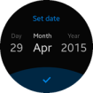
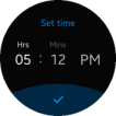
The UI components are wearable-friendly: for example, the Circle Datetime component extends the elm_date_time by visualizing the selected field, the Circle Genlist component provides a scrollbar with circular movement, and the Circle progress bar/scroller/slider components are adjusted to the circular design.
The wearable UI components were designed to allow the user to interact with small touch screen-equipped wearable devices with rotary component parts. Therefore, when developing wearable applications, you can easily use them through the wearable-related infrastructure in company with full notification and when reacting to touch and rotary events and the user finger size.
Table: Available UI components
| Category |
Component name |
Description |
| Navigation elements |
Index |
The index component provides an index for fast access to another group of UI items. |
| Presentation views |
Win |
The win component is the root window component that will be often used in an application. It allows you to create some content in it, and it is handled by the window manager. |
| Background |
The background component can be used to set a solid background decoration to a window or a container object. It works like an image, but has some background specific properties, such as setting it to tiled, centered, scaled, or stretched. |
| Genlist |
The genlist component displays a scrollable list of items. It can hold a lot of items while still being fast and memory-efficient (only the visible items are allocated memory). |
| List |
The list component is a very simple list for managing a small number of items. If you need to manage a lot of items, use the genlist component instead. |
| Label |
The label component displays text with simple HTML-like markup. |
| Image |
The image component can load and display an image from a file or from memory. |
| Icon |
The icon component inherits from the image component. It is used to display images in an icon context. |
| Progressbar |
The progressbar component can be used to display the progress status of a given job. |
| User input |
Button |
The button component is a simple push button. It is composed of a label icon and an icon object, and has an auto-repeat feature. |
| Check |
The check component toggles the value of a Boolean between true and false. |
| Radio |
The radio component can display 1 or more options, but the user can only select one of them. The UI component is composed of an indicator (selected/unselected), an optional icon, and an optional label. Even though it is usually grouped with 2 or more other radio components, it can also be used alone. |
| Entry |
The entry component is a box to which the user can enter text. |
| Slider |
The slider component is a draggable bar that is used to select a value from a range of values. |
| Datetime |
The datetime component can display and input date and time values. |
| Assist views |
Popup |
The popup component shows a pop-up area that can contain a title area, a content area, and an action area. |
| Ctxpopup |
The ctxpopup component is a contextual popup that can show a list of items. |
| Notify |
The notify component displays a container in a specific region of the parent object. It can receive some content, and it can be automatically hidden after a certain amount of time. |
| Transition |
Transit |
The transit component can apply several transition effects to an Evas object, such as translations and rotations. |
| Hardware acceleration |
GLView |
The GLView component can render OpenGL in an Elementary object, hiding EvasGL complexity. |
| Miscellaneous |
Plug |
The plug component allows you to show an Evas object created by another process. It can be used anywhere like any other Elementary UI component. |
The following UI components were designed for specific circular wearable devices which have rotary component parts. In a circular device, you can draw round UI components, such as a slider, progressbar, and scroller. Generally, wearable UI components provide compatibility between the rectangular and circular wearable devices. However, use circular UI components for circular wearable devices only, because they have a dependency with the round UX and rotary events. For more information on the compatibility of the UI components between rectangular and circular, see the Wearable Design guidelines.
Table: Available circular UI components
| Component name |
Description |
| Circle Datetime |
The circle datetime extends elm_datetime by visualizing the selected field. |
| Circle Genlist |
The circle genlist provides a scrollbar with circular movement. It is also operated with rotary events to move to the next or previous item. |
| Circle Object |
The circle object extends elementary components in a form of circular design. Sometimes a circle object merely provides additional UI features to elementary component, and sometimes it works as an independent component with UI and functionalities.
Circular components can usually be added with the eext_circle_object_[component_name]_add() function, which returns a circle object handle. Circular components are shown in a form of an arch with radius, line width, and color. These properties can be set with the eext_circle_object_item* APIs. The circle object can also take a rotary event. Generally, a clockwise rotary event increases the value of the rotary event activated by the circle object, and a counter clockwise rotary event decreases the value.
|
| Circle Progressbar |
The circle progressbar aims to show the progress status of a given task with circular design. It visualizes the progress status within a range. |
| Circle Scroller |
The circle scroller changes corresponding to the rotary events. It shows the whole scrollable area with a circular scroll bar. |
| Circle Slider |
The circle slider changes corresponding to rotary events. The circle slider not only extends the UI feature of the elm_slider, but also replaces the functionalities of the elm_slider in a circular design. |
| Circle Surface |
The circle surface manages and renders circle objects. Multiple circle objects can be connected to one circle surface as candidates of an object to be rendered. |
| Rotary Selector |
The rotary selector shows multiple items around a selector, and can change pages through rotary events. |
| More Option |
The more option contains a cue button, which, when clicked, reveals a rotary selector view. |
| Circle Spinner |
The circle spinner shows a spinner value as a marker around the circular display. |
Wearable Rectangular UI Component Styles
EFL can separate the GUI and logic of each UI component, resulting in each component having a different style of look. To change the styles of UI components, use the elm_object_style_get() and elm_object_style_set() functions to get and apply the style for a specific UI component.
The following tables list the styles for each winset, including the names of the styles, and the name of the part where to set text or some other Evas_Object in the UI component. For more detailed information, see Themes.
Table: Button styles
| Style |
Sample |
Text part |
Swallow part |
Notes |
| default |
 |
elm.text |
elm.swallow.content |
|
| green |
 |
elm.text |
elm.swallow.content |
|
| orange |
 |
elm.text |
elm.swallow.content |
|
| red |
 |
elm.text |
elm.swallow.content |
|
| nextdepth |
 |
|
|
|
| naviframe/title_icon |
 |
|
elm.swallow.content |
The icon can be set with the elm_object_part_content_set(btn, "icon", ic) function. |
Table: Check styles
| Style |
Sample |
| default |
 |
| on&off |
 |
Table: Contextual popup (Ctxpopup) styles
| Style |
Sample |
Notes |
| default |
 |
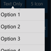
Use the elm_ctxpopup_item_append() function to add both text and an icon to the list. |
Table: Datetime styles
| Style |
Sample |
| datepicker_layout |
 |
| timepicker_layout |
 |
Table: Entry styles
| Style |
Sample |
Text part |
Swallow part |
Notes |
| default |
 |
elm.guide: for the guide text.
elm.text: for the main text.
|
|
The guide text is automatically erased when the main text is entered. |
Table: Index styles
| Style |
Sample |
| thumbnail |
 |
| tab |
 |
Table: Popup styles
| Style |
Sample |
| default |
 |
| toast |
 |
Table: Progressbar styles
| Style |
Sample |
| default |
 |
| pending_list |
 |
| process |
 |
| process/groupindex |
 |
Table: Radio styles
| Style |
Sample |
| default |
 |
Table: Slider styles
| Style |
Sample |
Swallow part |
| horizontal/default |
 |
elm.swallow.icon |
Wearable Circular UI Component Styles
EFL can separate the GUI and logic of each UI component, resulting in each component having a different style of look. To change the styles of UI components, use the elm_object_style_get() and elm_object_style_set() functions to get and apply the style for a specific UI component.
The following tables list the styles for each winset, including the names of the styles, and the name of the part where to set text or some other Evas_Object in the UI component.
Table: Button styles
| Style |
Sample |
Text part |
Swallow part |
| default |
 |
elm.text |
elm.swallow.content |
| bottom |
 |
elm.text |
elm.swallow.content |
Table: Check styles
| Style |
Sample |
| default |
 |
| small |
 |
| on&off |
 |
Table: Contextual popup (Ctxpopup) styles
| Style |
Sample |
Notes |
| select_mode |
 |
|
| select_mode/top |
 |
Pair this style with select_mode/bottom. |
| select_mode/bottom |
 |
Pair this style with select_mode/top. |
Table: Datetime styles
| Style |
Sample |
| datepicker/circle |
 |
| timepicker/circle |
 |
Table: Entry styles
| Style |
Sample |
Text part |
Swallow part |
Notes |
| default |
 |
elm.guide: for the guide text.
elm.text: for the main text.
|
|
The guide text is automatically erased when the main text is entered. |
Table: Index styles
| Style |
Sample |
| thumbnail |
 |
| circle |
 |
Table: Popup styles
| Style |
Sample |
| circle |
 |
| toast/circle |
 |
Table: Progressbar styles
| Style |
Sample |
| process |
 |
| process/small |
 |
Table: Radio styles
| Style |
Sample |
| default |
 |
Table: Slider styles
| Style |
Sample |
Swallow part |
| horizontal/default |
 |
elm.swallow.icon |
| Note |
| Except as noted, this content is licensed under LGPLv2.1+. |


