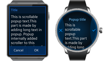
Popup
This feature is supported in wearable applications only.
The popup component shows a popup area that can contain the following:
- Title area (optional)
- Content area
- Action area (optional)
The optional title area can contain an icon and text, the action area can contain up to 3 buttons.
For more information, see the Popup API.
Figure: Popup component

Figure: Popup hierarchy

Adding a Popup Component
To create a popup component, use the elm_popup_add() function:
Evas_Object *popup, *parent;

// Create a popup
popup = elm_popup_add(parent);
Using Popup Styles
The following item styles are available for the rectangular screen:
- popup
- toast
The following item styles are available for the circular screen:
- circle
- toast/circle
The following layout styles are available for the circular screen:
- content/circle
- content/circle/buttons1
- content/circle/buttons2
The following example sets the style of the popup to toast.
elm_object_style_set(popup, "toast");
Setting the Popup Areas for a Rectangular Screen
To set the popup areas:
-
Configure the title area. Set the icon object using the part name title,icon. Set the title text as Test popup using the partname title,text.
elm_object_part_text_set(popup, "title,text", "Test popup");
-
Set the content of the popup. The content can be simple text.
elm_object_text_set(popup, "simple text");
The content can also be an Evas object.
Evas_Object *content;

elm_object_content_set(popup, content);
-
Set the buttons of the action area by creating an OK button, a Cancel button, and a Help button:
Evas_Object *button1, *button2;

// Create the 2 buttons
button1 = elm_button_add(popup);
elm_object_style_set(button1, "popup");
evas_object_size_hint_weight_set(button1, EVAS_HINT_EXPAND, EVAS_HINT_EXPAND);
elm_object_text_set(button1, "Cancel");

button2 = elm_button_add(popup)
elm_object_style_set(button2, "popup");
evas_object_size_hint_weight_set(button2, EVAS_HINT_EXPAND, EVAS_HINT_EXPAND);
elm_object_text_set(button2, "OK");

evas_object_show(popup);

// Set the buttons to the action area
elm_object_part_content_set(popup, "button1", button1);
elm_object_part_content_set(popup, "button2", button2);
Setting the Popup Areas for a Circular Screen
-
Set the circle style and the layout of the popup.
// Setting the style
elm_object_style_set(popup, "circle");

// Setting the layout
layout = elm_layout_add(popup);
elm_layout_theme_set(layout, "layout", "popup", "content/circle/buttons2");
-
To configure the title area, set the title text to Test popup using the elm.text.title partname.
// Setting the title text
elm_object_part_text_set(layout, "elm.text.title", "Text popup");
-
Set the content of the popup. The content can be simple text.
elm_object_part_text_set(layout, "elm.text.content", "Test popup");
The content of the popup can also be an Evas object.
Evas_Object *content;

elm_object_content_set(layout, content);
-
Set the popup content:
elm_object_content_set(popup, layout);
-
Set the buttons of the action area by creating an OK button, a Cancel button, and a Help button:
Evas_Object *button1, *button2, *icon;

// Create the 2 buttons

button1 = elm_button_add(popup);
elm_object_style_set(button1, "popup/circle/left");
icon = elm_image_add(button1);
elm_image_file_set(icon, ICON_DIR"/b_option_list_icon_share.png", NULL);
evas_object_size_hint_weight_set(icon, EVAS_HINT_EXPAND, EVAS_HINT_EXPAND);
elm_object_part_content_set(button1, "elm.swallow.content", icon);
evas_object_show(icon);

button2 = elm_button_add(popup);
elm_object_style_set(button2, "popup/circle/right");
icon = elm_image_add(button2);
elm_image_file_set(icon, ICON_DIR"/b_option_list_icon_delete.png", NULL);
evas_object_size_hint_weight_set(icon, EVAS_HINT_EXPAND, EVAS_HINT_EXPAND);
elm_object_part_content_set(button2, "elm.swallow.content", icon);
evas_object_show(icon);

// Set the buttons to the action area
elm_object_part_content_set(popup, "button1", button1);
elm_object_part_content_set(popup, "button2", button2);
Using Popup Callbacks
The popup component emits the following signals:
-
timeout: The popup is closed as a result of timeout.
The elm_popup_timeout_set() function is used to hide the popup after a certain time. In the following example, the timeout is set to 5 seconds.
elm_popup_timeout_set(popup, 5.0);
When the timeout expires, the timeout signal is sent to the user.
{ evas_object_smart_callback_add(popup, "timeout", _timeout_cb, data); } static void _timeout_cb(void *data, Evas_Object *obj, void *event_info) { dlog_print(DLOG_INFO, LOG_TAG, "Timeout \n"); } -
block,clicked: The user clicks on the blocked event area.
The visible region of the popup is surrounded by a translucent region called blocked event area. By clicking on this area, the signal block,clicked is sent to the application.
| Note |
|---|
| Except as noted, this content is licensed under LGPLv2.1+. |

