
UI Components
The UI component management features allow you manage the UI components and their focus on the screen, as well as create customizations. The Elementary library provides several UI components than can be used to compose the user interface of your application.
This feature is supported in wearable applications only.
The main features of UI component management are:
-
Scaling UI components
Enables you to scale UI components in order to be comfortably used with a finger and make text more readable.
-
Using UI components
Enables you to build your application without having to reinvent basic objects, such as buttons, lists, or text entries.
Scaling UI Components
Elementary, through its configuration API (elm_config), provides a way to scale UI components with two different parameters. Finger size parameter is used when the interactive zones (clickable, editable) of the UI components need to be scaled in order to be comfortably used with a finger. Scale parameter is responsible for scaling readable parts of a UI component (text or icons for example), so that it is more visible in the user interface.
Finger Size
Finger size parameter scales UI components based on the user's finger size. This is useful when using a touchscreen with a finger rather than with a stylus. The finger size parameter is in pixels and determines the minimum size of a square on the screen that is reliably hittable with a finger. This parameter scales the input and interactive areas.
The global finger size is set with the elm_config_finger_size_set() function. This adjusts the size and hit area of UI components so they are easy to hit with a finger. The current value is retrieved with the elm_config_finger_size_get() call. The finger size is always in pixel.
To increase the current global finger size by 20px:
Evas_Coord finger_size;

// Get the current finger size
finger_size = elm_config_finger_size_get();

// Add 20px to finger size parameter and set it
// to the global Elementary configuration
elm_config_finger_size_set(finger_size + 20);
Scale
This parameter only scales the readable areas of the UI component (text, icons). Parts that must stay pixel-perfect like the highlights, shading, textures and decorations stay as they are.
elm_config_scale_set() function is used to set the global scaling factor, that affects to all the UI components. It is also possible to use elm_object_scale_set() to set the scaling factor on a given Elementary UI component and all its children.
| Note |
|---|
| The scaling factor is multiplicative, if a child already has a scale size set, it is multiplied by its parent's scale size. |
The following example sets the global scaling factor to 2.0. Then, the scaling factor of an existing Elementary object is set to 2.0, meaning that this object appears as if it had a 4.0 scale factor, the rest of the application is displayed with a 2.0 scaling factor:
Evas_Object *button;

// The button object is created and configured

// Set the global scale factor to 2.0
elm_config_scale_set(2.0);

// Set the scaling factor of the button component to 2.0, this component
// appears 4 times bigger than its initial size
elm_object_scale_set(button, 2.0);
Example
This chapter shows the visual result of finger size and scaling factors modification.
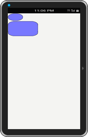
Figure: elementary_config application
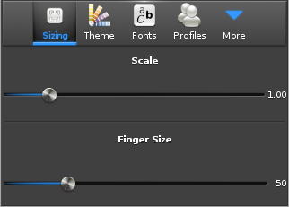
The previous picture shows the elementary_config application that enables the user to set global scale factor and finger size parameter. As the user drags the sliders, the UI is updated, directly showing the result of the new parameter value.
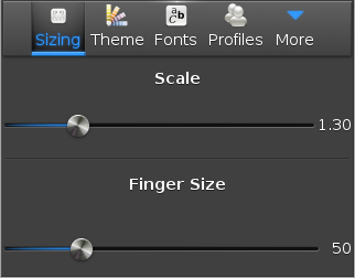
The next picture shows the behavior when the finger size parameter has been increased to 1.30. The text of the sliders and the text of the items in the toolbar are bigger.
Figure: Scale increased (1.30)
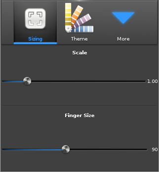
A finger size increase is showed in the image below (increase from 50px to 90 px). Now, the buttons in the toolbar are bigger, so the user can more reliably hit them with a big finger.
Figure: Finger size increased (90px)
| Note |
|---|
| It is up to the theme (Edje file) to set the parts that are scalable. This is something that needs to be taken into account when developing a new Edje theme. This can be done in EDC with the scale parameter. Refer to the Edje guide for more information on how to do that. |
Creating Scalable EDC Objects
Scale Parameter
This chapter explains how to make a scalable Edje object and give hints how to write an EDC file that is scalable. The example shows a basic button that is composed of a background image part and a swallow part that can receive some content.
group
{
   name: "button";
   images
   {
      image: "bg.png" COMP;
   }
   parts
   {
      part
      {
         name: "bg";
         type: IMAGE;
         description
         {
            state: "default" 0.0;
            image.normal: "bg.png";
         }
      }
      part
      {
         name: "elm.swallow.content";
         type: SWALLOW;
         description
         {
            state: "default" 0.0;
            visible: 0;
         }
         description
         {
            state: "visible" 0.0;
            visible:1;
         }
      }
   }
}
To have a scalable object, set the scale parameter to 1 on the parts you want to be scalable as explained in the scalability chapter of the Edje guide. Here the bg and elm.swallow.content parts must be scalable.
group
{
   name: "button";
   images
   {
      image: "bg.png" COMP;
   }
   parts
   {
      part
      {
         name: "bg";
         type: IMAGE;
         scale: 1;
         description
         {
            state: "default" 0.0;
            image.normal: "bg.png";
         }
      }
      part
      {
         name: "elm.swallow.content";
         type: SWALLOW;
         scale: 1;
         description
         {
            state: "default" 0.0;
            visible: 0;
         }
         description
         {
            state: "visible" 0.0;
            visible:1;
         }
      }
   }
}
Image Set
If your application needs to be used at different resolutions it is recommended to have 2 images for the background image bg.png. Here the bg_low.png is added to the application. It is used when the size of the image is under 500 px, and a bg_high.png image is for higher resolutions. Use a set on the bg.png image as explained in the Using Image Set chapter of the Edje guide.
group
{
   name: "button";
   images
   {
      set
      {
         name: "bg.png";
         image
         {
            image: "bg_low.png" COMP;
            size: 0 0 200 100;
         }
         image
         {
            image: "bg_high.png" COMP;
            size: 201 101 5000 5000;
         }
      }
   }
}
The image below shows three buttons with only a background part visible (the SWALLOW part is empty).
Figure: Image set example
The first button's size is 100x50 pixels, the background image (bg_low.png) is the same size. The second button is twice bigger than the first one (200x100 pixels). The image is scaled and it does not render well, the borders are quite blurry.
To prevent this, the image set has a bigger image to use when the size is bigger than 200x100 pixels (bg_high.png). The third button size is 201x101 pixels and it uses the new image, which has a better quality than the scaled image.
Image Borders
When the button is resized, the image part is also resized because it is marked as scalable. To get the image resized but to keep the image border as it is, use the border parameter. It specifies the border size which is not resized even if the image is. This is explained in the Border resizing chapter of the Edje guide.
To add a 40 pixel border on the left and right part of the bg image and a 20 pixel border on top and bottom borders:
parts
{
   part
   {
      name: "bg";
      type: IMAGE;
      scale: 1;
      description
      {
         state: "default" 0.0;
         image.normal: "bg.png";
         image.border: 40 40 20 20;
      }
   }
}
The image below shows that when resizing the button, the corners keep their initial ratio. Only the middle part of the button is resized.
Figure: Border example
Using UI Components
Figure: Elementary
The Elementary library is a simple toolkit. It provides several UI components than can be used to compose the user interface of your application. UI components allow you to build your application without having to reinvent basic objects, such as buttons, lists, or text entries. UI components will often generate signals that can be caught in the application when the user interacts with the UI components. This guide teaches you the basics of Elementary, describes selected concepts of the Elementary configuration framework, and describes the most common UI components.
Elementary Basics
In this chapter, we explain how UI components are built in a hierarchical manner, how to build a minimal Elementary application, and what the differences are between the callbacks that can be registered for UI components.
Elementary Configuration
Elementary can be configured using profiles. These chapters detail some configuration items that can be modified to tweak the use of Elementary.
Managing Elementary Profiles and Configuring Elementary Options
Components
| Category | Component name | Description |
|---|---|---|
| Navigation elements | Index | The index component provides an index for fast access to another group of UI items. |
| Presentation views | Win | The win component is the root window component that will be often used in an application. It allows you to create some content in it, and it is handled by the window manager. |
| Background | The background component can be used to set a solid background decoration to a window or a container object. It works like an image, but has some background specific properties, such as setting it to tiled, centered, scaled, or stretched. | |
| Genlist | The genlist component displays a scrollable list of items. It can hold a lot of items while still being fast and memory-efficient (only the visible items are allocated memory). | |
| List | The list component is a very simple list for managing a small number of items. If you need to manage a lot of items, use the genlist component instead. | |
| Label | The label component displays text with simple HTML-like markup. | |
| Image | The image component can load and display an image from a file or from memory. | |
| Icon | The icon component inherits from the image component. It is used to display images in an icon context. | |
| Progressbar | The progressbar component can be used to display the progress status of a given job. | |
| User input | Button | The button component is a simple push button. It is composed of a label icon and an icon object, and has an auto-repeat feature. |
| Check | The check component toggles the value of a Boolean between true and false. | |
| Radio | The radio component can display 1 or more options, but the user can only select one of them. The UI component is composed of an indicator (selected/unselected), an optional icon, and an optional label. Even though it is usually grouped with 2 or more other radio components, it can also be used alone. | |
| Entry | The entry component is a box to which the user can enter text. | |
| Slider | The slider component is a draggable bar that is used to select a value from a range of values. | |
| Datetime | The datetime component can display and input date and time values. | |
| Assist views | Popup | The popup component shows a pop-up area that can contain a title area, a content area, and an action area. |
| Ctxpopup | The ctxpopup component is a contextual popup that can show a list of items. | |
| Notify | The notify component displays a container in a specific region of the parent object. It can receive some content, and it can be automatically hidden after a certain amount of time. | |
| Transition | Transit | The transit component can apply several transition effects to an Evas object, such as translations and rotations. The use of the transit component is documented in the Creating Animations and Effects guide. |
| Hardware acceleration | GLView | The GLView component can render OpenGL in an Elementary object, hiding EvasGL complexity. |
| Miscellaneous | Plug | The plug component allows you to show an Evas object created by another process. It can be used anywhere like any other Elementary UI component. |
Circle components extend the UI features and provide functionalities optimized for the circular UI.
| Component name | Description |
|---|---|
| Circle Datetime | The circle datetime extends elm_datetime by visualizing the selected field. |
| Circle Genlist | The circle genlist provides a scrollbar with circular movement. It is also operated with rotary events to move to the next or previous item. |
| Circle Object | The circle object extends elementary components in a form of circular design. Sometimes a circle object merely provides additional UI features to elementary component, and sometimes it works as an independent component with UI and functionalities.
Generally, circle components can be added with the eext_circle_object_[component_name]_add() function, which returns a circle object handle. Circle components are shown in a form of an arch with radius, line width, and color. These properties can be set with the eext_circle_object_item* APIs. The circle object can also take a rotary event. Generally, a clockwise rotary event increases the value of the rotary event activated by the circle object, and a counter clockwise rotary event decreases the value. |
| Circle Progressbar | The circle progressbar aims to show the progress status of a given task with circular design. It visualizes the progress status within a range. |
| Circle Scroller | The circle scroller changes corresponding to the rotary events. It shows the whole scrollable area with a circular scroll bar. |
| Circle Slider | The circle slider changes corresponding to rotary events. The circle slider not only extends the UI feature of the elm_slider, but also replaces the functionalities of the elm_slider in a circular design. |
| Circle Surface | The circle surface manages and renders circle objects. Multiple circle objects can be connected to one circle surface as candidates of an object to be rendered. |
| Rotary Selector | The rotary selector shows multiple items around a selector, and can change pages through rotary events. |
| More Option | The more option contains a cue button, which, when clicked, reveals a rotary selector view. |
| Circle Spinner | The circle spinner shows a spinner value as a marker around the circular display. |
UI Component Focus
You can programmatically change the focus of UI components in an EFL application.
UI Component Styles
You can apply styles to various UI components to change their appearance.
UI Component Customization
You can use themes and styles to customize the look and feel of UI components.
Containers
All applications use containers to create the layout of their UI. The EFL and Elementary support several ways to create this layout. You can use a predefined layout or an animated layout, or you can create your own layout.
In this guide, we look at how to use the different containers provided by Elementary.
| Container name | Description |
|---|---|
| Box | One of the most simple containers in the EFL is a box. |
| Conformant | A conformant is a container component that accounts for the space taken by the indicator, virtual keyboard, and softkey windows. |
| Grid | In a grid, objects are placed at specific positions along a fixed grid. |
| Layout | A layout is a container component that takes a standard Edje design file and wraps it very thinly in a UI component. |
| Mapbuf | A mapbuf is a container component that uses an Evas map to hold a content object. This UI component is used to improve the moving and resizing performance of complex UI components. |
| Naviframe | A naviframe component consists of a stack of views. New views are pushed on top of previous ones, and only the top-most view is displayed. |
| Scroller | A scroller holds (and clips) a single object and allows you to scroll across it. |
| Table | A table is like a box but with 2 dimensions. |
