Flexible Layouts in Web Applications
PUBLISHED
Introduction
When creating mobile application, you have to decide if you want to support different screen orientations or just display application in one orientation (portrait by default). When you hold your device horizontally (landscape orientation) the viewport’s width is a longer edge. When you hold your device vertically (portrait orientation) the viewport’s width is a shorter edge. Moreover, we can hold device in portrait/landscape primary or secondary orientation. The difference is shown in the picture below.
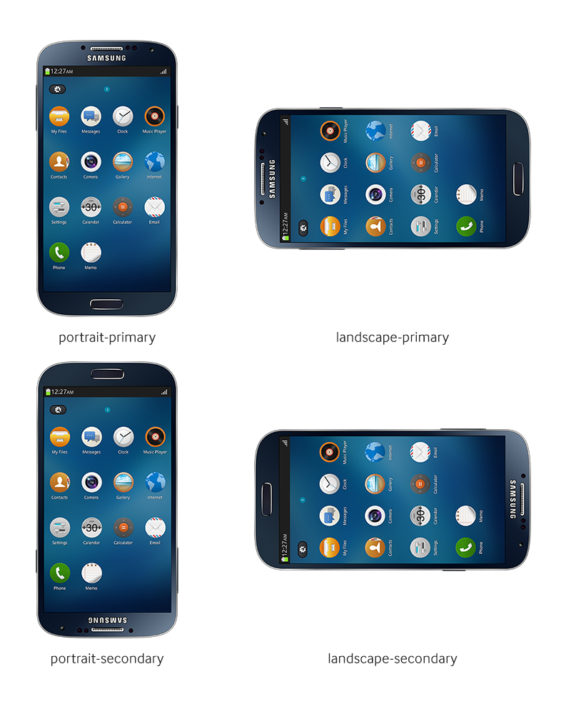
Different screen orientations
Take a look at where the Home button is positioned in each orientation. When you hold device in portrait-secondary orientation you actually hold the device upside down.
Good application’s design should utilize different screen orientations and display different layout for each of them. Some applications can display additional data on the side when displayed in a landscape mode, others can display the same data in a different way. Making the application look appealing in both cases is not an easy task. We will investigate this subject and give some clues on how to make it right in the Tizen applications.
Prerequisites
First of all, you have to enable orientation change feature in Settings menu in your Tizen device (or emulator). To turn it on, go to the Settings > Display and enable Auto rotate screen option, like shown in the picture below.
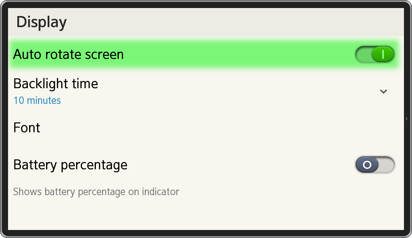
Auto rotate screen option turned on
Now, when rotating device you should see in some applications that screen orientation is also changing. Your application is set to portrait mode by default. We have to change it in config.xml file. Open it and go to the Tizen tab. In the setting section you should see few drop down menus, one of which is labeled screen-orientation. Change its value from portrait to auto-rotate. Now your application will automatically respond to device orientation changes.
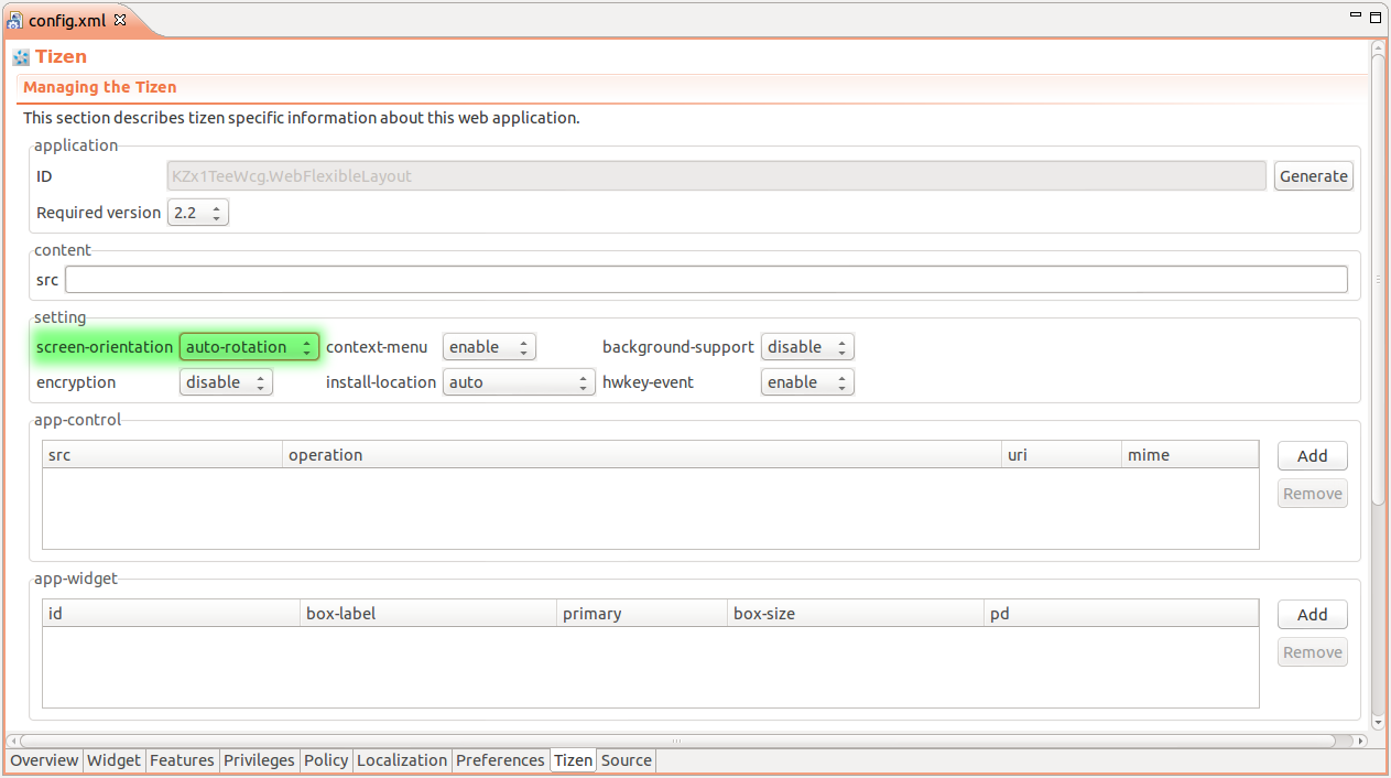
Setting screen-orientation option in config.xml file
Additionally, we will be using hardware back key, so we have to enable hwkey-event option in the same setting section, in the config.xml file.
Getting screen orientation
There are three ways to get device orientation value in the Tizen OS. We can get it utilizing Tizen API or by using W3C API.
Tizen API
The device orientation value is system information, so we can get it by using the following code.
tizen.systeminfo.getPropertyValue('DEVICE_ORIENTATION', function (device) {
    console.log(device.status);
});
getPropertyValue method takes 3 arguments: name, success callback and error callback function. The success callback receives the device orientation information object as a first argument. The orientation information object has two properties:
- status – stores current device orientation. It can be one of the following: PORTRAIT_PRIMARY, PORTRAIT_SECONDARY, LANDSCAPE_PRIMARY, LANDSCAPE_SECONDARY.
- isAutoRotate – stores information about the state of the Auto rotate screen option, indicating whether Tizen should rotate screen when device orientation changes.
W3C API
The simplest way to get device orientation using W3C API is with the following code.
console.log(screen.orientation);
// or
console.log(window.orientation);
The difference between screen.orientation and window.orientation is that the first one stores string representation of the screen orientation. It can be one of the following: portrait-primary, portrait-secondary, landscape-primary, landscape-secondary.
The window.orientation property stores an angle by which the device is rotated. It can be one of the following:
- 0 – corresponds to portrait-primary,
- 90 – corresponds to landscape-primary,
- 180 – corresponds to portrait-secondary,
- -90 – corresponds to landscape-secondary.
Locking screen orientation
Anytime you can decide to programmatically lock the screen orientation change.
screen.lockOrientation('portrait-primary');Now, even though the device is rotated it will not affect the screen orientation. To unlock screen orientation change just type.
screen.unlockOrientation();
Detecting screen orientation change
To detect screen orientation change we can use Tizen API or W3C API. They differ a little bit, so take a look on both of them.
Tizen API
The tizen.systeminfo object has addPropertyValueChangeListener method that listens to changes of some of the system properties and executes callback function when that change occurs.
tizen.systeminfo.addPropertyValueChangeListener('DEVICE_ORIENTATION', function (device) {
    console.log(device.status);
});
The first argument passed to addPropertyValueChangeListener method is the same object type like in getPropertyValue method, so we have status and isAutoRotate properties. Status property is a string representation of device orientation value. It’s one of the following: PORTRAIT_PRIMARY, PORTRAIT_SECONDARY, LANDSCAPE_PRIMARY, LANDSCAPE_SECONDARY.
W3C API
W3C introduced OrientationChange event to deal with detection of device’s orientation change. We can listen to this event in the following way.
window.onorientationchange = function (e) {};
// or
window.addEventListener('orientationchange', function (e) {});
The event object (e) passed to a listener function does not contain device orientation information. We have to get this information manually. We can use one of the functions from the “Getting screen orientation” section in this article. See the example below.
window.addEventListener('orientationchange', function () {
    console.log(screen.orientation); // WARNING! Wrong value!
    console.log(window.orientation);
    tizen.systeminfo.getPropertyValue('DEVICE_ORIENTATION', function (device) {
        console.log(device.status);
    });
});
You have to notice that screen.orientation property stores wrong value when printed in onOrientationChange event’s listener, actually it stores previous state’s value. To make it work we can wrap this line with setTimeout function with delay set to 0.
window.addEventListener('orientationchange', function () {
    console.log(screen.orientation); // WARNING! Wrong value!
    setTimeout(function () {
        console.log(screen.orientation); // Proper value.
    }, 0);
});
Conditional styling
Thanks to CSS3 we can prepare one HTML backbone for application layout and change its visual appearance depending on screen orientation (screen width). We will use @media rules to achieve this. The most popular @media rules for flexible layouts are min-width and max-width.
@media all and (max-width: 480px) {
    /* This code will take effect only when viewport width is under 480px */
    div {
        background-color: red;
    }
}
As you can see in the code above, we declared a media rule for viewports that are not wider than 480 pixels. In effect, DIV elements will have red background only when media rules are fulfilled. In mobile devices (especially Tizen devices) we have additional media rule called orientation that we declare in following way.
@media all and (orientation: portrait) {
    /* This code will take effect only when device is in portrait orientation */
    div {
        background-color: red;
    }
}
The above code will only affect DIV elements when device is in portrait orientation. In this simple way, we can control how layout is displayed depending on viewport width and device orientation. If you want to support more than one platform you should specify both (min/max)-width and orientation rules. Example media rules that should work for most smart phones could look like this.
@media all and (max-width: 480px) and (orientation: portrait) {
    /* portrait */
}

@media all and (min-width: 480px) and (max-width: 768px) {
    /* landscape */
}
Now we have all the needed information to make a simple application displaying different layouts depending on screen orientation.
Sample application
The sample application attached to this article is titled WebFlexibleLayout and presents information about planets of the Solar System. The application consists of two layout elements, menu with the list of planets of Solar System and element displaying information about given planet after clicking its name in the menu. Layout changes when device is rotated. Take a look at the screenshots below to see how each layout looks like.
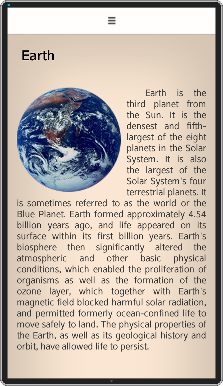
Layout for portrait viewport orientation of sample application
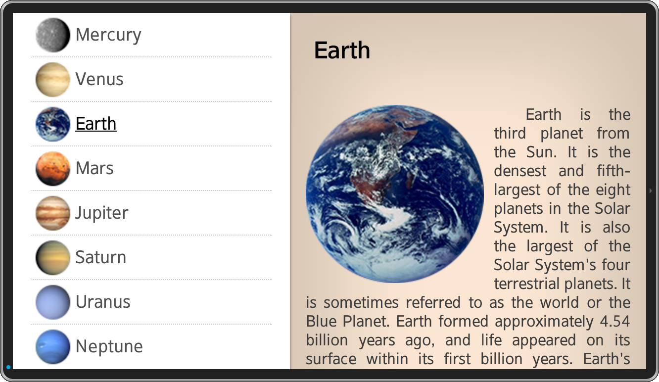
Layout for landscape viewport orientation of sample application
As you can see, in portrait mode, application takes use of all the screen space to display information about given planet and only a narrow bar on the top of the screen is dedicated for menu. Menu is folded by default and we can expand it by clicking on the bar or by swiping down on it. The picture below shows how the menu looks like when it’s unfolded.
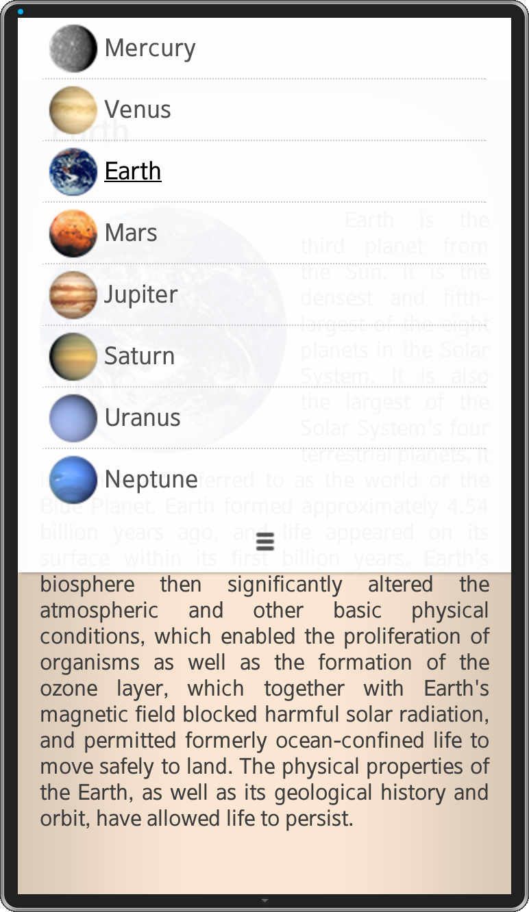
Unfolded menu in portrait viewport orientation of sample application
We can fold the menu again by swiping up on it or by clicking icon at the bottom of the menu. Let’s examine the most important parts of the application.
HTML
First of all we had to prepare the HTML skeleton of the application, which is presented in the below listing.
<body>
  <section class="menu-section folded">
    <ul class="menu">
      <li class="menu-item selected"><img src="images/mercury-m.png" /><span>Mercury</span></li>
      <li class="menu-item"><img src="images/venus-m.png" /><span>Venus</span></li>
      <li class="menu-item"><img src="images/earth-m.png" /><span>Earth</span></li>
      <li class="menu-item"><img src="images/mars-m.png" /><span>Mars</span></li>
      <li class="menu-item"><img src="images/jupiter-m.png" /><span>Jupiter</span></li>
      <li class="menu-item"><img src="images/saturn-m.png" /><span>Saturn</span></li>
      <li class="menu-item"><img src="images/uranus-m.png" /><span>Uranus</span></li>
      <li class="menu-item"><img src="images/neptune-m.png" /><span>Neptune</span></li>
      <li class="toggle"><img src="images/menu.png" /></li>
    </ul>
  </section><section class="desc-section">
    <div class="description" id="mercury">
      <h2>Mercury</h2>
      <p><img src="images/mercury.png" /><!-- Planet description --></p>
    </div>
    <div class="description" id="venus" style="display: none">
      <h2>Venus</h2>
      <p><img src="images/venus.png" /><!-- Planet description --></p>
    </div>
    <div class="description" id="earth" style="display: none">
      <h2>Earth</h2>
      <p><img src="images/earth.png" /><!-- Planet description --></p>
    </div>
    <div class="description" id="mars" style="display: none">
      <h2>Mars</h2>
      <p><img src="images/mars.png" /><!-- Planet description --></p>
    </div>
    <div class="description" id="jupiter" style="display: none">
      <h2>Jupiter</h2>
      <p><img src="images/jupiter.png" /><!-- Planet description --></p>
    </div>
    <div class="description" id="saturn" style="display: none">
      <h2>Saturn</h2>
      <p><img src="images/saturn.png" /><!-- Planet description --></p>
    </div>
    <div class="description" id="uranus" style="display: none">
      <h2>Uranus</h2>
      <p><img src="images/uranus.png" /><!-- Planet description --></p>
    </div>
    <div class="description" id="neptune" style="display: none">
      <h2>Neptune</h2>
      <p><img src="images/neptune.png" /><!-- Planet description --></p>
    </div>
  </section>
</body>
In the body DOM element we have two section elements for holding menu and planets’ descriptions. Each planet description is placed in the separate div element with proper id value.
Menu consists of ul element styled properly. A class named folded can be assigned to the menu section div element which styles menu in the way that makes it stuck to the upper edge of the screen (only in the portrait orientation).
Stylesheet
The element that changes the most after rotating the screen is menu. Take a look at how we styled menu and description sections depending on the screen orientation.
@media all and (max-width: 480px) and (orientation: portrait) {
  section {
    display: block;
    width: 100%;
  }
  .desc-section {
    top: 45px;
    width: 100%;
  }
  .menu-section {
    width: 100%;
    background-color: rgba(255, 255, 255, 0.95);
    /*box-shadow*/
    -webkit-box-shadow: 2px 0px 4px rgba(0, 0, 0, 0.5);
    -moz-box-shadow: 2px 0px 4px rgba(0, 0, 0, 0.5);
    box-shadow: 2px 0px 4px rgba(0, 0, 0, 0.5);
    /*transition*/
    -webkit-transition: top 1s;
    -moz-transition: top 1s;
    -o-transition: top 1s;
    transition: top 1s;
  }
  .menu-section.folded {
    top: -360px;
  }
}

@media all and (min-width: 480px) and (max-width: 768px) {
  section {
    display: inline-block;
  }
  .desc-section {
    left: 43.75%;
    width: 56.25%;
  }
  .menu-section {
    height: 100%;
    width: 43.75%;
    background-color: rgb(255, 255, 255);
    /*box-shadow*/
    -webkit-box-shadow: 0px 2px 4px rgba(0, 0, 0, 0.5);
    -moz-box-shadow: 0px 2px 4px rgba(0, 0, 0, 0.5);
    box-shadow: 0px 2px 4px rgba(0, 0, 0, 0.5);
  }
  .toggle {
    display: none;
  }
}
In landscape mode we set display property of section tags to inline-block value to put them side by side, and to default block in portrait orientation. When displaying them in side by side, we position them and set their width to fill the whole screen.
The menu section has position property set to fixed to always display it in the same position on the screen. In portrait mode we add additional rules to make unfolding and folding animation of menu.
-webkit-transition: top 1s;
When menu section is folded, we set its top property to -360px to hide it above top edge of the screen.
.menu-section.folded {
  top: -360px;
}
One more important thing is z-index property of elements. We had to put menu section above the description section so we set z-index to 2 and 1 values accordingly.
.desc-section {
    /* ... */
    z-index: 1;
}

.menu-section {
    /* ... */
    z-index: 2;
}
JavaScript
The JavaScript code is quite simple. First thing we do is getting screen orientation. We do it at the application start…
orientation = screen.orientation.substr(0, screen.orientation.indexOf('-'));… and when device orientation changes.
tizen.systeminfo.addPropertyValueChangeListener('DEVICE_ORIENTATION', function (e) {
  orientation = e.status.toLowerCase().substr(0, e.status.indexOf('_'));
});
We take only the first part of the screen orientation information (i.e. PORTRAIT and LANDSCAPE strings – so the use of substr method) from a string that is in the following format: [ORIENTATION]_[PRIMARY/SECONDARY]. Then we make it lowercase.
We use information about screen orientation, when the user clicks back hardware button of the device. When the device is in portrait mode and the menu is unfolded and user clicks back button, first thing we do is folding menu and clicking back button again will close the application.
document.addEventListener('tizenhwkey', function (e) {
    if (e.keyName === 'back') {
        if (!$menu.hasClass('folded') && orientation === 'portrait') {
            $menu.addClass('folded');
        } else {
            tizen.application.getCurrentApplication().exit();
        }
    }
});
Another thing we do with menu is toggling its visibility. We do it in two ways. The first one is by clicking icon in the bottom bar of the menu which just toggles the folded class of the menu section.
$menu.on('click', '.toggle', function () {
    $menu.toggleClass('folded');
});
Another way to unfold or fold menu is swiping it down or up. To do this, we have to use touch events (touchstart, touchmove, touchend). We measure the distance (dist variable) in Y axis that makes only one finger (touches.length === 1). When touch starts, we store the Y position of touch in start variable. When finger is moved we measure current Y position of the finger and calculate the distance. When the distance is positive it means that we want to unfold menu, and negative value means that we fold menu. One more important thing is using preventDefault method of the touchmove event to prevent scrolling the planet description when moving finger in the area of the menu section.
var start = null;
$menu.on('touchstart touchmove touchend', function (e) {
    var touches = e.originalEvent.changedTouches,
        dist = 0;

    if (touches.length === 1) {
        if (e.type === 'touchstart') {
            start = touches[0].pageY;
        } else if (e.type === 'touchmove') {
            e.preventDefault();

            dist = touches[0].pageY - start;
            if (dist > 20) {
                $menu.removeClass('folded');
            } else if (dist < -20) {
                $menu.addClass('folded');
            }
        } else if (e.type === 'touchend') {
            prev = null;
        }
    }
});
When user clicks any option in the menu, proper description is shown and others are being hidden and we scroll description to the top.
$menu.on('click', '.menu-item', function () {
    var $menuItem = $(this);
    var planetName = $menuItem.text().toLowerCase();

    $descriptions.hide();
    $descriptions.filter('#' + planetName).show();

    $menuItems.removeClass('selected');
    $menuItem.addClass('selected');

    window.scrollTo(0, 0);
});
Summary
An amount of work when making flexible layouts depends on how complex you want it to be. I hope that I showed in this article that making simple flexible layout isn’t hard thing to do. After reading this article you should be able to create your own layouts. If you want more details, please investigate the application’s code attached to this article.