CSS3 Animations with keyframes
PUBLISHED
Introduction
The times when static websites were common have gone away a long time ago. With introduction of Flash, websites became more vivid and interactive. However, Flash is being slowly replaced by HTML5 that has similar capabilities and is based on open standards. It is the future of the Web and mobile applications. To give developers possibility to create keyframe animations, W3C introduced CSS3 Animations. They allow animating HTML elements, specifically the CSS3 properties of elements. I will introduce you to CSS3 Animations.
The CSS3 Animation specification is still a working draft and Tizen implements its version from March 20, 2009. Because of that you have to write the ‘webkit’ prefix before each identifier.
Keyframes
Very simple animations can be created using the CSS3 Transitions. It allows only changing the CSS3 properties values with single animation. If you want to create more complex animations with properties’ values changing multiple times, you have to use keyframes that are part of the W3C CSS3 Animations specification. In CSS3 a keyframe is a definition of properties’ values in a given time. We declare keyframe animation using @-webkit-keyframes keyword (we have to use webkit prefix as long as specification is a working draft) and specifying animation name. Next, between curly braces, we declare animation’s keyframes. Each keyframe can contain a properties list and their values that will change over time. Look at the example below.
@-webkit-keyframes animation-name {
    from {
        width: 100px;
    }
    to {
        width: 200px;
    }
}
In this sample code two frames are defined, one for the animation’s beginning (‘from’) and second for the animation’s end (‘to’). It animates element’s width from 100 pixels to 200 pixels. Notice, that we gave this animation the name ‘animation-name’, which will be used later.
Having only two keyframes of animation is equal to using CSS3 Transitions. We can add more keyframes. We define them by giving the percentage value of animation’s duration. When we create a keyframe on 50% of animation’s length in a 4-second animation, it means that after 2 seconds element’s width should be equal to the specified value. The example will explain everything.
@-webkit-keyframes animation-name { // Let's assume that animation lasts 4 seconds.
    0% { // After 0 seconds.
        width: 100px;
    }
    50% { // After 2 seconds.
        width: 300px;
    }
    100% { // After 4 seconds.
        width: 200px;
    }
}
As you can see, we have replaced the ‘from’ keyframe with 0% and ‘to’ keyframe with 100%. You can change the order of the keyframes’ definitions without affecting the animation. It’s also possible to define many keyframes in one set by separating percentage values with a comma.
@-webkit-keyframes animation-name { // Let's assume that animation lasts 4 seconds.
    0%, 75% { // After 0 seconds and after 3 seconds.
        width: 100px;
    }

    100% { // After 4 seconds.
        width: 200px;
    }

    50% { // After 2 seconds - different order doesn't affect animation.
        width: 300px;
    }
}
We can also define one keyframe many times overwriting the previous value with the new one. It’s useful when we define many keyframes in one set and then we want to overwrite some of the values for one of those keyframes.
@-webkit-keyframes animation-name { // Let's assume that animation lasts 4 seconds.
    0%, 50% { // After 0 seconds and after 2 seconds.
        width: 100px;
        height: 100px;
    }

    50% { // After 2 seconds.
        height: 400px; // We overwrite height value.
    }

    100% { // After 4 seconds.
        width: 200px;
        height: 200px;
    }
}
What properties can we animate?
We can only animate CSS properties whose intermediate values can be calculated. They are the same values that are used in the CSS3 Transitions which were discussed in the Working with CSS3 Transitions article.
Performing animations
In the examples above we’ve named the keyframes definition ‘animation-name’. Now, we will use this name to perform an animation. At the beginning we have to use the -webkit-animation-name property where we choose the animation name we want to perform. The next parameter we need is the animation time. We set it with the -webkit-animation-time property. Its value can be expressed in seconds (s) or milliseconds (ms). To apply an animation to an HTML element we have to set only these two properties.
div {
    -webkit-animation-name: animation-name;
    -webkit-animation-time: 4s;
}
There are a few more properties that can be set in order to control the animation. Let’s describe them.
-webkit-animation-timing-function
This property determines how animated properties change between given keyframes. Its value can be one of the following: linear, ease, ease-in, ease-out, ease-in-out, steps. They’re almost the same as the ones that can be applied in the CSS3 Transitions, so for more details I would suggest you to refer CSS3 Transition article. The default value is ‘ease’. Moreover, we can apply this property not only for the whole animation, but for each keyframe independently to control how fast properties’ values change over time.
@-webkit-keyframes animation-name {
    0% {
        width: 100px;
        -webkit-animation-timing-function: ease;
    }

    50% {
        width: 300px;
        -webkit-animation-timing-function: linear;
    }

    100% {
        width: 200px;
        -webkit-animation-timing-function: ease-in;
    }
}
We have to discuss the ‘step’ timing function. It’s a very powerful function that allows creating frame sequence animations. Instead of smoothly going between properties’ values of sibling keyframes, it just instantly changes properties’ values with each keyframe. Having sprite animation prepared we can move background in instant steps to achieve a frame sequence animation. We will cover it in details when talking about the sample application in the last chapter.
-webkit-animation-iteration-count
We have to set this property to control how many times animation should repeat. By default it is set to 1. So, we can set it to any integer value or infinite to repeat the animation forever.
-webkit-animation-direction
It controls in which direction the animation will be played. It can be set to one of the following values:
- normal – just play animation from the beginning to the end,
- reverse – play animation backwards starting from the last keyframe and going down to the first one,
- alternate – play animation from the beginning to the end and then backwards (-webkit-animation-iteration-count property value has to be multiply of 2 to see the effect),
- alternate-reverse – it’s a combination of the two previously described methods. It’s playing animation back and forth but starting from the last keyframe and going down to the first one.
-webkit-animation-play-state
Thanks to this property, we can pause an animation. We can set this property to the ‘paused’ value for some class selector and toggle this class on some animated element after clicking it. Look at the example below. By adding and removing the ‘pause’ class from the DIV element that is being animated we can check if the animation is playing or not.
@-webkit-keyframes 'animation-name' {
    from { width: 100px; }
    to { width: 200px; }
}

div {
    height: 100px;
    background: black;
    -webkit-animation: 2s 'animation-name' infinite;
}
.pause {
    -webkit-animation-play-state: paused;
}
-webkit-animation-delay
By setting this property’s value we can delay the animation execution. The property’s value can be in seconds (s) or in milliseconds (ms) and the default value is 0s.
-webkit-animation-fill-mode
This property determines what animation values will be set to the element after the animation is completed. It accepts the following options:
- none – element goes back to the initial state (before the animation was started),
- forwards – properties’ values from the last keyframe of the animation will be set to the element after the animation finishes,
- backwards – properties’ values from the first keyframe of the animation will be set to the element before the animation starts (it only makes sense for animations with nonzero value of delay),
- both – follows both forwards and backwards rules.
-webkit-animation
This is a short version of all previously mentioned properties. We write one value after another separating them with spaces. The order is as follows: single-animation-name, time, single-animation-timing-function, time, single-animation-iteration-count, single-animation-direction, single-animation-fill-mode, single-animation-play-state. The order is not mandatory in all situations. You can read more about it in the documentation.
Animation events
CSS3 Animations provide three animation events: animationStart, animationInteration and animationEnd. Each one has to be written with the ‘webkit’ prefix. So, webkitAnimationStart is triggered when animation starts, webkitAnimationIteration is triggered after each iteration of the animation completes and webkitAnimationEnd is called after animation end. A callback function bound to the event gets an event object as function parameter. This object has some useful properties:
- animationName – the name of the animation that has started, ended or the iteration that took place,
- elapsedTime – time elapsed from the animation start.
Sample application
The sample application is a simple presentation of the CSS3 Animations features. The picture below shows an application screenshot.
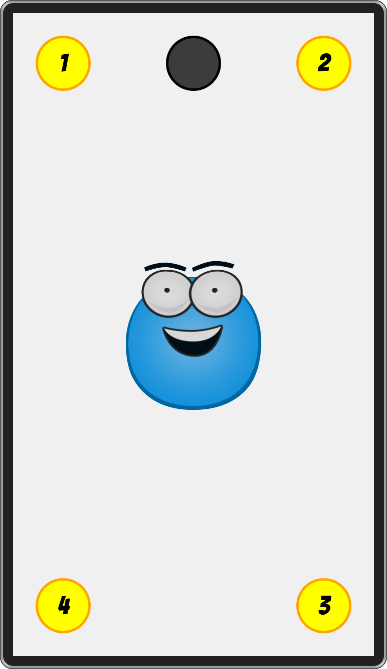 Fig 1 Application screenshot
In the center of the screen, there is a character that responds to user actions. When user clicks on any of the yellow circles in the corners, the character goes to this circle, animating while moving. Moreover, on the top of the screen, there is a black circle that turns green when animation takes place. Additionally, the character is constantly animated using frame sequence animations. We will explain how each of these features has been implemented.
We use the jQuery library in 2.0.0 version to simplify the user interaction with application. It’s the only external library that we use.
Frames sequence animation
The blue character in the middle of the screen is animated thanks to frames sequence animation. We had to prepare sprite image with each animation’s frame being positioned in sequence from the left to the right. The picture below shows how this sprite looks like.
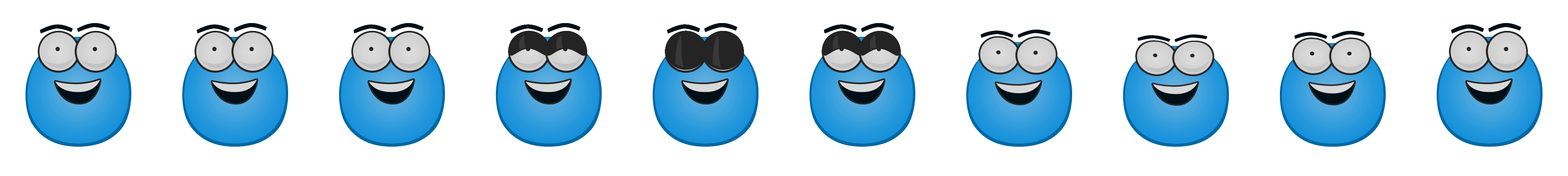 Fig 2 The sprite image with frames sequence
As you can see the sequence consists of ten frames representing the animation. This image is applied as the background image of the DIV element with ‘sprite’ class. Let’s check how this class looks like.
.sprite {
    position: absolute;
    left: 360px; top: 640px;
    margin-left: -200px;
    margin-top: -225px;
    width: 400px; height: 450px;
    background-image: url('../images/sprite.png');
    background-position: 0px 0px;
    -webkit-animation: sprite .8s steps(10) infinite;
}
We set the element’s size to 400px x 450px. The sprite image’s width is 4000 pixels, so it gives 10 frames. The background is moved to the (0px, 0px) position which is the first animation’s frame. We will have to move the background position to the left to make the animation. As you can see in the last line of the ‘sprite’ class, we used the ‘-webkit-animation’ property called ‘sprite’ which we will discuss in a moment. We set animation time to 0.8 seconds and we set the timing function to ‘step’ with 10 steps as a parameter. It creates a 10 frames animation and each frame is displayed with 0.08 seconds interval. We want to display this animation infinitely, so we’ve added the word ‘infinite’ at the end of the ‘-webkit-animation’ property.
The ‘sprite’ animation’s definition is even simpler. The background position is changed from the point (0px, 0px) to the point (-4000px, 0px). In each step the background is moved by 400 pixels to the left.
@-webkit-keyframes sprite {
   from { background-position:     0px 0px; }
     to { background-position: -4000px 0px; }
}
Moving the character
By clicking yellow circles we move the character to the chosen corner. The type of the animation of moving the character depends on which circle we click. So, we have defined four classes with different animations for each clicked circle. These classes will be applied to our character when the user clicks a circle. Each class’s animation lasts 1 second and is delayed by 200 milliseconds. The timing function was set to ease. The character is first moving towards the circle and going back to the center of the screen, so it’s why we set iterations count to 2 and animation direction to alternate.
.animation-1 { -webkit-animation: animation-1 1s ease 200ms 2 alternate; }
.animation-2 { -webkit-animation: animation-2 1s ease 200ms 2 alternate; }
.animation-3 { -webkit-animation: animation-3 1s ease 200ms 2 alternate; }
.animation-4 { -webkit-animation: animation-4 1s ease 200ms 2 alternate; }
Let’s take a look at the animations’ keyframes definition.
@-webkit-keyframes animation-1 {
    50% {
        left: 100px; opacity: 0.25; -webkit-transform: scale(0.5);
    }
    100% {
        left: 100px; top: 100px;
    }
}
@-webkit-keyframes animation-2 {
    50% {
        top: 100px;
    }
    100% {
        left: 620px; top: 100px; -webkit-transform: rotate(360deg) scale(0.6); -webkit-filter: saturate(0%);
    }
}
@-webkit-keyframes animation-3 {
    50% {
        top: 1180px;
    }
    100% {
        left: 620px; top: 1180px; -webkit-transform: scale(0.4, 0.4) ro-tate(720deg); -webkit-filter: hue-rotate(-80deg);
    }
}
@-webkit-keyframes animation-4 {
    50% {
        top: 1180px;
    }
    100% {
        left: 100px; top: 1180px; -webkit-transform: scale(0.4, 0.4) skewX(-30deg);
    }
}
Each animation consists of two keyframes. We used several CSS properties to animate. We animate position, rotation, scale, hue, saturation and skew. Rotation, scale and skew are controlled by the CSSS Transforms, about which you can read in the official specification. Hue and saturation are controlled by the CSS3 Filters about which you can read here.
Now take a look at how user’s actions affect our character.
addAnimation = function (id) {
    if (id >= 1 && id <= 4) {
        sprite.addClass('animation-' + id);
    }
};

$('.point').on('click', function (e) {
    var point;

    point = $(this);
    if(!sprite.is('.animation-1, .animation-2, .animation-3, .animation-4')) {
        addAnimation(parseInt(point.attr('id').replace('point-', ''), 10));
    }

    e.stopPropagation();
    e.preventDefault();
});
We’ve bound the callback function to the ‘click’ event for all yellow circles. First, we check if any animation is already assigned to the character. If there is no animation class assigned, then we can add one depending on what circle was clicked. We do it with the ‘addAnimation()’ function. It takes the number of the animation it should add to our character. The ‘sprite’ object is holding our character’s DIV element.
sprite = $('#sprite');Animation events
The last thing to discuss is the fallback information about animation being performed. The black indicator at the top of the screen is turning green when an animation is running. It doesn’t take into account the delay time, so the circle will light on only when the delay time is over and the appropriate animation takes place.
First, we have to bind functions to the animation start and the animation end events using the ‘on()’ jQuery function.
sprite.on({
    'webkitAnimationStart': function (e) {
        if (e.originalEvent.animationName !== 'sprite') {
            indicator.addClass('start');
        }
    },
    'webkitAnimationEnd': function (e) {
        if (e.originalEvent.animationName !== 'sprite') {
            removeAnimation(e.originalEvent.animationName);
            indicator.removeClass('start');
        }
    }
});
We have to check if the animation that called the event wasn’t animation named ‘sprite’. When an animation starts we add ‘start’ class to our indicator and when animation ends we just remove that class and class for the animation assigned to our character. We remove class from the character using the ‘removeAnimation()’ function which takes animation name as an argument. It removes a given animation or all animations if no name was specified.
removeAnimation = function (name) {
    sprite.removeClass(typeof name !== 'undefined' ? name : 'animation-1 anima-tion-2 animation-3 animation-4');
};
Summary
I hope that this article helped you understand basics of the CSS3 Animations. Now you should be able to create simple animations. However, creating more advanced animations would require some visual editor that would relieve you from monotonous work of specifying keyframes for the animation. There are tools that can help you with this task like Sencha Animator or Motion Composer.