


Starting from this lesson, let’s move from theory to practice. We will show you how to create demo applications that will be based on the use of several graphic components. At the beginning of each lesson, you will be able to see, which demo application this tutorial linked with.
During the next 6 lessons, we will show you how to create the first small application. It will contains the simplest standard layout, with text and button, clicking on which will change the text. Also, in the application will be a popup dialog window for confirming exit from the application. In one of these lessons, we will teach you how to add messages output to the Tizen Studio log window.
As a basis will be used template created in lessons 11. Basic project, required to begin implementation of the first demo application, is available here (WearUITemplate). In this lesson we will tell you about the layout, and will consider its standard styles and then will add this container to the demo application.
A layout is a container widget that can include a various number of objects. Number and type of objects are determined by the set theme (design). You can create a new layout using the following method:
Evas_Object *elm_layout_add(Evas_Object *parent);You can set the standard style, using the function:
Eina_Bool elm_layout_theme_set(Evas_Object *obj,
                               const char *class,
                               const char *group,
                               const char *style);
It is also possible to set your own custom layout style. To separate the design from the application logic, the style is marked up in a separate file using the EDC language. To set this style, you must specify to the layout the way to the compiled file with the .edj extension and the name of the group that is located in this file. Tizen Studio automatically compiles styles source code (files with the extension .edc) and places the resulting .edj files in the same area where the style source code is located. To specify path to such file, use the function:
Eina_Bool elm_layout_file_set(Evas_Object *obj,
                              const char *file,
                              const char *group);
Almost all widgets are inherited from the layout, so you can also use the layout API to manage widgets. For example, you can forward signals for a button from the C/C++ code to the EDC style code using the elm_layout_signal_emit() function. In this lesson, we will not look at user styles in detail, as this is a topic for more skilled Tizen developers.
We will consider only standard styles.
Theme is design of user interface on the device. The theme defines size and behavior of simple widgets, containers and their components. Each widget can have several styles (appearance options).
In this lesson, we'll look at the layout styles from the themes for wearable devices with a round display version 2.3.1. These are the basic layouts, so in later versions of Tizen they most likely will remain unchanged. Here is a list of the most useful styles:
- elm/layout/application/default
- elm/layout/nocontents/default
- elm/layout/body_thumbnail/default
- elm/layout/bottom_button/default
- elm/layout/select_mode/default
- elm/layout/circle/datetime
The name of the layout style is a combination of class, group, and style. For each of these examples, class is "layout", then the group and style respectively. Let’s look at it more closely.
Style elm/layout/nocontents/default:
The first standard layout style has only two text fields ("elm.text.title", "elm.text") and icon field ("elm.swallow.icon"). You can add text using the method:
void elm_object_part_text_set(Evas_Object *obj,
                              const char *part,
                              const char *text);
Any item can be used as an icon. To set this style, use the function:
elm_layout_theme_set(Evas_Object *layout,
                     "layout",
                     "nocontents",
                     "default");
So, class for the model will be "layout", the group - "nocontents", the style - "default".


An example of using this style is the empty application manager. You can see it on the picture above.
Style elm/layout/application/default:
The following standard layout has two zones: "elm.swallow.bg" and "elm.swallow.content". In the first area you can place a picture or another layout that will serve as a background for this layout. The second zone is appropriate for any graphic element. The sizes of these two components are maximal and occupy the entire area where you place the layout with this style.
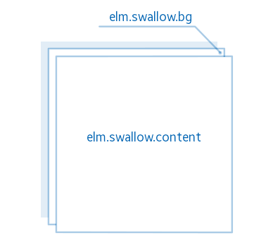
You can set this style using the function:
elm_layout_theme_set(Evas_Object *layout, "layout", "application", "default");Style elm/layout/bottom_button/default:
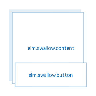
Style has two areas: content area "elm.swallow.content" and the button area at the bottom of the screen "elm.swallow.button".
Style elm/layout/select_mode/default:
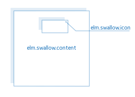
This layout style has two areas for content: "elm.swallow.content" and "elm.swallow.icon". The first zone occupies the entire area of the screen, the second - represents a rectangular area at the top of the layout, formatted in the middle. By default, the "elm.swallow.icon" area is not displayed. To change the visibility of the zone, in the style there are special programs that work by sending a signal to the layout. To send a signal, use following function:
void elm_layout_signal_emit(Evas_Object *obj,
                            const char *emission,
                            const char *source);
Thus, in order to "elm.swallow.icon" be displayed on the screen, it is necessary to call:
elm_layout_signal_emit(layout, "select_mode,button,show", "");And vice versa, to hide the zone, use "select_mode,button,hide" signal.
An example of using this style is selecting images in the gallery. In the content zone "elm.swallow.content", you can place a container (for example, a box) and fill it with elements. Use long press to show "elm.swallow.icon", where you can place an icon-indicator to count the selected items. Often this layout is paired with "elm/layout/body_thumbnail/default", which acts as the elements of the container.
Style elm/layout/circle/datetime:
The layout has the following appearance:

You can use an alias "elm/layout/circle/spinner". The style has two zones for placing user content: "elm.swallow.btn" – zone for the button, located at the lower part of the screen, "elm.swallow.content" zone, which is covering the whole screen, and a text block "elm.text" for the title. Area "elm.swallow.content" is intended for a date and time widget or a round spinner (look at lesson 10).
Style elm/layout/body_thumbnail/default:
The layout has the following appearance:

"elm.icon" is a content zone. This style is commonly used in conjunction with “elm/layout/select_mode/default” in the form of page elements, like selecting images in the gallery for a long press. After placing into this layout, the corners of the widget will be cut off (See the picture above).
Let's move on to the practice.
To create a new layout, add to the UIData structure another element - Evas_Object * layout.
typedef struct _UIData {
   Evas_Object *win;
   Evas_Object *conform;
   Evas_Object *layout;
} UIData;
Now create a separate function, in which add and configure a new layout.
static void
_layout_create(UIData *ui)
{
}
To create a container, call the following function:
ui->layout = elm_layout_add(ui->conform);The parent for the layout is a conformant, which means that the removal of the conformant automatically causes the deletion of the layout.
For the first demo application, the standard "elm/layout/bottom_button/default" layout is appropriate; add a button to the bottom of the screen.
To set the style, call the function:
elm_layout_theme_set(ui->layout, "layout", "bottom_button", "default");To display the layout on the screen, use the function:
evas_object_show(ui->layout);Call the function and place the layout in the conformant:
static void
_conformant_create(UIData *ui)
{
   ...

   _layout_create(ui);
   elm_object_content_set(ui->conform, ui->layout);

   ...
}
If you run the application now, you will see nothing but a black screen. In the following lessons, we will teach you how to create graphic elements and fill layout with them.
You can download the full source code of this lesson here WearLesson012. In the next lesson we will consider logging methods in Tizen.