


Lesson 10
In this lesson, we will consider the basics of creating a user interface in UI Tizen applications.
Creation of user interface of UI application starts from a window. This is the basic widget that represents your application; all screen components placed on it.
All elements of the user interface in Tizen are divided into widgets and containers. Containers are mostly responsible only for the widgets location and theirs size on the screen. Widgets are elements of information displaying or elements of control.
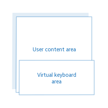
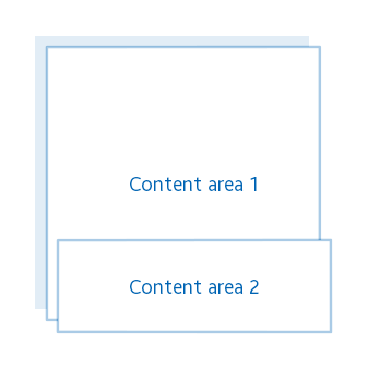
Let's see which containers from the Elementary library are available for us. A conformant is a container for using the system indicator and the system keyboard in your application. It will be placed on top of the application's graphic content. Below is an example of conformant layout.
Box is a container that places elements linearly (horizontally and/or vertically). You can specify an intermediate distance that will be used to separate the adjacent box elements.

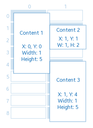
Grid allocates components in a grid with a specified size; each element occupies a position in accordance with given to it coordinates and amount of grid cells.

Layout is a very flexible type of container. You can create both standard and your own layouts. Also you may find standard layouts in the device themes (some of them we will consider in detail later). Moreover, there is an opportunity to create your own layout, with any configuration. Creating a layout, in general, reduces to specifying the relative coordinates of the areas into which widgets will be placed. It is also possible to create animations for this layout. Since for custom layouts creation, is used EDC markup language, these examples will be considered in the following lessons. Separation of the layout and the application logic is one of the advantages of this container.
The standard theme style of the "application" group, the "default" style:

The standard theme style of the "bottom_button" group, the "default" style:
User style (EDC) with any amount and location of content:

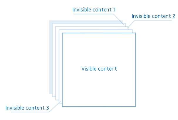
Naviframe is a container that stores the elements, placed in it in the form of a stack; only the top element is displayed. This container is convenient to use in multi-screen applications.
Scroller is a container that consists of a display area and a scroll bar. It allows containing only one element, but it makes possible scrolling the areas of this element if the size of the element is larger than the size of the scroller.
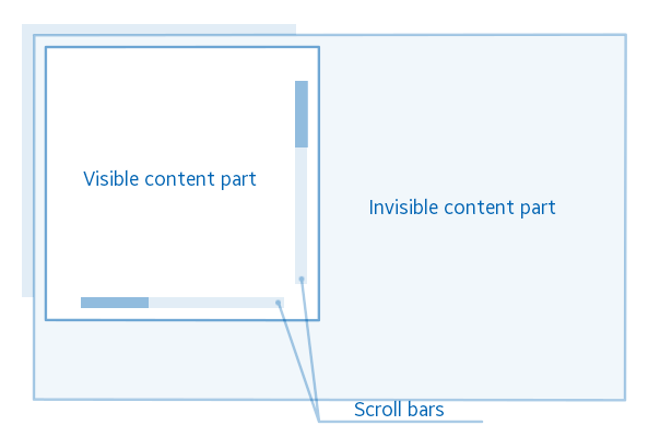
Table places the elements like a grid container, but it does not allow you to specify its dimensions. Table sizes are calculated automatically in accordance with cells in which the widgets are placed. But unlike the grid, it is possible to set an intermediate distance between neighboring cells horizontally and vertically, like in a container-box.
There are such available Elementary widgets:
Index Widget is a widget to display, for example, page numbering and number of the active page on the screen.

Background widget - is a widget used for setting the background of the application (fill with one color or set an image).

Dynamic list (genlist) is a widget that displays items in the scrollable area. It allocates memory for graphic information only for those items that are on the screen. Due to this, the widget is a very productive list, which allows you to add even a million items, while not losing productivity during scrolling.

List is a user friendly widget for displaying a relatively small list. For a large number of items, use a dynamic list.

Label - displays text; support HTML-like markup to change the text style.

Image widget allows you to display an image that is downloaded either from a file, or directly from a specified memory area. It is also possible to use the .gif animation instead of the static image.

Icon widget is a widget inherits from the image widget and used in the context of an icon, for example, in a button or in other widgets. There is a special functional for icon, which optimize memory usage. Let's say you are going to create 100 identical icons for a list. In this case, for such amount of images, widgets will use one memory area with graphic information of the image, instead of using 100 times more memory.

Progressbar is a widget with linear appearance, used to display the status of any process.

Button is a widget for receiving a signal from the user as a result of clicking on the screen in the area of this widget.
Check is a widget for reflecting the "on/off" status.

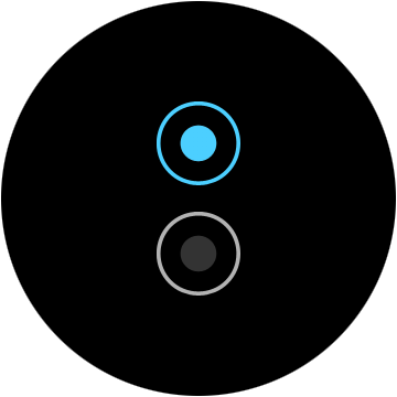
Switch (radio) is a widget that is commonly used immediately with several other such widgets in a group. The same as the Check widget it has two states: On and Off, but at the same time, in the group there is allowed only one Switch widget with the state On.
Entry is used by user for entering text information. The widget supports emoji, allows using the system keyboard for typing. In this case, it is required to use conformant container in your application.

Slider is used to set a value in a certain range, for example, by using this widget you can implement brightness settings.

The date and time widget (datetime) is a full-featured widget that allows user to enter a date and/or time.

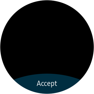
Popup window is a widget for displaying information about errors and additional data. It may have buttons to confirm user actions.

Contextual popup window (ctxpopup) - unlike the usual popup window, does not overlap the entire screen, but allows you to specify the coordinates where it will be displayed.

OpenGL widget (glview) is a special widget that displays a scene that is drawn by the OpenGL library.

Let’s consider widgets relate to the efl_extension library, these are extended widgets from the Elementary library. They have a special appearance, designed for a round display.
Rotary selector is a widget specially created for a round display that allows showing items on the screen in a circle. In case all items do not fit on one screen, there is opportunity to use multiple pages. Moreover, there is option to move between the elements, using the bezel scrolling.

The widget of additional options (more option) is a button placed on one of the four sides of the screen (left, right, top, bottom), when it is pressed, a round selector, with the elements placed in it, is displayed.

Circle progressbar is the same as a normal progressbar, but is designed for a round display.

Circle slider is the same as a usual slider, but designed for a round display. It allows changing the size using the bezel.

Circle spinner is widget that has a function similar to a circular slider. It allows to change the value using the bezel.

Circular scroller is the same as a usual scroll container, but it allows to scroll around the area using the bezel.

Circle genlist - despite the fact that this widget is called a dynamic list, it is rather a scroller, and the phrase "dynamic list" implies that this scroller is created specifically for displaying the current scrolling position in this list. It scrolls through the list using the bezel just like a round scroller does.

Circle datetime is a date and time widget, designed for the round screen. When the bezel rotates, depending on the active indicator, the values of the day, month, etc. changes.

Also round widgets have some additional functions for customization, but you can work with them like with regular widgets, using Elementary functions, for example, use elm_scroller_policy_set() for a round scroller.