Working with CSS3 Gradients
PUBLISHED
Note: This article describes CSS3 Gradients as part of the W3C CSS3 Image Values and Replaced Content API that works on Tizen. The document is Working Draft from 12 July 2011 and differs from the current version from 17 April 2012 which is Candidate Recommendation.
Now, you do not need to load bitmaps as background for gradient effect. CSS3 gives you possibility to create scalable gradient background using pure CSS3.
PhotoEditorGradientEffects sample application
The PhotoEditorGradientEffects sample application demonstrates how to use CSS3 Gradients to create the effect of smooth fade from one color to another, which you can use for example as a background image. The UI consists of: an image, a text area displaying the applied gradient, a button that restores the original input image (“Restore default”) and some menus of gradient's properties (‘Type’, ‘Parameters’, ‘Colors’), which you can use to modify the input image.
The ‘Type’ menu allows the change the type of created gradient. You can choose one of the following types: Linear, Radial, Repeating Linear, Repeating Radial. The last option (‘Clear’) displays the input image without any gradient. The ‘Parameters’ menu lets you set proper arguments for the function of the gradient. The ‘Colors’ menu allows to set the gradient’s starting and ending color.
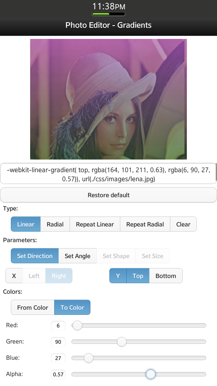
Figure 1 Sample application screen shot
The PhotoEditorGradientEffects sample application uses the full Tizen viewport (720x1280), includes jQuery Mobile 1.3.0 framework, jQuery 1.9.0 library and was tested on Tizen SDK version 2.1.0 final.
Introduction to CSS3 Gradients
Due to W3C specification:
“A gradient is an image that smoothly fades from one color to another. These are commonly used for subtle shading in background images, buttons, and many other things. The two functions described in this section allow an author to specify such an image in a terse syntax, so that the UA can generate the image automatically when rendering the page.”
A gradient can be used as the ‘background-image’ or ‘list-style-image’ property. It adapts to the size of the element to which it is applied.
Note: 'background-image' property sets a background image to the element. 'list-style-image' property sets a graphic as a marker in the list structure.
The syntax for <gradient> is:
<gradient> = [ <linear-gradient> | <radial-gradient> | <repeating-linear-gradient> | <repeating-radial-gradient> ]
<linear-gradient>, <radial-gradient>, <repeating-linear-gradient> and <repeating-radial-gradient> are functions creating an overlay for the element to which this gradient is applied.
CSS3 Gradients
Linear Gradients
The syntax of the linear-gradient function:
<linear-gradient> = linear-gradient(
        [[
               [ [ top | bottom ] || [ left | right ] ]
               |
               <angle>
        ],]?
        <color-stop>[, <color-stop>]+
        );
You can imagine the linear gradient as a line (gradient-line) connecting the starting and the ending point. The first argument of the linear-gradient() function defines the position of the starting point. To define it, you can use such keywords as: left, right, top, bottom or you can specify the angle. The first argument of the linear-gradient() function is optional. By default it is equal to ‘top’.
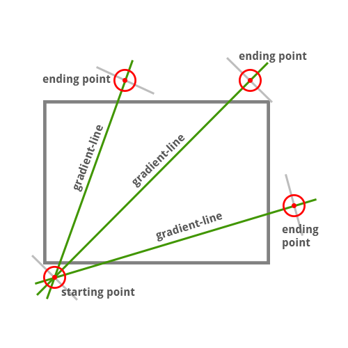
Figure 2 Gradient-line for the linear gradient
If you want to apply the linear-gradient to an element, you must add:
–webkit-linear-gradient(arguments);
as background-image CSS property value. Example:
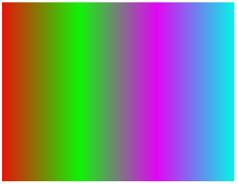
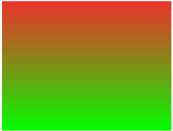
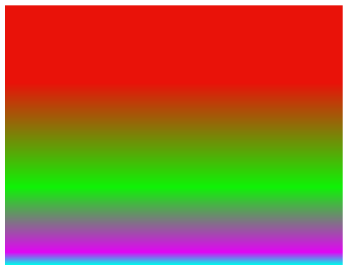
background-image: –webkit-linear-gradient (<pos>, rgb(233, 18, 9), rgb(15, 243, 6), rgb(224, 6, 243), rgb(6, 243, 234));
Depending on the value of <pos>, the output image with gradient can look as follows:
|
Figure 3 pos = top |
Figure 4 pos = bottom |
|
Figure 5 pos = left |
Figure 6 pos = right |

The effect of using an angle as the first parameter is shown later on figures 8 and 9.
The second parameter of the function is 'color-stop'. You must provide at least two 'color-stops'.
<color-stop> = <color> [ <percentage> | <length> ]?
The color of the gradient starts from the starting point’s color and smoothly fades to the ending point’s color (the starting and ending point positions: figure 2). The final color is reached in the 'ending point'. Defined color-stops are located between the starting (0%) and the ending point (100%) of the gradient-line. You can define the position of the color-stop adding percentage value after the color value (e.g. figure 11).
Examples of using Linear Gradients
The following examples demonstrate different ways of using the linear gradient function.
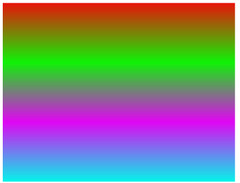
Figure 7
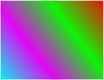
–webkit-linear-gradient(top right, rgb(233, 18, 9), rgb(15, 243, 6), rgb(224, 6, 243), rgb(6, 243, 234));
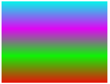
Figure 8
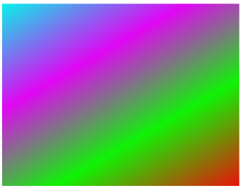
–webkit-linear-gradient(120deg, rgb(233, 18, 9), rgb(15, 243, 6), rgb(224, 6, 243), rgb(6, 243, 234));
Figure 9
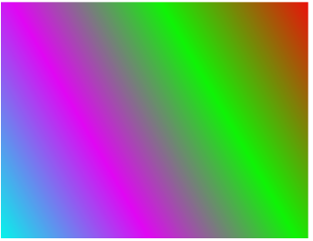
–webkit-linear-gradient(-150deg, rgb(233, 18, 9), rgb(15, 243, 6), rgb(224, 6, 243), rgb(6, 243, 234));
Figure 10
–webkit-linear-gradient( rgba(233, 18, 9, 0.86), #0f0);
Figure 11
–webkit-linear-gradient(rgb(233, 18, 9) 30%, rgb(15, 243, 6) 70%, rgb(224, 6, 243) 95%, rgb(6, 243, 234));
Radial Gradients
Unlike the linear gradient, the radial gradient starts from a single point and spreads out.
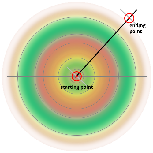
Figure 12 Example of a line connecting the starting point and one of ending points for radial gradient
The syntax of the radial-gradient function is as follows:
<radial-gradient> = radial-gradient(
        [<bg-position>,]?
        [[
               [<shape> || <size>]
               |
               [<length> | <percentage>]{2}
        ],]?
        <color-stop>[, <color-stop>]+
)
<bg-position> defines the center of the radial gradient. This argument is optional and by default equal to ‘center’. Available values for this argument are defined in Section 3.6 of W3C CSS Backgrounds and Borders Module Level 3 .
<bg-position> = [
  [ left | center | right | top | bottom | <percentage> | <length> ]
|
  [ left | center | right | <percentage> | <length> ]
  [ top | center | bottom | <percentage> | <length> ]
|
  [ center | [ left | right ] [ <percentage> | <length> ]? ] &&
  [ center | [ top | bottom ] [ <percentage> | <length> ]? ]
]
The second argument of the function can define the shape and/or size of the radial gradient. The shape is defined as:
<shape> = [ circle | ellipse ]
And the size is defined as:
<size> = [ closest-side | closest-corner | farthest-side | farthest-corner | contain | cover ]
More information about sizes of the radial gradient can be found at this page.
The shape and size of the gradient can be also defined using two lengths or percentage values. The first value means the width of the gradient, the second – the height. Of course, both values must be non-negative. Examples:
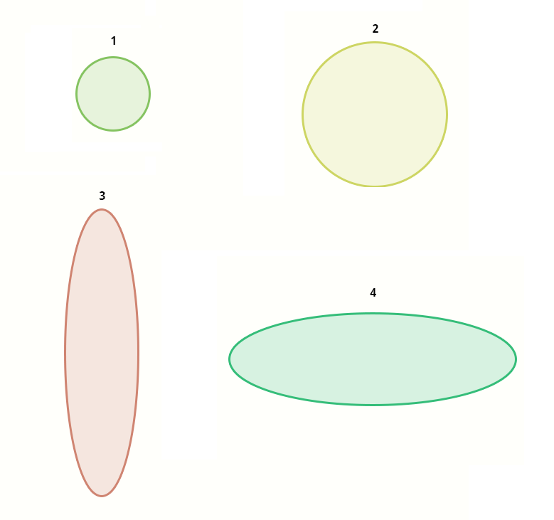
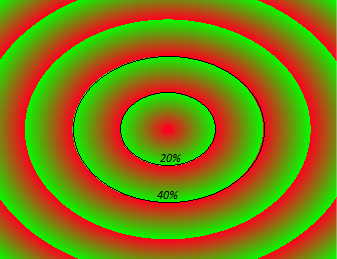
Let us imagine that we have the element with dimensions 500px on 500px to which we want to apply a gradient. To get the shape and size of the gradients illustrated above the second argument should be defined as:
- 100 px 100 px or 20% 20% (because 100px / 500px = 20%),
- 200px 200px or 40% 40%
- 100 px 400px or 20% 80%
- 400px 125px or 80% 25%
Figure 13 Figure shows the shape and size of the gradient according to used lengths or percentage values
The second argument of the radial gradient is optional and by default set to ‘ellipse cover’.
Because the first and the second arguments are optional, if only one is provided, it can be interpreted as the position. So, if you want to define the second argument as length or percentage, you should define the first argument explicitly.
The color-stop function has been described earlier.
Examples of using Radial Gradients
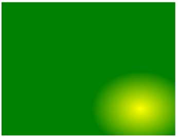
–webkit-radial-gradient(80% 80%, closest-corner, yellow, green);
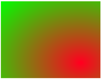
–webkit-radial-gradient(80% 80%, farthest-corner, red, green);
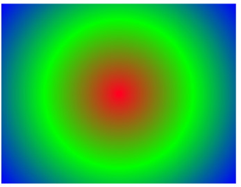
–webkit-radial-gradient(circle, rgb(255, 0, 31), #0f0, blue);
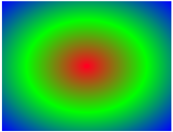
–webkit-radial-gradient(ellipse, rgb(255, 0, 31), #0f0, blue);
Repeating Gradients
We can distinguish two types of repeating gradients: repeating-linear-gradient and repeating-radial-gradient. Both are interpreted in the same way as the two corresponding functions described previously: linear-gradient and radial-gradient.
Syntax of functions:
<repeating-linear-gradient> = repeating-linear-gradient(
        [[
               [ [top | bottom] || [left | right] ]
               ||
               <angle>
        ],]?
        <color-stop>[, <color-stop>]+
)

<repeating-radial-gradient> = repeating-radial-gradient(
        [<bg-position>,]?
        [[
               [<shape> || <size>]
               |
               [<length> | <percentage>]{2}
        ],]?
        <color-stop>[, <color-stop>]+
)
The thing which differs from the previously defined non-repeating gradients is the repeatability of color-stops. As mentioned before:
<color-stop> = <color> [ <percentage> | <length> ]?
Where [ <percentage> | <length> ] means position of the color-stop. For:
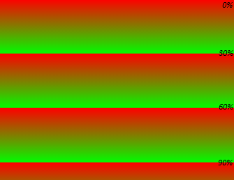
-webkit-repeating-linear-gradient(top, rgb(255, 0, 0) 0%, rgb(0, 255, 0) 30%);
The gradient starts from the top of the image (0%) and spreads to 30% of the image down, to the position of the second color stop. Then, the first color stop is located (again!) and spreads to 60% of the image down, etc. Described gradient is illustrated below:
Figure 14
Note: Where the repeating gradient is defined as follows (where <image_height> is self explainable):
–webkit-repeating-linear-gradient(rgb(255, 0, 31) 0%, #0f0 100%);
–webkit-repeating-linear-gradient(rgb(255, 0, 31) 0px, #0f0 <image_height>);
It looks the same as the non-repeating linear gradient.
Examples of using Repeating Gradients
Example of Repeating Linear Gradient
Figure 15
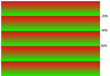
–webkit-repeating-linear-gradient(rgb(255, 0, 31), #0f0 20%);
Example of Repeating Radial Gradient
Figure 16
–webkit-repeating-radial-gradient(rgb(255, 0, 31), #0f0 20%);
How does the Sample Application work?
The element (to which gradients are applied) is defined in the index.html file in the following way:
<div id="image-with-gradient"></div>
Style of the element is defined in the style.css file:
#image-with-gradient{
    background-image: url(../css/images/lena.jpg);
    width: 520px;
    height: 400px;
    margin-left: 100px;
    margin-top: 10px;
}
The input image (to which the gradient will be applied) is lena.jpg. The UI elements (buttons, sliders and checkboxes) represent the properties of the gradient. Changing the parameters is reflected in the image. Initial values of the applied gradient are stored in the defaultProperties object.
    // default properties of gradient
    var defaultProperties = {
        fromColor : {
            red : 255,
            green : 255,
            blue : 255,
            alpha : 0.5
        },

        toColor : {
            red : 0,
            green : 0,
            blue : 0,
            alpha : 0.5
        },

        toPosition : {
            xEnable : false,
            yEnable : false,
            x : 'right',
            y : 'top'
        },

        angle : 0,
        shape : 'circle',
        size : 'def',
        type : 'linear'
    };
At startup the application creates a deep copy of the defaultProperties object.
var properties = jQuery.extend(true, {}, defaultProperties);Changing any of the menu’s parameters changes attributes of the properties object and reflects on the output image, calling the setGradientOnImage() function.
/**
 * Sets gradient on the image
 */

var setGradientOnImage = function() {
    var css = "";
    // set type of gradient
    css += "-webkit-" + properties.type + "-gradient(";
    // set angle as first parameter of linear- or repeating-linear-gradient
    if ((properties.type === 'linear')
            || (properties.type === 'repeating-linear')) {
        if (properties.angle !== 0) {
            css += properties.angle + "deg, ";
        }
    }

    // set position of the starting point
    if (properties.toPosition.xEnable || properties.toPosition.yEnable) {
        if (properties.toPosition.xEnable) {
            css += properties.toPosition.x;
        }

        if (properties.toPosition.yEnable) {
            css += " " + properties.toPosition.y;
        }

        css += ", ";
    }

    // set shape of radial- or repeating-radial-gradient
    if ((properties.type === 'radial')
            || (properties.type === 'repeating-radial')) {
        css += properties.shape;
        if (properties.size !== 'def') {
            css += " " + properties.size + ", ";
        } else {
            css += ", ";
        }
    }

    // set starting and ending point color stops
    css += "rgba("
            + properties.fromColor.red
            + ", "
            + properties.fromColor.green
            + ", "
            + properties.fromColor.blue
            + ", "
            + properties.fromColor.alpha
            + ")"
            + ((properties.type === 'repeating-linear')
                    || (properties.type === 'repeating-radial') ? " 20%"
                    : "")
            + ", rgba("
            + properties.toColor.red
            + ", "
            + properties.toColor.green
            + ", "
            + properties.toColor.blue
            + ", "
            + properties.toColor.alpha
            + ")"
            + ((properties.type === 'repeating-linear')
                    || (properties.type === 'repeating-radial') ? " 50%"
                    : "") + ")";

    // display image as gradient background
    css += ", url(./css/images/lena.jpg)";

    // apply gradient to 'div' element
    $('#image-with-gradient').css('background-image', css);
    $('#used-gradient').val(css);
}
Summary
In this article you learned how to specify the gradient using pure CSS3. You can utilize CSS3 gradients in your application to:
- Create backgrounds for all elements of UI,
- Modify photos (images) by applying gradient effects to them,
- Omit setting the large-size bitmaps as application background,
- Create the scalable images without fear that gradient effect will not spread.
This is the second from a series of three articles. The first one “Working with CSS3 Filter Effects” can be found here.
Figures presented in this article show different gradient effects. The effect of applying these gradients to the image can be observed using the PhotoEditorGradientEffects sample application.