JQuery to Tizen UX Conversion Tutorial: Multi-Step Form Tutorial - Part 1
PUBLISHED
Overview
This article is part one of the two-part series that demonstrates the Multi-Step Form pattern. The Multi-Step sample application is based of jQuery multi-page template generated by Tizen Web IDE. The application demonstrates the design of multi-page forms for Tizen applications.
Note: This article explains about how to design a multi-step application and does not contain functionality of saving the forms data, etc.
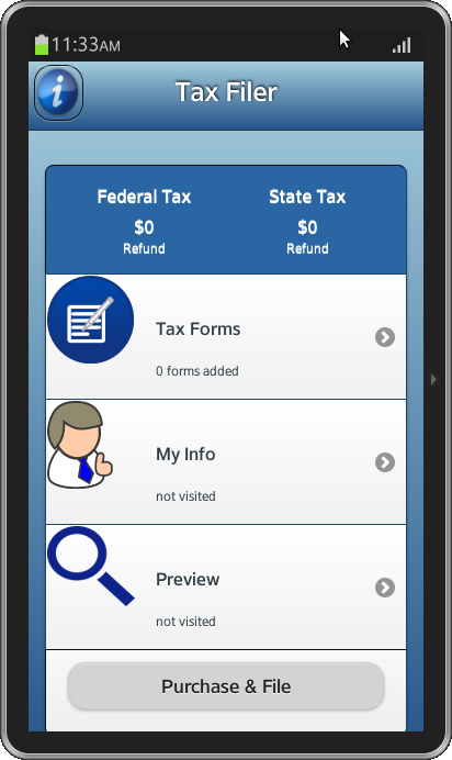
Main Screen
The application home page contains steps and submit button. Each step can be navigated to and fill in the required information. The total tax calculated can be displayed on home page like dash board.
The header contains a title along with two buttons displayed as images. When clicked, the right icon launches a popup.
<div id="ui-bg-header" data-role="header">
  <h1 id="ui-header-font">Tax Filer</h1>
    <a href="#" id="ui-btn-left"></a> <a href="#popup" id="ui-btn-right"
      data-rel="dialog" data-transition="pop"></a>
</div>
The steps on the home screen are displayed using list items and even the submit button in the bottom is a part of the list.
<ul data-role="listview" data-inset="true">
  <li id="ui-dashboard"><div class="ui-grid-a">
    <div style="float: left" class="ui-block-a">
      <h2 align="center">Federal Tax</h2>
      <h1 align="center">$0</h1>
      <p align="center">Refund</p>
    </div>
    <div style="float: right; border-style: solid;" class="ui-block-b">
      <h2 align="center">State Tax</h2>
      <h1 align="center">$0</h1>
      <p align="center">Refund</p>
    </div>
  </div></li>
  <li id="ui-taxForm"><a href="WebContent/form.html"> <img
    src="WebContent/images/edit-blue.png">
      <h2>Tax Forms</h2>
      <p class="numForms">0 forms added</p>
  </a></li>
  <li id="ui-myInfo"><a href="#"> <img
    src="WebContent/images/user-blue.png">
      <h2>My Info</h2>
      <p>not visited</p></a></li>
  <li id="ui-search"><a href="#"> <img
    src="WebContent/images/search-blue.png">
      <h2>Preview</h2>
      <p>not visited</p></a></li>
  <li id="ui-purchase"><div data-theme="b">
    <p class="ui-p-purchase">
      <a class="ui-btn-purchase" data-role="button">Purchase & File</a>
    </p>
  </div></li>
</ul>
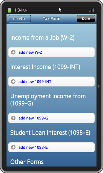
The Tax Forms item will navigate to a new page with options to enter all the information required for the form. The multiple forms in this page are displayed as collapsible sets.
<li id="ui-myInfo"><a href="#"> <img
  src="WebContent/images/user-blue.png">
    <h2>My Info</h2>
    <p>not visited</p></a></li>
<li id="ui-search"><a href="#"> <img
  src="WebContent/images/search-blue.png">
    <h2>Preview</h2>
    <p>not visited</p></a></li>
<li id="ui-purchase"><div data-theme="b">
  <p class="ui-p-purchase">
    <a class="ui-btn-purchase" data-role="button">Purchase &
      File</a>
  </p>
</div></li>
Each set contain forms needs to be filled. Upon completion, done button (in header) can be pressed to add the form.
The home screen can be upadated using
$('p.numForms').html("1 forms added");
CSS
CSS styles applied to header and buttons in home screen.
#ui-bg-header {
  background: -webkit-linear-gradient(top, rgba(167, 207, 223, 1) 0%,
    rgba(35, 83, 138, 1) 100% );
}

#ui-header-font {
  font-size: 1.5em;
}

#ui-btn-right {
  position: absolute;
  background: url("../WebContent/images/info-blue.png") no-repeat;
  background-size: 100% 100%;
  width: 12%;
  height: 80%;
}
You can set the color property to the text in the collapsible sets using
h2 .ui-btn-text{
  color: blue;
}
The styles applied to the header and buttons of the tax forms page.
#ui-frm-hdr {
  height: inherit;
  margin: 0px;
  width: 100%;
  font-weight: bold;
  overflow-x: hidden;
  overflow-y: hidden;
  background-image: -webkit-linear-gradient(top, rgba(167, 207, 223, 1) 0%,
    rgba(35, 83, 138, 1) 100% );
  width: 100%;
}

#frm-hdr-btn-1 {
  position: absolute;
  background-repeat: repeat-x;
  background: -webkit-linear-gradient(top, rgba(167, 207, 223, 1) 0%,
    rgba(35, 83, 138, 1) 100% );
  height: 30px;
  padding: 0 10px 0 8px;
  z-index: 0;
  border-radius: 6px;
  -webkit-border-top-left-radius: 10px 15px;
  -webkit-border-bottom-left-radius: 10px 15px;
  border-bottom: 1px solid rgba(255, 255, 255, 0.3);
  box-shadow: -1px -1px 0px rgba(0, 0, 0, 0.2) inset, 0 1px 2px
    rgba(0, 0, 0, 0.8) inset;
  display: block;
  color: white;
  font-size: 1.4em;
  text-shadow: 0px -1px 0px #000;
  -webkit-background-size: 30px;
}

#frm-hdr-btn-1:before {
  position: absolute;
  top: 9.9%;
  left: -5px;
  -webkit-background-size: 22px 22px;
  background-position: -2px -1.5px;
  background-color: -webkit-linear-gradient(top, rgba(167, 207, 223, 1) 0%,
    rgba(35, 83, 138, 1) 100% );
  background-image: -webkit-linear-gradient(top, rgba(167, 207, 223, 1) 0%,
    rgba(35, 83, 138, 1) 100% );
  height: 25px;
  width: 25px;
  -webkit-transform: rotate(-45deg) skew(-10deg, -10deg);
  -webkit-border-top-right-radius: 100px 40px;
  -webkit-border-top-left-radius: 30px 2px;
  -webkit-border-bottom-right-radius: 2px 30px;
  -webkit-border-bottom-left-radius: 40px 100px;
    z-index: 1;
  content: ' ';
  border-left: 1.5px solid rgba(255, 255, 255, 0.3);
  box-shadow: 1px 1px 0 rgba(0, 0, 0, 0.2) inset, -1px 1px 1px
    rgba(0, 0, 0, 0.5) inset;
  -webkit-mask-image: -webkit-gradient(linear, left top, right bottom, from(#000000),
    color-stop(0.33, #000000), color-stop(0.5, transparent),
  to(transparent) );
}

#frm-hdr-btn-1:active,#frm-hdr-btn-1:focus {
  background-image: -webkit-linear-gradient(greeb, green 43%, black 63%, black);
}

#frm-hdr-btn-2 {
  font-size: 1.2em;
  margin-left: 8%;
  margin-right: 0%;
  width: 20%;
  background: -webkit-linear-gradient(grey, grey 43%, black 63%, black);
  border-top-left-radius: 10px;
  border-bottom-left-radius: 10px;
  border-top-right-radius: 10px;
  border-bottom-right-radius: 10px;
  box-shadow: 0 4px 2px -2px grey;
  color: white;
}
Snapshot:
Below are the snapshots of the Multi-Step form application.