Sample App using Enyo framework
PUBLISHED
Overview
This article demonstrates the usage of Enyo framework. Enyo is a JavaScript framework, it is possible to create an entire application in Enyo without using either HTML or CSS code. It is object-oriented and uses object-oriented concepts such as encapsulation to create reusable code. The basic unit of an Enyo application is a "component", and these "components" can combines and wired together in different ways to create an application. Components can also be combined together to create more complex components. As a simple example, user may combine a text area, a submit button and a clear button into a search component. This can then be reused across multiple applications or within the same application.
Enyo Sample
enyo.kind({
    name: "SearchComponent",
    kind: enyo.Control,
    components: [
     {tag: "input"},
     {tag: "button", content: "Search"},
    {tag: "button", content: "Clear"}
   ]
  });
 new SearchComponent().write();
Kind in the above code is similar to that of the class in Java or C++. To use this sample in application user has to know how to setup an enyo framework.
Enyo setup
First download "enyo" from enyo website and extract the zip folder. After extracting, copy "enyo", "lib", "source" folders into "Tizen workspace". Replace the content of 'index.html' file in 'Tizen workspace' with 'debug.html' file of enyo framework. Now the enyo framework is ready to use.
Sample Application
This article explains a sample application that can 'rotate' and 'skew' an image. User has to write all the code in "source/App.js" file, so open App.js file and copy the below code in it.
enyo.kind({
	name: "RotateComponent",
	kind: enyo.Control,
	published: { rotation: 0 },
	components: [
	{tag: "img", name: "logo", src: "image1.jpg"},
	{tag: "button", content: "Rotate", onclick:"rotate"}
	] ,
	rotate:function () {
	    this.setRotation(this.rotation + 90);
	  }
	});
	enyo.kind({ name: "App", fit: true, components: [ {kind: "RotateComponent"} ] });
The above code has a published property called 'rotation' which is initially set to '0' and will store the rotation applied to the image in the component. The RotateComponent has two subcomponents, an image, which is named as "logo" and a button with a label set to "Rotate". Here the "onclick" property is set to 'rotate', which is the name of a method. In this method this.setRotation(this.rotation + 90) will update the value of rotation, but it will not rotate the image. To know how the image will rotate, user has to know about Published property.
Published Property
Enyo will create 'getters' and 'setters' for the properties defined in "Published" section of the code. So in the above case, Enyo will automatically create the methods 'setRotation' and 'getRotation' on the object. The advantage of this is that now Enyo can notify the component when a value is changed via the setter. In this case it will be able to find out when the rotation is changed, and update the component accordingly. Now create a method called "rotationChanged", and Enyo will automatically call it when 'rotation' value is changed via 'setRotation'. Below is the code for the 'rotationChanged' method.
rotationChanged: function(){
	this.$.logo.applyStyle("transform", "rotate(" + this.rotation + "deg)");
	this.$.logo.applyStyle("-moz-transform", "rotate(" + this.rotation + "deg)");
	this.$.logo.applyStyle("-o-transform", "rotate(" + this.rotation + "deg)");
	this.$.logo.applyStyle("-webkit-transform", "rotate(" + this.rotation + "deg)");
	this.$.logo.applyStyle("-ms-transform", "rotate(" + this.rotation + "deg)");
}
In the above code 'this.$' gives access to all the subcomponents that make up the component. In this case the image and the button are the subcomponents. In the above code the name property of the image is "logo", this gives access to the image component though 'this.$.logo'. The applyStyle method applies a CSS style to the particular component.
After adding the 'rotationChanged' function to the code, the image will rotate through 90 degrees when user clicks on "Rotate" button. Now divide the "Rotate" button into two, one for clockwise rotation and the other for counter clockwise rotation. And also add two buttons for "skewing" the image. Below is the code for rotating and skewing the image
enyo.kind({
 name: "RotateComponent",
 kind: enyo.Control,
 published: { rotation: 0, skewX: 0,skewY: 0},
 create: function () {
	    this.inherited(arguments);
	    this.updateTransforms();
	  },
	  rotateC: function () {
	    this.setRotation(this.rotation + 90);
	  },
	  rotateA: function () {
	    this.setRotation(this.rotation - 90);
	  },
	  skewXInc: function () {
	    this.setSkewX(this.skewX + 30);
	  },
	  skewXDex: function () {
	    this.setSkewX(this.skewX - 30);
	  },
	  skewYInc: function () {
	    this.setSkewY(this.skewY + 1);
	  },
	  skewYDec: function () {
	    this.setSkewY(this.skewY - 1);
	  },
	  rotationChanged: function () {
	    this.updateTransforms();
	  },
	  skewXChanged: function () {
	    this.updateTransforms();
	  },
	  skewYChanged: function () {
	    this.updateTransforms();
	  },
	  updateTransforms: function() {
	    this.$.logo.applyStyle("transform", "rotate(" + this.rotation + "deg) skewX(" + this.skewX + "deg) skewY(" + this.skewY + "deg)");
	    this.$.logo.applyStyle("-moz-transform", "rotate(" + this.rotation + "deg) skewX(" + this.skewX + "deg) skewY(" + this.skewY + "deg)");
	    this.$.logo.applyStyle("-o-transform", "rotate(" + this.rotation + "deg) skewX(" + this.skewX + "deg) skewY(" + this.skewY + "deg)");
	    this.$.logo.applyStyle("-webkit-transform", "rotate(" + this.rotation + "deg) skewX(" + this.skewX + "deg) skewY(" + this.skewY + "deg)");
	    this.$.logo.applyStyle("-ms-transform", "rotate(" + this.rotation + "deg) skewX(" + this.skewX + "deg) skewY(" + this.skewY + "deg)");
	  } ,
   components: [
   {tag: "img", name: "logo", src: "image1.jpg"},
   {tag: "button", content: "Rotate +", onclick: "rotateC"},
   {tag: "button", content: "Rotate -", onclick: "rotateA"},
   {tag: "button", content: "Skew X +", onclick: "skewXInc"},
   {tag: "button", content: "Skew X -", onclick: "skewXDex"},
   ]
   });
   enyo.kind({ name: "App", fit: true, components: [ {kind: "RotateComponent"} ] });
Onyx
Onyx extends and improves the library of components available for Enyo by adding additional features and styling. Enyo also offers a library of components for layout. The Onyx component set is designed with mobiles and tablets in mind. The first thing user has to do for using the 'Onyx' components is to add the "onyx" class to the application. This is as simple as adding a "classes" property to the "App" and setting that to "onyx". The next immediate change to be made is to convert all the normal buttons to Onyx buttons and also replace the "img" tag with an "enyo.Image" component. The advantage of this is that it disables the ability to drag the image, which is important for touch interfaces. To reduce the complexity in the app remove the app that included the "RotateComponent" and rename the RotateComponent to "App". This effectively makes the component itself the app.
 enyo.kind({
  name: "App",
  kind: enyo.Control,
  classes: "onyx",
  components: [
    { kind: "enyo.Image", name: "logo", src: "image1.jpg" },
    { kind: "onyx.Button", content: "Rotate +", onclick: "rotateC" },
    { kind: "onyx.Button", content: "Rotate -", onclick: "rotateA" },
    { kind: "onyx.Button", content: "Skew X +", onclick: "skewXInc" },
    { kind: "onyx.Button", content: "Skew X -", onclick: "skewXDex" },
  ]
});
Combine all the buttons into one toolbar.
 enyo.kind({
  name: "App",
  kind: enyo.Control,
  classes: "onyx",
  components: [
    { kind: "enyo.Image", name: "logo", src: "image1.jpg", fit: true },
    { kind: "onyx.Toolbar", components: [
      { kind: "onyx.Button", content: "Rotate +", onclick: "rotateC" },
      { kind: "onyx.Button", content: "Rotate -", onclick: "rotateA" },
      { kind: "onyx.Button", content: "Skew X +", onclick: "skewXInc" },
      { kind: "onyx.Button", content: "Skew X -", onclick: "skewXDex" },
    ]}
  ]
});
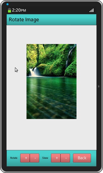
Apply proper layout to the app. Enyo provides a number of ways to define the layout of applications, two important components for layouts are FittableRows and FittableColumns. These two combined can be used to create complex flexible layouts for applications. FittableRows allows user to place content in rows, on one of these rows user can set the fit property to true which will give it a variable height that will expand as the page is resized. FittableColumns allows user to place content in columns. Like with FittableRows one of these columns can have fit set to true and that column will expand to take up available space. In this application "layoutKind" property of a control is used to apply proper layout to the application.
Below is the final code with proper layout
enyo.kind({
  name: "App",
  kind: enyo.Control,
  layoutKind: enyo.FittableRowsLayout,
  classes: "onyx",
  published: {
    rotation: 0,
    skewX: 0,
    skewY: 0
  },
  components: [
               {kind: "onyx.Toolbar",content:"Rotate Image",style:"background-color:#48D1CC; color: black;"},
               { fit: true, style: "text-align: center;", components: [
                 { kind: "enyo.Image", name: "logo", src: "image1.jpg", style:"position:relative;top:75px;height:300px"}
                 ]
               },
               { kind: "onyx.Toolbar",style:"background-color:#48D1CC; color: black;",components: [

                 { content: "Rotate",style:"font-size:10px;"},
                 { components: [
                   { kind: "onyx.Button", content: "+", onclick: "rotateC",style:"width:1px;background-color:LightCoral; color: #F1F1F1;"},
                   { kind: "onyx.Button", content: "-", onclick: "rotateA",style:"width:1px;background-color:LightCoral; color: #F1F1F1;"}]
                 },
                 { content: "Skew",style:"font-size:10px;"},
                 { components: [
                   { kind: "onyx.Button", content: "+", onclick: "skewXInc",style:"width:1px;background-color:LightCoral; color: #F1F1F1;" },
                   { kind: "onyx.Button", content: "-", onclick: "skewXDex",style:"width:1px;background-color:LightCoral; color: #F1F1F1;" }]
                 },
                 {kind: "onyx.Button",content:"Back",style:"background-color:LightCoral; color: #F1F1F1;",onclick:"goBack"}
               ]}
             ]
});
Screen Shot