CSS3 App
PUBLISHED
Overview
This article demonstrates features of CSS3, which is the latest standard for CSS and covers modules of CSS3 mentioned below :
- Borders
- Backgrounds
- Text Effects
- Fonts
- 2D and 3D Transforms
- Transitions
- Animations
- Multiple Columns
CSS3 HTML Page
This web application consists of three pages, each page showcasing the different CSS3 properties.
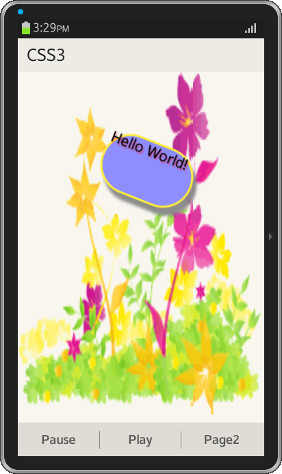
Page-1
The content area of first page has a div element with id "shape" and text inside it. This div element is binded with @keyframes rule for animation effect and by specifying a CSS style inside the @keyframes rule the animation will gradually change from the current style to the new style. The div element moves from top to bottom of the page and during this it undergoes various transformations in it's shape, color, scale etc using CSS3 features as mentioned in the below code.
HTML
<div data-role="content" id="content1">
  <div id="shape">Hello World!</div>
</div>
CSS
#shape
{
width:100px;
height:100px;
background:red;
position:relative;
border:2px solid brown;
-webkit-animation: myfirst 15s linear 2s infinite alternate;
}

@-webkit-keyframes myfirst
{
0%   {background:red; left:0px; top:0px;}
10%  {background:yellow; left:200px; top:0px;width:140px;height:80px;border:2px solid pink;}
20%  {background:white; left:200px; top:100px;box-shadow: 10px 10px 5px #888888;}
30%  {background:blue; left:0px; top:100px;-webkit-transform:rotate(30deg);border:4px solid yellow;}
40%  {background:orange; left:0px; top:200px;border-radius:98px;}
50%  {background:green; left:200px; top:200px;border-radius:48px;text-shadow: 5px 5px 5px #FF0000;-webkit-transform:rotateY(130deg);}
60%  {background:pink; left:200px; top:300px;border-radius:58px;-webkit-transform:skew(30deg,20deg);}
70%  {background:violet; left:0px; top:300px;-webkit-transform:rotateX(120deg);}
80%  {background:yellow; left:0px; top:400px;-webkit-transform:scale(3,3);border:4px solid blue;}
100% {background:red; left:200px; top:400px;border-radius:0px;width:100px;height:100px;}
}
#content1{
background:url(./css/img_flwr.gif);
background-size:370px 500px;
background-repeat:no-repeat;
}
CSS3 modules covered from the above code are as follows :
Animation : Properties of animation used in the code
- -webkit-animation-name is "myfirst".
- -webkit-animation-duration is 15s - animation will be completed in 15seconds.
- -webkit-animation-direction is "alternate" - animation will be played normal every odd time (1,3,5,etc..) and in reverse direction every even time (2,4,6,etc...).
- -webkit-animation-timing-funtion is "linear" - animation has the same speed from start to end.
- -webkit-animation-iteration-count is "infinite" - animation should be played infinite times (for ever).
- 0% is the beginning of the animation, 100% is when the animation is complete. This specifies when does the changes happen in CSS during the animation. For example, in the above mentioned code the background color of div element changes from red to yellow when the animation is 10% completed.
- Footer of the page has a tabbed menu to pause and play the animation. "-webkit-animation-play-state" will specify whether the animation is running or paused. The below code is added in main.js to pause and play the animation
JavaScript
function pause_anim1(){
	$('div').css('webkit-animation-play-state','paused');
}
function play_anim1(){
	$('div').css('webkit-animation-play-state','running');
}
Border : Properties of border used in the code
- When the animation is 20% complete, border property "box-shadow" which is used to add shadow to boxes is applied to div element.
- When the animation is 40% complete, border property "border-radius" which is used to create rounded corners is applied to div element.
Text Effects : Properties of text used in the code
- When the animation is 50% complete, text property "text-shadow" which adds shadow to text is applied to the text inside div element.
2D Transforms : Properties of 2D transforms used in the code
- When the animation is 30% complete, 2d transform method "rotate()" rotates the div clockwise at a given degree.
- when the animation is 60% complete, 2d transform method "skew()" turns the div in a given angle, depending on the parameters given for the horizontal (X-axis) and the vertical (Y-axis) lines.
- when the animation is 80% complete, 2d transform method "scale()" increases or decreases the size of div element, depending on the parameters given for the width (X-axis) and the height (Y-axis).
3D Transforms : Properties of 3D transforms used in the code
- When the animation is 50% complete, 3d transform method "rotateY()" rotates the div around its Y-axis at a given degree.
- When the animation is 70% complete, 3d transform method "rotateX()" rotates the div around its X-axis at a given degree.
Background : Properties of background used in the code
- The content area has a background image which is set using the background property "background-size" of CSS3. This property specifies the size of the background image.
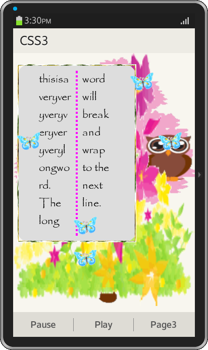
Page-2
The content area of second page has six images and a paragraph with a long word.
HTML
<div data-role="content" id="content2">
  <p id="box">thisisaveryveryveryveryveryverylongword. The long word will break and wrap to the next line.</p>
  <img src="./css/butterfly1.png" id="div1" class="divs" />
  <img src="./css/butterfly1.png" id="div2" class="divs" />
  <img src="./css/butterfly1.png" id="div3" class="divs" />
  <img src="./css/butterfly1.png" id="div4" class="divs" />
  <img src="./css/butterfly1.png" id="div5" class="divs" />
  <img src="./css/butterfly1.png" id="div1" class="divs" />
</div>
CSS
CSS3 modules covered in the code are as follows :
Background : Properties of background used in the code
#content2
{
background-image:url(./css/img_flwr.gif),url(./css/img_tree.gif);
background-size:370px 500px;
background-repeat:no-repeat;
}- The content area has multiple background images.
Font : Properties of fonts used in the code
#box{
font-family:myFirstFont;
}
@font-face
{
font-family: myFirstFont;
src: url(./css/PapyrusRegular.woff);
}- Fonts are defined using the CSS3 @font-face rule and applied to the text in the paragraph. In the @font-face rule, first define a name for the font "myFirstFont", and then point to the font file which is in "woff" format downloaded from web and placed in the project. To use the font, refer to the name of the font (myFirstFont) through the font-family property.
Border : Properties of border used in the code
#box
{
border-image:url(./css/border2.jpg) 30 30 stretch;
}- "border-image" property uses an image to create a border to the paragraph.
Text Effects : Properties of text used in the code
#box{
word-wrap:break-word;
}- There is word which is too long to fit within the paragraph line, so it expands outside. To avoid this, "word-wrap" property forces the text to wrap even if it means splitting it in the middle of a word.
Multiple Columns : Properties of columns used in the code
#box{
-webkit-column-count:2;
-webkit-column-rule:4px outset #ff00ff;
-webkit-column-rule-style:dotted;
}- -webkit-column-count property divides the text into two columns.
- -webkit-column-rule property sets the width, style, and color of the rule between columns.
- -webkit-column-rule-style property specifies the style of the rule between columns.
Animation is applied to the images in the content area. Each image moves from bottom to top and is given different animation-timing-function i.e speed.
@-webkit-keyframes mymove
{
from {top:500px;}
to {top:-600px;}
}
.divs
{
width:50px;
height:50px;
position:relative;
-webkit-animation:mymove 5s infinite;
}
#div1 {-webkit-animation-timing-function:linear;}
#div2 {-webkit-animation-timing-function:ease;}
#div3 {-webkit-animation-timing-function:ease-in;-webkit-animation-direction:alternate-reverse;}
#div4 {-webkit-animation-timing-function:ease-out;-webkit-animation-direction:alternate-reverse;}
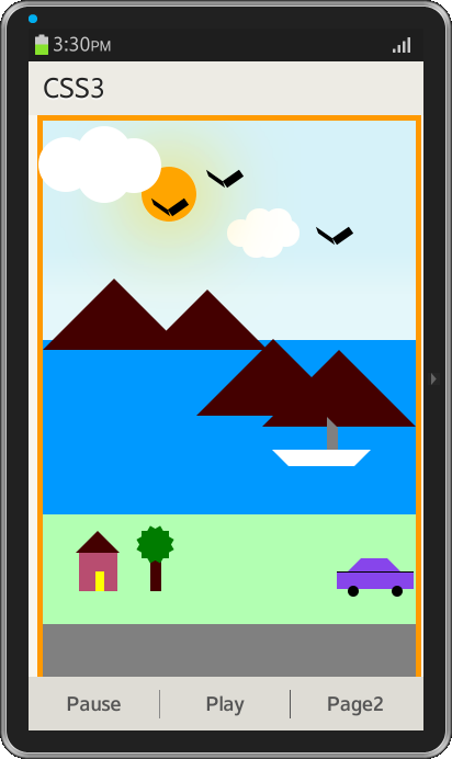
#div5 {-webkit-animation-timing-function:ease-in-out;}Page-3
The content area consists of Landscape designed entirely using CSS and animations are applied to it using CSS3.
Screenshots of CSS3 Application