


Lesson 20
From this lesson we will start considering how to create the next demo application. In which we will show you how by using a scroller container, a Box container, a Layout container, image widgets, and an index widget - display the active page and create an interface with a page-by-page content preview. In this lesson, we will take a closer look at the Box container and get acquainted with its available options. Moreover, we will create the container itself and fill it with the contents.
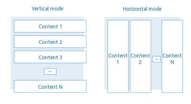
As it was already mentioned, Box container is a component that allows you to place graphic elements in a linear order. This can be a horizontal or vertical layout (by default). In this case, they are indexed from left to right in a horizontal layout and from top to bottom in a vertical layout. You can customize the way the components are placed in the boxes, and the distance between the neighboring components.
Below is a diagram of the components location, placed in the Box container.
Box allows you to place there any number of different elements, but all elements supposed to be Evas_Object. This container is often used together with scroller, since usually in the box placed much more elements than can be displayed on the screen, so there is a need for a scrollable area.
Now let's implement the program.
Like in the last two demos, take the same initial template for writing the third demo application. Code is available HERE
Let's start by adding a pointer to the box container in the structure with the main widgets. The Box container is Evas_Object just like all other containers and widgets in Elementary library.
Evas_Object *box;Now your structure with graphical components is looking like this:
typedef struct _UIData {
   Evas_Object *win;
   Evas_Object *conform;
   Evas_Object *box;
} UIData;
Write a separate function for creating and configuring the container in the application.
static void
_box_create(UIData *ui)
{
}
To create a Box container, call the following function:
ui->box = elm_box_add(ui->conform);As a parameter, the function takes a pointer to the parent component that will be responsible for the box container removing.
Now you can fill the container. Firstly add a couple of buttons and see what happens. We have already told you about buttons creation in lesson 14, so now we will not particularly stop on this topic. You can use the code below, and after the box creation add it to the _box_create() function.
static void
_box_create(UIData *ui)
{
   ...

   Evas_Object *button = NULL;
   for (int i = 0; i < 2; ++i)
   {
      button = elm_button_add(ui->box);

      evas_object_size_hint_weight_set(button, EVAS_HINT_EXPAND, EVAS_HINT_EXPAND);
      evas_object_size_hint_align_set(button, EVAS_HINT_FILL, EVAS_HINT_FILL);
      elm_object_text_set(button, " Button");

      evas_object_show(button);
      elm_box_pack_end(ui->box, button);
   }
}
Use this code to create 2 buttons and place them into the box. The content was added to the container by calling the function:
elm_box_pack_end(Evas_Object *obj, Evas_Object *insert);The first parameter is a pointer to a box, in which you should add the widget, and the second is a pointer to the component that you want to add.
The function shown above, adds the element on the last place in the box. The functionality of Elementary library also allows you to add an element in other ways. Adding elements in the beginning of the box:
elm_box_pack_start(Evas_Object *box, Evas_Object *insert);And also you may insert a component before or after another specified component by using the following functions:
elm_box_pack_before(Evas_Object *box, Evas_Object *insert, Evas_Object *before);
elm_box_pack_after(Evas_Object *box, Evas_Object *insert, Evas_Object *after);
The last functions take as a third argument a pointer to the Evas object, before/after which you should insert a new component.
Thus, by using these specified 4 functions, you can control objects location in the box.
Now display the box:
static void
_box_create(UIData *ui)
{
   ...

   evas_object_show(ui->box);
}
Call the function to create a box and then place it in the conformant:
static void
_conformant_create(UIData *ui)
{
   ...

   _box_create(ui);
   elm_object_content_set(ui->conform, ui->box);

   ...
}
Run the application.
You should get the following picture:
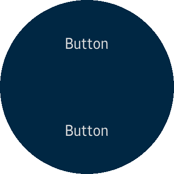
As expected, there are two buttons occupied all free space and located vertically on the screen, since we did not specify their orientation.
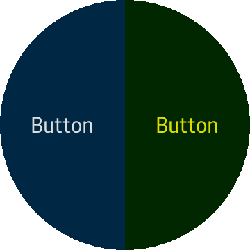
Evas allows you to set the color for any drawing object, let's use this feature to slightly tint the last button. It will help understand better where object boundaries are. If the component that you are going to paint already has a color (as in this case) then in the result the colors will be mixed, for example we will set the yellow color and thus the green button is expected.
To paint the Evas object, use the following function after button creation loop.
evas_object_color_set(button, 255, 255, 0, 255);The function takes a pointer to the object for which you want to specify the color, and 4 components of the color: red, green, blue, transparent. All parameters are allowed in the range from 0 to 255 inclusive. The last component is responsible for the transparency, so you can make any component translucent or even invisible by using a color.
So after painting, you should get the following look of the application.

As you can see, both buttons share the available space equally. As we said earlier the box can be used in two perspectives: vertical and horizontal. Let's change the container orientation from vertical to horizontal. Use following function:
elm_box_horizontal_set(ui->box, EINA_TRUE);The function takes a pointer to a box, in which the configuration needs to be changed and a Boolean value, where EINA_TRUE is responsible for setting the horizontal position and EINA_FALSE for setting the vertical position.
Run the application.
Now the elements are arranged horizontally, as it was indicated.
Another possibility of the box is to set the distance (padding) between adjacent components. Let's set the distance in 10 pixels between the horizontal elements. Use following function:
elm_box_padding_set(ui->box, 10, 0);The function takes a pointer to a box that supposed to change the spacing between adjacent components and the space size in pixels (horizontal and vertical).
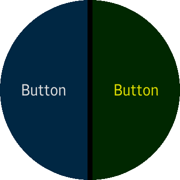
The above shows the result of adding space between elements.
In order to fully understand the box container, you should understand parameters of the weight and Evas objects location.
Knowing the object weight is necessary in order to change components proportions in the box. For example, if one button has a weight equal to 1 and the second button has a weight equal to 2, then in result, buttons of the box will weigh - 3. So the first button will occupy 1/3 of the container's size and the second one - 2/3. In this case, if the size of the box is 360 pixels, then the first button will be 120 pixels, and the second one - 240 pixels. Weight is specified for the horizontal as well as for the vertical plane and one or the other will be used, depending on the mode of the Box container. To change the weight of an object, use the following function:
evas_object_size_hint_weight_set(button, EVAS_HINT_EXPAND, EVAS_HINT_EXPAND);By default, the object weight is 0 on both axes. Therefore, the object will occupy the minimum area. Below are various combinations for the weights of the first and the second buttons for different objects weights.
Examples:
Horizontal box mode:
Button 1: horizontal weight 1.0, vertical - 0.0.
Button 2: horizontal weight 2.0, vertical - 0.0.

Options:
Horizontal box mode:
Button 1: horizontal weight 0.6, vertical - 0.5.
Button 2: horizontal weight 0.2, vertical – 1.5.

In these two cases, the vertical weight of the buttons is ignored because the box is horizontal.
Options:
Vertical box mode:
Button 1: horizontal weight 0.6, vertical - 0.5.
Button 2: horizontal weight 0.2, vertical – 1.5.
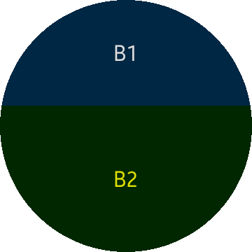
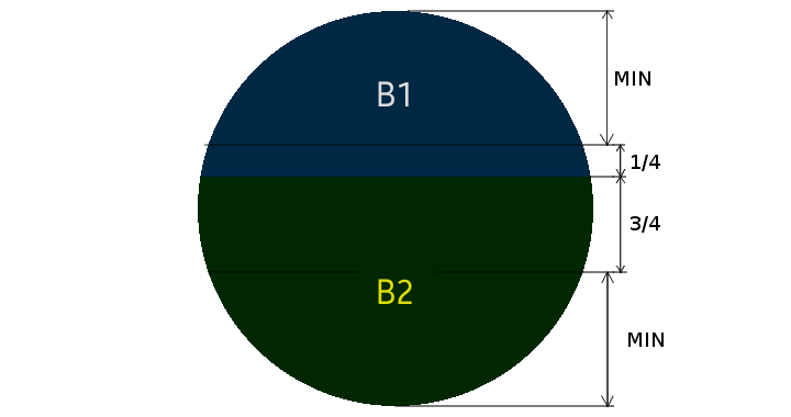
In this case, the result is not obvious, since button 1 should occupy ¼- of a box size. But due to the fact that the button has a minimum vertical size - 122 pixels, hence free space in the box is 360 - 122 * 2 = 116 pixels. This is the space, which buttons are dividing in proportion ¼ for the first button and ¾ for the second one. It turns out that the first button expands to 116 * ¼ = 29 pixels from the minimum size, and the second to 116 * ¾ = 87 pixels.
Below it is shown graphically:
In addition to weight, the alignment parameter affects the objects location. In the examples above, the filling type alignment (EVAS_HINT_FILL) was used, with the widget occupying all the provided space, which is calculated from the weight of the objects.
Let's see what happens if the alignment of the object changes and its weight remains the same. Alignment parameters are also specified for the horizontal as well as vertical plane and one or the other will be used, depending on the Box container mode. To change the alignment of an object, use the following function:
evas_object_size_hint_align_set(button, EVAS_HINT_FILL, EVAS_HINT_FILL);The function takes a real number from 0 to 1. Where 0 is the left/top position and 1 is the right/bottom position. So to set location in the middle, use 0.5 values. By default, the object uses center alignment.
If pass to the function a specific value EVAS_HINT_FILL which is -1, then the object will not be aligned in the area, but will be stretched over it. If you do not use EVAS_HINT_FILL for alignment, then the object will have the minimum widget size. So for the default alignment (in the middle) button, in the box will be located as follows:
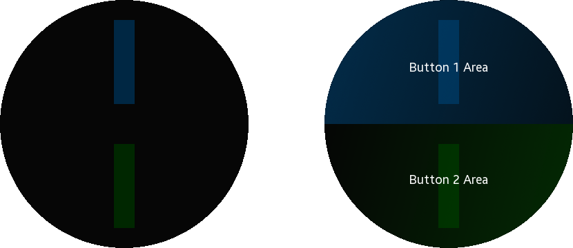
Now let's see what happens if you use for buttons the following alignment options.
Button 1: horizontal alignment 0.2, vertical - 0.5.
Button 2: horizontal alignment 0.5, vertical – 0.0.
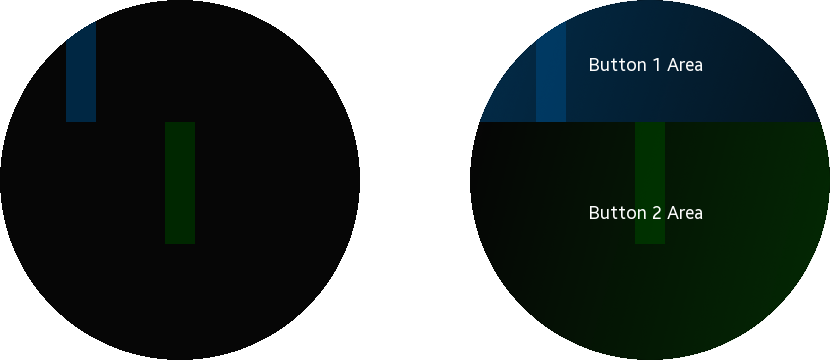
So the first button (blue) is located in the relative coordinate 0.2 horizontally and in the middle (0.5) vertically, in the zone allocated for this button. And the second button (green) is located horizontally in the middle of the provided space, and at the maximum permissible vertical position (0.0).
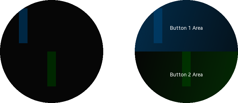
Now let's change the weight value for the widgets and see what happens with these parameters:
Button 1: horizontal alignment 0.2, vertical - 0.5.
Button 1: horizontal weight 1.0, vertical - 1.
Button 2: horizontal alignment 0.5, vertical - 0.0.
Button 2: horizontal weight 1.0, vertical - 2.
Now you can apply weight and alignment parameters due to the requirements of your application.
Now let's prepare box creating function for the needs of the demo application number 3. To do this, delete the buttons creation, since instead of it you should use layouts as the contents of the box. Use the following function:
static void
_box_create(UIData *ui)
{
   ui->box = elm_box_add(ui->conform);

   evas_object_show(ui->box);
}