


In this lesson we'll take a closer look at our first widget - a button-type component. We will teach you how to create and put it in the layout. And also consider the standard styles and how they can be used. Then we will continue to create the demo application by adding a button to the already created layout.
Button is a simple widget, placed on the screen of the application to receive a response from the user. This widget is inherited from the layout container, so you can use the layout API to manage or change the button. Let's consider the basic functions of working with this widget.
To create a button instance, use the following function:
Evas_Object *elm_button_add(Evas_Object *parent);In this function you supposed to pass pointer to the parent widget, which will monitor the deletion of the object. You can add content, for example an icon, and also set text if the style contains the corresponding areas. To do so, use the following functions:
Eina_Bool elm_object_style_set(Evas_Object *obj, const char *style);
void elm_object_text_set(Evas_Object *obj, const char *text);
These two functions can be used not only for a button, but as well for other widgets that have appropriate areas for content and/or text.
Let’s consider 6 basic styles from the standard Wearable profile theme.
- Style default:
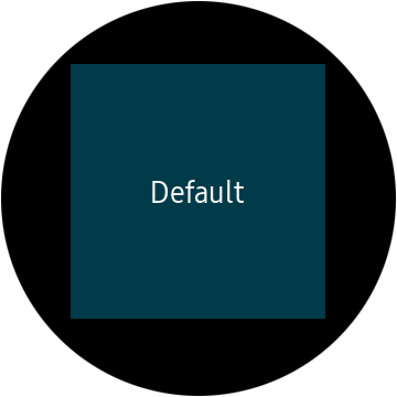
This button is square shaped.
There is an area for content and text settings.
You can set the style by calling the function: elm_object_style_set():
elm_object_style_set(button, "default");All other styles are set in the same way.
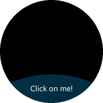
- Style bottom:
The button has a semi-circular shape. And it is designed for placing at the bottom of the screen.
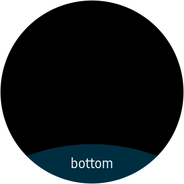
In this style the button also has two areas for placing the icon and text, but unlike the previous version, do not use them at the same time, because both areas have the same layout and overlap each other.
- Style popup/circle/left:
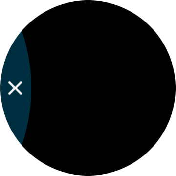
It contains the area for the icon, but because of the small width of the screen, space for text is not provided.
- Style popup/circle/right:
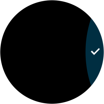
Just like the previous style, it contains only icon area. The "popup/circle/left" and "popup/circle/right" buttons are used in interactive popup windows to confirm an action. Usually two buttons with these styles are used simultaneously.
- Style select_mode:
A button with this style is usually placed in the layout with the "elm/layout/select_mode/default" style. It has a rectangular shape with rounded edges.
The button has a text area and a place for an icon. An example of using this style you may see on the watch in a standard Gallery application.
- Style transparent:
This is a transparent button that has neither text, nor icons.
Let's go to the practical part. Add one more pointer to the button in your widgets structure.
Evas_Object *button;Now the structure looks like this:
typedef struct _UIData {
   Evas_Object *win;
   Evas_Object *conform;
   Evas_Object *layout;
   Evas_Object *button;
} UIData;
Implement the function in which you will create and configure the button:
static void
_button_create(UIData *ui)
{
}
Create an instance of the button and specify layout as a parent:
ui->button = elm_button_add(ui->layout);Set bottom style for your button:
elm_object_style_set(ui->button, "bottom");Specify text for the button:
elm_object_style_set(ui->button, "Click on me!");Now you can display the button, using the following function:
evas_object_show(ui->button);Call the button's creation and customization function and place the widget in the layout. The lower content area in the layout is "elm.swallow.button", place the button there.
static void
_layout_create(UIData *ui)
{
   ...

   _button_create(ui);
   elm_object_part_content_set(ui->layout, "elm.swallow.button", ui->button);

   ...
}
Run the application and see what will happen.
Now you know how to create a button. Still you should learn how to handle widget events. In detail this topic will be considered in the next lesson. The complete source code for this tutorial is available here. WearLesson014.