Applications for Circular UI: Developing UI on Circular Wearable Applications
TAU supports different types of wearable devices (rectangular and circular) in the same application. To support a circular UI along with a rectangular UI, a media query is required.
This feature is supported in wearable applications only.
Applying the Circular UI
To support the circular UI:
- Include the link element for the latest tau.css file into the <head> element in HTML. Note that for the compatibility with the rectangular UI, you must use the latest version of the TAU library.
- Include the link element for the latest tau.circle.css file with the media query feature (-tizen-geometric-shape: circle) next to the link element for the tau.css. Note that adding the tau.circle.css file following the general tau.css file covers the additional circular UI.
- Include the link element for the latest tau.js script file at the end of <body> element in HTML.
- For writing a separate code for a circular UI in JavaScript, you can use the tau.support.shape.circle property for detecting the circular device.
<head name="viewport" content="width=device-width, user-scalable=no">
   <title>Support for Circular UI</title>
   <link rel="stylesheet" href="tau.css">
   <!-- CSS media query on a link element -->
   <link rel="stylesheet" media="all and (-tizen-geometric-shape: circle)" href="tau.circle.css">
   <link rel="stylesheet" href="css/style.css">
</head>
<body>
   <script type="text/javascript" src="tau.js"></script>
   <script>
      if (tau.support.shape.circle)
      {
         /* Implement your code for the circular UI */
      }
      else
      {
         /* Implement your code for the rectangular UI */
      }
   </script>
</body>
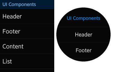
The following figure shows how the media query -tizen-geometric-shape: circle works in a rectangular and circular UI.
Figure: Media query in a rectangular device and circular device

Overriding the Circular CSS Style with a Media Query
For some styles to be applied selectively, you can use the -tizen-geometric-shape media query feature with a rectangle or circle value to distinguish the type difference. Note that the -tizen-geometric-shape feature is only available in Tizen devices.
| -tizen-geometric-shape | |
|---|---|
| Value | rectangle | circle |
| Applied to | Visual media types |
| Accept min/max prefixes | No |
.className
{
   /* Implement the basic CSS style for all types of devices (rectangular and circular) */
}

@media screen and (-tizen-geometric-shape: circle)
{
   .className
   {
      /* Implement the CSS style to be overridden in circular */
   }
}
Writing JavaScript Selectively for the Circular UI
TAU provides the tau.support.shape.circle property that checks whether the device screen is a circle. If you want to implement code selectively for a circular UI and rectangular UI, you can use the property with a boolean value. Note that for developing in a browser environment, this property is always set to true when the tau.circle.css file is loaded.
if (tau.support.shape.circle)
{
   /* Implement your code for the circular UI */
}
else
{
   /* Implement your code for the rectangular UI */
}
Supported UI Components
The following components can be used in both rectangular and circular devices.
| Component | Description |
|---|---|
| Helper Script | Shows how to support some application components. |
| Snap List | Shows how to create a snap list component. |
| Expandable Header | Shows how to create a header component. |
| Circle-shaped Progress Bar | Shows how to create a circle progress bar component. |
| Full Size Processing Component | Shows how to create a processing component. |
| Footer Button | Shows how to create a footer button component. |
| Thumbnail | Shows how to create a thumbnail component. |
| Popup Button | Shows how to create a popup component. |
| Index Scroll Bar | Shows how to create an index scroll bar component. |
| More Options | Shows how to create a more options button component. |

