
Creating Popup Buttons
You can create bottom and side popup button components with the Popup API.
This feature is supported in wearable applications only.
The following figures show the layout of the popup component in a rectangular and circular UI.
Figure: Bottom popup component in rectangular and circular devices
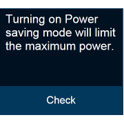
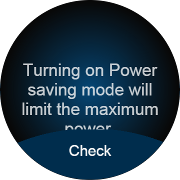
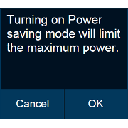
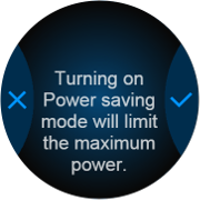
Figure: Side popup component in rectangular and circular devices
To implement the popup button component:
- To implement a bottom popup button component:
Edit the HTML code to add the bottom popup button component to your application screen. To add the bottom button to the circular UI, you must add the ui-bottom-button class to the popup footer. The popup can have only 1 bottom button.
<div id="bottomBtnPopup" class="ui-popup">
   <div class="ui-popup-content">
      Turning on Power
      saving mode will
      limit the maximum
      power
   </div>
   <div class="ui-popup-footer ui-bottom-button">
      <button id="bottomBtn" class="ui-btn">Check</button>
   </div>
</div>
- To implement a side popup button component:
Edit the HTML code to add the side popup button component to your application screen. To add side buttons for the circular UI, you must add the ui-side-button class to the popup footer. The popup can have only 2 side buttons.
<style>
   .btn-icon-cancel::before {-webkit-mask-image: url(./cancel.png)}
   .btn-icon-ok::before {-webkit-mask-image: url(./ok.png)}
</style>
<div id="sideBtnPopup" class="ui-popup">
   <div class="ui-popup-content">
      Turning on Power
      saving mode will
      limit the maximum
      power
   </div>
   <div class="ui-popup-footer ui-grid-col-2 ui-side-button">
      <button id="sideBtn-1" class="ui-btn btn-icon-cancel">Cancel</button>
      <button id="sideBtn-2" class="ui-btn btn-icon-ok">OK</button>
   </div>
</div>
