Tizen UX Conversion Tutorial: Sign-In and Registration Form Tutorials - Part 2
PUBLISHED
Sign In and Registration Form Tutorials
Overview
This article is part two of a two part series that demostrates the Sign In and Registration Form UI patterns, implemented in part 2 using Tizen web UI framework. and the UI is modified to follow the Tizen UX Guidelines.
The Sign In and Registration Form sample application is a Multi-Page Application based on Tizen Web UI Framework. The application demonstrates how the Sign In and Registration forms can be designed for the Tizen applications. Based on the requirements, each page can cater to different form or a multi-step form across multiple pages.
Application Header
The header consists of a application title and Tab, for providing the navigation across the pages (for sign In and sign Up options). This is achieved by using the Tizen's widget tabbar attribute. The Tizen's tabbar widget shows an unordered list of buttons on the screen wrapped together in a single group. The header is made persistent across the tab pages.
<div data-role="header" data-position="fixed">
  <h1>Welcome to Tizen World</h1>
    <div data-role="tabbar" data-id="persist_header">
      <ul>
        <li><a href="#one" class="ui-btn-active ui-state-persist" >Sign In</a></li>
	<li><a href="#two" >Sign Up</a></li>
      </ul>
    </div>
</div><!-- /header -->
Footer
Per Tizen's UX guidelines, you need to offer user with the return option to the previous stage (or level) in the form of Back or Cancel buttons. And these buttons must go on the right edge of the footer and ensure they appear on every screen of your application. So you can provide the back button option on every page by just adding the Tizen attribute data-add-back-btn="true" to every page as below.
<div data-role="page" id="one" data-add-back-btn="true">
Form Input Elements
-
Sign In Form
The application uses an HTML <form> tag in conjunction with the form-associated elements. To create a form you can use the <input> tag to collect data for all the corresponding form fields inside the tags. The <input> tag supports several types of inputs to collect the data, which helps the server understand the type of the data that is being sent.
The “placeholder” attribute is used to assist the user (by describing the required format) with the value to be entered in the specified input field. The description exists till the user enters a value in the input field.
<form action="" id="signinForm" method="post" onsubmit="return validateEmail()">
  <table class="form-layout">
    <tr><td class="form-text-layout"><input type="text" class="form-text"
         name="signinemail" id="signinemail" placeholder="Email address" required/></td></tr>
    <tr><td class="form-text-layout"><input type="text" class="form-text"
         name="passwd" id="passwd" placeholder="Password" required/></td></tr>
    <tr><td align="center"><div class="signin-button"><input type="submit"
         value="Sign In" data-theme="b"></div></td></tr>
  </table>
</form>
For the button behavior using the <input> tag, you can use the type as “submit”.
Now, when the submit button is pressed with the login details, below JavaScript code calls the “validateEmail” function to check, if the user entered a valid email or not.
$('#signinForm').submit(function() {
    validateEmail();
});
We can mandate the email field of the form with the use of “required” attribute before submitting. But at times, when you want to use custom dialog box to let user know the syntax with some description, then you might need to use your JavaScript to do that for you.
Below function validates the contents of the email field with the general email syntax. The rule followed to check the syntax here is , the email address should have “@” character and at least one dot (.) character. And also the character “@” must not be the first character of the email and the last dot must be after the @ character and minimum 2 characters before the end. If the contents doesn’t meet these requirements, then the user is prompted to enter a valid email address.
function validateEmail()
{
   console.log("ValidateEmail function called");
   var x=document.forms["signinForm"]["signinemail"].value;
   var posofat=x.indexOf("@");
   var posofdot=x.lastIndexOf(".");
   if (posofat<1 || posofdot<posofat+2 || posofdot+2>=x.length)
   {
	alert("Please enter a valid e-mail address. Example: Yourname@domain.com");
	return false;
   }
}-
Registration or Sign Up Form
Similarly, the registration form is also created using the <form> and <input> tags.Here we have used the input types like, email for the email address entries.
The application can be saved locally when not submitted and you can start working from the point you left later. This can be implemented with the use of HTML5 LocalStorage, where we store the field data locally and retrieve it back when the application or page is loaded again. To achieve this, we use the “stored” class to all the input fields which need to be saved and restored later.
<form id="signupform" method="post" action="#" onsubmit="return validateSignUpEmail()">
  <table class="form-layout">
    <tr><td class="form-text-layout"><input type="text" class="stored form-text"
         name="contactname" id="contactname" placeholder="Contact Name" required/></td></tr>
    <tr><td class="form-text-layout"><input type="text" class="stored form-text"
         name="businessname" id="businessname" placeholder="Business Name" required/></td></tr>
    <tr><td class="form-text-layout"><input type="text" class="stored form-text" name="phone"
         id="phone" placeholder="Phone Number"/></td></tr>
    <tr><td class="form-text-layout"><input type="text" class="stored form-text"
         name="signupemail" id="signupemail" placeholder="Email Address(this will be your ID)"
         required/></td></tr>
  </table>
</form>
The below keyup function is invoked for every key press in any form element with the class of stored. This function stores the inputted data (key/value) into the LocalStorage.
$('.stored').keyup(function () {
    localStorage[$(this).attr('name')] = $(this).val();
});
When the application is loaded, the “init” function checks for the data stored for each field and if so, then adds the data to the relevant form element.
var init = function () {
    //Do your initialization job
    console.log("myinit() called");
    if (localStorage["contactname"]) {
        $('#contactname').val(localStorage["contactname"]);
    }
    if (localStorage["businessname"]) {
        $('#businessname').val(localStorage["businessname"]);
    }
    if (localStorage["phone"]) {
        $('#phone').val(localStorage["phone"]);
    }
    if (localStorage["email"]) {
        $('#email').val(localStorage["email"]);
    }
};
Finally, when we submit the form, the LocalStorage clear method is called to clear off all the local data stored.
$('#signupform').submit(function() {
    localStorage.clear();
});
Signup Form Validation
You might need to validate your form, when you want to make sure that the required fields aren’t empty or not correct (in syntax) before submitting a form. Though, it can be done again on the server side, but can save time and bandwidth when validated before submitting.
We can always mandate the necessary fields of the form with the use of “required” attribute before submitting. But when you want to use custom dialog box, then you might do something like below using JavaScript function.
The code does the validation against empty fields of our registration or sign up form,
$(document).ready(function(){
    $('#signupbutton').click(function(){
        $("input.required").each(function(){
            if($(this).val().length == 0)
            {
               var field = $(this).val();
               alert(field + 'Field(s) left blank, please provide the details');
               $(this).focus();
               return false;
            }
        });
    });
});
The function below, does a validation of the passwords, if they are same or not for registration or sign up form,
function Passwdvalidation(pass1, pass2) {
	    if (pass1.value != pass2.value || pass1.value == '' || pass2.value == '') {
		     pass2.setCustomValidity('Password does not match');
	    } else {
	           pass2.setCustomValidity('');
	    }
}
CSS for form layout
Below are the CSS classes used for positioning form layout, text layout and text.
/* class for the form layout */
.form-layout {
background-color: rgb(212,209,204);
width:100%;
border-radius:15px;
margin-left:0px;
margin-right:0px;
margin-top:15px;
font-family:"Times New Roman", Times;
}
/* Class for positioning the text area */
.form-text-layout {
padding:5px 5px;
width:70%;
}
/* Class for the text and background color*/
.form-text {
border: 0px solid #FFF;
background: white;
vertical-align: middle;
color:black;
min-width:95%;
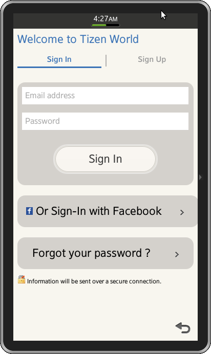
}Snapshot:
Sign In Form
Registration or Sign Up Form

Development Environment:
Tizen SDK
Version : 2.1.0
Build id : 20130416-1439
Note:
The sample application is available for reference (See under File Attachment section).