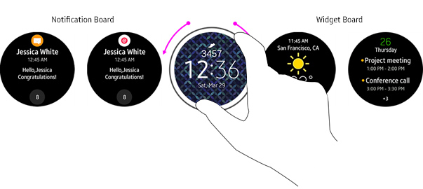
Widget Board
PUBLISHED
Widgets can be found on the right hand side of the watch face and are accessed by rotating the bezel. They deliver important information and access to quick actions without requiring a user to open an app. Because they’re easy to use on the move, they’re a great opportunity to engage with users.
The Basics
- Widgets occupy the whole watch face and must be designed for use on a single page. They do not allow vertical scrolling.
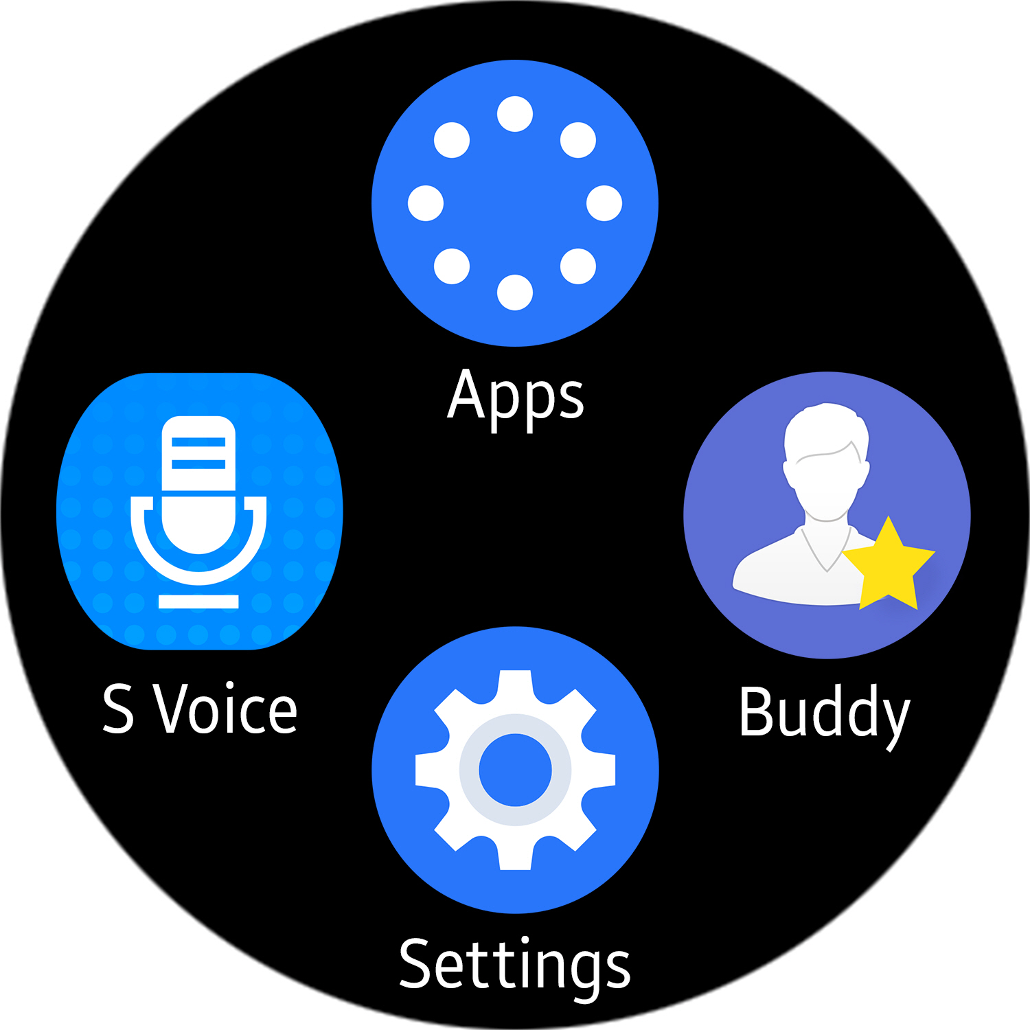
- Users can add up to 15 of their favorite widgets on the Widget Board, which is accessed from the right hand side of the watch face.
- The only gesture available on a widget is a single tap to perform a task or open an app.
- Apps can have multiple widgets for different purposes. If an app is uninstalled, all related widgets will also be removed.
- Widgets refresh automatically when they’re open.
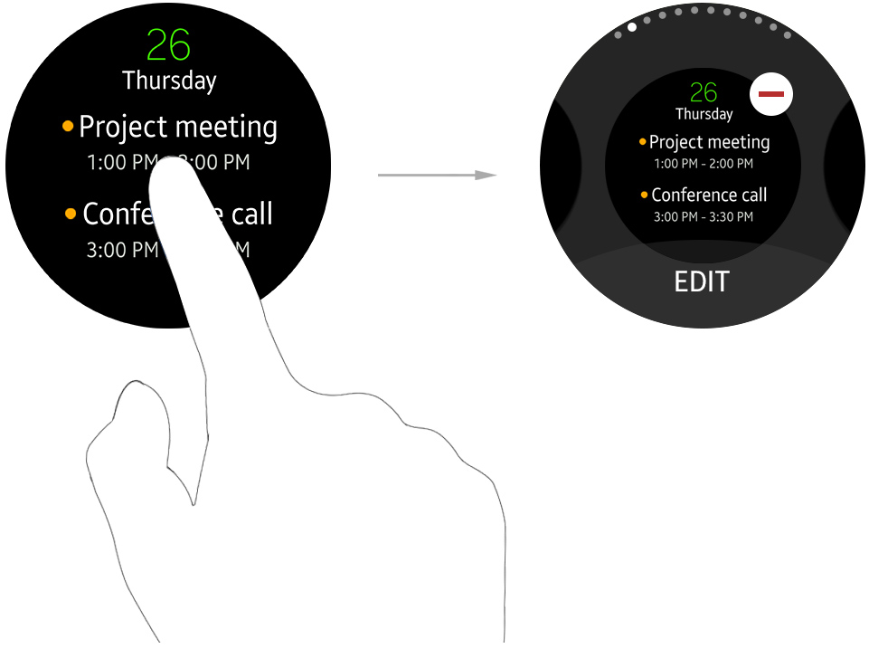
- Widgets are managed by pressing and holding them. Users can reorder them by dragging each icon, and they can be added or removed by tapping the corresponding buttons.
Types
Widgets can be divided into three categories.
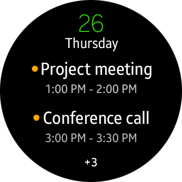
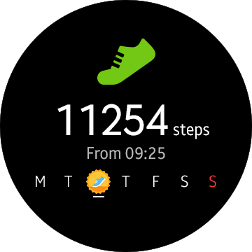
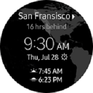
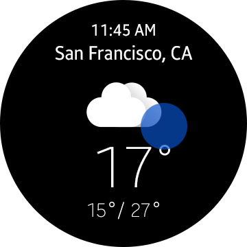
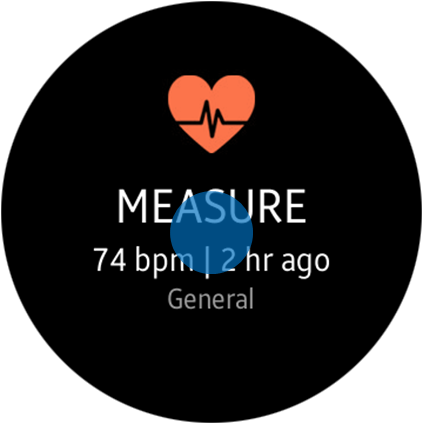
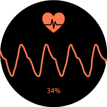
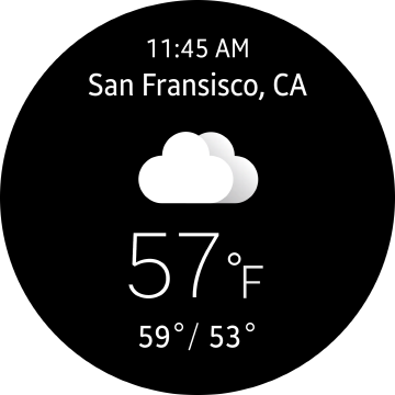
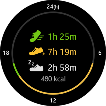
Informative Widgets
Informative widgets display the key data of a particular app.
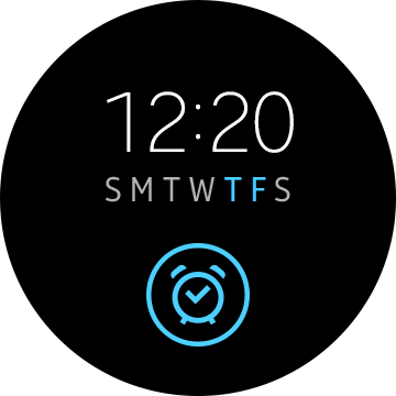
Control Widgets
Control widgets perform common and popular functions without needing the user to open an app.
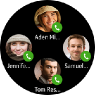
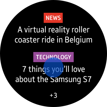
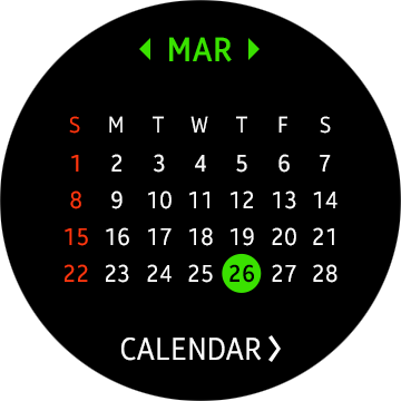
Shortcut Widgets
Shortcut widgets display a range of shortcuts that jump straight through to certain app screens.
Actions
Here are the four types of action that are most commonly carried out through a widget:
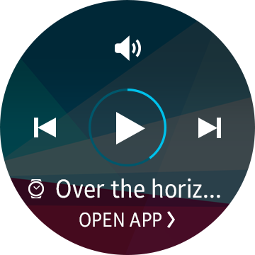
Opening an Application
Apps can be launched by simply tapping on a related widget. Users can choose to open apps on their wearable device or their phone if they need to look at information on a bigger screen.
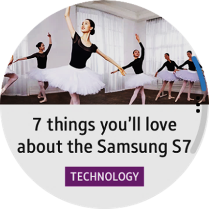
Deep Linking
Users can jump directly to a particular screen on an app from a widget with a single tap.
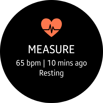
Interactive Control
Simple tasks can be completed without jumping to an app.
Direct Action
Tapping on a widget can immediately execute a certain command.
Common Use Cases
When you’re creating widgets, you’ll need to think about and plan for these use cases.
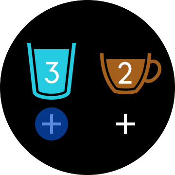
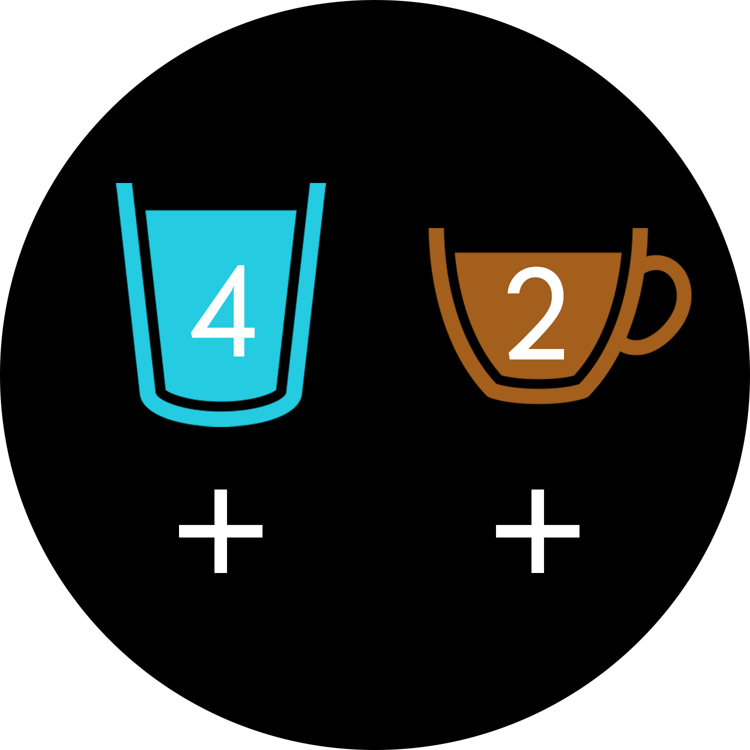
Empty Widgets that Need to be Filled
Some widgets will need to be populated with content by the user. If you’re creating one of these, make sure you include an Add button to let them do this.
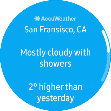
Check Your Phone
Widgets can redirect users to another device like a phone. Use the phrase “Check your phone” to indicate this in your design.
Visual Styles
Widget Color and Background
The use of the color black is recommended for widget backgrounds. Black is the primary color for the home structure of a wearable device, and it also increases readability when outdoors.
If black is being used as a background color, border lines between widgets may not be visible. Black is the optimal background color to harmonize the widget with the bezel of wearable devices.
If you’re using a colorful image on your background, add a black tinted layer (at least 60% of opacity) on top of it to make sure the text is legible.
The primary identity color of each app can be applied to title text to maintain a strong visual identity. Each app may have its own identity color, but readability must be taken into consideration.
Widget Layout
Widgets need to be designed with the circular shape of the display and the absence of a scrolling function in mind.
Center alignment is recommended, as it is more efficient when displaying text.
Widget Typography
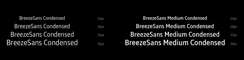
- If a widget is displaying text, please ensure that the color and typeface are optimized for readability..
- BreezSans Condensed regular or medium font should be used and the weight of the font is determined according to the importance of the text.
- For more important information, use a medium weight font.
- Text needs to be displayed within a circular boundary with a font size of no less than 24 points.