UI Components for Wearable App Design
PUBLISHED
This section provides sample images and information about the UI components included in the Tizen Wearable UI framework.
In the Tizen Studio, we have prepared a set of styles for the common UI elements, such as buttons, lists, and checkboxes. Refer to the following subsections to figure out what the default style elements look like and how they work.
- Pages
- Page Indicators
- Tabs
- Circular Indicators
- Pop-up Notifications
- Buttons
- More Menu
- List Views
- Checkbox and Radio Button
- Progress and Activity Indicators
- Sliders
- Switches
- Pickers
Pages
An app is composed of one or more pages. At any moment, a wearable device shows a part of a page or a whole page. The common UI elements of a page are header, footer, and content area. A header holds the title of the page. A footer is the overlaid element that is docked to the bottom. A footer usually has a set of buttons. The main content, images, or text is placed inside the content area.
Design the main page of your app with a header (title), content area, and a footer. Every page must have a title bar unless the page is used in an app to display full-screen information, such as an image or a map screen, or unless it carries action buttons only.
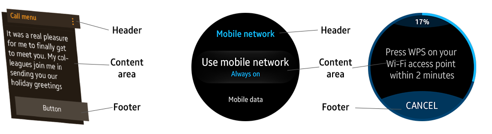
Generic Page structure for Tizen wearable devices
The title bar carries text-only titles without icons, and it moves with the content as the page is scrolled.
Page Indicators
Provide page indicators at the top or bottom of the screen to inform users that more pages are available. Users can swipe the screen or rotate the bezel to access other pages.
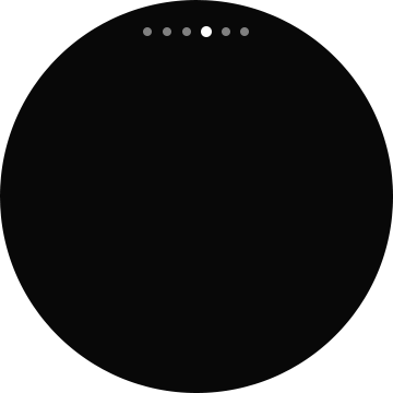

Page indicator
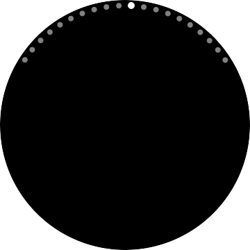
Circular page indicator
On a circular type wearable device, horizontal page indicators are used for screens designed for only horizontal swiping actions, while circular page indicators are for screens that take both the touch input and rotary action for horizontal navigation.
Tabs
A tab is used to create a paginated layout when the content in a topic is too large to be displayed in one page. If the first page has a header with a title, the same title is displayed on all the following screens. Remember that a 'back' interaction does not bring you to the previous tab screen- it simply closes the tab screen that is currently open.
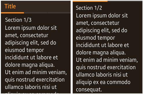
Tabs on a rectangular type wearable device
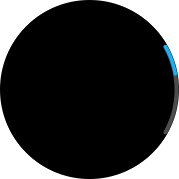
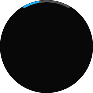
Circular Indicators
To go with circular screen design and the rotary action, bars or dots are used to indicate the current position on a page.
Scroll bar (vertical)
Scroll bar (horizontal)
Page indicators

Circular slider
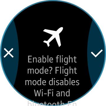
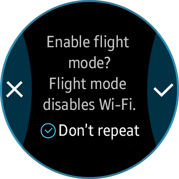
Pop-up Notifications
You can design and provide various types of pop-up notifications for different occasions based on their context.
On a circular type wearable device, a pop-up message does not require a header, but headers can be added if necessary.
Pop-ups messages on a circular type wearable device
When designing a pop-up for a circular type wearable device, you can place action icons on both sides of the screen to maximize the screen usage. This enhances usability as well because users can take instant actions as soon as they read the pop-up message.
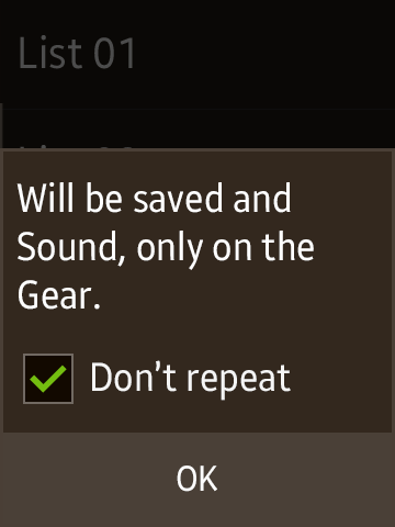
If you need to provide additional (secondary) action buttons or a small checkbox, add them at the bottom of the body text. These additional elements will only be accessible when the user has scrolled down to the end of the page.
Pop-up message with small checkbox at the bottom
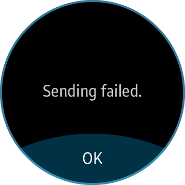
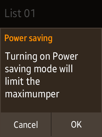
For information pop-ups that require only one button, place the action button at the bottom of the screen.
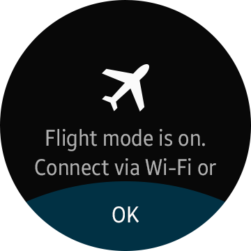
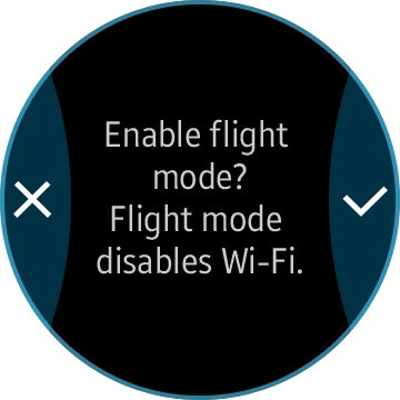
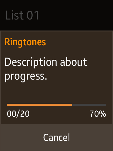
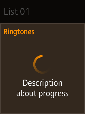
Pop-up Message Types Available on a Circular Type Wearable Device
Confirmation pop-up
Information pop-up
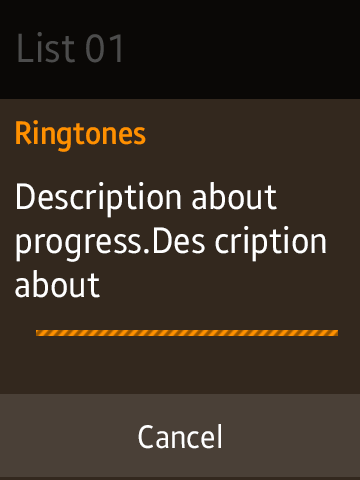
Progress pop-up (Overlay)

Graphical toast pop-up
- When you design pop-up notifications for a circular type wearable device, try to minimize the use of toast pop-ups. If your pop-up requires user interaction, or if the text is longer than the 3-line limit, provide a confirmation pop-up (dialog pop-up) instead.
- Plain toast pop-ups may only carry a maximum of 3 lines of text. Graphical toast pop-ups may carry a graphical icon only, with optional text up to a maximum of 2 lines. A toast pop-up is displayed for 2 seconds, and then it automatically disappears.
Pop-up Types Available on Rectangular and Square Type Wearable Devices
Confirmation pop-up
Information pop-up

Progress pop-up
Process pop-up
Toast pop-up
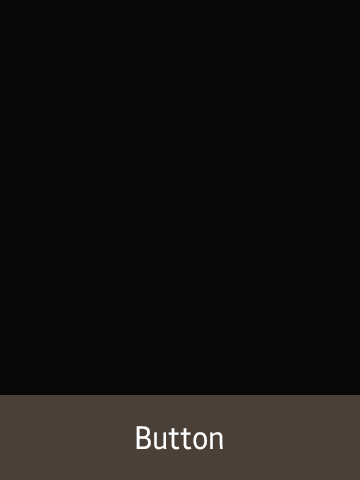
Buttons
The default buttons, without any styles applied to them, will look like generic buttons on a Web page. You can apply predefined styles to customize the buttons.
The following are the most common examples of the button designs.
Button Types for a Circular Type Wearable Device
If your app requires more than two buttons on a page, add the main action button at the bottom of the page. Provide the remaining action buttons on the More menu page, which can be accessed by tapping the visual cue.
Single button at the bottom
Button Types for the a Rectangular Type Wearable Device
Single button at the bottom
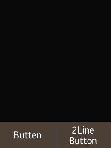
Two buttons at the bottom
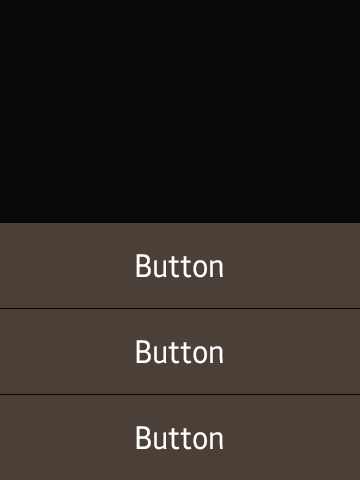
Three buttons stacked at the bottom
Single icon button
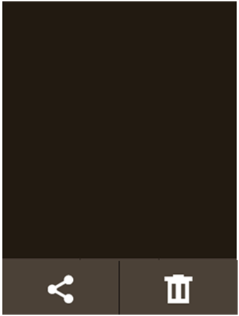
Two icon buttons
Three icon buttons
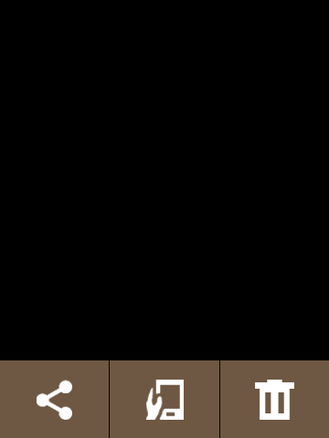
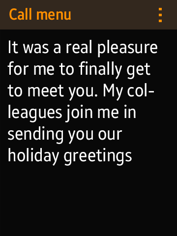
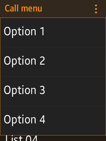
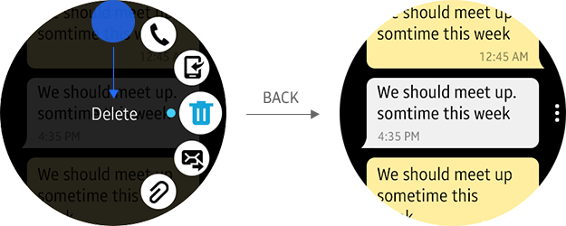
More Menu
The More menu is used to place multiple options on a separate page. Users can tap the More menu to see available options related to the information displayed on the current page.
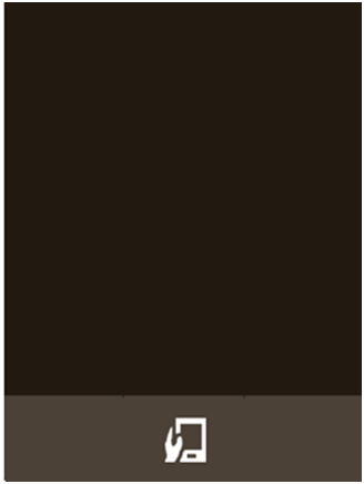
More menu butoon
On a circular type wearable device, an element called the “visual cue” has been added to provide direct access to the circular More menu page. The visual cue on the right side of the screen allows users to directly access the circular More menu page, regardless of where they are on the page.
The following figures illustrate how the visual cue works. The circular More menu page is displayed when users tap the visual cue.
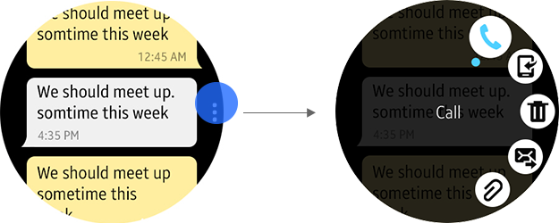
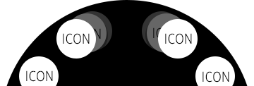
By default, the first item on the dial is selected when the circular More menu page first appears. Users can simply tap the action icons, or select an icon by rotating the bezel to view the text description, and then tap the text at the center of the dial to run the selected action. You can also provide multiple circular More menu pages if necessary. On a circular More menu page, the first and last items appear stacked if there are previous or next pages.
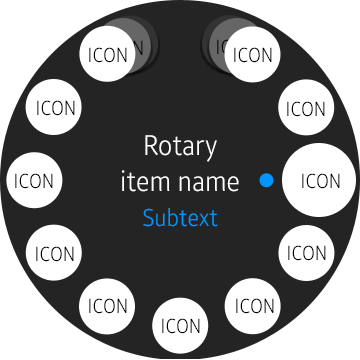
Action icons that can be provided on the circular More menu page are not limited to those for running features. You can also provide switch action icons that turns on or off a feature.
The circular More menu page disappears when a “back” interaction is performed, returning the visual cue to the right edge of the screen
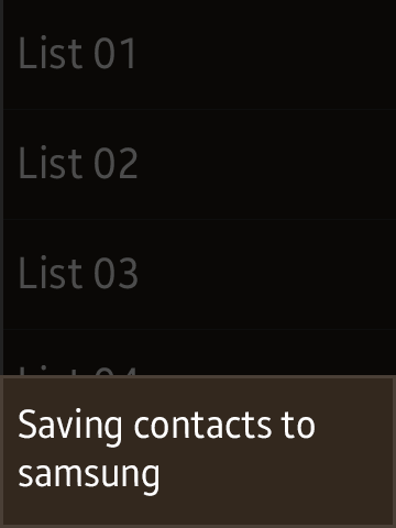
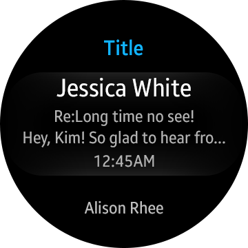
List Views
Use List views if you have multiple items to show in one page. On a circular type wearable device, users can rotate the bezel to scroll across the list.
Basic List Views
Design list pages using one of the following list view types. You can add subtext strings to the main item description to provide more information. The default height for a list item is fixed to 130 px for a circular type wearable device, and 100 px for a rectangular type wearable device. However, you can customize it with CSS styles if you use list items with their subtexts.
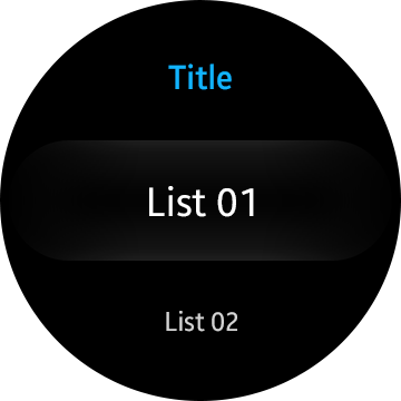
Basic list view
List view with subtext
List view with multiline subtext
List view with a divider and an icon
List view with radio buttons
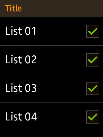
List view with checkboxes
List view with group index
Other than the subtext strings, you can also place action buttons, checkboxes, or radio buttons to add features to your basic list view layout. The following are examples of lists on a rectangular type wearable device.
Basic list view
List view with subtext
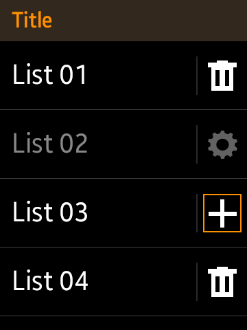
List view with action buttons
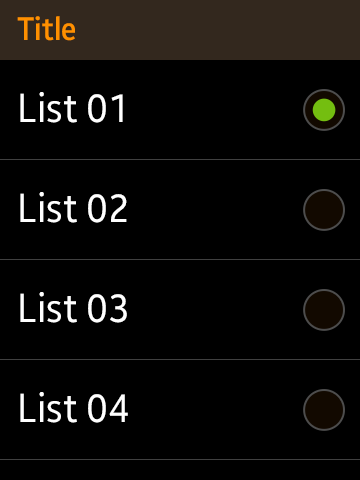
List view with radio buttons

List view with checkboxes
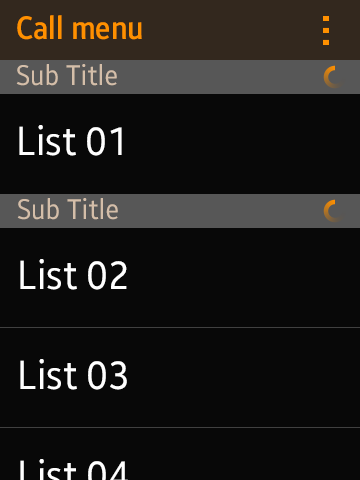
List view with group index
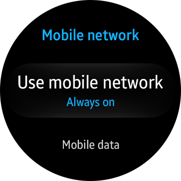
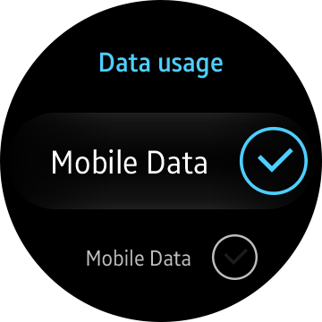
Checkbox and Radio Button
By default, Tizen wearable's key color schemes are applied to the checkboxes and radio buttons.
Radio buttons
Checkboxes
Checkbox (small)
Provide a small checkbox at the bottom of the screen to allow users to change setting options without accessing the More menu page.

Radio buttons
Checkboxes
When you design a list of checkboxes or radio buttons, make the whole area of each entry tappable, rather than designing only the checkboxes or the radio buttons to be tappable. This will provide an improved user experience by making list selections easier for users.
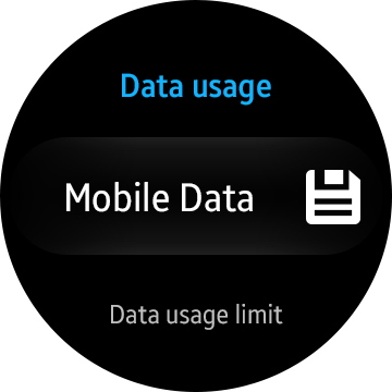
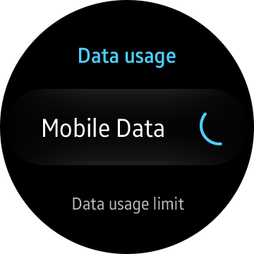
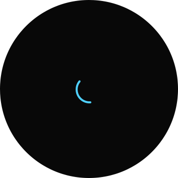
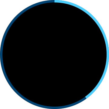
Progress and Activity Indicators
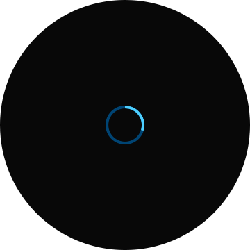
Progress and activity indicators can be used to inform users that a task is “in progress.” The progress indicator can be presented with either a percentage scale or a fraction indicator to show the detailed progress of a task. On the other hand, the activity indicator shows an indefinite process where the progress rate is unknown, with a rotating circle icon. You can design your app to stop the rotation when a job is done.

Progress indicator (Full)
Progress indicator (Small)
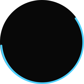
Activity indicator (Full)
Activity indicator (Small)
Progress indicator

Progress indicator (scaled)
Activity indicator
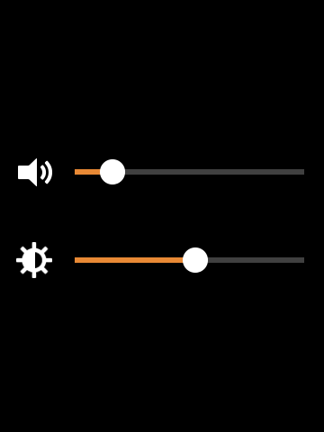
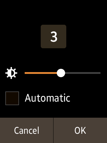
Sliders
You can implement sliders simply by adding the standard components to your design. The system style is automatically applied to the components to make your designs consistent with the Tizen wearable system.
Sliders are used to adjust a value within a certain range, and are provided with the descriptions and/or icons that explain the values. Users can tap the slider bar or circle to increase or decrease the value. You can choose to display numbers for the value to complement the sliders.
The following are examples of sliders presented in the Tizen wearable’s system style.
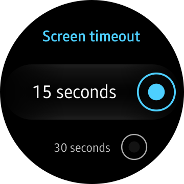
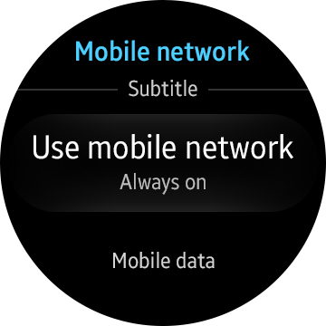
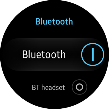
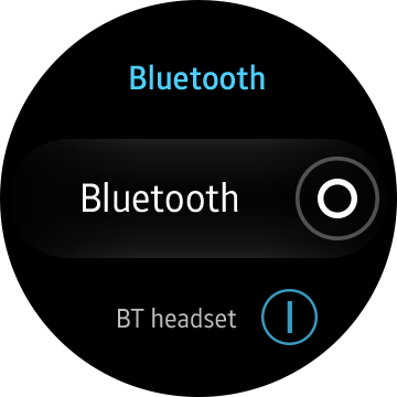
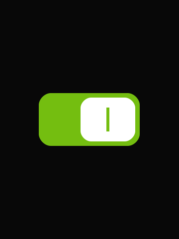
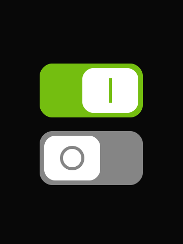
Switches
You can design toggles for your app to allow users to turn a feature on or off. Provide a switch beside a description for the option that can either be enabled or disabled by the user.
The following are examples of toggles presented in Tizen wearable’s system style.
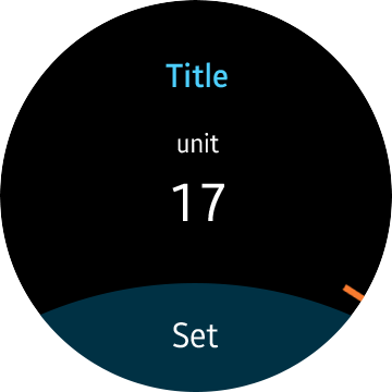
Pickers
Allow users to use the rotary action to set the date, time, and pick a color. Users can rotate the bezel to change the value of the centered item. For the date and time, users can touch and hold a value to display a marker. You can design your apps to use the touch input in combination with the rotary action to change the values on the screen. Provide a confirmation button at the bottom of the screen to confirm changes.
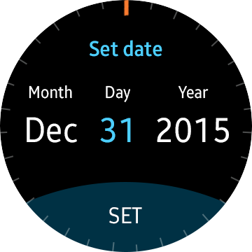
Date picker
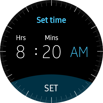
Time picker
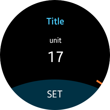
Number picker