Best Practices
PUBLISHED
This section provides suggestions to make the most out of the UI elements that we have covered in the previous section.
What is a header for?
A Header element is placed at the top of a page. It carries a title to provide users with a context. Small and simple apps made up of only a few pages may work just fine without headers. However, you should consider adding headers to your page designs if you are designing apps with many pages and a complex structure. Using such apps, users will be required to move to different pages, and chances are high that they will get lost in your app without headers.
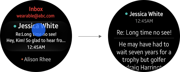
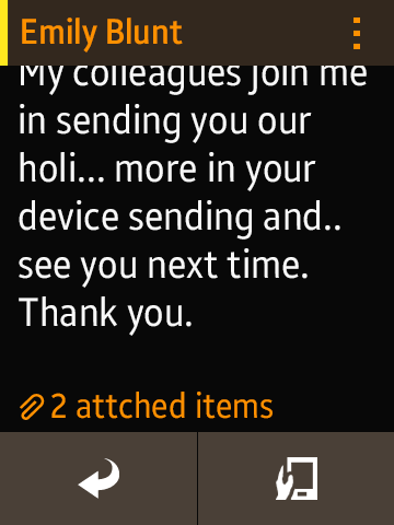
Example of headers: Headers help users understand the context.
How many buttons should I add on a page?
The display sizes vary among the wearable devices, and the display specifications will continue to change in future wearable devices. The following are guidelines to keep your apps compatible across different types of Tizen mobile devices.
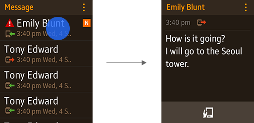
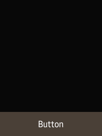
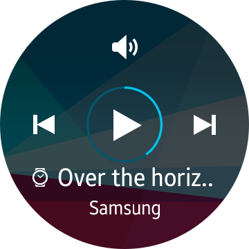
For a circular type wearable device, we recommend that you add only one button at the bottom of a page.
One bottom button on the screen
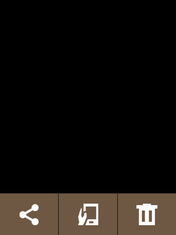
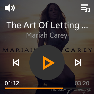
If you need to provide more than one feature on the page, place a bottom button for the main feature on the page, and then allow users to access the remaining buttons on the More menu screen by tapping the visual cue.
Multiple action buttons on the More menu
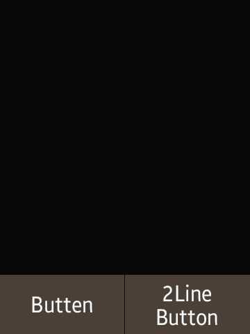
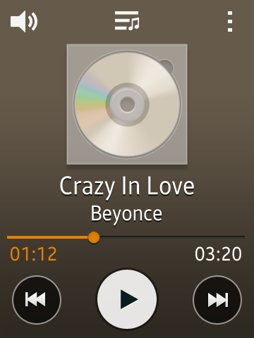
For rectangular and square type wearable devices, the number of buttons we recommend at the bottom of any page is two. We would advise you against using three buttons at the bottom of a page. However, if you need a three button design for your app, use button icons instead of button texts.
On a rectangular type wearable device, use the button group style to ensure that your button designs are compatible with various display sizes. These styles can automatically align a maximum of 3 buttons.
How should I design my app to close?
When users press the Home key or perform a bezel swipe down (the “back” interaction) from the main page (the first page) of your app, your app should close. If you have a lot of pages in your app, it will keep returning to the previous page each time the gesture is made. Then, it will close the app when another “back” interaction is made on the main page.
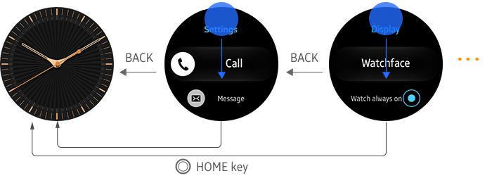
A bezel swipe down performs a “back” interaction on Tizen wearable devices. However, some Tizen wearable devices may have dedicated Back keys.
We recommend that you design your wearable app to close without a confirmation pop-up, since asking for confirmation may annoy the users. Also, avoid designing your app to run in the background when an action is performed to close the app, since stable background operation is not guaranteed.
How can I create compatible designs?
In order to ensure that your app is compatible with other wearable devices, use responsive designs when developing an app. Tizen wearable devices have been developed and marketed with different display sizes and resolutions so far, and such a trend may continue as the relevant technology advances.
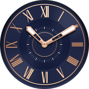
1:1 Circular screen layout

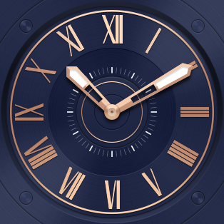
1:1 Screen layout
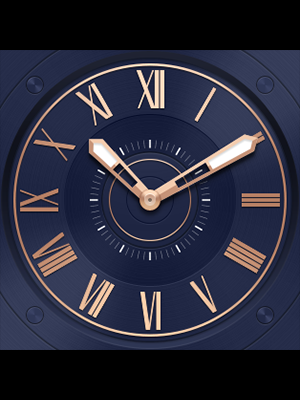
3:4 Screen layout
If you use the assets in the Tizen Studio, apps will be composed to match the screen ratio, but the layout may vary according to the screen ratio and size.
The Tizen Wearable UI framework elements are designed to shrink or expand according to the screen size. Also, note that the UI styles provided in the framework can be applied to display shapes other than the rectangular designs (circular display, for example).
Consider designing your screen based on a 1:1 ratio layout whenever it is practical. Then, find different ways to utilize the additional space provided by other screen ratios. While a design based on a 1:1 screen ratio screen layout will fit on any 3:4 ratio screen, one designed for a 3:4 screen ratio will not fit on a 1:1 ratio screen, nor can it be adjusted well enough to provide a natural look (if it is adjustable at all).
Refer to Wearable Design Principles and present information appropriately for the screen size and design layout.
1:1 Screen layout
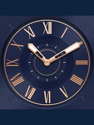
3:4 Screen layout
If you design an app where the layout cannot be modified (i.e. the Watch Face) and therefore cannot utilize the full screen, the app can be displayed as shown below. Set the horizontal width to 100% and leave blanks at the top and the bottom of the screen. The color for the blanks can be configured to match the main display, or separate images may be used to cover up the blanks.
1:1 Screen layout
3:4 Screen layout