Understanding SplitPanel
PUBLISHED
Introduction
SplitPanel can be a very handy control for displaying a group of UI elements in a pane and related UI elements in another pane. These panes can be placed side by side or one on the top of other. The image below illustrates this concept.
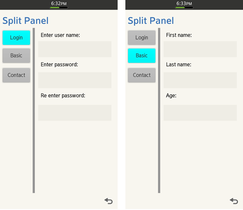
Figure: Sample App Output illustrating the Split Screen using Split Panel
In the demo application the SplitPanel is used to demonstrate how to build UI for new account creation. Of course there are other ways to implement this feature, such as providing a long list of all the entries, but in this case user would have to scroll through all the options. Using SplitPanel eliminates this problem. Also it is a nice idea to show the category-details relation with left/first and right/second panes of SplitPanel.
There can be many other use cases like photo viewer, where the left pane displays list of files, and the right pane displays the selected image. It is up to you to take the most out of SplitPanel.
In this article we will see a few features of SplitPanel and then we shall look into the implementation of the demo application.
Features
SplitPanel provides two panes, namely first and second pane. In the screenshot above the options “Login”, “Basic” and “Contact” are added to the container of the left pane. The area on the right is the container of the second pane with editable fields. Each pane can be associated with a Container. In this demo app Panel is used as a container for both the left and the right pane.
The panes are separated by a divider, which can be moved. Callbacks associated to its movement and click events will be described later. Position of the divider can be set and reset with the provided APIs.
When you click on Login button of the first pane, the editable fields on the right pane are shown, similarly upon click of the Basic button the corresponding editable fields are shown in the right pane and the user is allowed to enter the data into it.
Constructing a SplitPanel
//In Class declaration in .h file
Tizen::Ui::Controls::SplitPanel* __pSplitPanel;
…

//Implemantation
//Creates an instance of SplitPanel
__pSplitPanel = new (std::nothrow) SplitPanel();
Rectangle rcClient = GetClientAreaBounds();
__pSplitPanel->Construct(Rectangle(0, 0, rcClient.width, rcClient.height),
		SPLIT_PANEL_DIVIDER_STYLE_MOVABLE, SPLIT_PANEL_DIVIDER_DIRECTION_VERTICAL);
Along with the dimension the Construct() method needs the divider style, which can be either fixed or movable, and the divider direction, which can be vertical or horizontal.
Setting the divider’s position
//Sets the initial divider position
__pSplitPanel->SetDividerPosition(200);
__pSplitPanel->SetMinimumDividerPosition (100);
__pSplitPanel->SetMaximumDividerPosition (rcClient.width - 100);
As you can see the initial divider position is fixed to 200. Setting minimum and maximum divider position prevents it from moving till the end of the screen in either direction.
Setting Pane
//__pItemsPanel and __pDescriptionPanelMain are the container of type Panel
//control

//Sets panes in order
__pSplitPanel->SetPane(__pItemsPanel, SPLIT_PANEL_PANE_ORDER_FIRST);
__pSplitPanel->SetPane(__pDescriptionPanelMain, SPLIT_PANEL_PANE_ORDER_SECOND);
As explained earlier containers can be set as the first or the second pane. Here it is achieved with SetPane method.
Adding SplitPaneEventListener
//Adds event listener
__pSplitPanel->AddSplitPanelEventListener(*this);
This event listener provides two callbacks:
void
SplitPanelDemoForm::OnDividerDoublePressed (Tizen::Ui::Controls::SplitPanel &source)
{
	AppLog(" Divider Double Pressed");
}

void
SplitPanelDemoForm::OnDividerPositionChanged (Tizen::Ui::Controls::SplitPanel &source, int position)
{
	AppLog(" Divider Position Changed to %d", position);
}
Implementation of Demo app
In the attached demo application the buttons are added to the left pane. On button click the respective container is shown and others are hidden.
I have named these controls as *1, *2, *3 for purpose of similarity and clarity.
//Button ID's
static const int ID_BUTTON_1 = 101;
static const int ID_BUTTON_2 = 102;
static const int ID_BUTTON_3 = 103;

//Split panel
Tizen::Ui::Controls::SplitPanel* __pSplitPanel;

//Container for left pane and button control
Tizen::Ui::Controls::Panel* __pItemsPanel;
Tizen::Ui::Controls::Button* __pButton1;
Tizen::Ui::Controls::Button* __pButton2;
Tizen::Ui::Controls::Button* __pButton3;

//Container for right pane and associated panels
Tizen::Ui::Controls::Panel* __pDescriptionPanelMain;
Tizen::Ui::Controls::Panel* __pDescriptionPanel1;
Tizen::Ui::Controls::Panel* __pDescriptionPanel2;
Tizen::Ui::Controls::Panel* __pDescriptionPanel3;
Populating UI elements
Create all the UI elements:
// Creates instances Panels added as first and second order pane
__pItemsPanel = new (std::nothrow) Panel();
__pItemsPanel->Construct(Rectangle(0, 0, rcClient.width, rcClient.height));

__pDescriptionPanelMain = new (std::nothrow) Panel();
__pDescriptionPanelMain->Construct(Rectangle(0, 0, rcClient.width, rcClient.height));

__pDescriptionPanel1 = new (std::nothrow) Panel();
__pDescriptionPanel1->Construct(Rectangle(0, 0, rcClient.width, rcClient.height));

…
//Populate other controls and add to parent
…
__pDescriptionPanelMain->AddControl(*__pDescriptionPanel3);
__pDescriptionPanel3->SetShowState(false);
…
//Add buttons to container of left pane
…
__pButton1 = new Button();
__pButton1->Construct(Rectangle(10, 10, 180, 100), L"Login");
__pButton1->SetActionId(ID_BUTTON_1);
__pButton1->AddActionEventListener(*this);
__pItemsPanel->AddControl(*__pButton1);
…
//Add controls to respective container for right pane
…

//Add Controls to description panel 1
Label *pLabel11 = new Label();
pLabel11->Construct(Rectangle(20, 20, 400, 50), L"Enter user name:");
pLabel11->SetTextHorizontalAlignment(ALIGNMENT_LEFT);
__pDescriptionPanel1->AddControl(*pLabel11);
…
Handling button click events
Upon user click change the button’s color and show the respective right panel:
void
SplitPanelDemoForm::OnActionPerformed(const Tizen::Ui::Control& source, int actionId)
{
	switch(actionId)
	{
	case ID_BUTTON_1:
	{
		ShowHidePanels(true, false, false);
		SetSelectionColor(COLOR_ID_CYAN, COLOR_ID_GREY, COLOR_ID_GREY);
	}
	break;
	…
	…
	}
}

void
SplitPanelDemoForm::ShowHidePanels(bool first, bool second, bool third)
{
	__pDescriptionPanel1->SetShowState(first);
	__pDescriptionPanel2->SetShowState(second);
	__pDescriptionPanel3->SetShowState(third);
}

void
SplitPanelDemoForm::SetSelectionColor(ColorId colorId1, ColorId colorId2, ColorId colorId3)
{
	__pButton1->SetColor(BUTTON_STATUS_NORMAL, Color::GetColor(colorId1));
	__pButton2->SetColor(BUTTON_STATUS_NORMAL, Color::GetColor(colorId2));
	__pButton3->SetColor(BUTTON_STATUS_NORMAL, Color::GetColor(colorId3));
	RequestRedraw();
}
Summary
In this article, with the help of the attached demo app, using SplitPanels for building UIs of Tizen native applications has been explained and demonstrated.
When developing your application, you can decide when to apply the split view. It gives you the flexibility of using a split screen layout that contains a list view on the left and the detail view on the right.
If the user selects an item in the list on the left, the detail view on the right changes accordingly
Build Requirements
The application is built for devices with Tizen 2.2 firmware.
SDK Environment used: 2.2b
Appendix
Sample app attached.