Tizen UX Conversion Tutorial: Headerless Table Tutorial Part 2
PUBLISHED
Headerless Table Tutorial
Overview
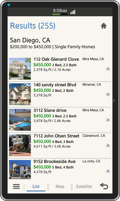
This article is part two of a two part series that demostrates the content listing with the use of headerless table, implemented in part 2 using Tizen web UI framework. And the UI is modified to follow the Tizen UX Guidelines.
The tutorial talks about using headerless tables for the content listing in mobile applications. The headerless table uses fat rows and every row displays multiple variables of an object. Generally, the row identifier is displayed in larger font and other details are displayed in smaller font.
The sample application demonstrates how the fat rows are designed.
Page Header
The header provides a button as an option for going back to the home page of the application. Per the Tizen UX guidelines, you can place up to two buttons in the header and use icon-shaped buttons. And if there are more than two buttons, you should place the most important and frequently used button to the left of the less important ones.
Below is the code snippet of the application's header,
<div data-role="header" data-position="fixed">
   <h1>Results (255)</h1>
   <div data-role="button" data-icon="home" class="naviframe-button"></div>
</div><!-- /header -->
Listing Contents using Headerless Table
The application uses the HTML <table> tag to create a table to hold the contents in the form of the fat rows. The fat rows contains the data for the corresponding identifier for that row which is highlighted in bold and larger font. The <tr> tag is used to wrap the row contents.
You can find the use of rowspan attribute in the first data cell, this allows us to span multiple rows together for that particular data cell and in this case we do the image data cell span for three rows. And other details are wrapped in the <td>tags with CSS classes for custom styling each data cell contents. For understanding purpose, only first two rows of the list are provided below, as its similar for rest all.
<table>
   <tbody class="property_listing_background">
     <tr><td rowspan="3" class="picture-border"><a href="#two">
           <img src="./css/images/pic1.png"/></a></td>
         <td class="property_address_boldtext">112 Oak Glenard Clove</td>
         <td class="property_address_normaltext"> Mira Mesa, CA</td>
         <td rowspan="3" valign="middle" ><a href="#two">
           <img src="./css/images/arrow.png"/></a></td>
     </tr>
     <tr>
       <td valign="top" class="property_price" colspan="2">$450,000
          <span class="prop-rooms"> 3 Bed, 2.5 Bath</span>
       </td>
     </tr>
     <tr class="separator-line">
       <td valign="top" class="property_area" colspan="2">2,378 Sq Ft / 2.16 Acres </td>
     </tr>

     <tr>
       <td rowspan="3" class="picture-border"><a href="#two">
          <img src="./css/images/pic2.png"/></a></td>
	  <td class="property_address_boldtext">140 sandy street Blvd</td>
	  <td class="property_address_normaltext"> Miramar, CA</td>
	  <td rowspan="3" valign="middle" ><a href="#two">
           <img src="./css/images/arrow.png"/></a></td>
     </tr>
     <tr>
       <td valign="top" class="property_price" colspan="2">$450,000
        <span class="prop-rooms"> 2 Bed, 2 Bath</span></td>
     </tr>
     <tr class="separator-line">
       <td valign="top" class="property_area" colspan="2">3,378 Sq Ft </td>
     </tr>
   </tbody>
</table>
It can also be observed that, a CSS class is used for separating each row from other with a thick line. Please find the class details under CSS section of this tutorial.
Page Footer
The application footer provides segments for navigation across List, Maps and Satellite pages. This is achieved by wrapping the unordered list of buttons in a single group using the tabbar widget.
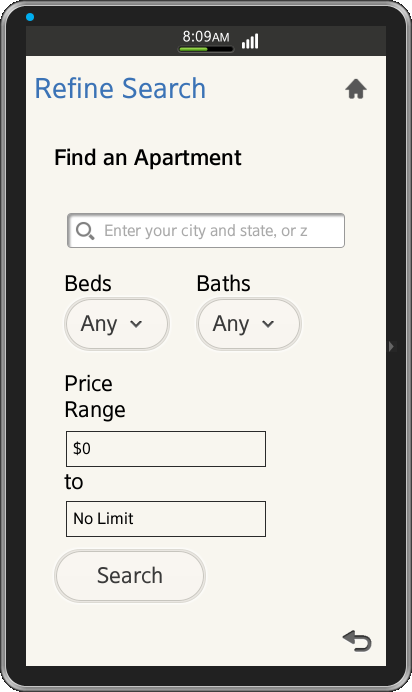
You can find that the application's footer also provides more button, which is placed on the left side of the footer. The more button use's a pop-up screen to give users access to more than two function buttons, like Refine Search option in our application.
<div data-role="footer" data-position="fixed">
  <a href="#pop_js" data-role="button"  data-icon="naviframe-more" data-transition="slideupfade" data-rel="popup"></a>
  <div id="pop_js" data-role="popup">
    <ul data-role="listview">
      <li><a href="#refine">Refine Search</a></li>
      <li><a href="#">Best Deals</a></li>
    </ul>
  </div>
  <div data-role="tabbar">
    <ul>
     <li><a href="#one"class="ui-btn-active ui-state-persist">List</a></li>
     <li><a href="#two">Map</a></li>
     <li><a href="#three">Satellite</a></li>
    </ul>
  </div>
</div><!-- /footer -->
CSS for Table
Below are the CSS classes used for styling the table, its rows and the contents.
The border-collapse attribute for the table is selected as collapse, so that the adjacent table cells share the borders.
/* Styling for Table */
table{
	height: 100%;
	width: 105%;
	margin-left: -15px;
	margin-right: 0px;
	margin-top: 25px;
	border-collapse: collapse;
}
The below class is for the separator or divider line between each fat rows.
.separator-line {
        border-bottom: 2px solid #c6c9cc;
}
CSS classes for the refine search page.
.search-area {
	padding-top:5px;
	padding-right:20px;
	padding-left:20px;
}

.search-submit-button {
	width: 50%;
	margin-right:auto;
}

.bed-bath-info {
	position: relative;
	width: 35%;
	margin-top:0px;
	display: inline-block;
	padding: 10px;
}

.price-range {
	width: 25%;
	margin-top:0px;
	padding: 10px;
	font-size: 8px;
}

.price-range .priceinput {
	display: inline-block;
	margin:0;
	padding:0;
}
Snapshot:
Below are the snapshots from the sample application.
License:
The icons used in the applications are licensed under Creative Commons License Attribution-ShareAlike 2.0.
Development Environment:
Tizen SDK
Version : 2.1.0
Build id : 20130416-1439
Note:
The sample application is available for reference (See under File Information section for attachment).