Tizen UX Conversion Tutorial: Expandable List - Part 1
PUBLISHED
Description
This article is part one of a two part series that demostrates the Expandable List UI pattern. Then in part 2, the UI is modified to follow the Tizen UX Guidelines.
This article explains how to create Expandable List UI and image scroller using Tizen platform. The expandable list shows a parent list view where the list items expand into child lists.
Pre-conditions
To develop Expandable List UI 'jquery.js' and 'web-ui-fw.js' must be included inside 'script' tag of HTML 'head'.
<ul>
  <li>src="tizen-web-ui-fw/latest/js/jquery.js"</li>
  <li>src="tizen-web-ui-fw/latest/js/tizen-web-ui-fw-libs.js"</li>
  <li>src="tizen-web-ui-fw/latest/js/tizen-web-ui-fw.js" data-framework-theme="tizen-white" data-framework-viewport-scale="false"</li>
</ul>
Expandable List HTML Page
In the content section, a division is created and a scroller style is applied to display automatic image slider on the top of the screen.
<div id="scroller">
  <div class="innerScrollArea">
    <ul>
      <!-- Define photos here -->
      <li>    <img src="./images/pic1.jpg" width="180" height="140" />    </li>
      <li>   <img src="./images/pic2.jpg" width="180" height="140" />    </li>
      <li>    <img src="./images/pic3.jpg" width="180" height="140" />   </li>
    </ul>
  </div>
</div>
To create an Expandable list in content section, the data-role attribute is set to "collapsible". Define parent list and child list. The expandable list shows a parent list view where the list items expand into child lists. When the list is in a collapsed state, only the parent list items are shown. If the user clicks a list item, the child list for that list item is displayed with a transition effect. If the user clicks the parent list item again, the child list collapses and is hidden. Each child list is created as part of its parent expandable list item as shown below.
<div  id="app_list">
  <div data-role="collapsible" data-icon="arrow-r" data-iconpos="right" class="ui-main-list" id="ui-main-list3">
    <h2 id="ui-hd-list3"> Automobiles</h2>
    <ul  data-role="listview"  data-filter-theme="c" data-divider-theme="d">
      <li>
        <a href="#">
          <img id="arrow_image" src="./images/arrow-r.jpeg" class="ui-li-bigicon" />
          BUS
        </a>
      </li>
      <li>
        <a href="#">
          <img id="arrow_image" src="./images/arrow-r.jpeg" class="ui-li-bigicon" />
          CUV
        </a>
      </li>
      <li>
        <a href="#">
          <img id="arrow_image" src="./images/arrow-r.jpeg" class="ui-li-bigicon" />
          Truck
        </a>
      </li>
    </ul>
  </div>
  <div data-role="collapsible" data-icon="arrow-r" data-iconpos="right" class="ui-main-list" id="ui-main-list2">
    <h2 id="ui-hd-list2"> Fashion</h2>
    <ul  data-role="listview"  data-filter-theme="c" data-divider-theme="d">
      <li>
        <a href="#">
          <img id="arrow_image" src="./images/arrow-r.jpeg" class="ui-li-bigicon" />
          Cloths
        </a>
      </li>
      <li>
        <a href="#">
          <img id="arrow_image" src="./images/arrow-r.jpeg" class="ui-li-bigicon" />
          footwears
        </a>
      </li>
      <li>
        <a href="#">
          <img id="arrow_image" src="./images/arrow-r.jpeg" class="ui-li-bigicon" />
          Jwels
        </a>
      </li>
    </ul>
  </div>
</div>
The Tab bar widget is used to wrap all buttons in footer.
<div data-role="footer" data-position="fixed" id="ui-ftr">
  <div data-role="tabbar">
    <ul>
      <li> <a data-icon="call" id="ui-link1"> </a> </li>
      <li> <a data-icon="call" id="ui-link2"> </a> </li>
      <li> <a  id="ui-link3"> Cancel</a> </li>
    </ul>
  </div>
</div>
Expandable List CSS file
Background color for page content can be changed as shown below.
#content{
	background-color:white;
	margin:0px auto;

}
Set the scroller position to 'relative' and specify the styles as shown below and apply to image scroller "div" element.
#scroller {
        position: relative;
        width: 550px; height: 200px; margin: 0 auto;
}
#scroller .innerScrollArea {
        overflow: hidden;
        position: absolute;
        left: 0;
        right: 0;
        top: 0;
        bottom: 0;
}
#scroller ul {
        padding: 0;
        margin: 0;
        position: relative;
}
#scroller li {
        padding: 0;
        margin: 0;
        list-style-type: none;
        position: absolute;
}
To set margin for arrow image(for Expandable list), define style as shown below.
#arrow_image{
        margin-left: 256px;
        margin-top: -12px;
}
Create style for expandable list as shown below:
#ui-main-list1,#ui-main-list2{
	margin-top:30px;
	background-color:#909090 ;
}
div h2#ui-hd-list1,div h2#ui-hd-list2,div h2#ui-hd-list3{
	color:white;
	background:#909090;
}
Create style for Tabbar(footer) as shown below:
#ui-link1,#ui-link2,#ui-link3{
	background-image: -webkit-gradient(
	linear,
	right top,
	left bottom,
	color-stop(0.5, rgb(144,144,144)  ),
	color-stop(0.5, rgb(144,144,144)  ));

}
div h2#ui-hd-list1,div h2#ui-hd-list2,div h2#ui-hd-list3{
	color:white;
	background:#909090;
}
#ui-link3{
	color:white;
}
Expandable List JavaScript file
To scroll image left, java script code is shown below .
 $(function(){
        var scroller = $('#scroller div.innerScrollArea');
        var scrollerContent = scroller.children('ul');
        scrollerContent.children().clone().appendTo(scrollerContent);
        var curX = 0;
        scrollerContent.children().each(function(){
            var $this = $(this);
            $this.css('left', curX);
            curX += $this.width();
        });
        var fullW = curX / 2;
        var viewportW = scroller.width();
});
Below code is used to manage the Scrolling speed for image slider
 var controller = {curSpeed:0, fullSpeed:2};
        var $controller = $(controller);
        var tweenToNewSpeed = function(newSpeed, duration)
        {
            if (duration === undefined)
                duration = 600;
            $controller.stop(true).animate({curSpeed:newSpeed}, duration);
        };
When the user selects an image, below code is used to display image will be in pause state.
       scroller.hover(function(){
            tweenToNewSpeed(0);
        }, function(){
            tweenToNewSpeed(controller.fullSpeed);
        });
To start the automatical scrolling in image slider, code is shown below.
var doScroll = function()
        {
            var curX = scroller.scrollLeft();
            var newX = curX + controller.curSpeed;
            if (newX > fullW*2 - viewportW)
                newX -= fullW;
            scroller.scrollLeft(newX);
        };
        setInterval(doScroll, 20);
        tweenToNewSpeed(controller.fullSpeed);
});
To hide current app, code is shown below:
$("#ui-link3").on('click', function(){
        var app = tizen.application.getCurrentApplication();
        app.hide();
});
Screenshots
Below are the screenshots of the Expandable List
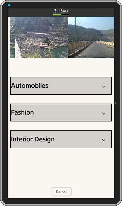
Figure-1:Expandable list items

Figure-2: Sub-list items with parent list