In this lesson, we'll look at popup windows, the purpose and the way of its using. In the end of the lesson, as a practice, we will show you how to add user popup confirmation request to close the application.
Often in applications, it becomes necessary to display important information on the top of the entire user interface, or to request confirmation and/or cancellation of some action. To do this, you can use a popup window. To create a widget, use the following function:
Evas_Object *elm_popup_add(Evas_Object *parent);As with other widgets, you need to call the evas_object_show() function to display a popup window. This widget supports delayed disappearing, so you can display information and in a few seconds automatically roll up the popup. To set this delay options and postponement time, use the following function:
void elm_popup_timeout_set(Evas_Object *obj, double timeout);The first parameter is a pointer to the popup window object, and the second - is the number of seconds through, which you want to roll up the specified widget. In some popup styles, animated window minimization can be implemented. In order to minimize the widget with such effect, use the following function:
void elm_popup_dismiss(Evas_Object *obj);Notice, after the call, the popup window will only become invisible, but it will not be deleted. Therefore, if you want to delete it, you should wait until the animation is complete, and then in this event handler, delete the widget using the evas_object_del() function. Later in this lesson we will look at the popups events. If you call evas_object_hide() , the window disappears instantly without any effect.
Since you are using a circle interface, you have to explicitly specify this for the widget using the next call:
elm_object_style_set(popup, "circle");Since to some extent popup is a container, styles for it are implemented a bit differently than for other widgets. In general, there is a following setting style process: a layout object creation, then one of the standard styles provided for popups is installed to it. And then depending on the chosen style, the popup window is filled with content.
Let's consider what layouts styles you may use in popup windows.

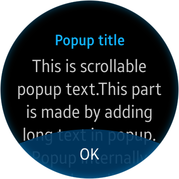
"layout/popup/content/circle" style:
The name of the layout style is composite: it consists of a class, a group, and a style. For each of the presented styles, the class is "layout", followed by the "popup" group and the "content/circle" style. You can set this style for the layout using the following function:
elm_layout_theme_set(layout, "layout", "popup", "content/circle");We have already done this for layouts in the lesson 12. This style consist of two areas in which you can set the text ("elm.text" is the name of the area for the main text, "elm.text.title" is the name of the area for the title text), and one area for buttons setting that will be located at the bottom of the screen.
If the text is too long, the internal implementation of the popup window adds the scroller.
Now, if the text size exceeds the height of the widget, the text will be scrolled.
In the popup window buttons is not directly installed to the layout, as it was with the text. To place buttons straight to the popup, use the function:
elm_object_part_content_set(popup, "button1", button);In the widgets for wearable devices with a circle screen, there are two such button areas. Like you may already guess, their names are "button1" and "button2".
"layout/popup/content/circle/buttons1" style:
This is the just like "style/popup/content/circle" style, but it is extended with buttons animation areas. Structurally these two styles are the same.
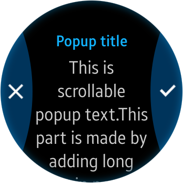
"layout/popup/content/circle/buttons2" style:
Like the "content/circle" and "content/circle/buttons1" layouts, this style has a text zone and a title. But it has two buttons: on the left (button1) and on the right (button2), instead of one at the bottom. We have already covered buttons styles ("popup/circle/left" and "popup/circle/right"), which are provided specifically for these areas, in the lesson 14.

A popup window with this style will be added to the demo application to confirm the completion of its work.
The widget supports the following smart events:
"timeout" – the event, triggered when the time, set by elm_popup_timeout_set() function, is ended. The popup window is hidden automatically.
"block,clicked". Some popup styles have areas that overlap the main user interface, to prevent user from actions with it. When user clicks on this area, this event is triggered. In the popup window with the "circle/toast" style, this area is placed on top of the entire user interface and on the top of the widget itself. Thus, if the user clicks anywhere in the popup window, this event will work. Usually at such action it is necessary to close the popup window.
"show,finished" – after displaying a popup window command, occurs some animation of “appearance”. This event happens after the completion of mentioned animation.
"dismissed" – this event is similar to the previous one, it works only after the animation of popup window disappearance, as a result of calling the elm_popup_dismiss() function, which was discussed earlier in this lesson.
"language,changed" – since the popup window is inherited from the layout, this signal is also supported. If a language in the system is changed, you can process it by registering the callback for this signal.
Let's move on to the practice and finish our demo application. We will show you how to create a popup window with two buttons: undo and confirm. The text message also will be displayed. In case of confirmation, the application will be closed; otherwise the popup window will be deleted by pressing the cancel button or the hardware Back button. Add a pointer to the popup window in your structure with widgets.
Evas_Object *popup;There is a following structure:
typedef struct _UIData {
   Evas_Object *win;
   Evas_Object *conform;
   Evas_Object *layout;
   Evas_Object *button;
   Evas_Object *label;
   Evas_Object *popup;

   int click_count;
} UIData;
Prepare a new function with which you will create popups:
static void
_exit_popup_create(UIData *ui)
{
}
Create a popup window object and set circle style to it:
ui->popup = elm_popup_add(ui->layout);
elm_object_style_set(ui->popup, "circle");
Now create a content layout with the "content/circle/buttons2" style and set it as content for the popup:
Evas_Object *popup_layout = elm_layout_add(ui->popup);
elm_layout_theme_set(popup_layout, "layout", "popup", "content/circle/buttons2");
elm_object_content_set(ui->popup, popup_layout);
After creating the layout, you can set the main text and title:
elm_object_part_text_set(popup_layout, "elm.text", "Close the application?");
elm_object_part_text_set(popup_layout, "elm.text.title", "Confirmation ");
Now let’s look at the buttons for the popup window.
We will use two buttons with the styles "popup/circle/left" and "popup/circle/right". Add icons (a cross and a tick) to these buttons, via the image widget. You can use our resources by downloading these pictures below and placing them in the folder res/ of your project.
Now we will not dwell in detail on the images displaying widget, so you can simply copy the following two functions for widget creation as well as specified images into your code.
static void
_file_abs_resource_path_get(char *res_file_path, char *abs_path, int buf_size)
{
   char *res_dir_path = app_get_resource_path();

   if (res_dir_path)
     {
        snprintf(abs_path, buf_size, "%s%s", res_dir_path, res_file_path);
        free(res_dir_path);
     }
}

static Evas_Object *
_image_create(Evas_Object *parent, char *image_name)
{
   Evas_Object *icon = elm_image_add(parent);

   char image_path[PATH_MAX] = {0,};
   _file_abs_resource_path_get(image_name, image_path, PATH_MAX);
   elm_image_file_set(icon, image_path, NULL);

   evas_object_show(icon);

   return icon;
}
Calling the last function will create and return the widget-image object, based on the passed parent widget and the name of the image, which is located in the res/ folder of your project. Let's create a function, which will be used to create buttons for a popup window. Pass into this function the parent widget, the buttons style, and the name of the icon that you want to use in the button.
static Evas_Object *
_popup_button_create(Evas_Object *parent, char *style, char *icon_name)
{
   Evas_Object *button = elm_button_add(parent);

   elm_object_style_set(button, style);

   Evas_Object *btn_icon = _image_create(button, icon_name);
   elm_object_content_set(button, btn_icon);

   evas_object_show(button);

   return button;
}
We have examined a button and its creation in the lesson 14.
You have implemented the auxiliary functions, so now use them to continue creating the popup window.
Create a left button to cancel the exit from the application and place it in the "button1" area of the popup window. And immediately register the handler for clicking on this button event.
static void
_exit_popup_create(UIData *ui)
{
   ...

   Evas_Object *left_button  = _popup_button_create(popup_layout,
                                                    "popup/circle/left",
                                                    "cancel.png");

   elm_object_part_content_set(ui->popup, "button1", left_button);
   evas_object_smart_callback_add(left_button, "clicked", _cancel_exit_cb, ui);

   ...
}
Create a right button to confirm the exit from the application and place it in the "button2" area of the popup window. And immediately register the handler for clicking on this button event.
static void
_exit_popup_create(UIData *ui)
{
   ...

   Evas_Object *right_button = _popup_button_create(popup_layout, "popup/circle/right", "apply.png");
   elm_object_part_content_set(ui->popup, "button2", right_button);
   evas_object_smart_callback_add(right_button, "clicked", _apply_exit_cb, ui);

   ...
}
Implement a small function to remove a popup window:
static void
_remove_popup(UIData *ui)
{
   evas_object_del(ui->popup);
   ui->popup = NULL;
}
After the object is deleted, set NULL to the pointer, because the evas_object_del() function does not make it automatically, and in the same time, you will tracking whether the popup window was created by the pointer to this widget. Now implement the handlers’ functionality for the created buttons.
static void
_cancel_exit_cb(void *data, Evas_Object *obj, void *info)
{
   UIData *ui = data;

   _remove_popup(ui);
}

static void
_apply_exit_cb(void *data, Evas_Object *obj, void *info)
{
   ui_app_exit();
}
In the handler of cancellation exit from the application, the function of removing and resetting the pointer of a popup window was used. In the exit method handler, call the function to terminate the application. The last step is to display the popup window using the function.
static void
_exit_popup_create(UIData *ui)
{
   ...

   evas_object_show(ui->popup);
}
Now, re-do the function of pressing the hardware Back button. You should create and display a popup if it has not been created yet, otherwise delete the widget. The handler should looks like this:
static void
_win_back_cb(void *data, Evas_Object *obj, void *event_info)
{
   UIData *ui = data;

   if (!ui->popup)
     {
        _exit_popup_create(ui);
     }
   else
     {
        _remove_popup(ui);
     }
}
Run the application and see how it works.
So, now you know how to create a popup window for this demo application.
The full source code for this tutorial is available here WearLesson017


