


Lesson 16
In this lesson we will consider a new widget for text displaying, you will find out how to control it and how to adjust the style of the displayed text. In the end we will show you how to add this label to the demo applications and how to change text in the widget after clicking on the button, which was created in lesson 14.
Label is a widget for displaying text on the screen of the applications with a graphical interface. For changing the text formatting, this component supports HTML-like markup. Also, the widget itself has several styles in the standard theme.
To create a text widget, use the following function:
Evas_Object *elm_label_add(Evas_Object *parent);To set the text, either to the label, or to any other widget of the Elementary library, use the following function:
void elm_object_text_set(Evas_Object *obj, const char *text);Like it was mentioned, for any smart widget of the Elementary library, style is set by the following function:
Eina_Bool elm_object_style_set(Evas_Object *obj, const char *style);The first parameter is the widget, for which style needs to be set, and the second - is the style name. If the style setting fails, the function returns EINA_FALSE, and in the other case EINA_TRUE. Let's consider the standard styles that are available for a text widget.
Style default:
This style has no visual effects.

Style slide_roll:
This style can be used if you need to show a long text to the user. During the displaying, text slides from left to right side within the widget area. You can control sliding duration/speed using the elm_label_slide_duration_set() function, which takes as a parameter duration of the text sliding per second. The slide effect supports three modes that can be set by the elm_label_slide_mode_set() function:
ELM_LABEL_SLIDE_MODE_NONE – absence of animation.
ELM_LABEL_SLIDE_MODE_AUTO - slide only if the text is longer than the width of the text widget.
ELM_LABEL_SLIDE_MODE_ALWAYS – permanent sliding.
After setting the text slide parameters, the effect itself needs to be started by calling the elm_label_slide_go() function.
To illustrate the above, let’s look at following example:
// Set the style
elm_object_style_set(label, "slide_roll");

// Add the text
elm_object_text_set(label,
                    "The text appears on the right and slides to the left"
                    "to show an overflow, and again appears to the right.");

// Select  the sliding mode
elm_label_slide_mode_set(label, ELM_LABEL_SLIDE_MODE_ALWAYS);

// Determine the speed
elm_label_slide_duration_set(label, 25);

// Launch the animation
elm_label_slide_go(label);
The result should be following:
Another style that uses sliding is slide_long. Here the text also appears on the right, but unlike slide_roll, it slides until disappears in the left part of the screen and appears again on the right.
As it was mentioned before, the text widget supports formatting via HTML-like markup. Let's consider this option.
Set up the horizontal alignment, using the align property. By default, there is set left alignment. To explicitly change it in the widget, you need to set the text with the additional tags and properties, as shown below.
Left alignment:
elm_object_text_set(label, " <font align=left>Hello</font>");
Right alignment:
elm_object_text_set(label, "<font align=right>Hello</font>");
Center alignment:
elm_object_text_set(label, "<font align=center>Hello</font>");
by the relative amount [0.0 … 1.0] or [0% … 100%]:
elm_object_text_set(label, "<font align=65%>Hello</font>");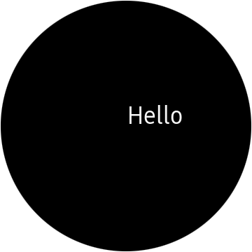
It is possible to make long text shorter by setting the ellipsis. The ellipsis = value parameter is used. The following values [0.0 … 1.0] or [0% … 100%] are valid. The value specifies in which part of the line the letters will be omitted and replaced with ellipsis. For example, an ellipse equal to one means that the text at the end of the line will be omitted.
So to set ellipsis shortening of the text, which is placed in the middle of the screen, specify the following parameters:
elm_object_text_set(label,
                    "<font ellipsis=1.0>The value of the ellipse determines where "
                    "the text will be converted to ellipsis.</font>");
Change the color and size of the text. Color can be set in any of the following formats: #RRGGBB, #RRGGBBAA, #RGB, or #RGBA. Also, the text can be underlined underline= {on, off, single, double} and/or crossed out strikethrough={on, off} . The color of the underlined/strikethrough line is transparent by default, so you should set the color underline_color=value, if the underscore line is double - underline2_color=value, strikethrough_color=value.
elm_object_text_set(label,
                    "<font align=center color=#25afdc "
                    "underline_color=#ffffff "
                    "underline2_color=#ffffff "
                    "underline=double "
                    "strikethrough_color=#ffffff "
                    "strikethrough=on>Hello Tizen</font>");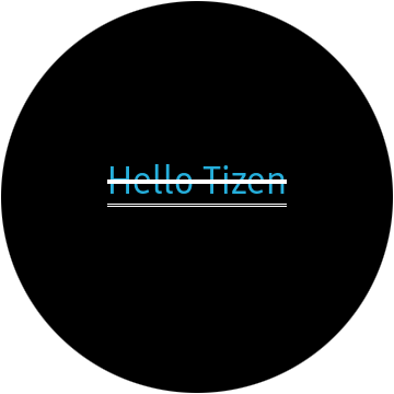
You can also change the background color by using the backing = {on, off} property, and set the color backing_color = value.
elm_object_text_set(ui->label, "<font align=center backing=on backing_color=#25afdc>Hello</font>");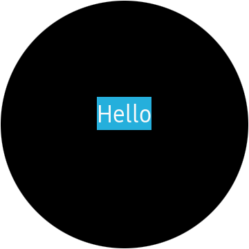
You can combine different properties to achieve the desired result.
There are several ways to add your own fonts to the project. Our task is to change the format of the text widget by adding the appropriate tags to the text, as it was done above.
To do this, use the interface for working with fonts, offered by the Evas library. First of all, specify to the application the directory where your fonts are stored, with following function:
void evas_font_path_global_append(const char *path);After the fonts are no longer needed, you can delete the added paths to the directories with fonts from the application list using the following function:
void evas_font_path_global_clear();Now after specifying to the application where your fonts are located, you can format the text.
elm_object_text_set(label, "<font=Sans:style=Italic>Hello</font> <font=graviseg:style=Bold>Tizen</font>");
Now, as you can see, it is possible to use several fonts in one text widget.
A text widget supports one of its own smart events: "slide, end", which occurs in the slip mode after the text animation is completed. Because the widget is inherited from the layout, it also supports the smart event "language, changed", which triggers when in the system a user interface language was changed.
Now add the text widget to the demo application and then, in the button click handlers, change the text in the label.
Add to your widgets structure pointers to the label and to the click counter.
Evas_Object *label;
int click_count;
You supposed to receive the following structure:
typedef struct _UIData {
   Evas_Object *win;
   Evas_Object *conform;
   Evas_Object *layout;
   Evas_Object *button;
   Evas_Object *label;

   int click_count;
} UIData;
Implement the function in which further the label will be created and configured:
static void
_label_create(UIData *ui)
{
}
Create a widget instance, specifying the layout as the parent.
ui->label = elm_label_add(ui->layout);Set a text for the centered horizontally label, for which was set the number of clicks on the button.
For this, create a separate function that will be used in the button callback.
static void
_label_click_count_text_set(UIData *ui)
{
   const int MAX_TEXT_SIZE  = 1024;
   char text[MAX_TEXT_SIZE] = {0,};

   snprintf(text,
            MAX_TEXT_SIZE,
            "<font align=center> Number of clicks: %d</font>",
            ui->click_count);

   elm_object_text_set(ui->label, text);
}

static void
_label_create(UIData *ui)
{
  ...

   _label_click_count_text_set(ui);

  ...
}
Define recommendations for the widget size, so that when you place it in the layout, it will be vertically positioned, approximately in the middle of the screen. If you do not do this, the widget will stretch across the entire screen area, and the text will be tied to top edge of the widget.
Evas_Coord w = 0;
Evas_Coord h = 0;
evas_object_size_hint_max_get(ui->label, &w, &h);
evas_object_size_hint_max_set(ui->label, w, 80);
Now display the widget with the following call:
evas_object_show(ui->label);
Now call the function to create and customize the label and place the widget in the layout. In it, the bottom area for the content is named "elm.swallow.content", place the button there.
static void
_layout_create(UIData *ui)
{
   ...

   _label_create(ui);
   elm_object_part_content_set(ui->layout, "elm.swallow.content", ui->label);

   ...
}
As a last step, pass to the callback for the click on the button event the pointer on the widgets structure. In this handler you should implement updating both text widget and button click counter.
static void
click_cb(void *data, Evas_Object *button, void *event_info)
{
   ...

   UIData *ui = data;

   ui->click_count++;
   _label_click_count_text_set(ui);
}

static void
_button_create(UIData *ui)
{
   ...

   evas_object_smart_callback_add(ui->button, "clicked", click_cb, ui);

   ...
}
Now you can run this application.
The full source code for this tutorial can be downloaded here WearLesson016