Containers
This feature is supported in mobile applications only.
Box
Figure: Box container
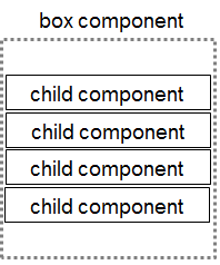
Most of the time, you want to display UI components on the screen in a specific order. In Form Tutorial, for example, the user information is arranged vertically. This basic container is called a box. There is no theme for a box layout. It is just a linear method of arranging UI components horizontally or vertically.
Creating a Box
To create a new horizontal box:
Evas_Object *vbox;

vbox = elm_box_add(parent);
By default, the elm_box_add() function creates a vertical box. If you want to create a horizontal box, use the elm_box_horizontal_set() function:
Evas_Object *hbox;

hbox = elm_box_add(parent);
elm_box_horizontal_set(hbox, EINA_TRUE);
| Note |
|---|
| A box is a non-graphical object. It adds no graphics to or around the objects it holds. |
Adding Objects to the Box
You can add any Evas object to the box. Here, we create 5 button components and add them to a box:
int i;
Evas_Object *bt;
Evas_Object *vbox;

vbox = elm_box_add(parent);

for (i = 0; i < 5; i++)
{
   char tmp[16];
   snprintf(tmp, sizeof(tmp), "Button %d", i);
   bt = elm_button_add(vbox);
   elm_object_text_set(bt, tmp);
   elm_box_pack_end(vbox, bt);
   evas_object_show(bt);
}
evas_object_show(vbox);
The most important function in the above code is elm_box_pack_end(), which is used to add the button component to the end of the box.
Setting the Padding
You can set the padding between the objects in a box by using the elm_box_padding_set() function. The padding values are the number of pixels horizontally and vertically.
elm_box_padding_set(vbox, 16, 64);
Handling Element Size
You can add different-size elements to a container. For example, to add an image with a size of 128x128 pixels as the first element in a box, use the elm_box_pack_start() function:
ic = elm_icon_add(vbox);
elm_image_file_set(ic, "./c1.png", NULL);
evas_object_size_hint_min_set(ic, 128, 128);
evas_object_show(ic);
elm_box_pack_start(vbox, ic);
We ask Evas to set the size hint for the icon object by using the elm_object_size_hint_min_set() function. Evas will try to set the minimum size of this object accordingly.
If you want to create a homogeneous box, where all objects have the same height or width, depending on the orientation of the box, use the elm_box_homogeneous_set() function:
elm_box_homogeneous_set(vbox, EINA_TRUE);
Elementary will set the height of the tallest object as the height of all objects, or the width of the widest element as the width of all objects.
Setting the Alignment
You can set the alignment of UI components inside a box using the elm_box_align_set() function. The function takes two doubles values, a horizontal value and a vertical value, representing the percentage between 0 and 1.0 of the alignment in the horizontal and vertical axes. When you add a UI component with the elm_box_pack_end() or elm_box_pack_start() function, Elementary computes the global size of the box. If the global size is bigger than the size of the box's parent, the box will take up all the space occupied by the parent, and the size of the parent may be extended to hold the box. If the global size is smaller than the parent's size, the alignment values will set the position of the box inside the parent.
Figure: Alignment
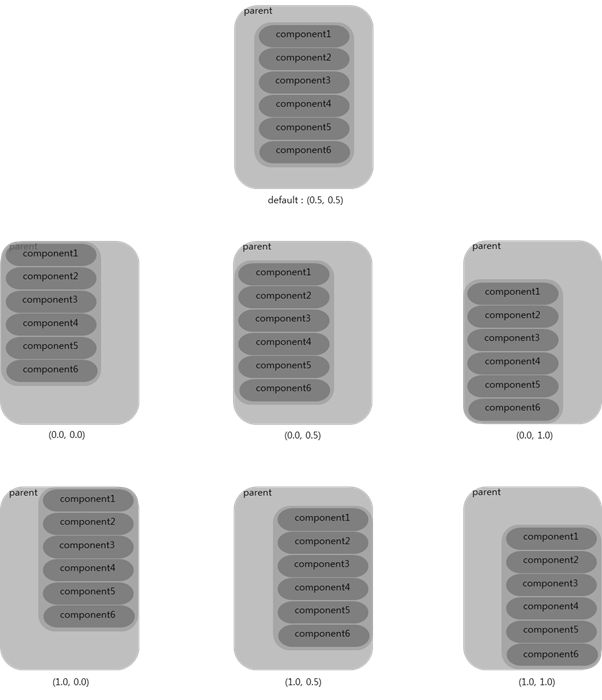
Here, we set an alignment of 0.8 vertically:
elm_box_align_set(vbox, 0.0, 0.8);
| Note |
|---|
| The alignment only takes effect in the opposite direction than the one defined with the elm_box_horizontal_set() function. |
The elm_box_layout_transition() function provides the ability to animate the motion of the objects in a box when switching from one layout to another.
Using Size Hints
Size hints are a set of functions that can be used on any Evas object. You request Evas to take care of various properties, and Evas will honor these requests if it can. This is why they are called "hints". The size hint functions are:
- evas_object_size_hint_min_set()
- evas_object_size_hint_max_set()
- evas_object_size_hint_aspect_set()
- evas_object_size_hint_align_set()
- evas_object_size_hint_weight_set()
You can also use the respective get functions to get the current hint values.
In case of the evas_object_size_hint_min_set() function, you ask Evas to respect the minimum size you define for the object. For example, to set the minimum size of an icon to 64x46 pixels:
evas_object_size_hint_min_set(ic, 64, 64);
You can also set a maximum size for the same icon:
evas_object_size_hint_max_set(ic, 128, 128);
When you resize the parent of the icon, if there are no constraints to the parent, the minimum size of the parent will be the minimum hint size of the icon. If you increase the parent size, the icon will grow larger until its maximum hint size is reached. After this point, the icon will not grow any larger and there will be empty space around the icon within the parent.
When the aspect size hint is set, Evas tries to fix the dimensional proportions of the object. Here, the proportion of the icon is respected, and the width will be the same as the height:
evas_object_size_hint_aspect_set(ic, EVAS_ASPECT_CONTROL_VERTICAL, 1, 1);
Here, the width will be twice the height:
evas_object_size_hint_aspect_set(ic, EVAS_ASPECT_CONTROL_VERTICAL, 2, 1);
If we want to change the alignment of the icon relative to the parent, we can use the evas_object_size_hint_align() function. By default, the icon is centered, so it is aligned with a value of 0.5. You can change the alignment as follows:
evas_object_size_hint_align_set(ic, EVAS_HINT_FILL, EVAS_HINT_FILL);
In the above case, the icon is aligned to the bottom left corner of the parent.
We can also play with the size of the icon inside its container by using the weight size hint. By default, the weight is not set, so the size of the icon will be the minimum size. But if you set this value to 1, the icon will be expand as much as it can inside the container:
evas_object_size_hint_weight_set(ic, EVAS_HINT_EXPAND, EVAS_HINT_EXPAND);
You can also use the alignment and weight hints together. Here, we want the icon to take up all the space in its parent:
evas_object_size_hint_align_set(ic, EVAS_HINT_FILL, EVAS_HINT_FILL);
evas_object_size_hint_weight_set(ic, EVAS_HINT_EXPAND, EVAS_HINT_EXPAND);
Conformant
Figure: Conformant container
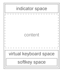
A conformant is a container UI component that accounts for the space taken by the indicator, virtual keyboard, and softkey windows. The content area of the conformant is resized and positioned based on the space available. When the virtual keyboard is displayed, the content area is not resized.
Creating a Conformant
To create a conformant, use the elm_conformant_add() function:
Evas_Object *conformant;

conformant = elm_conformant_add(parent);
Adding Content to the Conformant
To add content to the conformant, use the elm_object_content_set() function:
elm_object_content_set(conformant, main_view);
Signals
To receive notifications about the state of the virtual keyboard and clipboard, listen to the following Evas signals:
- "virtualkeypad,state,on": The virtual keyboard has been switched on.
- "virtualkeypad,state,off": The virtual keyboard has been switched off.
- "virtualkeypad,size,changed": The virtual keyboard size has changed.
- "clipboard,state,on": The clipboard has been switched on.
- "clipboard,state,off": The clipboard has been switched off.
Grid
In a grid, objects are placed at specific positions along a fixed grid, where the position of each object is given as a percentage of the full width and height of the grid. By default, the size of the grid is 100 x 100 pixels.
Creating a Grid
To create a grid, use the elm_grid_add() function:
Evas_Object *grid;

grid = elm_grid_add(parent);
Adding Items to the Grid
To add an item to the grid, use the elm_grid_pack_set() function. Provide the X and Y coordinates, and the width and height in the grid as parameters. The following code adds 12 icons in a circle formation:
for (i = 0; i < 12; i++)
{
   ic = elm_icon_add(grid);
   elm_image_file_set(ic, "c1.png", NULL);
   evas_object_size_hint_min_set(ic, 128, 128);
   evas_object_show(ic);
   x = 40 * cos(2.0 * M_PI / 12 * i);
   y = 40 * sin(2.0 * M_PI / 12 * i);
   elm_grid_pack(grid, ic,  40 + x,  40 + y,  20 , 20);
}
evas_object_show(grid);
Changing Position and Size
To change the position of an item in the grid, use the elm_grid_pack_set() function. The first parameter is the item you want to move, and the following parameters are the same as for the elm_grid_pack() function.
To change the size of the grid, use the elm_grid_size_set() function. You can set the new width and height for the grid. The position and size of the items in the grid are changed accordingly.
Clearing the Grid
To clear the grid, use the elm_grid_clear() function. All items are removed from the grid. If you set the clear parameter, all the items are also deleted, with the evas_object_del() function called on each item.
Layout
A layout is a container that takes a standard Edje design file and wraps it very thinly in a UI component. Layouts are the basis of a lot of graphics components used in Elementary.
An Edje design file describes how the elements of the UI are positioned and how they behave when interacted with. For more information about Edje, see the Edje guide.
Creating a Layout
To create a new layout, use the elm_layout_add() function:
Evas_Object *layout;

layout = elm_layout_add(parent);
In Tizen, the layout component is extended to support different kinds of layouts. Rather than define layouts yourself, you can use the following predefined default layouts:
- application/default: This layout can be used to display content inside a window.
- drawer/panel: This layout can be used to create a 2-panel view.
- nocontents/default: This layout can be used when there is no content to display, such as in a contact or email.
To use the application/default layout:
Evas_Object *ly;

ly = elm_layout_add(parent);
elm_layout_theme_set(ly, "layout", "application", "default");
Adding Objects to the Layout
To add an Evas object to the layout:
elm_object_part_content_set(ly, "elm.swallow.content" view);
elm.swallow.content is the swallow part of the application layout, and with this call you integrate the view inside the swallow object of the layout.
The drawer/panel layout can display 2 different views, the background and the main content:
Evas_Object *ly;

ly = elm_layout_add(parent);
elm_layout_theme_set(ly, "layout", "drawer", "panel");
To swallow an object inside the main content and background views:
elm_object_part_content_set(ly, "elm.swallow.content", main_view);
elm_object_part_content_set(ly, "elm.swallow.background", background);
The nocontents/default layout is a special layout in that it does not contain any swallows. You can only set the text part. There are two different texts zones: elm.text and elm.help.text. To change the text:
elm_object_part_text_set(ly, "elm.text", "Hi All :)");
elm_object_part_text_set(ly, "elm.help.text", "Hi All :)");
Using Layout Themes
The layout component supports the following predefined default themes:
- toolbar-content: For applications with a toolbar and main content area.
- toolbar-content-back: For applications with a toolbar, main content area (with a back button), and title area.
- toolbar-content-back-next: For applications with a toolbar, main content area (with back and next buttons), and title area.
- content-back: For applications with main content (with a back button) and title areas.
- content-back-next: For applications with main content (with back and next buttons) and title areas.
- toolbar-vbox: For applications with a toolbar and main content area as a vertical box.
- toolbar-table: For applications with a toolbar and main content area as a table.
To set a theme to the layout, use the elm_layout_theme_set() function.
Mapbuf
Figure: Mapbuf hierarchy
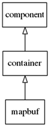
A mapbuf component is a container UI component that uses an Evas map to hold a content object. This component is used to improve the moving and resizing performance of complex UI components.
The content object is treated as a single image by the Evas map. If you have a content object containing several child objects, frequently moving the mapbuf component will be faster than frequently moving the content object.
The mapbuf component inherits all the functions of the container class.
Creating a Mapbuf
To create a mapbuf component, use the elm_mapbuf_add() function:
Evas_Object *mapbuf, *parent, *content;

// Creating a mapbuf
mapbuf = elm_mapbuf_add(parent);
Adding Content to the Mapbuf
To add content to the mapbuf component, use the elm_object_content_set() function with the "default" part:
elm_object_content_set(mapbuf, content);
| Note |
|---|
| Calling elm_object_content_set(mapbuf, content) is equivalent to calling elm_object_part_content_set(mapbuf, "default", content). |
To activate smooth map rendering and alpha rendering for the mapbuf component:
elm_mapbuf_smooth_set(mapbuf, EINA_TRUE);
elm_mapbuf_alpha_set(mapbuf, EINA_TRUE);
Activating the Mapbuf
Finally, to use the mapbuf component, you must activate it:
elm_mapbuf_enabled_set (mapbuf, EINA_TRUE);
Signals
The mapbuf component does not emit any signals and therefore does not provide any callbacks that you can register.
Naviframe
A naviframe component consists of a stack of views. New views are pushed on top of previous ones, and only the top-most view on the stack is displayed. The previous views are not deleted. A previous view is displayed when the view on top of it is popped. Transitions can be animated on a push or a pop, depending on the theme applied to the UI component.
Creating a Naviframe
To create a naviframe, use the elm_naviframe_add() function:
Evas_Object *nav;

nav = elm_naviframe_add(parent);
Adding and Deleting Views
The naviframe is a stack of views. A new view is always pushed to the top of the stack. The top-most view is deleted by popping it.
To add a new view to the naviframe:
Elm_Object_Item *nav_it;

nav_it = elm_naviframe_item_push(nav, NULL, NULL, NULL, view, NULL);
// In Tizen 2.3, the back button is not supported in the naviframe
When you push a new view to the stack, you receive an Elm_Object_Item for the view. You can use this item to modify the view.
To pop and delete the top-most view:
elm_naviframe_item_pop(nav);
Adding Fixed Content
The naviframe can also display fixed content on top of the current (top-most) view. Use the elm_object_item_part_content_set() function to set this content. Use the following part names to specify the location of the content:
- "default": The main content area of the current view.
- "title_left_btn": A button on the left side of the naviframe.
- "title_right_btn": A button on the right side of the naviframe.
For example, to add a button to the naviframe:
btn = elm_button_add(nav);
elm_object_style_set(btn, "naviframe/title_cancel");
elm_object_item_part_content_set(nav_it, "title_left_btn", btn);
To set the title labels of the naviframe, use the elm_object_item_part_text_set() function and specify one of the following label locations:
- "default": Sets the title label in the title area of the current view.
- "subtitle": Sets the subtitle label in the title area of the current view.
Signals
The naviframe emits the following signals:
- "transition,finished": The transition has finished changing the view.
- "title,transition,finished": The title area transition has finished changing the state of the title.
- "title,clicked": The user has clicked the title area.
Panes
Figure: Panes component
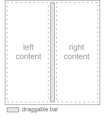
A panes component adds a draggable bar between two sections of content. The sections are resized when the bar is dragged.
Creating Panes
To create a panes component, use the elm_panes_add() function:
Evas_Object *panes;

panes = elm_panes_add(parent);
Adding Content to the Panes
To add content to the panes, use the elm_object_part_content_set() function. The following code adds an object to the left pane:
elm_object_part_content_set(panes, "left", obj);
Setting Panes Options
To set the orientation of the panes, use the elm_panes_horizontal_set() function.
To set the size of the panes, use the elm_panes_content_left_size_set() and elm_panes_content_right_size_set() functions.
Signals
The panes component emits the following signals:
- "press": The panes component has been pressed (but the press has not been released yet).
- "unpress": The press has been released.
- "clicked": The panes component has been clicked.
- "clicked,double": The panes component has been double-clicked.
Scroller
A scroller holds (and clips) a single object and allows you to scroll across it. This means that the user can use a scroll bar or their finger to drag the viewable region across the object, moving through a much larger area than is contained in the viewport. The scroller will always have a default minimum size that is not limited by its contents.
The scroller component inherits all the functions of the Layout.
Creating a Scroller
To create a scroller, use the elm_scroller_add() function:
Evas_Object *scroller;

scroller = elm_scroller_add(parent);
Adding Objects to the Scroller
To add an object to the scroller, use the elm_object_content_set() function:
Evas_Object *image;

image = elm_image_add(parent);
elm_image_file_set(image, "image.png", NULL);
evas_object_show(image);
evas_object_size_hint_min_set(image, 2560, 1600);
elm_object_content_set(scroller, image);
In the above code, we set a minimum size of 2560 x 1600 pixels for the image. The scroller is smaller than the image, so you can scroll across the image.
If you want to be informed when the user begins scrolling the image, use the following code:
evas_object_smart_callback_add(scroller, "scroll,drag,start", _scroll_start_cb, NULL);

// Callback function for the "animate,begin" signal
// This callback is called when the user begins scrolling the image
void _scroll_start_cb(void *data, Evas_Object *obj, void *event_info)
{
   printf("Scroll starts\n");
}
Managing the Properties of the Scroller
When scrolling content, the scroller may "bounce" when reaching the edge of the content. This is a visual way of indicating that there is no more content to scroll in that direction. Bounce is enabled by default for both axes. To enable or disable the bounce for either or both axes, use the elm_scroller_bounce_set() function. The following code disables the bounce for the horizontal axis and enables it for the vertical axis:
elm_scroller_bounce_set(scroller, EINA_FALSE, EINA_TRUE);
The scroller can limit the scrolling to "pages". In this case, the scrolling occurs in page-sized chunks of content rather than in a purely continuous fashion, with the scroller displaying a single "page" at a time. This feature sets the size of the page relative to the viewport of the scroller. A size of 1.0 equals 1 viewport (horizontally or vertically). A size of 0.0 disables paging for that axis. These settings are mutually exclusive with page size (see the elm_scroller_page_size_set() function). A size of 0.5 equals half a viewport. Usable size values are normally between 0.0 and 1.0, including 1.0. If you only want a single axis to scroll in pages, use 0.0 for the other axis.
Signals
The scroller emits the following signals, which you can catch in your application:
- "edge,left": The left edge of the content has been reached.
- "edge,right": The right edge of the content has been reached.
- "edge,top": The top edge of the content has been reached.
- "edge,bottom": The bottom edge of the content has been reached.
- "scroll": The content has been scrolled (moved).
- "scroll,anim,start": The scrolling animation has started.
- "scroll,anim,stop": The scrolling animation has stopped.
- "scroll,drag,start": Dragging the contents has started.
- "scroll,drag,stop": Dragging the contents has stopped.
- "vbar,drag": The vertical scroll bar has been dragged.
- "vbar,press": The vertical scroll bar has been pressed.
- "vbar,unpress": The vertical scroll bar has been unpressed.
- "hbar,drag": The horizontal scroll bar has been dragged.
- "hbar,press": The horizontal scroll bar has been pressed.
- "hbar,unpress": The horizontal scroll bar has been unpressed.
- "scroll,page,changed": The visible page has changed.
Example
A good example of the scroller is a picture slideshow: we add images to the scroller and limit the scrolling to pages (one picture at a time). In the following code, we disable the scroll bars for both axes, limit the scrolling to pages by using the elm_scroller_page_scroll_limit_set() function, and lock the scrolling on the Y axis by using the elm_object_scroll_lock_y_set() function:
elm_scroller_policy_set(scroller, ELM_SCROLLER_POLICY_OFF, ELM_SCROLLER_POLICY_OFF);
elm_scroller_page_scroll_limit_set(scroller, 1, 0);
elm_object_scroll_lock_y_set(scroller, EINA_TRUE);
We create a horizontal box, which will contain all the images, and which itself will be contained by the scroller:
box = elm_box_add(scroller);
elm_box_horizontal_set(box, EINA_TRUE);
elm_object_content_set(scroller, box);
evas_object_show(box);
We then create all the images and add them to the horizontal box:
img = elm_image_add(scroller);
snprintf(buf, sizeof(buf), IMAGE_DIR"/%d.jpg", i);
elm_image_file_set(img, buf, NULL);
evas_object_show(img);
pages = eina_list_append(pages, img);
elm_box_pack_end(box, img);
We store references to the images in an eina_list for easy retrieval later.
Finally, we display the first page of the scroller:
elm_scroller_page_show(scroller, 0, 0);
The size of the scroller depends on the size of the parent. When the parent changes, for example when the window is resized or rotated, the scroller is also resized. Since we need to be informed when the scroller is resized, we add a callback on the EVAS_CALLBACK_RESIZE event for the scroller:
evas_object_event_callback_add(scroller, EVAS_CALLBACK_RESIZE, _scroller_resize_cb, NULL);
The callback retrieves the new size of the scroller by using the evas_object_geometry_get() function on the object pointer. The pointer is relative to the object that has been resized, which in our case is the scroller itself. We can then iterate through the images of the scroller and set the minimum size to fit the scroller size:
EINA_LIST_FOREACH(images, l, page)
{
   evas_object_size_hint_min_set(page, w, h);
}
Finally, we set the page size of the scroller to match the scroller size and display the first page:
elm_scroller_page_size_set(obj, w, h);
elm_scroller_page_show(obj, 0, 0);
Table
A table is like a box but with 2 dimensions. You have the same kind of APIs as with boxes. An item inside the table can span multiple columns and rows, and even overlap with other items (and it can then be raised or lowered accordingly to adjust stacking if there is overlap).
Creating a Table
To create a table, use the elm_table_add() function:
Evas_Object *table;
table = elm_table_add(parent);
Adding Items to the Table
Items are added to the table with the elm_table_pack() function. This function takes as parameters the table, the item to add to the table, and the position where to add the item: column, row, and the size of the item in number of rows and columns (colspan and rowspan). If we want to create an icon that takes 3 columns and rows and a button that only takes 1 row and column, the code will look like this:
ic = elm_icon_add(table);
elm_image_file_set(ic, "icon.png", NULL);
evas_object_show(ic);
elm_table_pack(table, ic, 0, 0, 3, 3);

btn = elm_button_add(table);
elm_object_text_set(btn, "Click me i'm famous");
evas_object_show(btn);
elm_table_pack(table, btn, 3, 1, 1, 1);
evas_object_show(table);
Managing the Items
If you want to change the position of the item after adding it, use the elm_table_pack_set() function. This function takes as parameters the item whose position to change, the new column, the new row, and the size of the item in number of rows and columns (colspan and rowspan).
To add padding around the item, use the elm_table_padding_set() function. The second parameter is the padding between columns, and the third parameter is the padding between rows:
elm_table_padding_set(table, 10, 10);
To change the alignment and size of an item, use the evas_object_size_hint parameters. They are used in the same way as with boxes. You can set the same size and weight to each item by using the homogeneous parameter:
elm_table_homogeneous_set(table, EINA_TRUE);
Clearing the Table
To clear the table, use the elm_table_clear() function. If the clear parameter is EINA_TRUE, the table items are deleted. The evas_object_del() function will be called on each item.

