Rotary selectors
PUBLISHED
The rotary selector arranges multiple items around the circular edge of the screen, and switches the focus between items as users rotate the bezel.
|
Rotary selector in developer's guides |
|
|---|---|
| Native | Rotary selector |
| Web | Selector |

The rotary selector displays multiple items in a circle.
Usage
- Present multiptle items to be selected
The rotary selector can be used on any screen that includes multiple items. The title of an item is only displayed when the item is in focus.
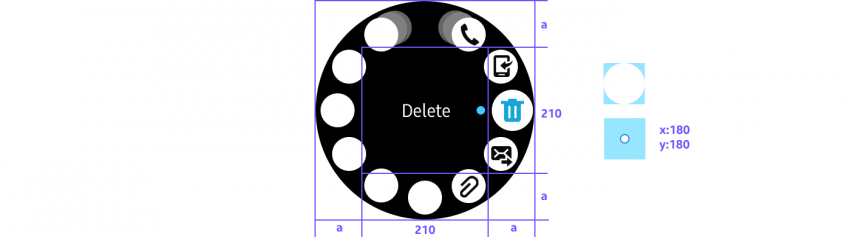
- Provide more options
More options are revealed with the rotary selector when users tap the visual cue on the right side of the screen. More options appear as a temporary view over the current screen and provide additional functions available for a list item.
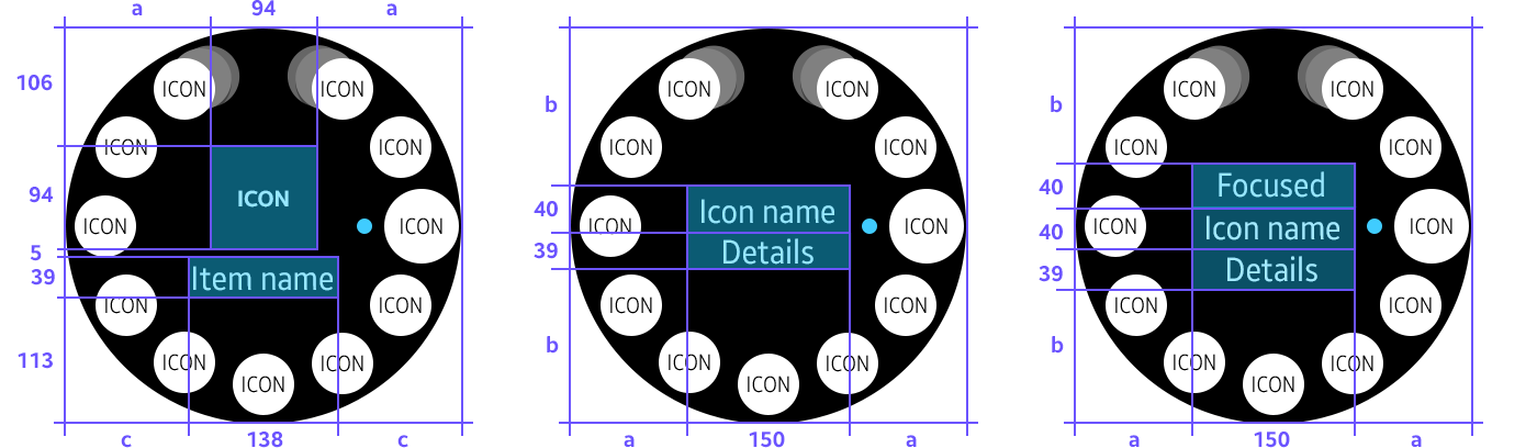
Elements
- Option icon
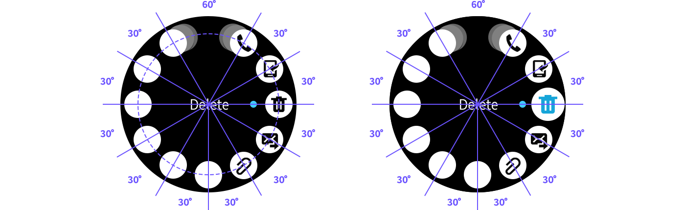
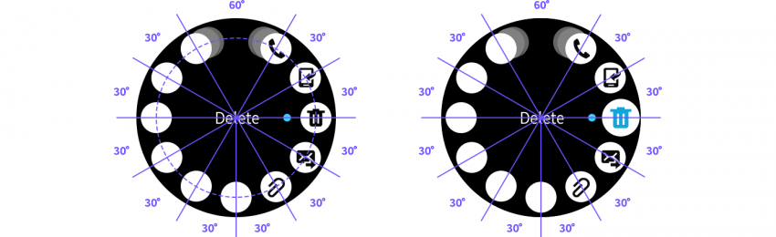
The rotary selector can present up to 11 option icons on a page. Option icons are ordered clockwise from the top.
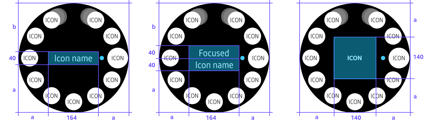
- Option detail
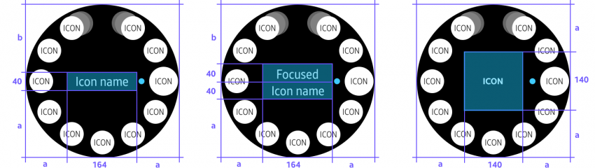
When an option item comes into focus as users rotate the bezel, its title, subtext, and icon are shown in the center of the screen. If the item is a toggle button, the current state is displayed as subtext.
- Previous/Next icon
Previous/next icons are shown when the rotary selector has more than 11 option items to display. Moving in a clockwise direction from the top, the previous icon is placed at the left of the first button and the next icon is placed at the right of the last.
Behavior
- Focus
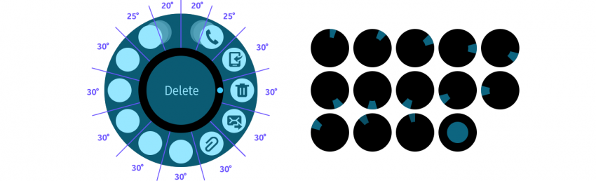
Rotating the bezel by one detent brings the next option on the list into focus. An indicator shows which option is currently in focus.

The rotary selector switches the focus to the next item as the bezel rotates by one detent.
- Select
An option performs its assigned task when users tap it, regardless of whether or not it’s in focus. A tap on the center of the screen triggers the task of the item in focus. If an item is a toggle button, tapping the item or its option detail switches its state.

Design specs
- Icon
Normal Selected
2nd layer icon 3rd layer icon

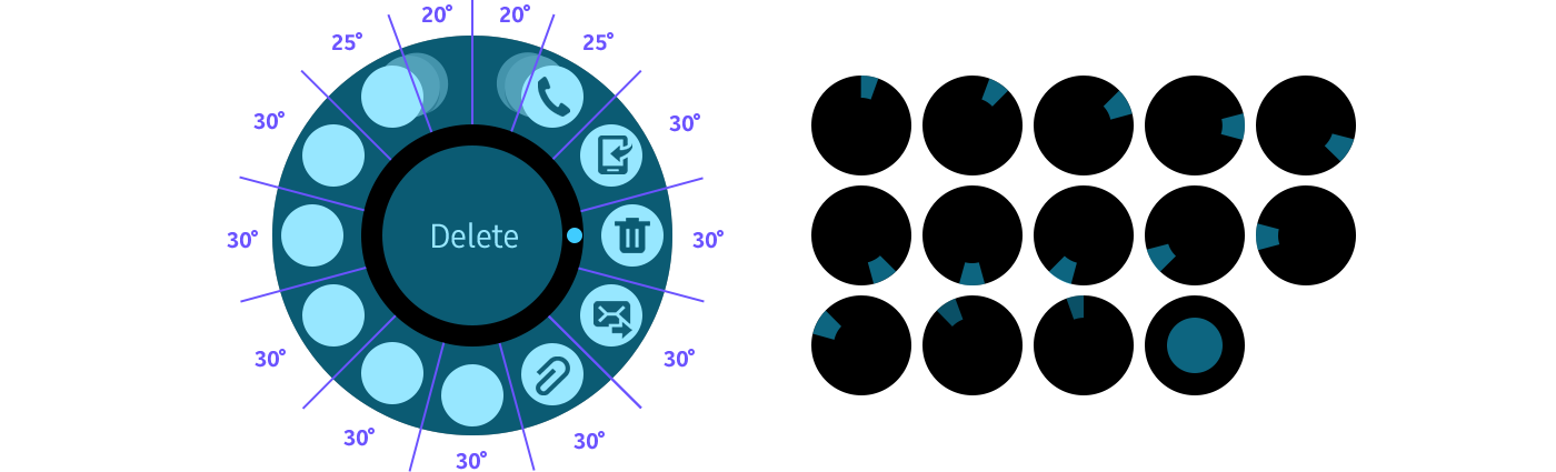
The 2nd layer icon rotates 7 ° from the 1st layer icon. The 3rd layer icon rotates 3° from the 2nd layer icon

The center of an icon
is used as coordinates.
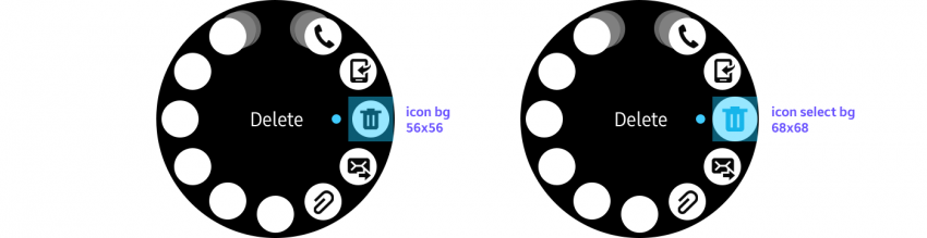
A normal icon is reduced to 56x56 from the
selected icon size of 68x68.
Normal Selected
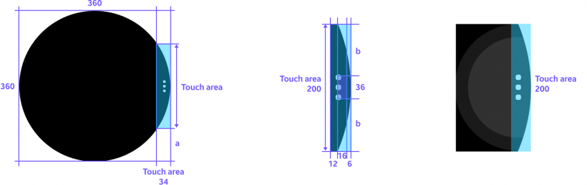
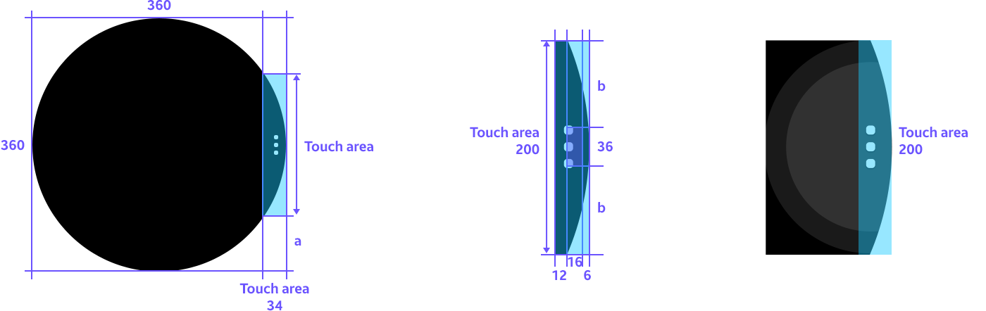
Touch Area
Rotary selector icon color More options icon color

- Title
1 line text 2 line text Icon only

Icon + Text 1 line text + Subtext 2 line text + Subtext
- More options