Working with CSS3 Transitions
PUBLISHED
Introduction
Thanks to animations, websites and web applications became more interactive and vivid. The times when “website” meant “static content” have gone to past. Menu animations, slideshows, interactive charts are now an integral part of most applications. Before the introduction of the third version of CSS we had to use external libraries like jQuery or script.aculo.us for animations. Now we have two powerful features which are transitions and animations with keyframes. We’re going to focus on the first one in this article.
Sample applications were tested on Tizen SDK 2.1.0.
What are CSS3 transitions?
Transitions were introduced in the third version of Cascade Style Sheets. Thanks to them, we can manipulate specific properties of an element over time. Transitions are supported by Tizen’s WebKit engine. We can control such properties like position, size, rotation, color, opacity, font settings, margins, paddings and a few more. Going to this address http://www.w3.org/TR/css3-transitions/#animation-of-property-types- you can check what property types you can animate. The only requirement is that it has to be possible to calculate intermediate values for the property that you’re changing. For example, you can’t animate a font-family property because setting its value is an immediate operation.
Transition properties
There are four properties by which we can control transitions. The first one is a transition-property where we choose a CSS property to animate e.g. width, opacity, color etc. The second one is a transition-duration (given in seconds or milliseconds) by which we can control how long the animation will last. The next one is a transition-timing-function, thanks to which we can manipulate how the value of the property changes over time, for instance exponentially accelerating. It’s going to be described in detail later on in this article. The last one is a transition-delay (given in seconds or milliseconds) that delays animation execution in time. The code below shows an example usage of transitions.
transition-property: width;
transition-duration: 1s; /* in seconds */
transition-timing-function: ease-in; /* slow at the beginning, fast at the end */
transition-delay: 250ms; /* in milliseconds */
All the code can be written in one line thanks to a transition shorthand property. Properties have to be placed in the following order: property, duration, timing function, delay. The last two may be omitted and their default values will be ease and 0.
transition: width 1s ease-in 250ms;
When more than one property has to be animated, we can separate them by commas (both in the long and the short version) which is shown in the code below.
/* long version */
/* animate width for 1 second and opacity for 2 seconds */
transition-property: width, opacity;
transition-duration: 1s, 2s;

/* short version */
transition: width 1s, opacity 2s;
The timing function needs more attention. It can be one of the predefined values: linear (the same speed over time), ease (default value; brief acceleration at the beginning and longer slowing down at the end), ease-in (accelerating over time), ease-out (slowing down over time), ease-in-out (accelerating at the beginning and slowing down at the end). Each of these values is a cubic Bézier curve. You can read more about it here: http://en.wikipedia.org/wiki/B%C3%A9zier_curve. In short words, it’s a curve whose shape is manipulated by control points. In the CSS we use 4 points (cubic) curves. We have to define only 2 middle points because the first one is placed by default in the <0,0> position and the last one is placed in the <1,1> position. The picture below shows different Bézier curves predefined in CSS3. You can notice how fast the value changes over time. The time is put on the x-axis (increasing to the right) and the value on the y-axis (increasing to the top).
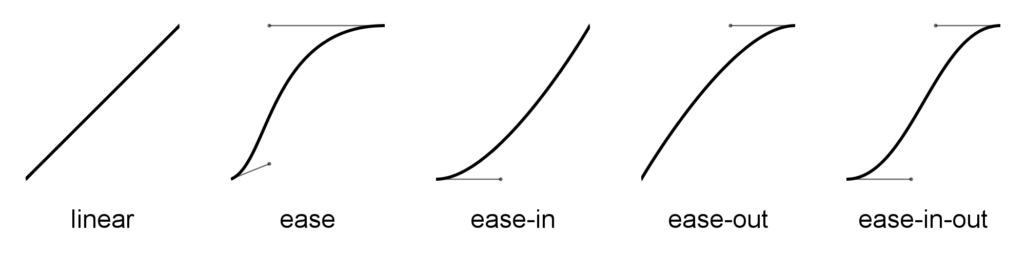
Fig 1: Bézier curves predefined in CSS3.
You can define your own curve by giving a cubic-bezier function as value for the transition-timing-function property. It takes 4 parameters: x1, y1, x2, y2 which refer to x and y positions of two middle points that create the curve. You can try to create your own curve on these example websites: http://cubic-bezier.com, http://matthewlein.com/ceaser/. The code below presents an example usage of the Bézier function.
Performing animations
Now, let’s animate something. We can animate element’s properties in a few ways. We can change the property value directly via JavaScript, modifying the element’s style attribute or by adding/removing a class. There is one more way. You can hook on to some of the CSS pseudo classes like :hover, :active, :focus etc. You just have to change the value of a property and the animation will start – it’s that simple. Here is the example’s code.
HTML code:
<html>
    <head>
        <meta charset="utf-8" />
        <meta name="viewport" content="user-scalable=no, width=720, height=1280">
        <style type="text/css">/* CSS code here */</style>
        <script type="text/javascript">/* JS code here */</script>
    </head>
    <body>
        <textarea id="pseudo-class-test">Pseudo class test</textarea>
        <textarea id="js-test">JavaScript style and class manipulation</textarea>
    </body>
</html>
CSS code:
#pseudo-class-test, #js-test {
    display: block;
    width: 200px; height: 100px;
    background-color: green;
    /* Animate width and opacity properties */
    -webkit-transition: width 0.5s ease-in-out, opacity 0.5s ease-in;
    transition: width 0.5s ease-in-out, opacity 0.5s ease-in;
}

#pseudo-class-test:focus {
    width: 300px; opacity: 0.5;
}

.width300px {
    width: 300px !important;
}
JavaScript code:
window.onload = function() {
    var jsTest = document.getElementById('js-test');
    jsTest.onfocus = function() {
        jsTest.className = 'width300px';
        jsTest.style.opacity = 0.5;
    };
    jsTest.onblur = function() {
        jsTest.className = '';
        jsTest.style.opacity = 1;
    }
};
What it actually does is change the width and opacity of textarea fields. The animation of both elements is triggered when they get focus. Properties come back to their original state when focus is lost.
What will happen when an animation is running and in the meantime the animated property will change its value? It will follow CSS cascading and inheritance rules. So, properties set in a style attribute will always be more relevant than those set in a class, and properties with an !important value will have the biggest influence on the element’s style. When a property’s value is changed, an animation stops immediately and starts animating to reach its new value.
Cross platform/browser compatibility
The Tizen WebKit engine uses transitions implementation from the W3C Working Draft specification from December 1, 2009 which can be found here. It doesn’t require prefixes but to make your application cross platform/browser compatible you should write them for common web engines like -webkit, -moz, -o. It would require writing a lot of code to make it work. Fortunately, thanks to a Transit.js jQuery plug-in by Rico Sta. Cruz, the entire job is a matter of a few lines of JavaScript code. The disadvantage of this is that we move all the animation logic to the JavaScript code instead of having it in the CSS file. However, for the most people it’s not a problem because they’re accustomed to use the jQuery’s animate function.
To work with Transit.js, we first have to include the jQuery library (version 1.4+) and later on the transition plug-in in the head section. You can download it from this website. To animate properties we have to use a ‘transition’ function whose syntax is similar to the jQuery’s animate function:
// Default syntax
$("...").transition(properties [,duration] [,easing] [,callback]);

// Default
$("...").transition({ opacity: 0.1, scale: 0.3 });
// Specific duration
$("...").transition({ opacity: 0.1, scale: 0.3 }, 500);
// With duration and easing
$("...").transition({ opacity: 0.1, scale: 0.3 }, 500, 'in');
// With callback
$("...").transition({ opacity: 0.1, scale: 0.3 }, function () { ... });
// With everything
$("...").transition({ opacity: 0.1, scale: 0.3 }, 500, 'in', function () { ... });

// Alternate syntax
$("...").transition({
    opacity: 0.1,
    duration: 200,
    delay: 40,
    easing: 'in', /* equivalent of ease-in */
    complete: function () { /* ... */ }
});
As you can see, there are several options that help you control an animation duration, delay, easing function and callback function that is going to be executed after the animation is finished.
The properties parameter is a list of CSS properties and its values that we want to animate. Thanks to the Transit.js plug-in, when some property needs a vendor prefix, we don’t have to write it. It just checks in what browser the code is executed and adds the proper prefix by itself.
The duration and delay parameters are given in milliseconds, however it can also be one a string ( ‘fast’ or ‘slow’) which are identical to the jQuery’s animate function. Their purpose is the same as in bare CSS3 transitions.
The easing parameter is a string indicating how animation speed should change over time. Unlike in bare CSS3 transitions there are different names for functions. The code below shows those differences. Unfortunately, you can’t give your own Bézier curve as parameter of the transition function but you have many predefined to choose from. However, you can add a new property with your own easing function to the $.cssEase object as shown below.
$.cssEase = {
    '_default':       'ease',
    'in':             'ease-in',
    'out':            'ease-out',
    'in-out':         'ease-in-out',
    'snap':           'cubic-bezier(0,1,.5,1)',
    'easeOutCubic':   'cubic-bezier(.215,.61,.355,1)',
    'easeInOutCubic': 'cubic-bezier(.645,.045,.355,1)',
    'easeInCirc':     'cubic-bezier(.6,.04,.98,.335)',
    'easeOutCirc':    'cubic-bezier(.075,.82,.165,1)',
    'easeInOutCirc':  'cubic-bezier(.785,.135,.15,.86)',
    'easeInExpo':     'cubic-bezier(.95,.05,.795,.035)',
    'easeOutExpo':    'cubic-bezier(.19,1,.22,1)',
    'easeInOutExpo':  'cubic-bezier(1,0,0,1)',
    'easeInQuad':     'cubic-bezier(.55,.085,.68,.53)',
    'easeOutQuad':    'cubic-bezier(.25,.46,.45,.94)',
    'easeInOutQuad':  'cubic-bezier(.455,.03,.515,.955)',
    'easeInQuart':    'cubic-bezier(.895,.03,.685,.22)',
    'easeOutQuart':   'cubic-bezier(.165,.84,.44,1)',
    'easeInOutQuart': 'cubic-bezier(.77,0,.175,1)',
    'easeInQuint':    'cubic-bezier(.755,.05,.855,.06)',
    'easeOutQuint':   'cubic-bezier(.23,1,.32,1)',
    'easeInOutQuint': 'cubic-bezier(.86,0,.07,1)',
    'easeInSine':     'cubic-bezier(.47,0,.745,.715)',
    'easeOutSine':    'cubic-bezier(.39,.575,.565,1)',
    'easeInOutSine':  'cubic-bezier(.445,.05,.55,.95)',
    'easeInBack':     'cubic-bezier(.6,-.28,.735,.045)',
    'easeOutBack':    'cubic-bezier(.175, .885,.32,1.275)',
    'easeInOutBack':  'cubic-bezier(.68,-.55,.265,1.55)'
};

/* Adding custom easing function. Put this line at the beginning of your code. */
$.cssEase['myEasingFunction'] = 'cubic-bazier(0,1,0,1)';
The complete function is a callback that will be triggered when the animation has finished. It’s as simple to use as giving the function that has to be called. If we want to do the same thing in bare CSS transitions we will have to add an event listener to that object.
element.addEventListener('transitionend', callbackFunction);And once again, there is a problem with prefixes. We have to listen to the 5 different events: transitionend, transitionEnd, webkitTransitionEnd, msTransitionEnd and oTransitionEnd. In this situation, using the Transit.js plug-in is a good alternative because we don’t have to write all the listeners.
Sample application
Now, I will demonstrate how to use CSS3 Transitions in a Tizen application. “Transitions” is a sample application that shows transitions in action. The picture below shows what the application looks like. The user can change the following options: transition property, easing function, animation duration and delay. An animation is run by tapping a black, rounded box, on which the animation is going to be performed.
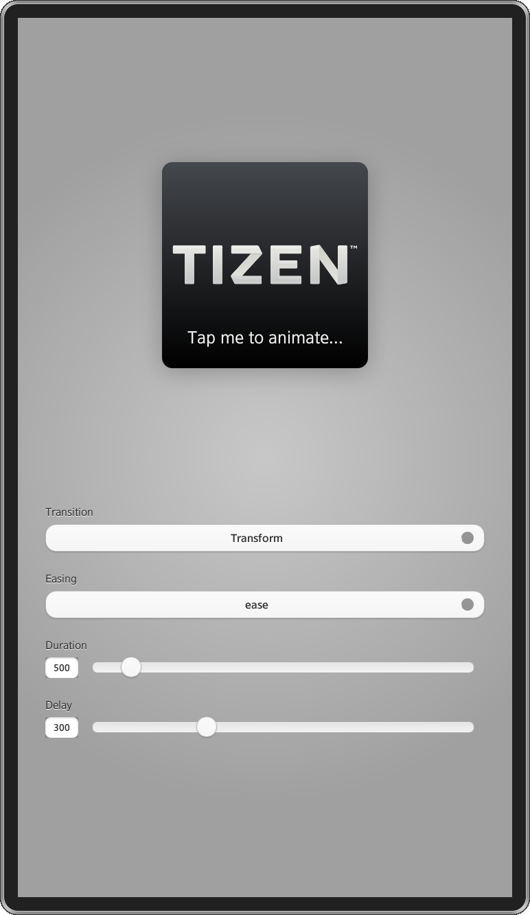
Fig 2: Application screenshot.
The application uses the jQuery Mobile library to display a user interface and the jQuery transi.js plug-in to perform transitions. All libraries are included in the head section.
<head>
<link rel="stylesheet" type="text/css" href="./libs/jquery/jquery.mobile-1.3.0.css"/>
<script type="text/javascript" src="./libs/jquery/jquery-1.9.1.min.js"></script>
<script type="text/javascript" src="./libs/jquery/jquery.mobile-1.3.0.js"></script>
<script type="text/javascript" src="./libs/jquery/jquery.transit.min.js"></script>
</head>
The main application logic is placed in the ‘./js/main.js’ file. It consists of an app object definition which has five public methods: init, setProperty, setEasing, setDuration, setDelay. The first one is bound to the onload event.
return {
        init        : _init,
        setProperty : _setProperty,
        setEasing   : _setEasing,
        setDuration : _setDuration,
        setDelay    : _setDelay
    };
}());

window.onload = app.init;
In the ‘init’ function we define a list of fields and their common onchange event listener. The listener gets the clicked field’s id and tries to set a new value in the app object. These values are later used by a private _transition function to perform the animation.
The _transition function needs special attention. It performs the transition from a default value to its final value and in the opposite way. It uses a delay parameter to delay animation execution both in a transition in and a transition out step. To execute one transition after another we use a callback function as the fourth parameter of the transition function.
/* Prepare options to transition out. */
options = { easing : easing, duration : duration, delay: delay, complete : transitionOutComplete }
options = jQuery.extend(options, _defaultValues[property]);
_$box.transition(options);

/* ... */

/* Prepare options for transition in. */
options = { easing : easing, duration : duration, delay: delay, complete : transitionInComplete };
options = jQuery.extend(options, _transitionValues[property]);
_animated = true;
_$box.transition(options);
The _transition function also doesn’t allow performing any animations when another one already takes place thanks to the usage of the _animated variable as flag.
/* Don't perform transition if another one is already taking place. */
if (_animated) return;
The transition code is wrapped by an anonymous function call to make sure that changing any transition option will not affect the animation that already takes place. It would cause unexpected behavior if omitted.
/* Wrap animation execution with function to make sure that transition
 * options does not change over time. */
(function (property, easing, duration, delay) {
    /* Save _transition function code here ... */
}(_property, _easing, _duration, _delay));
Summary
In this article I have described the usage of CSS3 transitions and the jQuery transit.js plug-in. I hope that it helped understand what transitions are and how to create Tizen applications with beautiful animations.